Crafting a Recognizable Festival Identity Through Menu-Driven Design
Food festivals thrive on their unique culinary offerings, and the most successful ones turn those offerings into a visual identity. Menu-driven identity means using elements of your festival’s food menu – icons of dishes, signature colors inspired by cuisine, even consistent dish names – as the foundation of your branding. This consistency across physical signage and social media doesn’t just look nice; it makes your festival instantly recognizable amid a crowded events landscape. Festival producers around the world have learned that a cohesive visual style can create an identity so strong that attendees know it at a glance, as consistent branding drives recognition and loyalty.
Why Consistency Matters for Food Festivals
Brand consistency isn’t just a buzzword – it’s a proven way to build recognition and trust. Designing a festival brand means capturing an entire experience and feeling, not just selling a product. When every banner, menu board, and Instagram post carries the same visual language, it reinforces what your event is about. Consistent use of logos, icons, and colours helps attendees form mental links with your event’s theme. Over time, this visual repetition boosts brand awareness and loyalty: people spot your content and immediately associate it with the great tastes and times at your festival.
Even famously ill-fated events demonstrate this principle. Fyre Festival (though a failure operationally) had a remarkably consistent visual identity across its website, Instagram, and even wristbands – conveying a luxurious, exclusive vibe everywhere. That consistency built massive pre-event hype, illustrating how powerful unified branding can be in grabbing attention (even if, as Fyre showed, you must deliver on the promises behind the branding!). In short, consistent branding is key to making your food festival memorable and trustworthy.
Icons: Visual Shortcuts to Your Festival Theme
One of the most actionable ways to create a menu-driven identity is through iconography. Develop a set of simple, striking icons that represent key aspects of your festival – especially the food. For example, the Gilroy Garlic Festival in California famously uses a garlic bulb in its logo and signage, reflecting its theme in one glance. Attendees see a garlic icon on social media or on a street sign and immediately know it’s Gilroy’s event. In Singapore, the annual Singapore Food Festival often incorporates a stylized utensil or food item in its graphics, celebrating local cuisine in every poster. These icons act as visual shortcuts; someone scrolling through their feed can see a chili pepper or taco symbol and instantly think of your festival if you’ve consistently used it.
Turn Fans Into Your Marketing Team
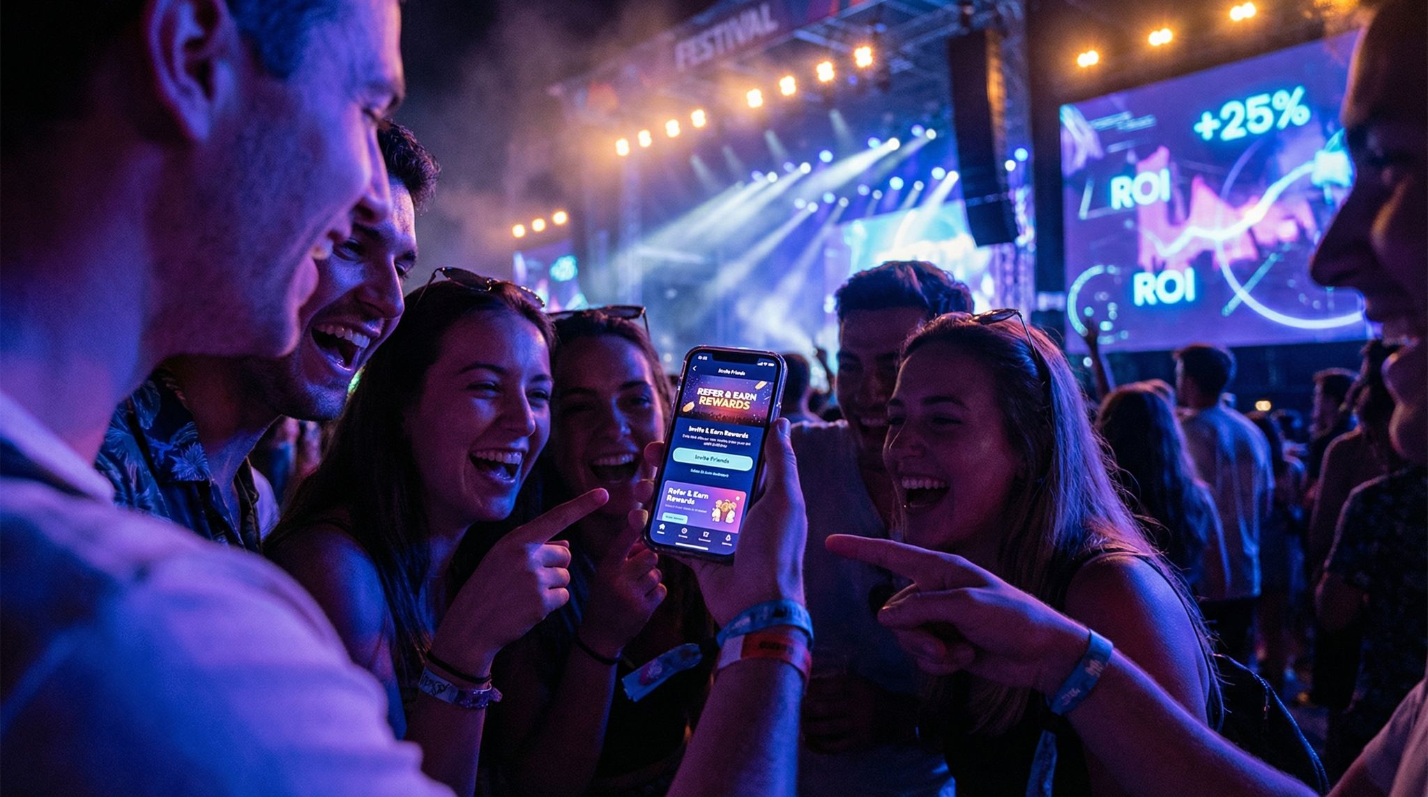
Ticket Fairy's built-in referral rewards system incentivizes attendees to share your event, delivering 15-25% sales boosts and 30x ROI vs paid ads.
Symbols can even create emotional bonds. For example, the Green Man Festival in Wales devised a rebrand where ten distinct areas of the event were each given a unique name and symbol inspired by the festival’s pagan roots. Attendees began embracing these icons as part of the festival’s lore, wearing them and sharing them to show their connection. A food festival can do something similar – a well-designed emblem (say, a cute dumpling character for the dumpling zone) might become a cherished marker that attendees love to spot and share.
If your festival features multiple cuisines or sections, consider an icon for each category. Taste of Chicago, for instance, might use a slice of deep-dish pizza to mark its Italian-American vendors, and a hot dog icon for its BBQ stalls (hypothetically). Those same icons can appear on the event map, booth signage, and corresponding social media posts (“Don’t miss the [pizza icon]in Little Italy Village!”). By repeating these symbols, you create a mental map for attendees. It not only personalizes the experience (people love spotting their favorite food icon around the venue), but it also makes your marketing materials cohesive and fun.
Planning a Festival?
Ticket Fairy's festival ticketing platform handles multi-day passes, RFID wristbands, and complex festival operations.
Actionable Tips – Icons:
- Choose versatile icons: They should look good small (on a social media graphic) and large (on a banner or sign). Food emojis or simplified illustrations work well.
- Use icons contextually: e.g., a beer mug icon on directional signs leading to the beer garden, the same icon on your Facebook event header about craft brews.
- Create an icon library as part of your festival brand kit. Share this with vendors and partners so they can use official icons in their promo materials too, extending your identity’s reach.
Color Palettes That Whet the Appetite
Colors are deeply tied to memory and emotion – perfect for making your festival stand out. Think about the colours associated with your festival’s food or vibe and use them relentlessly. The key is to develop a signature color palette and apply it across all channels. For example, the Oktoberfest in Munich is instantly linked with blue and white (the colors of the Bavarian flag); its tents, flags, and even social media graphics feature this scheme, so anywhere in the world those colors plus a beer mug image scream “Oktoberfest!”. Similarly, the Sydney Night Noodle Markets in Australia use vibrant reds and yellows in their lantern-filled signage and social posts, reflecting the energy of Asian street food markets. When locals see those hues lighting up their Instagram feed in spring, they know the Night Noodle Markets are back.
Color can also differentiate sections of your festival’s menu. Mumbai Street Food Festival (as an example) might assign each region a color – green for South Indian, saffron for North Indian – and use those in both the stall signage and corresponding online vendor spotlights. This not only creates visual variety under one unified style but also helps attendees navigate (“Let’s head towards the stalls with green banners for dosas.”). The important part is that all these colours come from a pre-defined palette that aligns with your festival’s theme (earthy tones for organic/vegan fests, neon brights for pop-culture food fests, etc.).
Actionable Tips – Colors:
- Pick 2-3 primary colors that reflect your festival’s theme or location, and a couple of neutrals. Use these consistently in backgrounds, text, and accents.
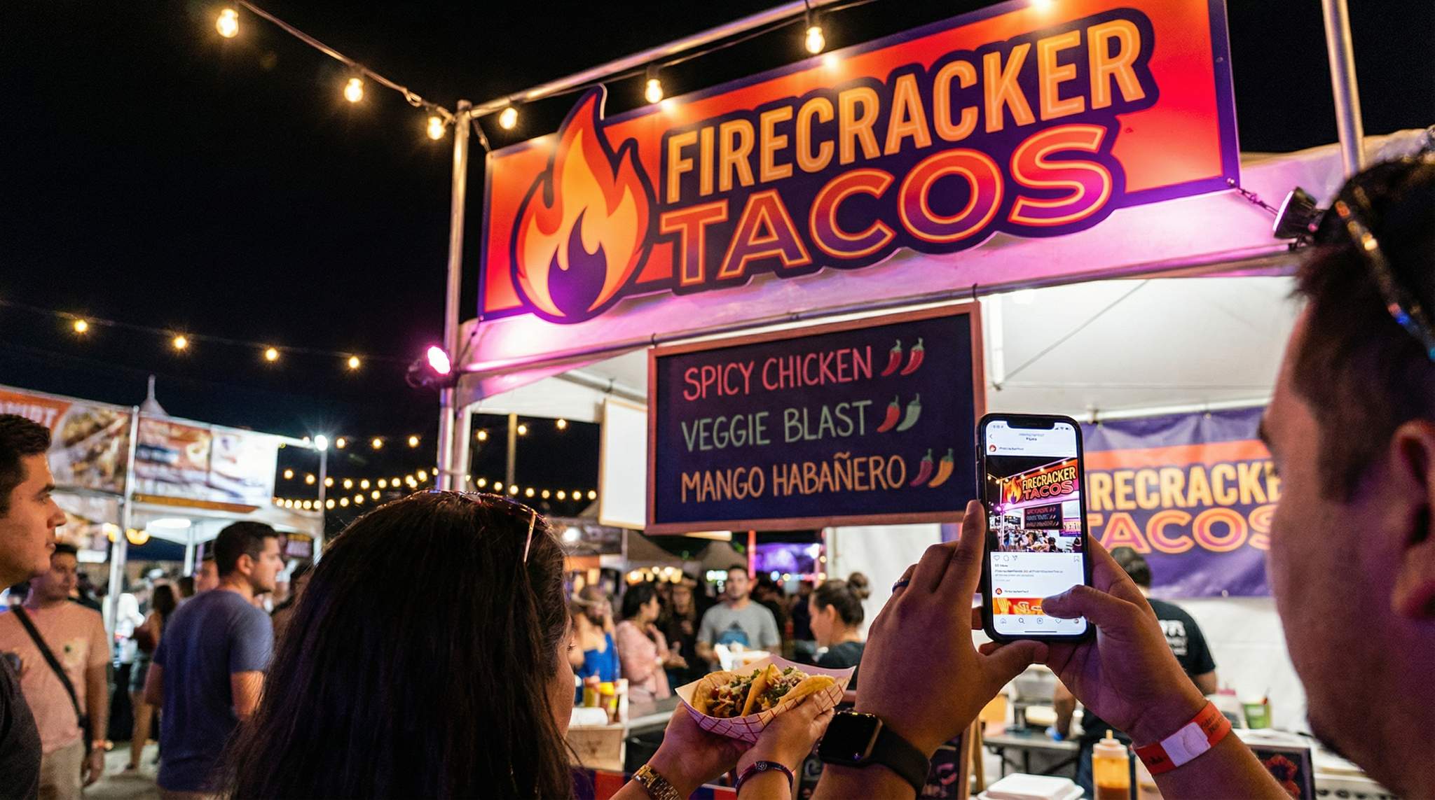
- Ensure readability: High contrast between text and background colors on signs is a must (branding shouldn’t sacrifice clarity of a menu board!).
- Extend colors to details: staff T-shirts, volunteer aprons, tickets, and wristbands should coordinate with the palette for a fully immersive brand experience.
Dish Names and Thematic Language
It’s not just visuals – the words you use become part of your identity too. Embrace thematic naming for dishes, areas, and activities in your festival. Consistent dish names and section names across your signage and social media reinforce the festival’s personality. For example, at a barbecue festival, don’t list a vendor’s dish as just “Spicy Ribs” in one place and “Blazing Texas Ribs” in another – pick a name and stick to it. If you call them “Blazing Texas Ribs” on your website’s menu preview, make sure the on-site booth sign and the festival app use that exact name. This avoids confusion and cements the dish in attendees’ minds (perhaps even encouraging them to post about it by name).
Some festivals take this to the next level by branding signature dishes or experiences. The Gilroy Garlic Festival has the “Garlic Ice Cream”, a quirky treat so famous it has become synonymous with the event. Festival organizers promoted it consistently – in press releases, on signage at the festival (“Try our famous Garlic Ice Cream!”), and on social media with its own hashtag. Over years, that dish name itself became free marketing; attendees and media alike mention it whenever Gilroy comes up. New Orleans Po-Boy Festival similarly names a “Best of the Fest Po-Boy” each year – a special creation highlighted in all marketing. By giving a dish a catchy name and using it everywhere, you add to the lore of your event.
Need Festival Funding?
Get the capital you need to book headliners, secure venues, and scale your festival production.
Also, consider naming sections or features with on-brand terms. Instead of a generic “Main Stage” and “Kids Zone,” a dessert festival might have “Sweet Stage” and “Little Sprinkle Land” – playful names that appear on the map, schedule, and signboards, as well as in your Facebook updates (“Don’t miss the cupcake eating contest at Little Sprinkle Land at 3 PM!”). This kind of consistency in language, paired with visuals, makes the whole event feel like a cohesive world.
For example, Green Man Festival (a music & culture event in Wales) took this approach by renaming each section of the festival with an imaginative title and icon. They created names like “Babbling Tongues” (the spoken word stage) and “Little Folk” (the kids’ area) – each with its own symbol to match, a strategy detailed in Green Man Festival’s design case study. This turned ordinary signposts into engaging talking points and gave the festival a personality that attendees immediately recognize and remember.
Actionable Tips – Naming:
- Develop a glossary of festival terms (what you call your stages, areas, currency/tokens, etc.) and share it with your team and vendors. Use those terms uniformly on signage and online.
- Encourage vendors to create festival-themed dish names (and set some guidelines so names fit the family-friendly or thematic tone). A bit of fun naming can generate buzz, especially if announced in pre-event social posts.
- Hashtag it: Turn unique names into hashtags or tags on social media (e.g., #GarlicIceCreamChallenge) so that attendees use the same language when they post about it.
Unifying Signage On-Site
Walk into a well-branded festival and you’ll notice how all the signs seem to belong to the same “family.” That’s what you’re aiming for. Start with your entrance and wayfinding signage – these usually carry your festival name/logo and set the tone. Use the same logo, icon style, and colors on the welcome arch, the tickets or wristbands, and the directional signs inside. Many festivals print or digital-display welcome messages that match the graphics they’ve been posting on social media, so attendees feel a sense of familiarity as soon as they arrive.
Next, look at menu boards and vendor signage. Often at food festivals, each vendor will have their own menu sign. Provide them with a branded template: for instance, a blank menu poster that has your festival border, your fonts, and space for them to list their dishes. This way, every stall advertises its fare while still looking unified. Street Feast London, a popular street food event, does this well – every vendor’s price sign had the same neon-coloured border and font style, so wandering through the market felt like flipping through a single menu book. Attendees could immediately distinguish official info (like prices, token info) because it all had the same styling.
Don’t forget maps, schedules, and info booths: design these boards or banners with the same icon set and palette. If your map shows a little burger icon for Zone A, the actual sign in Zone A should feature that same burger icon. Consistency here doubles as a service – it helps people navigate intuitively. Large festivals like the Melbourne Food & Wine Festival ensure the print map, the mobile app, and on-site directional signs all share a common design language, so attendees never feel lost between mediums. One pro tip: invest in high-quality, weather-resistant signage that you can reuse yearly (especially if your branding will be consistent annually). It saves cost long-term and reinforces your identity year after year.
Actionable Tips – On-site Signage:
- Create a Signage Style Guide: Document fonts, colors, logo usage, icon placements, etc., specifically for signs. This is separate from general branding guidelines, focusing on legibility and materials.
- Centralize Production: Wherever possible, print all signs through one vendor or at least on the same material, to avoid color mismatches. If volunteers hand-make some signs (for that rustic charm), give them a template or examples to mimic.
- Brand All Touchpoints: Every touchpoint is an opportunity – the stage banner, the trash bins (“Thank you for keeping the festival clean!” with your logo), volunteer badges, and even the tokens or tickets should carry elements of the identity. When everything attendees see reminds them where they are, it strengthens the brand imprint.
- Coordinate with Vendors: Provide pre-made signage assets to vendors (like a logo sticker or a flag to pin on their stall). By doing this, even individual booths become part of the larger visual theme, rather than isolated islands.
Extending Identity to Social Media & Marketing
Now, think digital. Long before attendees see your beautiful on-site decor, they’re encountering your festival online – through your website, ticketing page, Instagram, Facebook, TikTok, emails, and maybe ads. Extending your menu-driven identity to these channels is critical for building that instant recognition. Use the same icons, colors, and names from your physical event in your digital content. For example, if you designed cute icons for each cuisine at the festival, use them in your social media posts when talking about those cuisines (“Meet our Sushi Vendors! [? icon]”). The festival’s official hashtag and social avatar should also feature your key visuals (logo or mascot) and colours.
Successful festivals often create a social media style guide mirroring their event branding. The Good Food & Wine Show in Australia, for instance, provides partners and exhibitors with comprehensive logo and branding guidelines so that even external promotions remain on-brand. Likewise, your own social posts should have a consistent look: perhaps every Instagram post uses the same filter or border that matches your poster design, and your Twitter graphics use the festival’s font and colour scheme. When someone visits your profile, the grid or feed immediately feels cohesive and unmistakably you.
Consider also the tone and voice in your captions – consistent language (as discussed in the naming section) carries over online. If your festival is playful and pun-filled (“We’re soy excited for the Vegan Food Fest!”), keep that tone in all channels. If it’s more upscale and informative (as a wine & dine festival might be), maintain that voice.
Engaging the Community: One powerful way to strengthen your identity is to involve your audience and local community in creating and sharing it. Some festivals run design contests for posters or mascots – for example, the Knoxville Asian Festival in the U.S. holds an annual poster design contest where local artists submit ideas, incorporating the festival’s core icons and themes. The winning design is used on official signage and widely shared on social, giving the festival a fresh look while staying true to its theme. This kind of community engagement not only provides you with unique artwork but also turns participants into ambassadors for your brand; they’re excited to share “their” festival poster, which spreads your visuals further.
Another approach is encouraging user-generated content that aligns with your branding. Create Instagram Story templates with your festival’s frames, stickers of your icons (many festivals now offer GIF stickers of their logo or food icons on Instagram), and a special photo backdrop at the event featuring your branding. Attendees will take photos with it and post them. When your branding is literally in their shared content, you amplify that consistent identity to all their followers, essentially crowdsourcing your marketing.
Actionable Tips – Social & Marketing:
- Themed Event Pages: Customise your ticketing and event pages to reflect the branding. For instance, Ticket Fairy’s platform allows adding your banner images, colours, and even custom content to the event page—effectively customizing your event page according to your theme—so the ticket-buying experience feels like part of your festival. Carry that through to confirmation emails or mobile tickets with your logo.
- Template Library: Create templates for social media posts (announcement, countdown, vendor spotlight, etc.) that all use the same layout style. This ensures whenever someone sees a graphic from you, they know it’s from your festival before even reading the text.
- Consistent Hashtags & Emojis: Pick one primary hashtag (e.g., #LondonBurgerFest) and use it on every platform. If a relevant emoji or your own icon can accompany it, even better – these become shorthand for your event.
- Schedule Regular Content that reinforces identity: Have a “Menu Monday” where you post a dish icon and feature, or “Wine Wednesday” with your wine glass icon and a featured winery, for example. The repetition of these mini branded series helps people remember you.
- Monitor and Adapt: Watch how your audience engages. If certain visuals or phrases really catch on (say people keep sharing the taco icon you used), double down on those in your branding next time. If something isn’t resonating, tweak it, but do so carefully – aim to improve within your established brand framework rather than reinventing it each time.
Scaling from Boutique to Mega-Fest
Whether you’re running a cozy local food fair or a sprawling international expo, the principles of menu-driven identity scale up and down. For small boutique festivals (maybe a neighborhood vegan fair), budget might be tight, but consistency is free. You can achieve a lot with a cohesive vision: maybe all signage is hand-painted in the same two colors by volunteers, and all social posts use the same Instagram filter. Those little touches create a branded feel without big spending. Small festivals also often have the advantage of intimacy – you might literally know your attendees – so lean into community input on branding. Perhaps ask your followers to vote on the new logo icon (banana or mango for the tropical theme?). When they feel included, they become loyal and help spread your look.
For large festivals with tens or hundreds of thousands of attendees (think Taste of London, Eat! Vancouver, or Mexico’s Festival Gourmet), you likely have professional designers and bigger marketing campaigns. Here, consistency can be more challenging because of sheer scale – multiple teams working on different facets. That makes having a clearly defined brand style guide crucial. Ensure everyone from the website developer to the signage printing team to the social media managers has access to the same logo files, font files, color codes, and example use-cases. Major festivals such as the Good Food & Wine Show and Melbourne Food & Wine Festival maintain extensive brand guides and often share them with sponsors/exhibitors. The payoff is huge: consistent branding across large events breeds a sense of professionalism and reliability that can attract sponsors (who love a well-presented event) and helps new attendees feel oriented.
One thing to consider at scale is annual refresh vs. consistency. Some festivals change their theme yearly (e.g., a Chocolate Festival might go from “Dark Chocolate Decadence” theme one year to “Bean-to-Bar Craft” theme the next). It’s absolutely fine to refresh marketing creatives, but try to retain key brand elements even as you do. The festival name/logo should remain prominent and unchanged, or if altered, it should be evolutionary (an update, not a whole new persona). A good example is Green Man Festival (a major arts & music fest in Wales): they commission new illustrated designs each year to keep things fresh but still incorporate the core Green Man icon and ethos, striking a balance between consistency and novelty. A food festival can do similarly – keep your fork-and-knife logo and signature color, but change the supporting art to match this year’s focus (e.g., images of tacos one year, sushi the next). This way, loyal visitors feel the familiar vibe, and new graphics keep it interesting.
Frequently Asked Questions
What is menu-driven identity in festival branding?
Menu-driven identity involves using elements of a festival’s food menu—such as dish icons, cuisine-inspired colors, and consistent naming—as the foundation for visual branding. This strategy creates a cohesive look across physical signage and digital platforms, making the event instantly recognizable and reinforcing the culinary theme for attendees.
Why is brand consistency important for food festivals?
Brand consistency builds recognition, trust, and loyalty by creating a unified visual language across all touchpoints. When banners, menus, and social posts share the same logos and colors, it reinforces the event’s theme and helps attendees form strong mental associations. This visual repetition makes the festival memorable and distinct in a crowded market.
How can food festivals use iconography to build a brand?
Festivals can use simple, versatile icons representing key food items or themes to create visual shortcuts for attendees. For example, using a specific chili pepper or garlic bulb icon on social media, maps, and directional signage helps visitors instantly identify specific zones or cuisines, strengthening the connection between the visual symbol and the event experience.
How do you choose a color palette for a food festival?
Select two to three primary colors that reflect the festival’s cuisine or location, along with neutral accents for readability. For instance, use vibrant reds and yellows for Asian street markets or blue and white for Oktoberfest themes. Consistently applying these colors to backgrounds, text, and staff uniforms creates an immersive, appetizing brand atmosphere.
How does thematic naming affect food festival branding?
Thematic naming reinforces a festival’s personality by replacing generic terms with creative, on-brand language for dishes and zones. Instead of “Main Stage” or “Kids Zone,” using names like “Sweet Stage” or “Little Sprinkle Land” creates a cohesive narrative. This consistency across signage and social media reduces confusion and encourages attendees to share unique names online.
How can organizers unify on-site signage at food festivals?
Organizers can unify signage by creating a specific style guide and providing branded templates to vendors for menu boards. Ensuring that entrance arches, wayfinding signs, and booth banners all utilize the same fonts, borders, and icon sets creates a professional “family” of signs. This visual cohesion helps attendees navigate the event intuitively.
How do you extend festival identity to social media channels?
Extend festival identity online by using the same icons, color schemes, and tone of voice found in physical branding. Create a digital style guide and templates for posts to ensure a consistent look. Customizing event pages, using specific hashtags, and incorporating brand visuals into user-generated content like Instagram filters helps build recognition before the event begins.
How can festivals ensure vendors follow brand guidelines?
Festivals can ensure compliance by distributing a comprehensive brand kit or style guide to all vendors and partners. Providing pre-made assets, such as menu templates, logo stickers, or digital graphics, makes it easy for vendors to align with the festival’s visual identity. Centralizing sign production also guarantees color accuracy and design consistency across all booths.


