Navigating Choices: Reducing Decision Friction at Food Festivals
Attending a food festival should be a delightful journey of discovery, not a confusing maze. Yet one common challenge visitors face is decision friction – the hesitation and delay in choosing where to go or what to eat due to unclear information. When confronted with dozens of food stalls and tantalizing menus, festival-goers can easily become overwhelmed if signage is lacking or menus are hard to read. Effective wayfinding (directional signage) and menu board readability are crucial in smoothing this experience. By designing icon-forward signs that highlight allergens and price bands, festival organizers can help attendees make quick, informed decisions. The result? Shorter lines, happier guests, and a more efficient, enjoyable festival for all.
The Importance of Wayfinding at Food Festivals
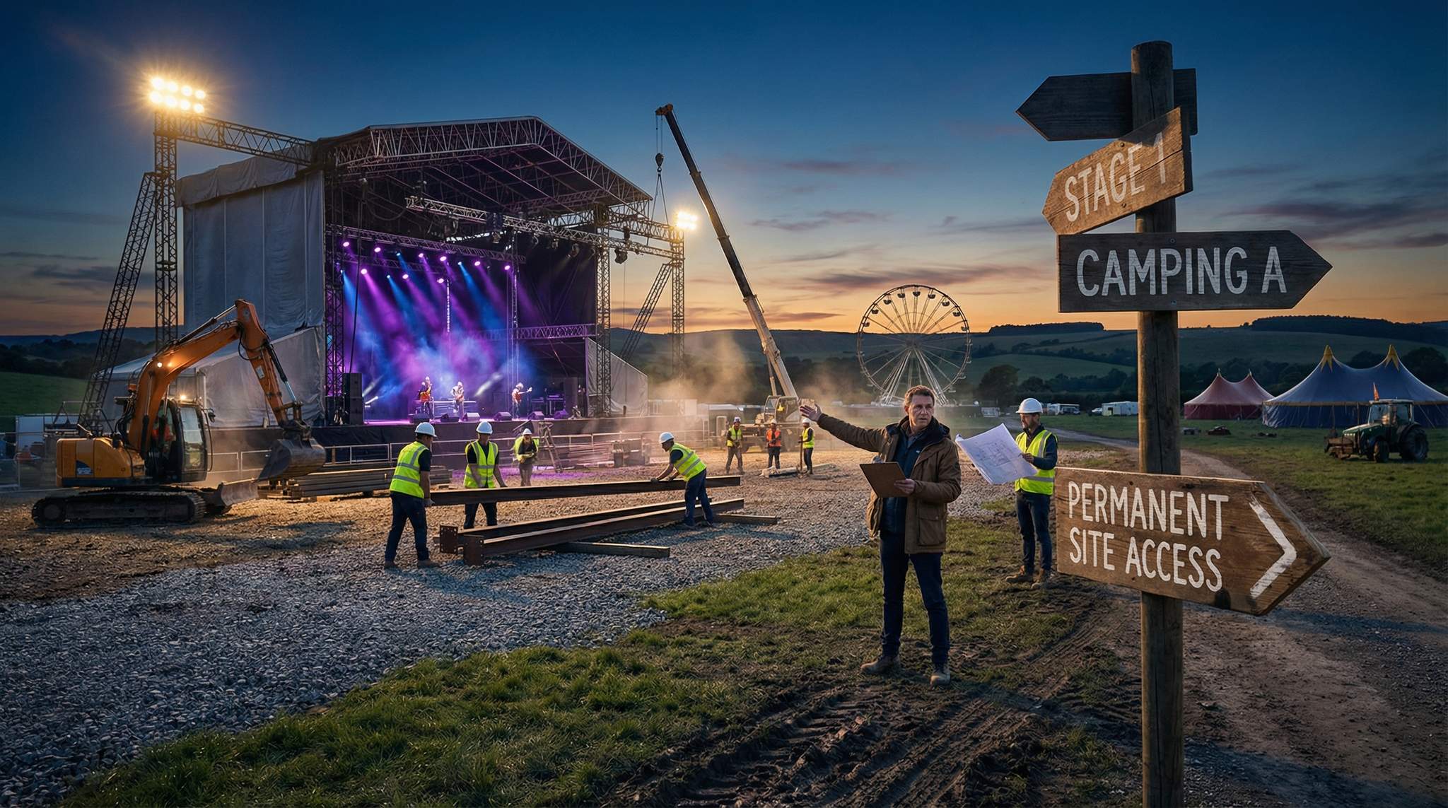
Wayfinding refers to the system of signs, symbols, and maps that guide people through an environment. In a bustling festival setting – whether it’s a sprawling food carnival in Singapore, a weekend wine and cheese fair in France, or a local chili cook-off in Texas – good wayfinding is essential. Clear directional signage at entrances, crossroads, and key points prevents attendees from getting lost or missing out on attractions. It also reduces the burden on staff who would otherwise field constant “Where is ___?” questions, a common issue noted in studies on event wayfinding signage systems.
Consider large-scale festivals like Taste of Chicago or Sydney’s Night Noodle Markets: these events cover large areas with multiple zones (desserts, drinks, regional cuisines, etc.). Strategic signage (often using universal pictograms like a fork and knife for food areas, a restroom icon, or a first aid cross) helps visitors orient themselves quickly. For example, colored banners or flags can mark different cuisine zones, and arrows at intersections might point toward “Latin American Street Food ?” or “Craft Beer Garden ?”. In multilingual regions or international events, pictograms and color-coding become even more vital – they transcend language barriers and help foreign visitors navigate with ease. A well-placed arrow or an icon can turn a confused wanderer into a happy participant, as highlighted in guides for creating seamless event experiences.
Small festivals benefit too. Even if your farmers’ market or local food truck rally spans just a few blocks or a single field, use signage to highlight important locations: entrances, ticket booths or top-up stations (if using coupons), restrooms, water stations, and popular vendors. Signage at eye level with large text and high contrast colors ensures nobody has to squint to read directions, a key tip for venue signage and wayfinding optimization. Remember, if attendees can’t easily spot or read your signs, they might give up and wander off in frustration, according to expert advice on event venue signage – potentially missing out on great food (and you missing out on their spending).
Consistency is key in wayfinding design. Use a coherent style for all directional signs – a uniform color scheme, font, and set of icons – so people recognize guidance at a glance. For instance, all signs related to beverages might be blue with a mug icon, while food section signs are green with a fork icon. This consistent visual language subconsciously trains attendees to find what they need faster. Also, ensure maps (whether printed in a festival brochure, displayed on large boards, or available on a mobile app) use the same icons as the physical signs. Repetition cements understanding.
Logistics play a role as well. Walk the venue like an attendee during your planning. Identify spots where someone might get confused (a fork in the pathway, a cluster of booths forming a “dead end,” etc.) and place directional cues there. Make sure signs are visible above crowds – sometimes elevated banners or signs on tall poles work better than ones at waist height, especially in dense gatherings. At night events, use well-lit or reflective signs so they don’t disappear into the darkness. In outdoor festivals from Mexico to Indonesia, consider weather-resistant signage (waterproof prints, sturdy A-frames) that won’t wilt in rain or wind.
Planning a Festival?
Ticket Fairy's festival ticketing platform handles multi-day passes, RFID wristbands, and complex festival operations.
Ultimately, robust wayfinding is more than just nice-to-have – it directly impacts guest experience and safety. Studies in event management have noted that without a well-designed wayfinding system, visitors experience confusion and chaos, whereas effective signage encourages them to explore more and stay longer, reinforcing the impact of wayfinding on visitor experience. People who can easily find their way are more likely to discover all your offerings (translating to more food and drink sales) and less likely to crowd in one area. By guiding foot traffic intelligently, you avoid congestion at bottlenecks and distribute crowds more evenly across your venue.
Designing Readable Menu Boards
Once attendees reach a food stall, the next hurdle is deciphering the menu. At a busy food festival, no one wants to spend ten minutes poring over a convoluted menu board while a line grows behind them. Readability is king. Every festival producer should work with vendors to ensure that menus are clear, concise, and legible from a distance.
Start with the basics: font size and style. Tiny or overly fancy fonts might look artistic on a designer’s screen, but in a real-world setting – taped to a booth or written on a chalkboard – they can be illegible. Encourage vendors to use large, high-contrast text for item names and prices. A good rule of thumb is that someone standing 6-10 feet away should be able to read the menu without straining. For example, bold sans-serif fonts in white/yellow against a dark background (or vice versa) tend to be easily readable under most lighting conditions. If your event runs into the evening, ask vendors to provide menu lighting (like a small LED light shining on a chalkboard) or supply them with backlit posters, so attendees aren’t squinting in the dark.
Keep menus concise. Festivals are about quick decisions and trying a variety of bites – it’s better for a stall to showcase their 5 best dishes clearly than list 20 items in tiny print. Long, descriptive paragraphs or laundry lists of ingredients can overwhelm readers. Instead, advise vendors to use short, catchy descriptions (a few words if possible) and let icons or labels do some of the explanatory work (more on that shortly). When menus are too cluttered or text-dense, the decision-making process slows down, a concept discussed in digital signage menu board design principles. And the longer it takes people to decide and order, the slower the line moves – which hurts both the customer experience and the vendor’s sales, as noted in strategies for effective menu board layouts. As one digital signage expert put it, “The longer it takes people to order, the slower you’re making money”, a sentiment echoed by experts in menu board design optimization. In other words, clarity and brevity on the menu board can directly impact revenue.
Consider the menu board’s layout as well. Group similar items or create logical sections (e.g., “Tacos”, “Beverages”, “Desserts”) so readers can scan quickly for the type of item they want. Use bullet points or clear separators rather than running text together. If prices vary widely, list them in a neat column so customers aren’t hunting through the text to find the cost. Consistency in formatting across all vendors can be very helpful – if every booth follows a similar menu template (say, item name on the left, icons in the middle, price on the right), visitors know exactly where to look for information no matter which stall they approach. As a festival organizer, you might distribute a menu template or style guide to your food vendors before the event, emphasizing readability standards. Some upscale festivals even print standardized menu boards for vendors – ensuring every sign meets legibility and branding criteria (this also prevents a few poorly prepared stalls from sticking out with handwritten scrawls).
Another tip: test readability beforehand. If possible, do a walkthrough with sample menu prints. Can a person of average eyesight read it from a few paces away? How about an older attendee or someone in a hurry? Gather feedback and tweak as needed – perhaps the font needs to be bolder, or you realize certain terms might be unclear to a general audience (e.g., not everyone knows “artisanal gouda croquette” is actually a fried cheese ball). Clarity trumps cleverness when time is short.
Need Festival Funding?
Get the capital you need to book headliners, secure venues, and scale your festival production.
Icon-Forward Signage: Allergen & Dietary Icons
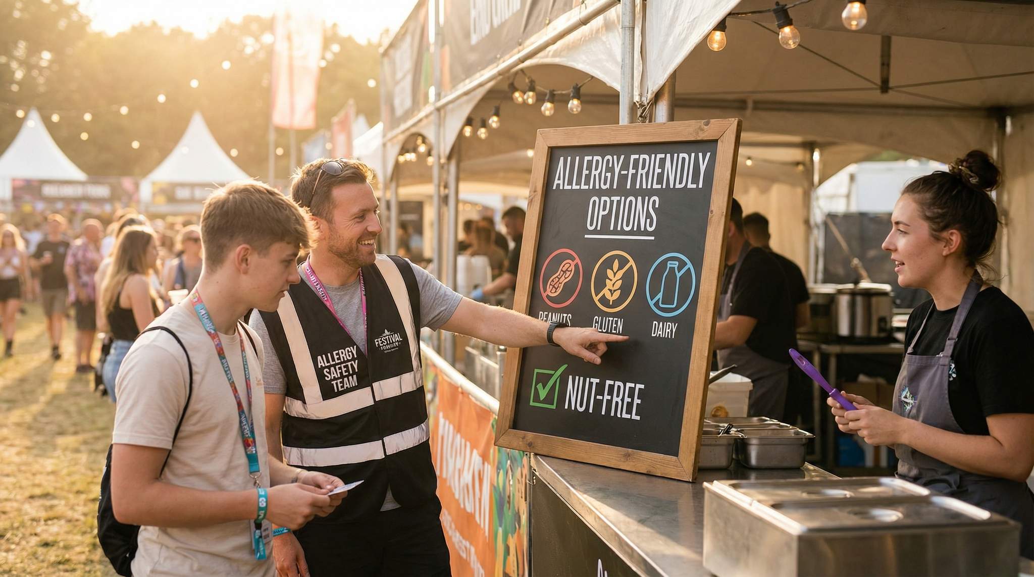
One of the most powerful tools for menu clarity is the use of icons to convey key information instantly. In the context of food festivals, icons can be a game-changer for indicating dietary attributes and allergen warnings. Rather than expecting every attendee to read through ingredient lists or ask staff about each dish, well-placed icons let people scan a menu board and immediately spot items that meet their needs or restrictions.
Allergen icons are especially important as food allergies and dietary intolerances become more prevalent worldwide. Many countries have recognized the need for clear allergen information – for instance, the EU requires identifying 14 major allergens in food service, and diners everywhere increasingly expect transparency. By incorporating small symbols next to menu items, you cater to this need proactively. A peanut icon can signal nut ingredients, a grain icon for gluten, a milk symbol for dairy, a shrimp for shellfish, and so on. The Food Standards Agency in the UK found that diners feel safest when allergen details are clearly available in writing at the point of decision, as FSA research on written allergen information indicates. In other words, putting allergen info right on the menu (where customers are already looking) builds trust and helps people make safe choices without extra hassle.
When using allergen symbols, make sure they are easy to recognize and legible. Simplicity is key – a straightforward icon like an outline of a peanut or a wheat stalk with a clear slash through it (for gluten-free) works better than abstract art. Many regulatory bodies or food safety organizations provide standard allergen icons that you can use or adapt. Also, maintain a consistent size (the UK’s FSA suggests at least 6mm square for icons to ensure readability, according to guidelines on presenting allergen information) and place them in a consistent spot relative to each menu item. For instance, you might list each dish, and right after the name (or below it) have a row of relevant icons. If a dish has no common allergens, you can either leave icons blank or use a “safe for all” symbol – but be cautious, as claiming “allergen-free” could be risky if cross-contamination is possible. It might be safer to only note the presence of specific allergens and otherwise have a default assumption that unmarked items have no major allergens (apart from standard ingredients).
Beyond allergies, dietary preference icons greatly assist attendees with specific diets. A simple (V) or a green leaf symbol universally denotes vegetarian options; a (VE) or plant-based icon typically indicates vegan. In India, for example, packaged foods use a mandatory green dot symbol for vegetarian items and a brown dot for non-vegetarian, a standard explained by Beauty Without Cruelty India regarding vegetarian labeling – a practice some Indian food festivals extend to their stall signage so that vegetarians (a large demographic there) can identify suitable foods at a glance. In predominantly Muslim countries or events with many Muslim attendees, a halal certification logo displayed by food stalls that meet that standard can be very reassuring (and similarly, a kosher symbol in Jewish cultural festivals, etc.). Including these icons broadens your event’s appeal and makes it welcoming to diverse audiences: a visitor who keeps kosher or a vegan guest is more likely to attend (and spend money) if they know they’ll easily find clearly labeled options for them.
There are other useful icons to consider as well: a small chili pepper icon to indicate spiciness level (common in Southeast Asian festivals where tourists may need a warning for heat levels), a little alcohol bottle icon if a dish contains alcohol, or a pig silhouette to mark pork (which some communities avoid). However, be careful not to go overboard – a menu item plastered with five or six different icons might paradoxically become harder to parse. Choose the most critical icon categories based on your expected audience. For instance, if your festival is in California or Australia, you’ll likely want gluten-free and vegan clearly marked, as these are frequent queries. If it’s a cheese or chocolate festival, you might not need a spicy icon at all, but you may want to mark items that contain nuts or gelatin. Know your audience’s top concerns and prioritize those.
It’s wise to provide a legend or key for your icons somewhere visible, especially if you introduce any uncommon symbols. A small sign at each booth or a page in the festival program can explain: “Icons: ?? = spicy, ? = contains nuts, ? = contains dairy, ? = vegan, ?? = kosher certified, etc.” That said, the icons should ideally be self-explanatory to most people – the legend is just a safety net for those unsure. Aim for universally understood imagery (for example, a crossed-out wheat stalk for “gluten-free” is often clearer than just a letter “G”).
Training and accuracy are crucial here. Ensure that each vendor accurately reports their ingredients so the icon labels are correct. Mislabeling an allergen can have serious consequences – the last thing any festival wants is an avoidable medical emergency. Establish a process during vendor onboarding to collect info on which of the 8 (or 14) common allergens their dishes contain, and double-check that their menu signage matches that information. In some regions, regulations may require this transparency, but even when not legally mandated, it’s a mark of professionalism and care for your attendees’ well-being.
By embracing allergen and dietary icons, you drastically cut down the decision time for those attendees who have to be careful about what they eat. Rather than walking up to each booth and asking a series of questions (“Does this have nuts? Dairy? Is there a vegan option?”), they can scan and decide in seconds. This not only reduces friction for them but also shortens the queue for everyone else.
Introducing Price Bands for Quick Budget Cues
Another source of decision friction at food festivals is pricing confusion. Festival-goers often come with a budget in mind. If they have to approach a stall and read through each item’s price to figure out if it fits their wallet, that takes time – and some may even feel awkward walking away if prices are higher than expected. Introducing price band icons is an innovative way to telegraph cost range quickly and help visitors make choices faster and more comfortably.
A price band system categorizes menu items (or vendors as a whole) into price tiers and denotes them with symbols. For example, you might use a single $ icon (or your local currency symbol) to indicate inexpensive eats (say, under $5 or under ?300 in India, etc.), $$ for mid-range ($6–$10), and $$$ for premium ($11+). These symbols can appear next to each item on a menu or at the top of a vendor’s menu board (e.g., “Most dishes here are $$”). Alternatively, a festival might use color-coded tags or simple icons like one coin, two coins, or three coins to represent the bands. The goal is to give a quick visual cue about price.
How does this help? Put yourself in the shoes of an attendee juggling limited cash or festival tokens. If they spot a food stall with a $$$ marker, they know instantly it’s on the higher end, and they might skip it if they’re nearing budget (saving them from waiting in line only to walk away upon seeing prices). Conversely, a $ marker can draw in students or families looking for affordable bites. It’s about managing expectations and easing comparisons. At some large festivals in Europe and Canada, organizers list vendors in the program or website along with a price range symbol, enabling guests to plan their foodie adventure by balancing splurges and cheap eats. Bringing that same idea onto the physical signs on-site closes the loop, because people may not all read the program but will see the sign.
If your festival uses a token system (common in many tasting events and beer festivals, where attendees purchase tokens or credits instead of cash transactions at each booth), price band icons are especially handy. They can indicate how many tokens an item costs in a visual way (e.g., an icon of a token with “2x” for two tokens) so that people don’t have to do math on the spot. Always display the conversion clearly too (“1 token = $2” or whatever the system) at each booth to avoid confusion. The fewer mental hurdles a hungry guest has to overcome, the better their experience.
Implementing price bands requires some coordination. You’ll need to define the tiers appropriately for your event (prices might vary country to country – what’s “cheap” street food in Los Angeles might not be the same in Jakarta or London due to currency differences and portion sizes). Communicate these tiers to vendors so they can price accordingly or at least agree to have those symbols applied to their menu. Some festivals include pricing guidelines as part of vendor agreements to ensure a good mix of affordable and premium offerings. If that’s the case, using price band icons is just a visual extension of a policy that already exists.
One potential concern is whether price bands oversimplify pricing – after all, an attendee will eventually see the exact price when they read the menu. The idea isn’t to hide prices, but to allow an initial filter. It’s like giving the crowd a heuristic: “If you’re on a tight budget, look for the $ symbol on the booths.” It can also help tactically with crowd distribution. Often the most popular, trendy vendors have long lines and higher prices. If your cheaper vendors are being overlooked, a $ symbol might lure some thrifty eaters to those shorter lines, balancing the crowd a bit more. Conversely, foodies seeking the very best or unique might intentionally seek out the $$$ spots – as long as they know where to find them without scanning every menu in detail.
From a messaging standpoint, price icons should be subtle and supportive. You wouldn’t want to plaster giant dollar signs that imply “this stall is expensive!” and possibly deter people too much. Rather, incorporate it modestly in the design – maybe a small icon by the vendor name or next to the menu header. Always still list actual prices clearly for each item; the bands are a supplement, not a replacement. Transparency is key to maintaining trust.
Reducing Decision Friction and Improving Flow
When wayfinding signage, menu readability, dietary icons, and price bands all come together, the cumulative effect is a significant reduction in decision friction. Attendees spend less time puzzling over maps or menus and more time enjoying the festival (and purchasing food). Let’s break down the benefits and some best practices to maximize them:
-
Faster Decisions, Shorter Lines: Every second an attendee saves in finding a stall or choosing an item helps keep lines moving. Imagine a visitor with a peanut allergy – without clear signage, they might spend several minutes at each booth enquiring about ingredients. With allergen icons, they can skip unsuitable options at a glance and zero in on safe choices. Likewise, clear wayfinding signs mean a newcomer looking for the dessert tent isn’t wandering around lost for ten minutes. Speedier decisions not only make individual attendees happier but also prevent bottlenecks. Vendors can serve more people per hour when customers step up already knowing what they want. One industry analysis pointed out that slow ordering processes can frustrate customers and hurt sales, as people abandon long waits, a critical factor in menu board design and customer retention. Good signage is an antidote to that.
-
Enhanced Attendee Satisfaction: A well-organized festival where guests can navigate effortlessly and feel confident about their food choices leads to greater satisfaction. Attendees remember the overall vibe – “It was so easy to get around and everything was clearly labeled!” is the kind of feedback that drives repeat attendance and positive word-of-mouth. In contrast, if people leave saying “It was fun but I spent half my time just figuring out where to go and what I could eat,” that’s a lost opportunity. By reducing stress and uncertainty, you create a more relaxing environment. Think of it as an invisible hospitality gesture – you’re taking care of guests’ needs proactively. For international visitors or those with dietary restrictions, this thoughtfulness is even more appreciated; they feel seen and catered to.
-
Inclusivity and Safety: Clear allergen and dietary information isn’t just a nicety, it’s a safety imperative. Festivals in the UK, EU, and beyond have learned from unfortunate incidents that allergen miscommunication can be life-threatening. By implementing icon-forward menus, you significantly lower the risk of someone accidentally consuming something they shouldn’t. It also signals that your festival is inclusive – welcoming people who are vegan, halal, gluten-intolerant, etc. For instance, at VegFood Fest in Toronto, all vendors use icons to mark vegan, raw, and gluten-free items, which is obviously core to that event’s mission. But even at general food festivals like Taste of Auckland or LA Food Fest, providing a baseline of options and labeling for different diets ensures no one has to stay hungry or feel left out. Inclusivity in food choice can set your event apart in a crowded market; it widens your potential audience to include those who might otherwise skip food events for fear of limited options.
-
Better Vendor Performance: When festival organizers lead the charge in providing signage standards (icons, templates, price band guidelines), it can actually help the vendors succeed. Not all chefs and food truck owners are graphic design savvy; some might show up with poorly handwritten menus or a hard-to-read sandwich board. By giving them a framework – say, a printed board with their menu pre-printed in a clear font and spaces for them to just fill in prices or special notes – you level the playing field. Every stall gets fair visibility and no vendor loses customers just because their sign was illegible. Additionally, vendors appreciate when they don’t have to repeatedly answer the same questions (“Is this gluten-free? How much is that?”) because the info is already displayed – it frees them to focus on cooking and serving, improving overall operations.
-
Flexibility and Updates: Consider how you will handle changes during the festival. A digital solution (like LED menu boards or a festival app) can complement physical signage by providing up-to-the-minute info, but assuming we’re focusing on physical signs, it’s good to have a plan for updates. For example, if a dish sells out and a vendor needs to update their menu board, having a clear process (and maybe some blank space on the board or a removable strip) can let them do that without ruining the readability. Ideally, the icon system remains simple even with changes – e.g., if a vendor switches to a nut-free version of a dish on day 2, they can remove the peanut icon from their sign or cover it. In terms of wayfinding, having a few extra temporary signs on hand can be a savior if you notice unexpected chokepoints or if an entrance/exit flow needs redirection on the fly.
-
Global Considerations: As you implement these practices, remember cultural context. Colors and symbols can mean different things in different cultures. A thumbs-up icon might be positive in some places but offensive in others; colors like red can signify danger (good for “spicy/hot” perhaps) but in some contexts red might also attract attention or indicate something special. If your festival draws an international crowd, stick to truly universal symbols (the classic fork/knife for food, for example, or the circle-bar “no” symbol for “free from” something). Language on signs should be as simple as possible – often English plus the local language if the event is non-English speaking. However, as noted, visuals often speak louder than words. Pictorial signs have been used in theme parks and Olympic events to overcome language gaps, and food festivals can do the same.
Lessons from the Field
To see these principles in action, look at some festivals that have excelled in signage and communication:
-
Taste of London (UK): This premier food festival provides attendees with menus that have dietary symbols for vegetarian, vegan, and dairy-free options on every vendor’s list. It’s part of their effort to be accessible; every restaurant at the festival is encouraged to offer at least one vegetarian dish and mark it clearly. As a result, visitors with dietary restrictions flock to the festival knowing they’ll be able to find suitable dishes without detective work. This clarity reduces questions vendors get and speeds up decision making for thousands of guests.
-
Gilroy Garlic Festival (USA): A famous garlic-themed festival in California (before it ended in its traditional form) used clever wayfinding and thematic signage. Icons of garlic bulbs on arrows led people to different attractions like the cook-off stage or the garlic ice cream stand. Even with huge crowds, attendees could navigate the fairgrounds because the symbols were bold and placed at key junctions. Vendors also embraced simple, bold menu signs – many featuring a garlic icon next to items that were especially garlicky (a fun thematic twist that doubled as an informational icon).
-
Ubud Food Festival (Indonesia): This international festival in Bali attracts visitors from around the world. Organizers there print menus and signage in both English and Indonesian, and they utilize icons for chili (spice), peanuts, and shellfish, reflecting local ingredients of concern. They also place a large legend banner at the info booth illustrating all icons used. A visitor from, say, Australia who doesn’t speak Indonesian can still navigate the stalls by following the bilingual signs and the universal food icons. The festival has received positive feedback for being tourist-friendly, something other destination events can emulate.
-
Local Vegan Fairs (Global): Smaller scale events like vegan food fairs or gluten-free expos inherently label everything, but their experience offers a takeaway for mainstream festivals: clear labeling creates a sense of community and trust. At a vegan festival in Melbourne, for instance, all stalls prominently displayed vegan certification badges and allergen info, which not only reassured patrons but also educated newcomers about ingredient transparency. Mainstream festivals might not go to that extent, but adopting some of these practices (like visible badges for certain qualities) can elevate the overall professionalism of your event.
Not every festival will have the resources to execute a perfect signage system from day one, but incremental improvements go a long way. Perhaps this year you invest in a decent map and a few directional signs, and encourage vendors to use basic allergy labels. Next year, you expand with printed icon stickers for each vendor to use, and maybe a color-coded flag system for sections of your event. Over time, these elements become part of your festival’s identity and logistics toolkit.
Key Takeaways
- Plan Your Wayfinding Early: Design a signage strategy during the venue layout stage. Use clear, consistent signs and universally recognized icons to guide attendees, reducing confusion and congestion.
- Make Menus Easy to Read: Encourage or supply menu boards with large, high-contrast text. Limit item count and description length so that customers can scan and decide quickly, keeping lines moving.
- Use Icons for Dietary Info: Incorporate icons for common allergens (nuts, gluten, dairy, etc.) and diets (vegetarian, vegan, halal, etc.) on menus. This visual shorthand builds trust and helps attendees instantly identify suitable options.
- Introduce Price Bands: Consider categorizing menu items or vendors by price range with simple symbols (e.g., $, $$, $$$). This transparency helps guests manage their budget at a glance and choose accordingly.
- Reduce Decision Friction: All these measures together minimize the effort for attendees to navigate and choose. Faster decisions mean shorter wait times, more satisfied guests, and potentially higher sales for vendors.
- Be Inclusive and Safe: Clear labeling and guidance make your festival welcoming to diverse audiences and ensure people with dietary restrictions can participate fully without fear. It’s not just good hospitality – it’s risk management.
- Test and Iterate: Gather feedback from attendees and vendors. Notice where people seem lost or indecisive, and improve your signage and menu designs for the next event. Small tweaks (like bigger fonts or an extra sign at a tricky corner) can dramatically improve flow.
By implementing icon-forward signage and prioritizing readability, festival producers around the world can create an environment where the food, fun, and culture take center stage – and logistical hiccups fade into the background. The easier you make it for attendees to find their way and make choices, the more memorable and enjoyable their festival experience will be. In the end, reducing decision friction isn’t just about cutting wait times; it’s about showing your audience that you value their time, needs, and enjoyment. And a happy attendee, as every seasoned festival organizer knows, is the cornerstone of a successful festival.