Creating a compelling visual identity for a festival is an art and a science. The most successful festivals in the world are instantly recognizable before attendees even set foot on the grounds. From the iconic psychedelic posters of the late 1960s to the sleek, minimalist logos of today’s mega-festivals, great branding sets the tone and personality of an event. It’s not just about making a pretty logo – it’s about capturing the soul and vibe of the festival in a way that resonates with your audience.
Why Festival Branding Matters
Branding is more than just logos and colors; it encompasses the overall look, feel, and emotional appeal of your festival. A strong brand gives potential attendees an immediate sense of what your event is about. For example, a playful food festival might use vibrant colors and quirky illustrations, signaling a fun family-friendly atmosphere. In contrast, a techno music festival might have a darker, more futuristic visual identity, hinting at the edgy late-night experience. Consistent and creative branding helps your festival stand out in a crowded market and builds trust and loyalty with fans – they’ll recognize your posters or merch at a glance and feel part of the festival’s community.
Designing a Compelling Festival Logo
The logo is the cornerstone of your festival’s visual identity. It will appear on posters, websites, tickets, wristbands, merchandise – essentially everywhere – so it needs to be strong and versatile. Seasoned festival producers emphasize a few key principles when creating a logo:
-
Simplicity and Memorability: The best festival logos are often simple in form, making them easy to remember and recognize. Think of the classic Woodstock 1969 poster logo – a simple white dove perched on a guitar neck against a red background, encapsulating “3 Days of Peace & Music.” That simple imagery became legendary because it was bold and straightforward. A cluttered or overly complicated logo can be hard to distinguish from afar or when scaled down.
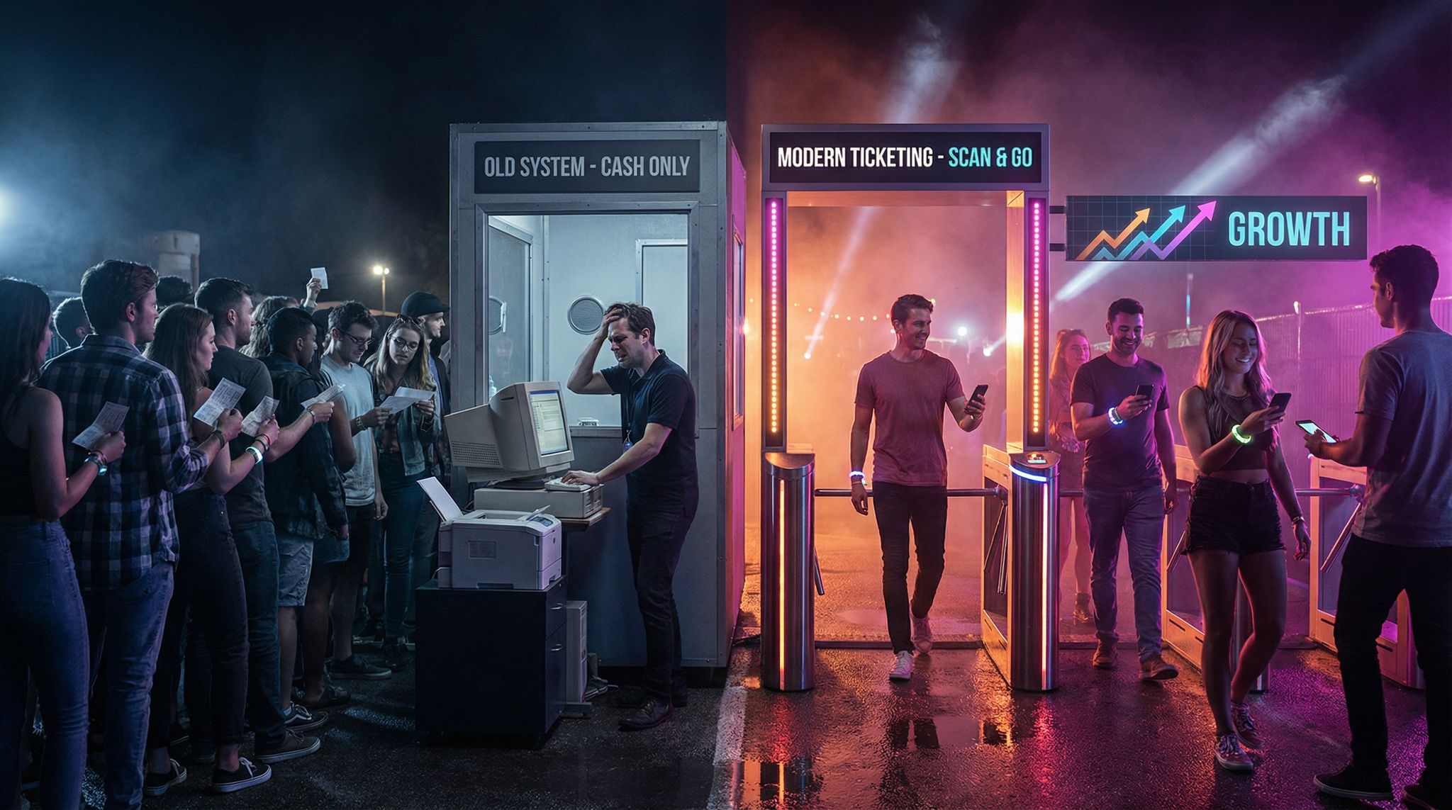
Boost Revenue With Smart Upsells
Sell merchandise, VIP upgrades, parking passes, and add-ons during checkout and via post-purchase emails. Increase average order value by up to 220%.
-
Reflect the Festival’s Vibe: Your logo should visually convey the essence of your event. A logo for a psychedelic rock festival could incorporate flowing, hand-drawn lettering reminiscent of 60s concert posters, whereas an electronic dance festival logo might use sleek geometric shapes or futuristic fonts. Consider what symbols or imagery connect to your festival’s theme or location (mountains, waves, musical instruments, etc.) and incorporate those in a creative way. For instance, a mountain music festival might stylize a guitar to look like a mountain range.
Mastering the Art of Brand Evolution — Keep your festival fresh and collectible by updating your annual theme while maintaining a rock-solid core identity. -
Color and Emotion: Colors evoke emotions. A tropical beach festival might lean into bright yellows, pinks, and blues to convey sunshine and fun, while a classical music festival might use elegant deep blues or golds to suggest sophistication. Choose a color palette that matches your festival’s mood and stick with it. Many veteran promoters recommend selecting 2-3 core colors for your brand and using them consistently.
Planning a Festival?
Ticket Fairy's festival ticketing platform handles multi-day passes, RFID wristbands, and complex festival operations.
-
Typography Matters: The font or lettering style in your logo and marketing materials should align with the festival’s character. Bold, quirky fonts signal a casual good time, while clean sans-serif type can feel modern and upscale. Ensure the festival name is legible in the logo – if people can’t read the name, the branding fails. Custom or hand-drawn typography can make your logo unique, but balance creativity with readability.
-
Versatility and Scalability: A festival logo must work in many sizes and contexts. Test how it looks both on a giant billboard and as a tiny social media icon. Does it still make an impact when shrunk down? Also consider versions for dark or light backgrounds (you may need a black, white, or single-color variant). A good logo should be adaptable – for example, you might have a full logo with text and an emblem, and a simplified icon version for small uses like app avatars or merchandise tags.
Creating Key Art and Posters
Beyond the logo, the key art (main poster or visual theme) of your festival is crucial for marketing. This is the eye-catching artwork that appears on your event posters, website header, social media ads, and sometimes on merchandise like T-shirts or program booklets. Designing effective key art is a creative process that ties together imagery, typography, and color into a cohesive snapshot of your festival’s identity.
Tell a Story with Imagery: Great festival posters often tell a story or spark an emotion at a glance. They might depict scenes or symbols related to the event’s theme. For example, a jazz festival poster might feature abstract illustrations of musicians in action, while a gaming convention festival might use bold graphics inspired by 8-bit game art. Consider what story or vibe you want potential attendees to feel – is it peace and love, wild adventure, cultural celebration, cutting-edge innovation? Incorporate that into the artwork concept.
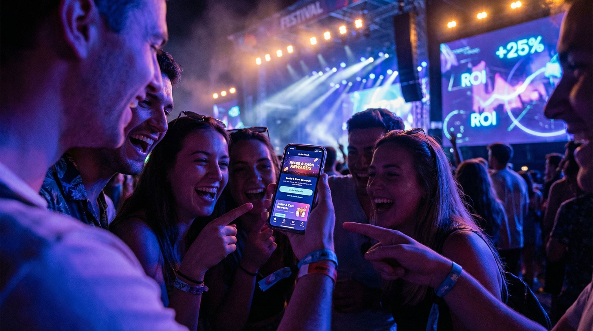
Turn Fans Into Your Marketing Team
Ticket Fairy's built-in referral rewards system incentivizes attendees to share your event, delivering 15-25% sales boosts and 30x ROI vs paid ads.
Collaborate on Illustration and Photography: Decide whether your festival’s key art will be illustrated, photographic, or a combination. Illustration offers limitless creativity and can become highly iconic (like the hand-drawn psychedelic posters of the 60s and 70s that people collect as art). On the other hand, using striking photography (for example, a dramatic photo of the festival location or crowd) can ground your branding in reality and excitement. Some modern festivals blend the two – using a photo with graphic overlays or stylized filters to create a unique look.
Include Essential Information Stylishly: A poster needs to convey key details (festival name, dates, location, headliners, etc.), but design is key to making sure this info doesn’t overwhelm the art. Many classic festival posters use creative layouts where the imagery draws you in, and the text provides information without clutter. Work with your designer on hierarchy: the festival name and dates should be immediately visible; supporting details can be smaller. Tip: Look at examples of famous festival posters (Woodstock, Glastonbury, Coachella) to see how they balance art and information. For instance, the Woodstock poster’s art was so dominant that the list of bands was tiny – yet it worked because the image captured the spirit perfectly.
Need Festival Funding?
Get the capital you need to book headliners, secure venues, and scale your festival production.
Consistent Theme Each Year: If your festival runs annually, it’s a good idea to maintain some consistent branding elements year-to-year. You might introduce a fresh poster design or theme each edition (many festivals do this to keep things exciting), but keeping your logo and some hallmark styles or colors will ensure returning fans still recognize it as the same festival. Think of it like variations on a theme: new art, same recognizable brand. For example, a film festival might change its poster artwork each year to reflect the festival’s theme or featured genre, but the festival’s logo and a core color palette remain constant.
Working with Graphic Designers
Even the most experienced festival producer knows the value of a talented graphic designer. Translating a festival’s vibe into visuals is a specialized skill – and working collaboratively with designers will elevate your branding. Here are some tips for productive collaboration:
-
Share Your Vision Clearly: Start by creating a creative brief for your festival’s branding. Outline what your event is about – the genre of music or type of experience, the target audience demographics, the location, and the atmosphere you want to convey. Include keywords (e.g., “energetic,” “family-friendly,” “avant-garde,” “eco-conscious”) and any symbolism you have in mind. If you have a theme or tagline for the festival, let the designer know. The more clearly you can describe the festival’s personality, the better a designer can capture it.
Bridging Vision and Creative Execution — Follow the journey from a producer's initial brief and mood board to a designer's final polished masterpiece. -
Provide Inspiration and References: Gather examples of other festival or event branding that you admire, especially those with a similar vibe. These could be classic posters, modern festival websites, album covers, or even art movements. For instance, if you want a psychedelic retro feel, show the designer some 1960s concert poster art; if you want a futuristic feel, share examples of modern minimalistic designs or sci-fi inspired artwork. Mood boards (collections of images, color swatches, and fonts) are incredibly helpful to get everyone on the same page visually.
-
Encourage Creativity (with Guidance): Good designers thrive on creative freedom, but they also appreciate guidance to meet your needs. Encourage your graphic designer to bring their own ideas to the table – they might envision a logo or poster concept you never imagined. Be open to bold concepts. However, also communicate any firm no-nos (for example, if neon pink is off-brand for you, or you absolutely need to include the full festival name). Give feedback that is clear and constructive: instead of “I don’t like it,” say “The color feels too dark for the fun vibe we want – can we try a brighter shade?”
-
Iterate and Refine: Expect to go through several drafts. It’s rare to hit the perfect logo or poster on the very first try. Seasoned producers know that iteration – tweaking fonts, adjusting layouts, trying different color combinations – is part of the process. Build in enough time before your marketing launch to allow for this back-and-forth with the designer. Each round of revision should get you closer to a design that really sings. Remember to also test the nearly-final designs in real-world scenarios (print out a poster at full size, view the logo on a phone screen, etc.) to see if they hold up.
-
Professionalism and Credit: Treat your designers like the creative professionals they are. Set clear agreements on payment, deliverables, and timelines. If a designer creates an amazing poster or logo for your festival, credit them where appropriate – not only is it fair, but it also builds a positive relationship for future editions. Many festivals develop long-term partnerships with designers who evolve the brand year after year.
Color, Typography, and Visual Consistency
Consistency across all touchpoints makes your festival instantly recognizable, whether someone is looking at your website, a flyer in a cafe, or an Instagram post. To achieve this consistency, focus on a coherent set of design elements:
-
Color Palette: Stick to a defined set of brand colors (as mentioned earlier, typically 2-3 main colors, with maybe a couple of secondary accents). Use these colors everywhere – on your website, social media graphics, wristbands, stage banners, signage at the event, and so on. Consistency in color creates a subconscious association with your festival. Some events practically own a color scheme – just a glimpse of their signature hues in an ad or poster, and fans know exactly which festival it is. Pick colors that also work well together and maintain readability (e.g., bright yellow text might be hard to read on white, but great on black).
-
Typography and Fonts: Decide on one or two fonts to use across your materials. Often, festivals choose a distinctive display font for titles (one that might even be the font of the logo or harmonious with it) and a clean, easy-to-read font for body text or details. For example, your poster might have the festival name in a creative font at the top, and the lineup or information in a simple font below. Using too many different fonts looks unprofessional and jarring. Keeping typefaces consistent across web, print, and signage is a subtle cue that all these materials are part of the same brand family.
-
Graphic Elements and Style: If your branding includes certain graphic elements or patterns (for instance, star shapes, wave patterns, a particular icon or mascot, or a filter effect on photos), carry those through all your designs. Let’s say your festival’s visual identity uses a motif of vinyl records in the background of designs – you could incorporate that on tickets, stage scrims or the festival map design as well. Some festivals develop a set of icons or illustrations (for stages, food areas, camping, etc.) that match the look of the logo, reinforcing that unified feel. Consistency might even extend to things like the style of photographs you use (are they bright and saturated or moody and monochrome?) or the tone of voice in your copywriting, which, while not visual, is part of your overall brand presentation.
-
Brand Guidelines: It’s wise to create a simple brand style guide once you finalize your festival’s visual identity. This can be a short document that outlines the do’s and don’ts of using the logo, the exact color codes (hex or CMYK values) for your palette, the names of your official fonts, and examples of correct and incorrect logo use. Share this with anyone designing materials for the festival – whether it’s a web developer, a social media manager, or printing vendors – to ensure the branding stays consistent. The last thing you want is an off-brand poster floating around because someone used the wrong colors or stretched your logo incorrectly.
Iconic Festival Branding Examples: From Psychedelic to Sleek
Looking at successful festival branding through the years can offer inspiration and lessons:
-
1960s Psychedelic Posters: The late 60s introduced festival and concert posters that were works of art. Woodstock (1969) is a prime example – the poster with the dove and guitar is still one of the most famous festival images in history. It used psychedelic-inspired colors and simple imagery to represent peace, music, and unity. Other festivals and concerts of that era had wild, hand-drawn lettering and surreal imagery that captured the counterculture spirit. These posters weren’t just advertisements; they became cultural symbols and sought-after collectibles. The lesson here is that bold originality can make your festival art timeless.
-
Modern Minimalism and Clean Logos: Fast forward to today, and many festivals opt for cleaner branding to cut through the visual noise, especially in digital formats. For example, Ultra Music Festival uses a sharp, stylized “U” symbol for its logo – it’s modern, instantly recognizable, and scalable (works on a stage backdrop or an app icon equally well). Coachella has a logotype that mimics a carefree, hand-painted style, evoking the artful, laid-back desert vibe of the event, but it remains fairly simple and adaptable to various designs each year. The Burning Man festival, while not heavily marketed in a traditional sense, has an iconic stick-figure “man” symbol that has come to represent the event’s ethos; you’ll find that symbol on everything from their tickets to art installations. The takeaway: a minimal or simple logo can carry a lot of meaning, and it often translates better across today’s many platforms.
Testing Your Logo Across Every Touchpoint — See how a single mark maintains its power from massive stage banners to tiny digital icons. -
Consistent Themes and Evolution: Some long-running festivals show how you can evolve a brand without losing its core. Glastonbury Festival in England has used variations of its bold, block-letter logo for decades – the design is tweaked year to year with different colors or patterns, but it always reads as “Glastonbury” in a distinctive style, so fans immediately know it. Likewise, the Montreux Jazz Festival commissions new poster art annually from famous artists; each poster is unique and collectible, yet the festival’s name and spirit remain front and center across all the designs. These examples highlight that you can refresh your visuals to keep things interesting, as long as you maintain recognizable elements that tie back to your brand identity.
Final Thoughts: Make Your Festival Unmistakable
In the end, branding your festival is about forging an emotional connection with your audience through visuals. It’s the face and personality of your event. A well-crafted logo and visual identity can do more than attract attendees – it can give your festival a sense of place in the cultural landscape. Think of your branding as the chorus of a song: it’s the part people remember, hum later, and associate with the experience long after the festival is over.
Aspiring festival producers should see design and branding as integral to their event’s success, not an afterthought. Allocating time and resources to develop a compelling logo, poster, and cohesive visual identity is an investment that pays off in recognition and loyalty. When your festival’s branding is consistent and evocative, it builds trust – attendees know what to expect and feel excited when they see your visuals pop up each year.
Finally, remember that authenticity is key. Your branding should be true to the experience you’re offering. A glossy, high-tech look won’t ring true for a grassroots folk festival, and a mellow earthy look won’t fit a cutting-edge gaming convention. Align your visual identity with your festival’s soul, and you’ll create a brand that rings true and stands the test of time.
By approaching festival branding with creativity, clear vision, and consistency, the next generation of festival producers can create events that not only sound great and feel great – but look just as amazing, every step of the way.
Frequently Asked Questions
Why does visual branding matter for a music festival?
Branding sets the tone and personality of an event before attendees even arrive, helping festivals stand out in a crowded market. A strong visual identity builds trust and loyalty by giving fans an immediate sense of the atmosphere, such as using vibrant colors for a playful vibe or futuristic designs for an edgy electronic experience.
What are the key principles for designing a successful festival logo?
A successful festival logo relies on simplicity and memorability, ensuring it is recognizable even when scaled down for social media or merchandise. It must reflect the event’s vibe through appropriate typography and imagery while using a consistent color palette to evoke specific emotions. Additionally, the design needs to be versatile enough for use on dark or light backgrounds.
How should key art be designed for festival posters?
Festival key art should tell a story or spark emotion using imagery that reflects the event’s theme, such as abstract illustrations for jazz or bold graphics for gaming. Effective posters balance visual hierarchy so that essential information like dates and headliners is legible without overwhelming the artistic design, similar to classic posters from Woodstock or Glastonbury.
How can festival producers collaborate effectively with graphic designers?
Producers should start by creating a clear creative brief outlining the target audience, atmosphere, and keywords. Providing visual references or mood boards helps align the vision, while constructive feedback allows for necessary iterations. It is also crucial to set clear agreements on deliverables and credit the designer to build a positive long-term relationship.
How can a festival maintain visual consistency across different marketing materials?
Festivals maintain consistency by sticking to a defined color palette of 2-3 main colors and using specific fonts across all platforms, from websites to wristbands. Creating a brand style guide that outlines logo usage, color codes, and typography ensures that all vendors and team members adhere to the same visual identity, preventing off-brand designs.
What can we learn from iconic festival branding examples like Woodstock or Coachella?
Iconic branding often utilizes bold originality or distinct styles, such as Woodstock’s simple dove and guitar imagery representing peace and music. Modern examples like Coachella use a consistent hand-painted logotype to evoke a specific vibe, while Ultra Music Festival employs a sleek, minimalist symbol that cuts through visual noise on digital platforms.