At folk festivals, where authenticity and community spirit shine, even the signage becomes part of the experience. There’s a particular charm—and an importance—to signage that feels handmade. Festival-goers appreciate when signs feel like they were crafted by caring human hands rather than mass-produced – it adds to the charm and character of the event. However, handmade aesthetics must never come at the expense of clarity or accessibility. A lost or confused attendee is a frustrated attendee, so the goal is to blend craftsmanship with clear communication. Effective festival signage guides everyone – from first-timers to seasoned fans – smoothly around the venue, all while complementing the festival’s vibe.
Organisers of world-famous events and intimate folk gatherings alike have learned that good signage is an unsung hero of event operations. It can reduce attendee stress, prevent bottlenecks, and even enhance safety. Below, we explore how to create festival signage that looks hand-crafted and friendly yet remains highly legible, consistent, and accessible to all.
Consistency: Icons, Colours, and Lettering Matter
One key to clarity is consistency. No matter how artistic your signs are, they should follow a consistent visual language:
-
Standard Icons: Choose a set of simple, easily-recognisable icons for common needs – e.g. symbols for restrooms, first aid, information, food, and camping. Use the same icons on all signs and maps. Consistency helps even those who don’t speak the festival’s primary language; a universal icon for “toilets” or “medical” transcends words. Many large festivals (from Glastonbury in the UK to Fuji Rock in Japan) use universal pictograms so international visitors instantly know what a sign points to. Create or obtain an icon pack that matches your festival’s aesthetic (for example, using a hand-drawn style icon set) and stick with it event-wide.
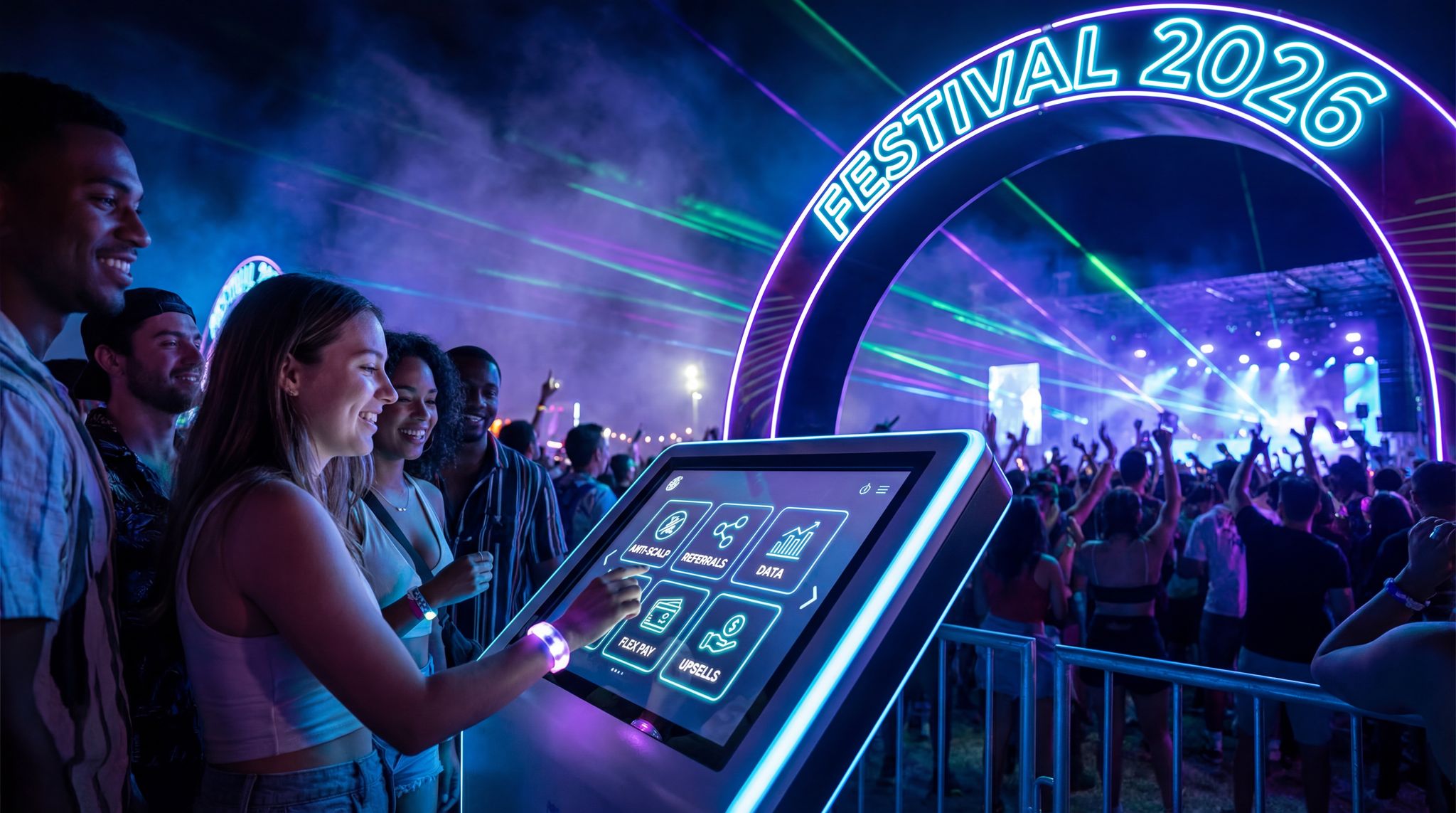
Boost Revenue With Smart Upsells
Sell merchandise, VIP upgrades, parking passes, and add-ons during checkout and via post-purchase emails. Increase average order value by up to 220%.
-
Colour Coding: Develop a colour scheme for your signage and apply it consistently. For instance, you might paint all directional signs in one colour palette (say, earthy greens and browns for a folk festival), while all informational or rules signs use another (perhaps a bright contrasting colour for visibility). Some events colour-code different zones or stages – e.g., blue signs for the “River Stage” area and red for the “Mountain Stage” area. If you do this, include a legend on maps and make sure to use high contrast combinations (dark text on light background or vice versa) so they’re easy to read at a glance. Avoid neon-on-neon or any hard-to-read colour pairings, no matter how fun they look.
-
Consistent Lettering and Size: Even if you hand-paint or stencil your signs, use a consistent font style or lettering approach across all signs. Decide on an approximate letter height for major signs and stick to it so that, from sign to sign, people know what to look for. A rule of thumb: the further away or faster someone passes a sign, the bigger and bolder its text should be. Stage name boards, for example, need huge, bold letters visible from across a field, whereas a detailed schedule can use smaller letters since people will stand near it. If using a custom or artistic font, test it for legibility – decorative fonts can be charming but should only be used if they’re easily readable. Many festival producers find that using all-caps for short labels (like “EXIT” or “FIRST AID”) works well for clarity, but for longer messages, Mixed Case or bold lowercase tends to be easier on the eyes. The key is pick a style and maintain it everywhere: this uniformity subconsciously helps attendees know what to look for from afar.
Planning a Festival?
Ticket Fairy's festival ticketing platform handles multi-day passes, RFID wristbands, and complex festival operations.
-
Multi-Lingual and Accessible Text: If your festival draws an international crowd or is in a region with multiple languages, consider bilingual or pictorial signage. For example, at Montreal’s folk festivals, you might see English/French signs; at a world music festival like WOMAD, signs might include icons and words in multiple languages for clarity. Always ensure text is large enough and fonts are plain enough that those with visual impairments or dyslexia can still read them. High contrast is not optional – it’s essential for readability (think black lettering on a white or light yellow background for maximum contrast, or white on dark). Consistency in these choices means once attendees figure out your “sign system,” they can navigate more confidently.
-
Establish Formal Wayfinding Signage Design Guidelines: Before a single piece of wood is painted or banner is printed, draft a comprehensive style guide for your production team. Effective wayfinding signage design guidelines should document your chosen color palettes, approved typography, icon sets, and minimum contrast ratios. By distributing this rulebook to all site operations staff, volunteer art departments, and third-party vendors, you ensure that every directional marker—from the main gate to the furthest campground—speaks the same visual language, eliminating navigational friction for your attendees.
Blending Craft Aesthetics with Legibility
One of the joys of folk festivals is their handmade, grassroots feel – and signage can definitely play a part in that craft aesthetic. The challenge is to balance art and function. Here’s how festival organisers can achieve that blend:
-
Use Authentic Materials Wisely: Wooden plaques, repurposed barn wood, chalkboards, canvas banners – using natural or repurposed materials for signs can reinforce a folk or rustic theme. For example, the Cambridge Folk Festival (UK) has been known to use wooden signposts hand-painted by volunteers, which fits the cosy, community vibe. Similarly, Australia’s Woodford Folk Festival creates an enchanting village atmosphere with hand-painted wooden direction signs along paths. When using such materials, make sure they’re prepared for clear lettering (smooth enough surface, and paint or chalk that contrasts strongly with the background). A piece of reclaimed wood with white or cream painted letters can look quaint and still be easy to read. Apply a sealant or weatherproofing coat so your beautiful hand-lettered signs don’t run or fade if it rains.
Accept Payments Across 13 Countries
Local currency processing via Stripe, Razorpay, Xendit, Paystack, and OXXO across 13 countries with region-specific payment methods.
-
Sourcing the Right Festival Signs: When designing music festival signage, the choice of substrate dictates both longevity and vibe. For instance, utilizing classic wooden signs paired with painted directional arrows offers a timeless, rustic appeal that resonates well with folk and indie music crowds. However, organizers must ensure these wooden directional markers are sealed against the elements and use high-contrast lettering to remain functional during heavy downpours or bright midday sun.
-
Fabricating Custom Festival Signs: For independent promoters wondering what are the best materials for creating accessible signage in small DIY music venues or boutique outdoor events, the focus should be on low-glare, high-contrast combinations. Matte-finished acrylics, flat-painted plywood, and routed high-density urethane (HDU) are excellent choices. These substrates allow you to craft tactile, ADA-compliant lettering and clear directional arrows that won’t reflect harsh stage lighting. By utilizing these accessible materials, your music festival signage remains highly functional for all attendees while preserving the event’s unique, handcrafted identity.
Need Festival Funding?
Get the capital you need to book headliners, secure venues, and scale your festival production.
-
Maintain a Clear Typographic Style: It’s possible to have a quirky, “handwritten” look while maintaining legibility. Some festivals commission a typographer or a graphic artist to design a custom font that looks hand-drawn but is optimized for readability. Others use stencils to hand-paint letters, ensuring uniform shape and size. Blend uppercase and lowercase in a friendly style, or use all uppercase in a chunky sans-serif style that mimics sign-painter lettering (this was historically done on many old fair signs). The key is testing: paint one prototype sign, place it 20-30 feet (or 10 meters) away, and see if someone can read it quickly. If not, simplify the design or increase the size. Decorative flourishes should never obscure the letters. For instance, if you add folk art patterns (floral motifs, borders, etc.) around the edges of the sign, keep the central text area clean.
-
Theming Without Confusing: The signage should reflect the festival’s character and be self-explanatory. Some events get playful with sign wording or design – which can be delightful if done carefully. At a festival in Texas, organizers once labeled the toilets as “Watering Hole” with a cowboy icon – charming for locals, but it confused international guests until small “Restrooms” text was added underneath. The lesson: it’s fine to get creative (humorous captions, rhyme or folk jargon) as long as any attendee can still immediately grasp the meaning. One approach is to pair the fun phrase with a more straightforward subtitle, or an icon. For example, a sign could say “Pitch Your Tents Yonder” in script, but include a tent icon and an arrow so everyone understands it means camping this way.
-
Community Artwork and Signage: Involving local artists or festival community members in making signs can boost the handmade feel and give artists pride of place. The Philadelphia Folk Festival in the USA, for instance, has long relied on teams of dedicated volunteers to decorate the grounds – painting stage signs, murals, and directional arrows. By providing these volunteers with guidelines (such as a specific palette or font template), the festival ensures a consistent look even though dozens of people contributed. This kind of community engagement not only produces charming, handcrafted signage but also tells your audience that the festival is a labour of love. Just be sure someone on the production team oversees the final designs to enforce readability and consistency (so one well-meaning artist doesn’t suddenly use tiny cursive script on a crucial sign!).
-
Success Stories: Many folk and world music festivals have successfully married craft and clarity. At Glastonbury Festival in England – despite its enormous scale – the organisers famously include handmade elements in their signage. As attendees arrive on site, they are greeted by Dan’s iconic hand-painted welcome signs that immediately set a friendly tone. Around the grounds, witty posters from the on-site Glastonbury Free Press and big chalkboard schedules in the Theatre & Circus fields add to the homespun feel. Yet all these artistic touches are backed by practical design: the welcome signs are large, with bold lettering on bright backgrounds, and the chalkboard schedules are neatly written in high-contrast colours so they can be read even in a crowd. Glastonbury’s team shows that you can have visually interesting, even humorous, signage without confusing your audience. On the other hand, there have been learning experiences: one year at a European folk festival, organizers added intricate illustrations to every sign, which looked beautiful up close but made the words hard to decipher from afar. Attendees started complaining they couldn’t find key areas. The next year, the festival corrected course by simplifying the sign artwork around the text and bumping up the font size – and the complaints disappeared. The moral is to test for legibility first, then decorate around the essential information.
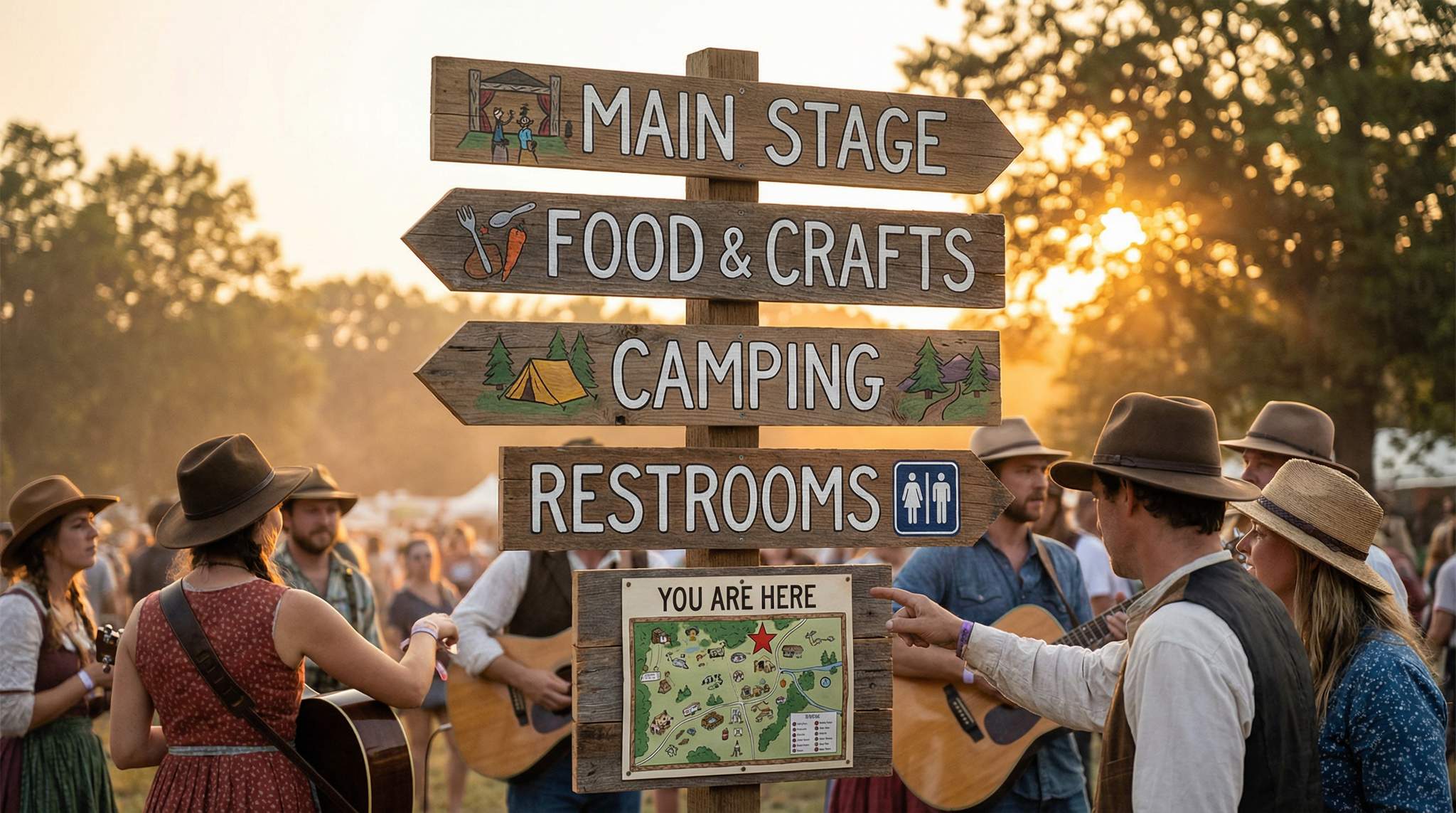
Wayfinding Maps at Key Nodes (“You Are Here”)
Nothing reduces the anxiety of navigating a festival site like a well-placed “You Are Here” map. Festivals often span large fairgrounds, parks, or even entire city blocks, and first-time visitors won’t automatically know the layout. That’s why providing maps on-site is vital, even if you’ve given out paper maps or a mobile app – people will still get turned around once inside.
-
Place Maps at Nodes: Identify the key nodes in your festival’s flow – these are places where attendees naturally stop or must choose a direction. Typical nodes include major entrances/exits, the info booth, near main stages, junctions of significant pathways, food courts, and campground entrances. At each of these, consider installing a large, clearly drawn map of the festival grounds with a bold “You Are Here” indicator (often a bright star or arrow). For instance, at Canada’s Winnipeg Folk Festival, big map boards stand at the entrance and by popular crossroads in the campground and food village, ensuring people can re-orient themselves easily during the event.
-
Make the Map Easy to Understand: A festival site map should be simplified for quick reading. Highlight major landmarks like stage areas, the first aid tent, water refill stations, toilets, and exits. Use the same consistent icons and colours on the map that you use on signs (this is crucial – if stage 2 is colour-coded orange on signs, label it in orange on the map as well). Include a clear legend if needed. Your “You Are Here” mark should stand out distinctly (a big red dot or a custom graphic like a friendly “You Are Here” arrow). Orientation matters: ideally, orient the map in the direction the viewer is facing for intuitive navigation (many permanent city wayfinding signs do this). If that’s not possible, include a compass or directional arrow (e.g., “? North”) so people don’t get turned around by the map.
-
Durability and Updates: Use weather-resistant materials for maps – a laminated poster, a coated board, or even behind plexiglass. Outdoor maps can suffer from rain or muddy fingerprints, so make them sturdy and easy to wipe. Also plan how you’ll update them if things change. If a schedule or venue change happens mid-festival, having a chalkboard section on the map sign or a pin-board for notices at least lets you inform people at these nodes. Some festivals will mark “temporarily closed” on a map with an overlay if needed (for example, if one gate gets closed, slapping a “X” sticker or note on the map at the node is useful).
-
Localisation and Language: In multicultural festivals, consider adding multiple languages to the maps. Even if the rest of the sign system relies on icons, a map might have labels that benefit from translation. World music festivals in particular often attract an international crowd; for example, the Rainforest World Music Festival in Malaysia features Malay and English on its signage and maps to accommodate locals and visitors alike. A “You Are Here” map labeled in two languages (or with numeric/colour codes that correspond to a separate legend card available in different languages) can be a thoughtful touch.
Reducing Attendee Stress with Helpful Info (Walking Times & More)
Wayfinding signage can do more than point directions – it can also reduce stress and uncertainty. One innovative yet simple technique is to add walking times or distance estimates on key directional signs. This idea, borrowed from city pedestrian signage systems and theme parks, helps set expectations so people know what they’re in for:
-
“X minutes to…”: On long paths or between major areas – let’s say from the main stage to the parking lot, or from the campsite to the workshop tents – consider signs that read something like “Main Stage – 5 minute walk ?” or “Parking Lot ? 10 min”. Knowing that it’s just a five-minute walk to reach a destination can reassure someone that they won’t miss the next act if they take a quick restroom break, for example. It also prevents that feeling of “Are we even going the right way?” that can arise on an unfamiliar path. Festivals spread over large grounds (like Sziget in Hungary or Bonnaroo in the USA) commonly have long walks; savvy organisers at such events have started to include distance markers or time estimates on signage to keep attendees confident and calm as they trek around.
-
Reducing Perceived Distance: Studies in urban design have shown that providing a time or distance estimate makes a walk feel shorter. For a folk festival audience that might include families with kids or older attendees, a little psychological boost goes a long way. If Grandma sees it’s “200m ahead” to the next seating area, she knows it’s manageable. If a dad with toddlers knows “Kids’ Zone – 3 min ?”, he’ll be less anxious about the journey. This transparency is especially helpful if your festival venue is in a natural setting where distances feel ambiguous (“just over that hill, somewhere”). At Woodford Folk Festival in Queensland – which is set up like a temporary village – signage includes not just arrows but sometimes markers like “Hilltop Arena – 8 min uphill” to help people plan (and perhaps decide to catch a shuttle if one is provided).
-
Where to Add Times: You don’t need walking times on every sign (which could clutter things), but focus on key decision points: for example, from the entrance to major areas (“Village Green this way – 5 min”), between far-apart stages (“? Dance Tent (7 min)” if it’s a hike), and towards exits/parking when the show is over. During egress when thousands are leaving at night, a sign saying “Car Park – 15 min walk” can mentally prepare the crowd and reduce impatience (and also cut down the constant “How far is the parking lot?” questions to staff).
-
Other Stress-Reducing Ideas: Apart from times, think of adding helpful tidbits on signs that ease minds. For example, directional signs to the camping area might include an icon indicating a water station on the way, reminding folks they can refill bottles en route. Or a sign to the exit could say “Thank you for coming! See you next year!” – not directional info per se, but a warm send-off that leaves attendees feeling good. Some festivals even put up gentle reminders like “Stay hydrated – water this way (2 min) ?”, which both points to the water refill station and prompts self-care. These little touches, done in the same friendly style, continue the festival’s personality while providing useful information.
Visibility After Dark: Lighting and Night-Friendly Design
Festivals don’t stop when the sun goes down, and neither should your signs. A handcrafted sign that looked adorable by day might become invisible at night if not planned for. Ensuring night visibility is crucial for safety and convenience:
-
Add Light Sources: The most direct solution is to physically light up the important signs. This can be done subtly to maintain the handmade feel. For instance, hang solar-powered lanterns or fairy lights above a wooden direction sign, or use small LED spotlights to shine on a large map board. At camping-friendly events like the Kerrville Folk Festival in Texas, organisers often string gentle lights along pathways and on signposts so people can find their tents and stage areas during late-night jam sessions. Lighting doesn’t have to be harsh – even a soft warm glow is enough to read by when eyes are adjusted to darkness. Make sure any electrical cords are safely secured and weather-proof, and use energy-efficient bulbs or solar panels where possible.
-
Reflective and High-Contrast Materials: Another technique is to incorporate reflective paints or materials into the signage. You can buy reflective tape or paint (the kind used on road signs) and creatively integrate it: for example, outline letters or arrows with a thin border of reflective paint. By day it’s hardly noticeable, but at night a flashlight or phone light will catch it. Also consider backgrounds: a light-coloured sign with dark text can be easier to read in low light than a dark sign with light text once external lighting is dim. Test your sign in the dark with a flashlight to see what works best. Some festivals also use glow-in-the-dark paint as a fun touch – for instance, painting a moon or stars on signs (or the arrows themselves) that soak up sunlight by day and emit a gentle glow at night. Just ensure any such paint is non-toxic and weather-resistant.
-
Dedicated Night Signage: In some cases, deploy specific signage for night use. At large multi-day festivals, crews sometimes go out at dusk with extra LED signs or battery-powered beacons to place at critical spots (like along a dark trail or highlighting the first aid tent) if the existing signs aren’t sufficient. Think ahead in your budget: renting or buying a few portable LED arrow signs or battery lanterns can be invaluable if people need to evacuate or find exits in darkness. Even if your aesthetic goal is to keep things rustic, emergency exit signs with lights must be visible – you can always disguise them during daylight if they clash with decor, but turn them on when it’s dark.
-
Fire Safety and Power: Since many folk festivals love an old-timey vibe with candles or torches, remember that open flames near wooden signs (or anywhere crowded) are a hazard. Opt for LED candles or enclosed solar lanterns to get that flickering look without risk. Also plan how lights will get power: solar is great for small guide lights, while battery-powered LEDs are handy for portability (stock up on extra batteries). If running cables or generators, ensure they can handle overnight lighting and are set up away from walkways to avoid trips. Ultimately, a well-lit festival path is not just safer but also more welcoming – it invites people to keep exploring even after dark.
Adapting Signage to Festival Scale
Every festival is different in size and layout, and signage strategies should scale accordingly:
-
Small Boutique Festivals: At a small folk festival of a few hundred to a couple of thousand people, you can often manage with minimal but well-placed signage. In a compact site, attendees won’t get too lost, yet you should still clearly mark essentials (stage, food, first aid, toilets, parking). A charming chalkboard at the entrance can welcome everyone and list the day’s schedule, and a handful of wooden arrows around the grounds can do the rest. The handmade vibe is easiest to maintain when the footprint is small – a few volunteers with paint pens can create all the signs. Just don’t assume “everyone will figure it out”; first-timers will appreciate even basic signs like “? Stage” or “Campground ?”. And ensure your limited signs are sturdy and secure – that one pretty sign pointing to the car park should be tied down well so the wind (or an enthusiastic dancer) doesn’t knock it over.
-
Small DIY Music Venues and Indoor Stages: Not all events take place in sprawling outdoor fields. For organizers operating indoor events, selecting the best materials for accessible signage in small DIY music venues requires balancing limited space with clear visibility. Non-glare acrylics, matte-finished PVC, and flat-painted wood are excellent choices because they prevent harsh reflections from stage lighting. Even in a punk or indie DIY space, ADA-compliant tactile elements and high-contrast festival signs ensure that all attendees can safely locate exits, restrooms, and merchandise tables without compromising the venue’s independent character.
-
Large Festivals & Multiple Stages: As festivals grow (5,000, 10,000, 50,000+ attendees), the signage system must become more extensive and robust. This often means repeating key signs and elevating them for visibility. For example, at a 30,000-person event, you can’t rely on a single arrow for “Main Stage” at the entrance – you’ll need follow-up signs along the way, possibly even tall banners or flagpoles marking routes. Big events like Byron Bay Bluesfest in Australia use colour-coded signage for different areas and tall signposts that rise above the crowd for sightlines. Even if your festival is folkier and smaller-scale, think like a big festival as soon as people might have trouble seeing or recalling one sign. It can be worth investing in professionally printed signs for durability at this scale (e.g., weatherproof corrugated plastic or metal signs), but design them with a rustic look to keep the charm. For instance, print on a woodgrain background or use a font that looks hand-painted – the audience gets the aesthetic, and you get the clarity of crisp printing.
-
Staffed Information Points: The larger the event, the more you should supplement signage with human assistance. Make sure you have an obvious Info Booth or help desk, marked by a big “Information” sign (and the universal “??” symbol). At huge festivals like Glastonbury or New Orleans Jazz & Heritage Festival, info booths are lifesavers for lost or overwhelmed attendees. Train the staff there to answer common wayfinding questions – but also use that as feedback. If thousands of people keep asking “Which way is Stage B?”, maybe a sign is missing or not clear enough. Large festivals might also print pocket maps or use mobile apps extensively, but never assume everyone will use those. Your on-site signs should be able to guide someone who didn’t pick up a map or has no cell signal.
-
Emergency Preparedness: With bigger crowds, robust safety signage is non-negotiable. By law and good practice, you’ll need exit signs, fire points, first aid, and lost-child reunion points well-marked. Work with your health and safety officers to ensure compliance with local regulations (which might dictate specific sign designs for exits or fire extinguishers). Even beyond those, consider scenarios: if a thunderstorm hits and you pause the festival, do people know where to shelter or how to find the exit quickly? Use signage (and PA announcements) to guide them. Large folk festivals like Philadelphia Folk Festival (which involves camping) often post extra signs like “Severe Weather Shelter ?” or use coloured flags to indicate stages of weather warnings. Plan these in advance – hopefully you never need them, but if you do, clear signage can protect everyone.
Tips for Different Audiences and Needs
Each festival has a unique audience, and considering their specific needs will make your signage more effective and appreciated:
-
Family-Friendly Audiences: If your folk festival attracts a lot of families, ensure that the family/children’s areas are clearly marked. Use playful imagery – for instance, a sign with a cartoon kite or music notes leading to the Kids’ Zone – but keep wording straightforward. Also think about signage at kids’ eye level: perhaps smaller signs or decals that children can spot (especially useful for things like marking where the face-painting booth or ice cream stand is). For parents, include signs for practical things like stroller-friendly routes (e.g., “Ramp to Concert Barn ?” with a wheelchair/stroller icon). Families will also appreciate directional signs to baby changing or breastfeeding areas if you have them. The easier you make it for parents to find facilities, the more they can relax and enjoy the music.
-
Accessibility for All: A truly inclusive festival makes sure that attendees with disabilities can navigate just as easily. Clearly label accessible entrances, viewing platforms, and facilities with the standard wheelchair symbol and bold text. For example, if there’s an accessible pathway that avoids stairs or a steep hill, put signs that say “Accessible Route” with an arrow (even people who don’t use wheelchairs but have mobility challenges will use it). On maps and at key junctions, indicate these routes and the locations of things like accessible toilets. If you offer sign-language interpretation at some performances, a sign at that stage could say “ASL interpretation available here at 6 PM” to direct Deaf attendees. Also, think about the design of your signs from an accessibility standpoint: avoid glare (matte finishes on posters), ensure fonts are dyslexia-friendly (simple, not overly condensed), and don’t rely solely on colour-coding (add labels or patterns for those who are colour-blind). These details can hugely improve the experience for those who often have to hunt for accommodations.
-
Cultural Sensitivity: Folk festivals, especially world music or cultural heritage events, often have diverse crowds. Design your signage to be culturally neutral and welcoming. For example, use images of a variety of food or symbols if pointing to a food court (not just, say, a pork roast icon, as some attendees might avoid certain foods). If your festival has sacred spaces or cultural protocol (like a First Nations blessing area or a temple), use signage that both respects the tone (e.g., elegant, respectful design) and clearly informs (perhaps “Quiet Zone” or notes on proper conduct). In multilingual environments, even if you can’t translate everything, a few key welcome signs or thank-you signs in different languages can make international visitors feel seen. And always double-check any non-English text with native speakers for accuracy and nuance.
-
Urban vs. Rural Layouts: A folk festival in a city (spread across venues or city blocks) demands a slightly different signage approach than one in an open field. Urban festivals should collaborate with city wayfinding where possible – for example, using official directional posts or adding temporary pointers on street sign poles to guide people from a subway station to your venue. You might need permission for sidewalk decals or banners on lampposts, so plan ahead. Also, consider the night environment: city lighting may help or hinder your signs (a backlit ad kiosk could outshine your small arrow sign). In rural or natural settings, you might have the opposite issue: pitch darkness at night except where you light it. Use natural landmarks (big oak tree, red barn, etc.) mentioned on signs to help people orient in a large field – e.g., “Workshops – past the big oak tree ?”. For multi-venue folk festivals, provide clear walking directions between venues (“Next venue: Community Hall, 5-min walk ?”) and maybe even put volunteers with handheld signs during peak transition times to assist.
Budgeting and Planning for Signage
To execute a great signage plan, treat it as an integral part of your festival production – including its own budget and timeline:
-
Budget for Materials and Time: List all the signage you anticipate (directional, informational, decorative, safety) and estimate costs and labour for each. For a small festival, it might be as simple as plywood, paint, brushes, stakes, and volunteer time. For a larger festival, you might need to rent message boards or order printed signs for durability. Don’t forget lighting costs if you’re illuminating signs (even small solar lights or batteries). Try to allocate a contingency fund for last-minute sign needs – there are almost always a couple of “oops, we need another sign for this” moments as the festival nears.
-
Start Early: Creating handmade signage can be time-consuming. Begin design and production well in advance. Print any necessary stencils or templates for letter painting early, and gather or cut your sign materials ahead of time. If volunteers are painting signs, give them ample time and perhaps hold a fun “sign painting day” well before the event (this can double as a team-building activity). Early preparation also gives you time to proofread and test signs. Nothing’s worse than painting a big beautiful sign and then noticing you misspelled a headliner’s name or pointing an arrow the wrong way! By starting early, you have time to correct or redo any sign that isn’t up to par.
-
The Placement Plan: Make a master plan of where every sign goes. This could be a map of the site with pins or a spreadsheet listing sign text and its location. When the build week arrives, you or your site ops team can follow the plan and install systematically. Marking sign locations with a flag or tape on the ground ahead of time can be very helpful, especially for complex sites – then your crew isn’t guessing the best spot while holding a heavy sign. Also consider height and angle: a sign nailed to a tree should be angled toward the walking path people come from, for example. Once everything is installed, do another walk-through (maybe with someone who hasn’t seen the plan, to simulate a new attendee’s perspective). Fine-tune positions if needed, and tighten any wobbling posts.
-
Contingency and Maintenance: During the festival, assign someone to monitor signage each day. Large events may even have a “Signage team” as part of operations. Attendees might accidentally rotate an arrow sign, wind might knock something down, or a paper sign might get soggy. Have basic repair kits on hand: duct tape, zip ties, extra stakes, markers for touch-ups, etc. If a sign goes missing or is pointing wrong, you want to fix it quickly before it causes frustration. After the festival, collect the signs (if reusing) and store them properly – clean off mud, roll up banners, and keep an inventory. This saves money and effort for next time, and can also be a sentimental record of the festival’s history.
Beyond Directions: Signage as Part of the Experience
Finally, remember that signage isn’t just about logistics – it’s part of your festival’s storytelling and atmosphere. A few extra touches can make it truly special:
-
Interactive Signs: Some festivals incorporate bulletin boards or art walls as signage. For example, a huge chalkboard titled “Share Your Folk Fest Memories” where people can write notes becomes both a navigational landmark and a social piece. Or a world map at the info area asking “Where are you from?” with pins can engage attendees while serving as a meeting point. These don’t guide people to a location, but they foster community and serve as landmarks (“let’s meet by the big chalkboard”).
-
Photo-Worthy Moments: In the age of Instagram, a beautiful sign can become free marketing. Consider creating a few signs or banners that are deliberately eye-catching – like an artistic welcome sign at the gate with the festival’s name in gorgeous lettering, or a signpost with arrows pointing to cities of all the performers (e.g., “Dublin – 3000 miles” for an Irish band at your US festival, etc.). Attendees love taking photos with these quirky signs. When they share them, your festival’s name or art goes out to the world. It’s worth balancing a bit of the budget or volunteer time for these “just for fun” signs that nonetheless reinforce your festival’s identity.
-
The Personal Touch: Handcrafted signs can convey warmth in ways digital screens or generic printouts can’t. A sign at the exit saying “Safe travels, y’all!” or “Thank you for being part of our festival family!” can leave a lasting good impression. If you have community partners or sponsors, creative signage acknowledging them (beyond just logos on a banner) can also stand out – for instance, a hand-painted thank-you board listing local organizations who helped, placed somewhere everyone sees it. It shows that the festival values people over commercial gloss.
-
Learning from Feedback: Encourage your team to note any signage-related feedback during and after the event. Did volunteers report a common question that a sign could have answered? Did anyone mention how lovely or helpful a particular sign was? Use that to continuously improve. Over years, you might find your signage approach becomes part of the festival’s legacy – attendees might recall, “I love how they always have those funny quotes on the toilet signs,” or on the flip side, you’ll know you finally solved the perennial problem of people getting lost on the way to the parking lot.
In summary, by treating signage as both an art and a science, festival producers can dramatically enhance the navigability and atmosphere of their events. The next generation of festival organisers can carry these lessons forward, ensuring that every guest feels the festival’s welcoming touch from the moment they see the first sign.
Frequently Asked Questions
Why is festival signage important for event operations?
Effective signage reduces attendee stress, prevents bottlenecks, and enhances safety by guiding crowds smoothly around the venue. It acts as an unsung hero of event operations, helping everyone from first-timers to seasoned fans navigate the site while complementing the festival’s unique atmosphere and authentic vibe.
How can handmade festival signage remain legible?
Maintain legibility in handmade signs by using high-contrast colors and consistent, bold lettering styles rather than complex decorative fonts. Organizers should test prototype signs from a distance of 20-30 feet to ensure readability. While artistic flourishes add charm, they must never obscure the central text or confuse the message.
Where should wayfinding maps be placed at a festival?
Wayfinding maps should be positioned at key nodes where attendees naturally stop or choose directions, such as entrances, major pathway junctions, and near food courts. These “You Are Here” boards help orient visitors and should ideally align with the viewer’s facing direction for intuitive navigation.
How do you ensure festival signs are visible at night?
Ensure night visibility by incorporating solar-powered lanterns, LED spotlights, or reflective paint on signage. High-contrast designs, such as dark text on light backgrounds, remain readable in low light. Dedicated night signage, like battery-powered beacons, is also essential for marking emergency exits and critical paths safely.
What are best practices for accessible festival signage?
Accessible signage utilizes high-contrast text, large fonts, and universal symbols to assist attendees with visual impairments or language barriers. Signs should clearly label accessible routes, viewing platforms, and facilities. Placing information at appropriate heights ensures visibility for wheelchair users and children alike.
How does adding walking times to signage benefit attendees?
Adding walking times or distance estimates to directional signs reduces anxiety by setting clear expectations for travel between stages or facilities. Knowing a destination is only a “5-minute walk” reassures guests, prevents disorientation on long paths, and helps manage crowd flow effectively.
What materials work best for rustic festival signs?
Natural or repurposed materials like wooden plaques, barn wood, and canvas banners reinforce a rustic aesthetic while remaining functional. To ensure durability and readability, surfaces must be smooth enough for clear lettering and treated with weatherproofing sealants to prevent paint from running during rain.
Why is visual consistency important for event wayfinding?
Visual consistency allows attendees to instantly recognize and trust navigation cues across the festival grounds. Using a unified set of icons, color codes, and font styles creates a “sign system” that helps visitors, including those who speak different languages, find essential services like first aid and restrooms quickly.
What are the best materials for accessible signage in small DIY music venues?
When outfitting small DIY music venues, the best materials for accessible signage include non-glare acrylic, matte-finished PVC, and flat-painted wood. These materials prevent harsh reflections from stage lighting. If you are using rustic elements like wooden signs with directional arrows, ensure the text is highly contrasting—such as white lettering on dark stained wood—and consider adding tactile or Braille elements to meet accessibility standards without losing the venue’s independent character.
What makes music festival signage different from standard event signs?
Music festival signage must balance artistic branding with high-volume crowd control. Unlike standard corporate event signs, festival signs often need to withstand unpredictable weather, guide attendees through massive outdoor footprints or multi-stage layouts, and remain highly visible during both daytime and late-night hours.
How can organizers create durable music festival signage on a budget?
To produce cost-effective yet durable festival signs, organizers should utilize weather-resistant substrates like corrugated plastic, sealed plywood, or matte PVC. Pairing these sturdy bases with high-contrast vinyl lettering or UV-resistant paint ensures the markers remain legible through rain and harsh sunlight. For independent operators looking into the best materials for creating accessible signage in small DIY music venues, combining flat-painted wood with tactile, non-glare finishes offers an affordable, ADA-friendly solution that maintains a grassroots aesthetic.
What should be included in a festival’s wayfinding signage design guidelines?
Comprehensive wayfinding signage design guidelines should outline approved color palettes, typography rules, universal icon sets, and minimum contrast ratios. For event producers, documenting these standards ensures that all directional markers, maps, and informational boards maintain visual consistency across the site, regardless of whether they are hand-painted by volunteers or professionally printed.