Visual Identity Built to Last
Crafting a festival’s visual identity is about capturing its soul while ensuring every attendee can read and recognize it. An effective design balances nostalgic charm with modern legibility. By rooting visuals in classic letterpress-inspired elements like wood type fonts, textured paper backgrounds, and regional motifs, a festival can evoke a sense of history and place. At the same time, clarity and accessibility must remain top priorities – no matter how vintage the style, information on posters, signs, and screens needs to be easily readable for everyone.
Rooted in Wood Type and Texture
Letterpress printing, with its wooden type blocks and tactile ink impressions, embodies an authentic Americana vibe. Many folk and country festival producers draw inspiration from this heritage to give their events a handcrafted feel. To emulate a letterpress soul in your designs, consider using bold slab-serif or woodblock-style typefaces for headlines and stage banners. Incorporate paper grain or weathered textures into backgrounds – for example, a slight parchment or newsprint background can make a digital poster feel like it came off an old press. Just be cautious: ensure text remains legible atop these textures by using high-contrast colors or subtle drop shadows.
Mixing old and new techniques can amplify authenticity. Some events have commissioned actual letterpress or screen-printed artwork for certain pieces (like collectible posters or VIP invitations) to capture that handcrafted spirit. These prints can then be digitized for use across other materials so that the warm, imperfect charm of real ink and paper carries into the online realm. The goal is to invoke nostalgia through design details without making the materials look faded or unclear. A classic letterpress-style poster with modern readability can become a signature of your festival’s brand.
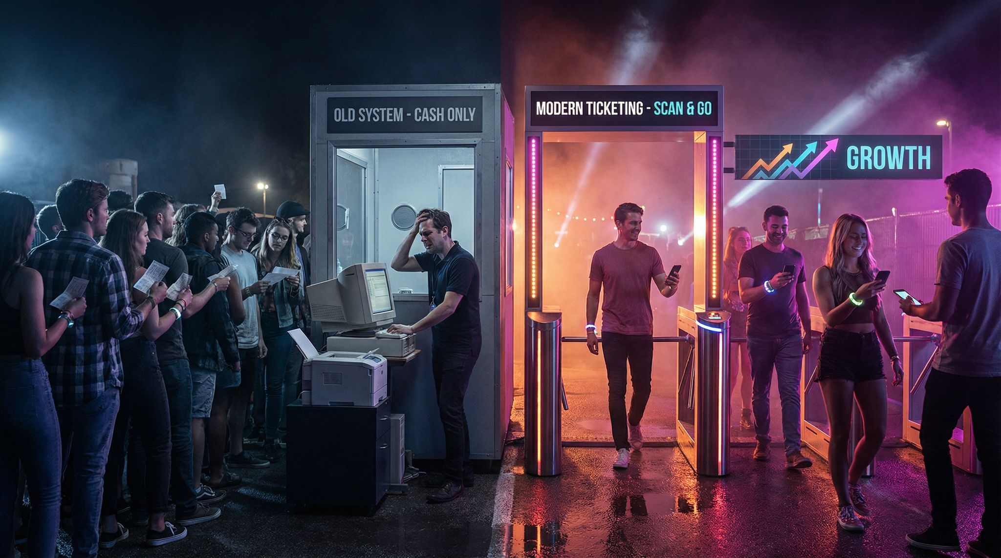
Boost Revenue With Smart Upsells
Sell merchandise, VIP upgrades, parking passes, and add-ons during checkout and via post-purchase emails. Increase average order value by up to 220%.
Weaving in Regional Motifs
Great festival identities feel connected to their location and culture. Incorporating regional motifs – whether it’s a local pattern, architecture, flora and fauna, or cultural symbols – gives the visual system a unique sense of place. For instance, a desert music festival in Arizona might use motifs of cacti and cowboy boot stitching in its graphics, while a country fair in New Zealand could feature Maori k?whaiwhai patterns as a respectful nod to local heritage. The key is to collaborate closely with community members or cultural experts so that these elements are used authentically and respectfully. When done right, local visual cues can deepen the festival’s story and resonate strongly with attendees.
Using regional color palettes can also reinforce the theme. An Americana festival might use faded denim blues, barn red, and cream tones reminiscent of old American flags and antique signs. A festival in India could draw from vibrant Rangoli patterns or the hues of local textiles, whereas one in Mexico might weave in designs inspired by papel picado or Day of the Dead sugar skull art. Importantly, any such motif should integrate seamlessly with the overall design – it should feel like an organic part of the artwork, not an afterthought or a stereotype. By rooting your festival’s look in its locale, you create a deeper emotional connection and make the event instantly recognizable.
Planning a Festival?
Ticket Fairy's festival ticketing platform handles multi-day passes, RFID wristbands, and complex festival operations.
Modern Legibility and Accessibility
While vintage styles are charming, accessibility and clarity are non-negotiable. High contrast and clean legibility ensure everyone can enjoy the festival experience without straining. When designing, follow the rule that text must pop off the background. If you’re using an old paper texture background, choose text colors that stand out (e.g. dark charcoal or black on a light sepia paper tone). Avoid color combinations that look period-correct but lack contrast – such as ornate gold lettering on a brown background – which can be hard to read from a distance or under bright sun. Instead, opt for accessible alternatives, like a warm yellow-beige background with bold black or navy text, to preserve the antique feel while maximizing contrast.
Pay attention to font choices for readability. Those beautifully distressed Victorian or Western fonts might serve well for large titles or the festival name, but they can become illegible at smaller sizes. Use them sparingly and pair them with a simple, modern typeface for body text and detailed information. For example, use a decorative woodtype font for stage banners or main headings, but a clear sans-serif or easy-to-read serif for schedules, maps, and app content. This dual-font approach keeps the character of your design intact and ensures critical information is quick to read.
Also consider accessibility guidelines – many countries have standards (like the WCAG) for color contrast and text size. Designing with these in mind (larger text, testing for color blindness visibility, etc.) means no one in the crowd will miss that crucial sign or safety notice.
Test in Real Festival Conditions
A design that looks fantastic on a computer screen or a print proof might falter in the wild fields of a festival. Always test posters and signage in real-world conditions similar to your event’s environment. Sun glare is a common challenge – put up a poster outside at noon and see if reflective surfaces or light colors become blinding or wash out. If the sun makes it hard to read, consider a matte finish or adjusting colors to be bolder. Distance is another factor: a wayfinding sign that seems large on your desk could be hard to decipher from 50 feet away by a moving crowd. As a rule of thumb, try viewing your signage from various distances; you might realize the font needs to be larger or the message phrased more succinctly for quick comprehension.
Smooth Entry With Mobile Check-In
Scan tickets and manage entry with our mobile check-in app. Supports photo ID verification, real-time capacity tracking, and multi-gate coordination.
Outdoor festivals often contend with dust, mud, and weather that can literally coat your signs. In desert or dusty farm environments, for example, a light-colored sign can get dirty fast. To combat this, use backgrounds or laminates that won’t show grime easily (mid-tone colors or protective coverings) and maintain strong contrast so even a layer of dust doesn’t obscure the message. It’s worth doing a “stress test” by deliberately throwing a bit of dust or water on a sample print to see how it holds up. If your event runs into evening or night, test how signs look under low light or colored stage lights – you may need to add reflective elements or lighting for nighttime visibility. By simulating these conditions ahead of time, festival organizers can tweak the design (and materials, like UV-resistant ink or waterproof paper) to ensure that the visual identity performs as beautifully as it looks.
Collaborate with Local Illustrators
One of the most enriching ways to build a unique visual identity is to commission local illustrators or designers to contribute. Local artists can infuse genuine regional flavor and creativity that a generic template will never match. Whether it’s for the main poster artwork, stage backdrops, merchandise graphics, or on-site murals, tapping into local talent gives the festival a distinct voice. It also creates community pride – attendees love seeing their culture and hometown artists celebrated on a big stage.
Need Festival Funding?
Get the capital you need to book headliners, secure venues, and scale your festival production.
Be sure to give these artists credit prominently. You can print the artist’s name and signature on posters and flyers, display “Artwork by __” plaques on installed pieces, and include a section in the festival app or website that profiles the contributor. Not only is this the right thing to do, it also adds a story that fans can connect with (“Did you know a local muralist painted this stage?!”).
There are successful examples of festivals building traditions around commissioned art. The New Orleans Jazz & Heritage Festival, for instance, unveils a new poster by a noted artist each year – these posters have become collectible souvenirs that honor Louisiana culture and often feature local music legends. Over decades, the series has contributed significantly to the festival’s cultural foundation and given credit to artists on an international platform.
In California, the renowned Hardly Strictly Bluegrass festival once set up a live printing press on-site, allowing a local printmaker to create limited-edition screen printed posters in front of the audience. The artist signed each print and festival-goers could take home a piece of the event’s identity, freshly inked. Moves like this turn artwork into an interactive experience and give creators well-deserved recognition. For your festival, consider hosting an artist spotlight, where illustrators not only design for you but maybe even demonstrate their craft during the event. It enriches the atmosphere and shows that the festival’s visuals aren’t just marketing – they’re art.
Consistency Across Every Medium
A cohesive visual identity means someone can glance at any festival-related item – be it a social media post, a directional sign, or a wristband – and immediately link it to the event. Achieving this requires consistency in typography, color, and design elements across all platforms and merchandise. Start by defining a small palette of brand colors and 1–2 official typefaces in your style guide. Use these faithfully on all materials: the website and mobile app should mirror the same fonts and colors as your physical banners and printed tickets. If you’ve chosen, say, a vintage Western-style font for your festival name, incorporate that on your merch designs and even on the fabric wristbands given to attendees. Small touches like printing the festival’s logo or a distinctive motif on wristbands reinforce the branding (and make for cherished keepsakes that fans wear proudly).
Consistency doesn’t mean everything looks identical or boring – you can still have creative variations. For example, you might have a series of poster designs by different artists, but all of them use the same logo placement, typeface for the lineup text, or color family, creating a visual thread throughout. On digital screens or Jumbotron displays at the venue, you might simplify some details (ultra-fancy fonts can be hard to read on a pixel screen from far away) but you’ll keep core elements like the color scheme and logos the same. The benefit of consistency is twofold: it builds brand recognition (each encounter with the visuals strengthens the memory of the festival), and it avoids confusing your audience. A festival that uses one style on social media and a completely different style on site can feel disjointed. By keeping a unified look, you ensure that from the moment a guest buys a ticket on Ticket Fairy’s platform to the moment they put on their wristband at the gate, they’re immersed in the same world.
Crafted Nostalgia, Not a Costume Party
When embracing nostalgic aesthetics, subtlety and craftsmanship make all the difference. Think of your festival design as creating an atmosphere, not a caricature. Nostalgic design elements should feel genuinely crafted rather than like cheap costume props. This means focusing on quality and coherence: for example, if you’re channeling a 19th-century fairground vibe, invest in creating high-quality emblematic illustrations and signage that echo that era’s style (perhaps even hand-painted signs or authentic-looking typefaces) instead of just slapping a sepia filter over everything and calling it old-timey. Audiences can tell when something is thoughtfully designed versus thrown together. Genuine craftsmanship – like textured prints, well-researched typography, or decorations actually made by artisans – conveys respect for the source era and avoids the trap of feeling gimmicky.
Balance is key. It’s certainly possible to go overboard with a theme and inadvertently alienate festival-goers who aren’t there for a history lesson or a dress-up party. A heavy-handed theme can overshadow the actual content of the festival (be it music, food, or film). To prevent this, integrate nostalgic touches in a balanced way. Use modern layouts and info design with vintage flourishes, so the essential information delivery remains modern and efficient. For instance, you might use a heritage color scheme and a retro title font on your festival map, but the map’s layout, icons, and labels should be clean and contemporary for easy navigation. This way, the feeling of the past is present, but the functionality is 100% present-day.
Emphasize authenticity by perhaps sharing a bit of background in your app or program about the design – if a pattern was inspired by local 1900s artwork or a sign was actually letterpressed by hand, let people know. Storytelling can reinforce that the nostalgia in your festival’s visuals is a heartfelt tribute, not just decoration. In short, immerse attendees in a lovingly crafted visual theme that enhances the experience but never at the cost of comfort or clarity.
Frequently Asked Questions
How can festival organizers create a letterpress-inspired visual identity?
Festival producers can emulate a letterpress soul by using bold slab-serif or woodblock-style typefaces for headlines and incorporating textured backgrounds like parchment or newsprint. To ensure modern legibility, designers must maintain high contrast between text and these textured elements, avoiding faded looks while capturing a handcrafted spirit.
How can designers ensure vintage festival posters remain accessible and legible?
Designers should prioritize high contrast, such as using dark charcoal text on light sepia backgrounds, rather than low-contrast combinations like gold on brown. A dual-font approach works best, utilizing decorative woodtype fonts for large titles while reserving clear, modern sans-serif typefaces for schedules, maps, and detailed body text.
What are the benefits of incorporating regional motifs into festival branding?
Integrating regional motifs, such as local flora, architecture, or cultural patterns, gives a festival a unique sense of place and deepens the emotional connection with attendees. When done authentically through collaboration with community members, these local visual cues make the event instantly recognizable and reinforce the festival’s specific story.
Why is it important to test festival signage in real-world conditions?
Testing signage outdoors reveals potential issues with sun glare, distance legibility, and environmental factors like dust or mud that computer screens hide. Simulating these conditions allows organizers to adjust font sizes, choose matte finishes to reduce reflection, or select durable laminates that ensure safety notices and wayfinding remain readable.
How can festivals maintain visual consistency across digital and physical materials?
A cohesive identity requires using a defined palette of brand colors and one or two official typefaces across all platforms, from mobile apps to physical wristbands. Even if specific details are simplified for digital screens, maintaining core elements like logo placement and color families ensures immediate brand recognition at every touchpoint.
How can festivals utilize local illustrators to enhance their visual identity?
Commissioning local artists for posters, stage backdrops, or merchandise infuses the event with genuine regional flavor and community pride. Festivals can feature artist spotlights, such as live screen-printing demonstrations or collectible poster series, while ensuring creators receive prominent credit through signatures on artwork and profiles in the festival app.