Visual branding is the soul of any festival’s identity, especially in genres as rich in culture as reggae. A reggae festival’s look and feel instantly communicates its vibe and values to potential attendees. Seasoned festival producers know that relying on tired visual tropes can make an event feel generic. This is an advisory on crafting a visual identity without cliché – an identity that is authentic, vibrant, and respectful of reggae’s lineage while still feeling fresh. From commissioning culturally rooted designers to stress-testing your signage in real-world conditions, this guide covers practical steps to create festival visuals that stand out for all the right reasons.
Commission Designers from the Culture for Authenticity
One of the most effective ways to avoid clichéd design is to hire designers who are part of the reggae culture or community. These creatives bring lived experience and deeper understanding, ensuring your festival’s visuals aren’t just stereotypical symbols. For example, instead of defaulting to the ubiquitous red, gold, and green color scheme on autopilot, a Jamaican or reggae-diaspora designer might incorporate nuanced elements that resonate authentically – perhaps colors inspired by local landscapes, or patterns influenced by Afro-Caribbean art.
Avoid Generic “Red, Gold, Green” Shortcuts: The red-gold-green palette is iconic in reggae and Rastafarian culture, but use it thoughtfully. If every reggae festival uses the same trio of colors without context, the branding can blur together. Seasoned festival organizers suggest earning the use of those colors – meaning they should connect to your event’s story or values. If your festival has a specific roots Rastafarian focus or is honoring reggae legends (where those colors hold meaning), then they fit. Otherwise, lean on your culturally savvy designer to propose alternative palettes that still evoke reggae’s warmth and energy without being a copy-paste of the Jamaican flag.
By commissioning designers from within the culture, you also avoid cultural appropriation pitfalls. You’re empowering voices that can highlight reggae’s heritage respectfully. Many renowned reggae festivals do this: for instance, Europe’s Rototom Sunsplash has worked with international artists each year to infuse fresh perspectives, and Jamaica’s Reggae Sumfest often taps local talent for artwork that truly speaks to Jamaican fans. The result is branding that feels genuine. And as a bonus, your festival gains credibility among artists and attendees who see that you’ve invested in authentic representation, not just a quick flashy logo.
Boost Revenue With Smart Upsells
Sell merchandise, VIP upgrades, parking passes, and add-ons during checkout and via post-purchase emails. Increase average order value by up to 220%.
Build a Flexible Visual Identity System
A successful festival brand isn’t just a one-off logo – it’s a whole visual system that stays consistent across posters, social media, on-site signage, and merchandise. Think of it as your festival’s visual toolkit, comprising typography, color palette, and graphic motifs or patterns that can adapt to any format.
-
Typography: Choose fonts that reflect the festival’s personality but remain highly readable. For a reggae festival, you might be tempted by funky or retro reggae-lettering, but ensure the main text font is clear. Often a combination works well: a stylized display font for the festival name or headlines, paired with a simple bold font for details. This way, your posters and schedules are easy to scan, even at a distance. Consider how the type looks on a giant banner versus a phone screen. Test it: print out a sample poster or view it on a small screen to verify that every word stands out.
Planning a Festival?
Ticket Fairy's festival ticketing platform handles multi-day passes, RFID wristbands, and complex festival operations.
-
Color Palette: Develop a palette beyond the obvious. While staying true to reggae’s vibrant spirit, explore complementary colors or modern interpretations of classic reggae hues. For instance, alongside (or instead of) the classic red-yellow-green, you might use rich earth tones, sunny golds, or bold tropical colors like turquoise and coral – hues that convey island vibes and positivity. The key is flexibility: your colors should work in bright daylight and on backlit screens. Create light and dark variations if needed (for day/night visibility). And ensure the colors maintain contrast. If you overlay text on colored backgrounds (on stage screens or banners), the text should pop clearly.
-
Patterns & Imagery: Incorporate patterns or icons that can become signature elements of your brand. This could be a subtle geometric pattern inspired by traditional Caribbean prints, a stylized illustration of a lion or sound system speakers, or a modern take on Rastafarian art (if appropriate). Use these motifs across various assets – maybe a faint pattern on your website background, a bold version on merch, and a simplified version on wristbands. A flexible system means these elements can be remixed without losing recognition. For example, a pattern used on the poster border might reappear on stage backdrops or directional signs, tying everything together visually.
By building a robust visual identity system, you ensure that whether someone sees your festival on a flyer, an Instagram post, a stage banner, or a t-shirt, it always feels like the same event. Consistency breeds professionalism and trust – attendees will sense the attention to detail. It also makes your life easier: you can create templates and guidelines so that every new piece of content (like a last-minute schedule change announcement or a sponsor appreciation post) still looks on-brand. This unified look is especially important for reggae festivals that might take place in sprawling outdoor venues; clear and consistent visuals help attendees navigate and feel connected to the festival space.
Digital and Physical Consistency: Ensure the identity translates online as well. Your festival website or ticketing page should feature the same logos, fonts, and colors so that the ticket-buying experience feels like part of the festival. (For instance, Ticket Fairy’s event pages allow promoters to add custom banners, videos, and graphics – a great opportunity to showcase your visual identity from the moment fans click “Buy Ticket.”) This consistency builds excitement and trust long before attendees set foot on the festival grounds.
Turn Fans Into Your Marketing Team
Ticket Fairy's built-in referral rewards system incentivizes attendees to share your event, delivering 15-25% sales boosts and 30x ROI vs paid ads.
Test for Legibility in Sunlight and at a Distance
Outdoor festivals, from Jamaica to California to Australia, share one challenge: the elements. A design that looks fantastic on a computer screen might fall apart under a blazing sun or when blown up to billboard size. Experienced producers stress the importance of real-world legibility tests.
Before finalizing your designs, do a trial run: print signage samples and take them outside. How does your stage schedule banner look under noon sunlight? Do the colors stay vibrant, and is the text readable from 20 or 30 meters away? Sun glare can wash out pale colors or slim type, so you may need to tweak contrast or font weight. Similarly, if your festival signage will be viewed from afar (think of people finding the right stage or the exit in a field), the design should be bold. Simple icons, large lettering, and high-contrast color combinations are your friends here.
Need Festival Funding?
Get the capital you need to book headliners, secure venues, and scale your festival production.
Also consider nighttime and low-light conditions if your event goes on after dark – for instance, will that dark green text be visible under dim festival lights? Perhaps outline key text with a light border or have a backup lighting plan for important signs. In wayfinding (directional signs on site), clarity trumps artistry: it’s possible to stay on-brand with colors and fonts while still using arrows and words that anyone can read in a hurry.
A pro tip from large-scale festival production: view your digital designs on different screens and sizes – a phone, a laptop, a large monitor – to simulate how your graphics will appear on LED screens at the venue or on attendees’ devices. What looks good on a hi-res monitor might be less clear on a cheap phone screen or a sunlit LED wall. Adjust accordingly. It’s far better to catch a visibility issue in advance than to have an unreadable schedule poster on festival day.
Credit Artists and Pay Them Fairly
Behind every great festival visual identity is a talented artist or design team. Give credit where it’s due and compensate fairly – this isn’t just ethical, it also strengthens the festival’s relationship with the creative community. Publicly acknowledging the designer (for example, a shout-out on social media or a mention on your website’s “about” page) shows respect. Attendees often love to know the story behind the artwork; highlighting the artist can add to the festival’s narrative and give the artist deserved exposure (on top of payment).
Budget realistically for design in your festival’s finances. Cutting corners by asking for free work or underpaying not only harms trust, it can result in subpar quality or last-minute fallout. Remember that a festival’s branding is a cornerstone of its marketing – it’s worth the investment. Paying fairly also encourages designers to go the extra mile and possibly continue working with your festival in future editions, maintaining consistency year to year.
Consider creating opportunities to showcase the art beyond just the poster: perhaps feature the illustrator’s work in a gallery on-site or sell limited-edition screen prints of the festival poster (with royalties to the artist). This not only rewards the creatives but can become an additional draw for fans who appreciate art and culture. The bottom line is, treating artists well is part of honoring the reggae ethos of respect and community – a win-win for your festival’s reputation.
Note: Even for smaller grassroots festivals with tight budgets, it’s important to find ways to fairly compensate creatives – if cash is limited, offer value in other ways (such as free tickets, accommodations, or barter arrangements), and always get clear agreement. What matters is acknowledging the worth of their work. This sets a professional tone for your event, no matter the scale.
Honoring Lineage While Welcoming Newcomers
Reggae music and culture come with a rich visual heritage – from the iconic posters of 1970s Kingston dancehalls to the Pan-African colors that symbolize liberation and unity. Your festival’s look should honor this lineage but also feel inviting to those new to the scene. It’s a balancing act of tradition and innovation.
To honor reggae’s roots, you might incorporate subtle homages: maybe use a vintage-inspired font akin to old reggae album covers, or include a small lion emblem or Ethiopian-inspired motif in a respectful way. Work closely with cultural advisors or elder artists if you’re tapping sacred symbols (for instance, the Lion of Judah or Emperor Haile Selassie’s imagery) to ensure they’re used in the right spirit. Context matters – a symbol like the Lion of Judah carries Rastafarian religious significance, so it should appear only if your festival actively embraces that spiritual aspect.
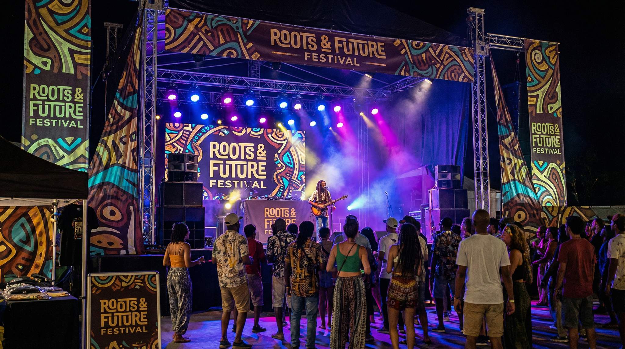
Welcoming newcomers means the visuals should also feel accessible and contemporary. New and younger audiences might not catch every historical reference in the art – and that’s okay. Use design to bridge the gap. Bright, clean design elements and inclusive imagery (like depicting diverse crowds enjoying music) can signal that everyone is invited to the celebration. For example, One Love Festival in New Zealand combines reggae symbolism with modern, colorful graphics that appeal to a broad audience, including first-time reggae festival-goers. The idea is to celebrate reggae’s message of unity by making the aesthetic itself inclusive.
Another approach is to refresh the theme year by year. Some festivals keep a core logo but change the poster art annually, spotlighting different aspects of reggae culture each time – one year might highlight dub and sound system culture with a speaker-inspired design, the next year might celebrate reggae’s ska roots with retro dance motifs. This honors various lineages within reggae and keeps things fresh for returning attendees.
In all cases, communicate the story of your design. If you chose certain colors or icons for a reason, share that story in press releases or on social media. Educate your audience subtly – it deepens their connection to the festival. A visual identity that has meaning will resonate more deeply than one that just “looked cool.” Ultimately, reggae festivals thrive on a sense of community and shared culture, and your branding can be a powerful way to foster that.
In conclusion, approaching visual identity with cultural awareness and creativity can elevate a reggae festival from just another event to a beloved tradition. Avoiding clichés doesn’t mean ignoring reggae’s symbols – it means using them with respect and purpose, and mixing in fresh design thinking. By investing in authentic designers, building a versatile design system, testing for real-world impact, and upholding ethics with artists, festival producers anywhere in the world (from Jamaica to Germany, India to the UK) can create visuals that strike that magic balance: honoring the roots, yet actively growing the culture. Aspiring festival organizers can take these hard-earned lessons to heart and create something truly memorable.
Frequently Asked Questions
How can reggae festivals avoid clichéd visual branding?
Festival organizers avoid clichés by commissioning designers from within the reggae culture or community. These creatives bring lived experience to the project, replacing stereotypical tropes with nuanced elements like local landscape colors or Afro-Caribbean patterns. This approach ensures authentic representation and prevents cultural appropriation pitfalls while empowering community voices.
Should reggae festivals always use red, gold, and green colors?
Reggae festivals should not default to the red-gold-green palette unless the event specifically focuses on roots Rastafarian culture or honors legends where those colors hold deep meaning. Instead, designers can use earth tones, sunny golds, or tropical hues like turquoise and coral to evoke island vibes without relying on generic shortcuts.
Why is a flexible visual identity system important for festivals?
A flexible visual identity system ensures consistency across all festival assets, from social media posts to stage banners. By establishing a toolkit of typography, color palettes, and graphic motifs, organizers guarantee that every touchpoint feels like the same event. This consistency builds professionalism, trust, and helps attendees navigate the venue.
How do festival producers test signage for outdoor visibility?
Producers ensure outdoor legibility by printing sample signage and testing it in real-world conditions, such as direct sunlight and from distances of 20 to 30 meters. This process helps identify if sun glare washes out colors or if fonts are too thin, allowing for adjustments to contrast and boldness before the event.
How can festival branding honor reggae history while attracting new fans?
Branding can honor reggae lineage through vintage-inspired fonts or respectful use of symbols like the Lion of Judah, while attracting newcomers with bright, clean designs. Mixing traditional elements with modern graphics bridges the gap, ensuring the visual identity respects the culture’s roots while remaining accessible and inviting to younger audiences.
Why is it important to credit festival graphic designers?
Publicly crediting and fairly compensating designers strengthens relationships with the creative community and adds to the festival’s narrative. Acknowledging the artist on social media or websites shows respect for the work, while fair pay encourages high-quality designs and future collaborations, aligning with the reggae ethos of respect and community.