Modern events are awash in data. Every ticket purchase, RFID wristband scan, mobile app click, and on-site sensor reading generates information that can transform an event in real time. The challenge for 2026’s event organizers is harnessing this flood of attendee behavior data and turning it into actionable insights without getting overwhelmed. Those who succeed gain a powerful edge – they can elevate the attendee experience on the fly, prove ROI to sponsors with hard numbers, and make each future event better than the last.
In this guide, an event technology consultant with 25+ years of implementation experience shares how to collect and leverage data from every touchpoint. You’ll learn practical strategies for building dashboards and reports that reveal trends in attendee behavior, measure sponsor ROI, and empower data-driven decisions. From 500-person conferences to 500,000-attendee festivals, we’ll explore real-world examples of using analytics to boost attendee satisfaction and operational efficiency – all while respecting evolving privacy laws.
Collecting Data Across the Attendee Journey
To turn attendee behavior into insights, you first need to capture that behavior as data. In 2026, nearly every step of an attendee’s journey leaves a digital footprint. By deploying the right technologies, events can gather a comprehensive dataset covering before, during, and after the event. Below are the key data sources and what they offer:
Ticketing & Registration Insights
The attendee journey begins with ticketing and registration. Modern ticketing platforms capture rich information at the point of purchase: buyer demographics, ticket types (e.g. VIP, early-bird), time of purchase, and even referral sources. This data reveals who is attending and how they decided to buy. For example, analyzing ticket sale times can pinpoint when demand peaks (perhaps most tickets sell during lunch hour or right after a lineup announcement), which helps in scheduling marketing pushes and staffing call centers. Attendee demographics and home locations inform everything from on-site content (e.g. language services if many international guests) to merchandise stock (shirt sizes, regional preferences). Registration systems also often include survey questions (like meal preferences or interest tracks), supplying planners with upfront insights to tailor the event experience.
Data-Driven Event Marketing
Track ticket sales, demographics, marketing ROI, and social reach in real time. Exportable reports give you the insights to make smarter decisions.
Critically, ticket scan data at the venue entrance shows who actually showed up and when. Comparing check-in timestamps against start times can reveal if many attendees arrive late (prompting schedule tweaks or more entry staff). No-show rates (those who bought tickets but didn’t attend) are valuable for future sales projections and capacity planning. Leading ticketing platforms (such as Ticket Fairy’s integrated solution) combine these capabilities with real-time reporting, so organizers can monitor attendance numbers as doors open. By leveraging ticketing and registration data, events can start on day one with a clear understanding of their audience profile and anticipated flow through the gates.
RFID & Access Control Data
Many events in 2026 employ RFID or NFC-based credentials – smart wristbands, badges, or even biometric passes – for access control. Every scan of an RFID badge at an entry gate or zone checkpoint instantly generates a data point. Unlike manual clickers or simple QR codes, RFID enables continuous, passive data collection as RFID uses radio waves to track movement across booths and key touchpoints. This yields a dynamic view of crowd presence and movement, which turns physical attendance into operational data. Organizers can see exactly how many people are in each zone or room in real time, and they can analyze flow patterns (e.g. noticing that 70% of VIP pass-holders migrated to the new lounge by 3pm).
Ready to Sell Tickets?
Create professional event pages with built-in payment processing, marketing tools, and real-time analytics.
RFID access data is incredibly rich for understanding attendee behavior at scale. It provides verified attendance for each session or attraction, eliminating the guesswork of headcounts. Planners gain insights into which sessions were packed and which had light attendance, informing content decisions for future agendas through precise session tracking and attendance accuracy. They can also track how attendees navigate the event – for instance, detecting that a large segment of the audience consistently left the keynote early to line up at a popular workshop, indicating high interest in that topic. For multi-zone festivals, RFID gates between areas show crowd migrations (e.g. a spike in movement to Stage 2 right after a main stage act ends).
Beyond attendance, access control data improves operations and safety. Real-time dashboards can flag when a zone is approaching capacity, so staff can temporarily restrict entry or divert people – preventing dangerous overcrowding. Organizers of a 50,000-person festival have used such data to identify congestion points and re-route attendees on the fly, effectively transforming physical behavior into operational intelligence. Over time, these logs build a detailed picture of crowd patterns, helping improve venue layout and signage in the future by analyzing historical RFID data patterns. In short, RFID/NFC systems don’t just keep unauthorized people out – they turn physical movement into actionable intelligence. As one industry publication put it, RFID has evolved into “foundational infrastructure” that can transform events into measurable, intelligent systems understanding crowd behavior at scale.
Cashless Payments & Purchase Behavior
When events implement cashless payment systems – whether via RFID wristbands, venue-specific payment apps, or contactless cards – they unlock another trove of data: attendee spending behavior. Every time an attendee buys a drink, meal, or merchandise, the transaction data (item, price, time, and buyer ID) is recorded digitally. This data offers direct insight into revenue streams and attendee preferences. For example, organizers can see which food vendors are most popular by total sales and at what times peak demand occurs (maybe coffee spiked each morning, while food sales surged post-concert). They might discover that certain menu items consistently sold out by 8pm, signaling an opportunity to stock more or adjust pricing.
Cashless systems also enable calculating the per capita spending – a key metric for festivals and attractions. If 20,000 attendees spent an average of $60 each on-site, that’s $1.2 million in on-site revenue; any changes (like adding more points of sale or promotional bundles) can be evaluated against this baseline. Organizers often notice higher per-attendee spend after going cashless, thanks to reduced queue times and frictionless transactions (people buy more when it’s just a tap of the wrist). In fact, industry case studies have reported double-digit percentage increases in on-site revenue after moving to RFID payment systems for festivals. Just as importantly, cashless data helps optimize operations: real-time sales dashboards might show an unusual drop in transactions at one bar, cueing managers to check if a POS terminal went down or if a staff rotation is needed.
Smooth Entry With Mobile Check-In
Scan tickets and manage entry with our mobile check-in app. Supports photo ID verification, real-time capacity tracking, and multi-gate coordination.
At a recent 15,000-person music event in Barcelona, the organizers recorded over 60,000 cashless transactions and 70,000+ menu items sold via RFID wristbands using Tappit at UNITE with Tomorrowland. This not only accelerated service (shorter lines) but gave deep visibility into attendee preferences. The promoters could see exactly what every vendor sold and even analyze how spending patterns varied by time of day. With those insights, they tailored inventories and layouts for the next year – for instance, placing popular items at more convenient locations and timing restocks before peaks. As the CEO of that festival noted, the data allows them to continually improve the fan experience based on actual behavior. In 2026, embracing cashless payments is about more than convenience – it’s about capturing the financial pulse of your event in real time.
Mobile App Engagement Data
Mobile event apps have become ubiquitous at conferences, trade shows, and large festivals alike. Attendees use apps to plan their schedules, network, navigate maps, and give feedback – and in the process, they generate a wealth of engagement data through surveys, ratings, and qualitative comments. Every tap and interaction in the app is a clue to what attendees care about. Did a huge number of people bookmark a particular breakout session? That suggests high interest, and organizers might prepare extra chairs or even move a popular session to a larger room. Are certain sessions getting far more in-app questions or poll responses? That content clearly resonated, and presenters can be asked to allow extra Q&A time or even do an encore session if demand outstrips capacity.
Grow Your Events
Leverage referral marketing, social sharing incentives, and audience insights to sell more tickets.
Event app analytics typically track metrics like:
– Session interest and attendance: e.g. number of schedule add-ons (“My Schedule” bookmarks) and check-ins per session, which correlates with actual attendance. This helps identify the most popular sessions before they happen and measure true attendance vs. room capacity.
– Content engagement: views or downloads of speaker slides, repeated plays of on-demand videos, etc. If certain content pieces have low engagement, organizers might replace or promote them differently; if they’re high, that topic might be expanded in future events, as engagement data reveals attendee preferences.
– Feature usage: which app sections are used most (maps, speaker bios, live chat, networking). For instance, if few attendees visit the “Sponsors” section, the event team might need to boost its visibility or tell sponsors to push their QR codes more on-site.
– Feedback and ratings: responses to live polls, surveys, session ratings. These provide qualitative context to the quantitative behaviors. A session might have high attendance but low ratings, indicating the topic was enticing but the content didn’t satisfy – a nuance only clear when you correlate behavior data with feedback.
In one conference example, organizers noticed through the app that a workshop had 300 people marked “interested” while the room only sat 150. Anticipating a problem, they proactively scheduled a repeat session for later or enabled overflow seating with a video feed. Sure enough, the session hit capacity and the overflow plan ensured those extra 150 interested attendees still got the content – a real-time adjustment made possible entirely by app engagement data. It’s no surprise that 65% of event organizers report increased attendee engagement thanks to mobile event apps, bridging in-person and virtual elements, and that engagement comes with data that organizers can immediately leverage. The key is to actively monitor the app analytics (often available in the app’s management dashboard) throughout the event, not just post-event. That way, you catch trends – like a surge of interest in a specific topic or a flurry of questions about a logistics issue – and respond quickly via announcements or program tweaks.
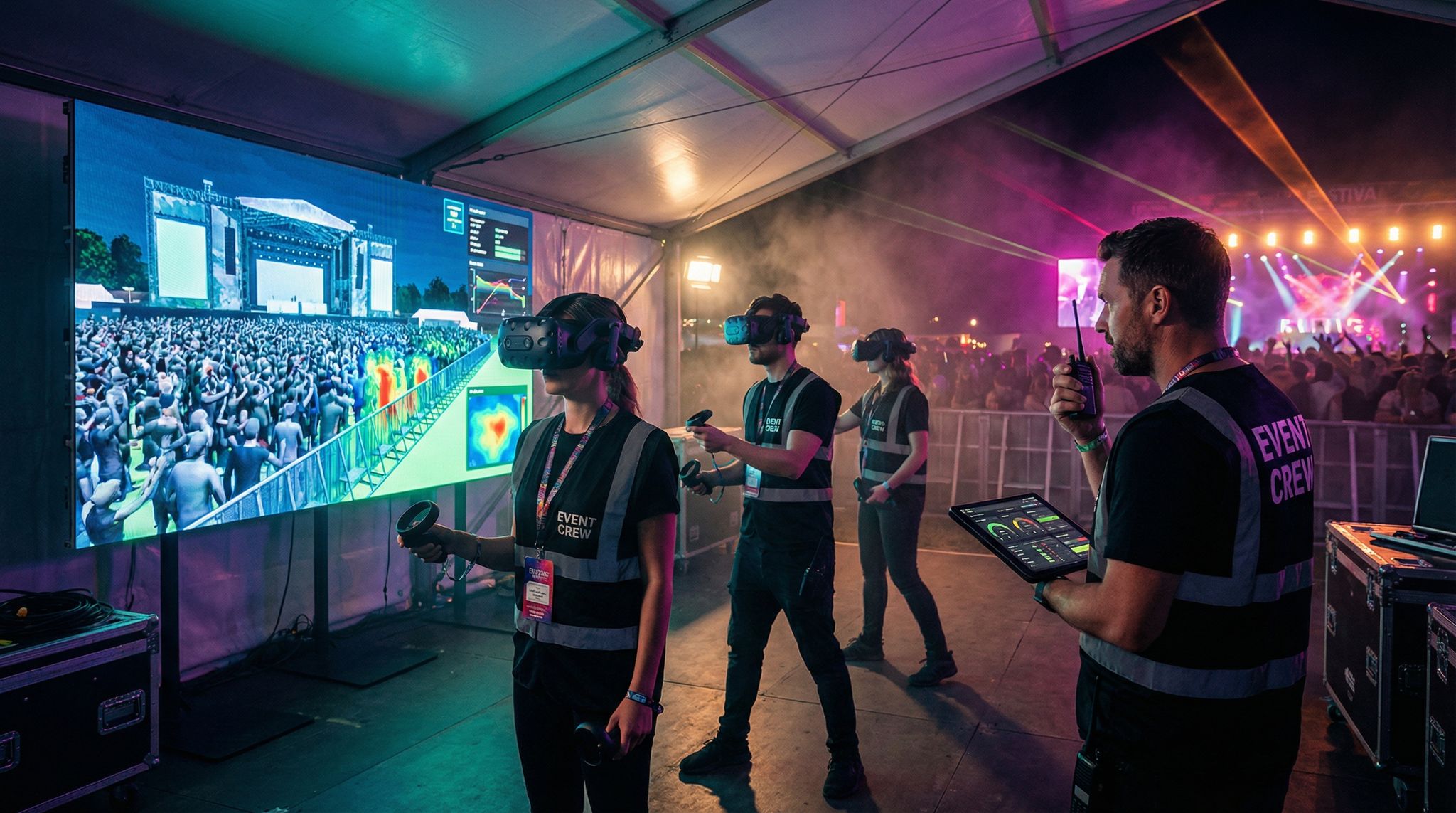
On-Site Sensors & Crowd Tracking
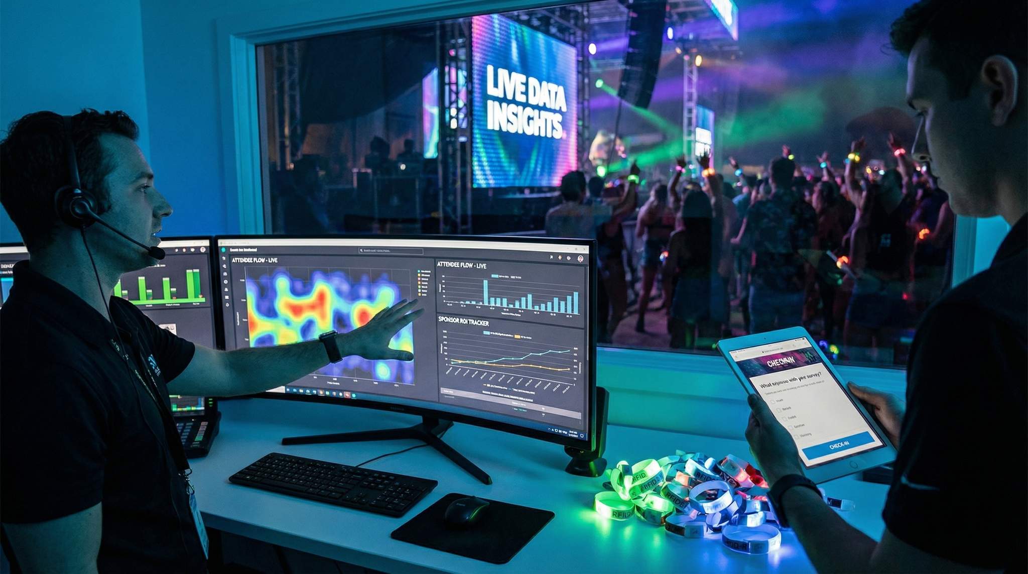
Beyond what attendees explicitly do (buy a ticket, tap a wristband, use the app), there’s a layer of implicit behavioral data captured by on-site sensors. In 2026, large venues and festivals are increasingly instrumented with IoT sensors to monitor crowd movement, density, and environmental conditions. For example, Wi-Fi access point data can estimate crowd numbers in an area by counting the number of smartphones connected, and thermal or infrared sensors can detect body heat signatures to map how people distribute in a space. Some events deploy dedicated footfall counters at entryways to count traffic flow, or LiDAR and computer vision systems to monitor queue lengths at concession stands. These sensors operate passively in the background, feeding a continuous stream of crowd metrics into control center dashboards.
What do organizers do with this data? One critical use is real-time crowd management for safety. If a dense crowd buildup is detected in front of a stage or in a hallway, alerts can be triggered before it becomes a crush. For instance, a network of crowd density sensors might show that one side of a festival grounds is reaching dangerous concentration while another area is relatively empty. Organizers can respond by opening additional pathways, sending security teams to redirect foot traffic, or triggering public messages like “Plenty of space at the Blue Stage to the west.” Modern crowd analytics tools even create live heat maps of the venue that event directors monitor in a command center, introducing heat map data for enhanced visitor experience. These heat maps visualize attendee distribution and movement in real time, enabling informed decisions such as re-routing entry queues or pausing admission to a packed zone. As a result, staff can intervene before an incident occurs – a dramatically more proactive stance than traditional reactive crowd control.
Sensors also help optimize the attendee experience. Consider a network of environmental sensors at an outdoor festival measuring temperature and humidity in different areas; a sudden spike might indicate an overcrowded tent with poor airflow, prompting the team to temporarily limit entry or provide extra water stations and fans. Or imagine smart wristbands that detect when attendees are idle in line for too long (through lack of movement or repeated position pings); this could cue mobile vendors or entertainers to engage people in long queues, alleviating frustration. The technology for these use cases exists now: high-end venues use AI camera systems and IoT crowd sensors as part of their crowd management toolkit. For example, facial recognition cameras (where privacy laws permit) can count individuals and even gauge mood or stress in a crowd, and pressure sensors under the floor can feel the weight of a crowd surge.
All these sensors feed into unified dashboards for operations. One UK arena implemented an IoT system that monitored everything from crowd flow to infrastructure status in real time, allowing them to track activity across zones and venues. Their control room dashboard showed live data on crowd movement, device health (like CCTV uptime, metal detector status), and even restroom usage. By catching anomalies early – e.g. a stalled crowd indicating a blocked walkway, or an unusual drop in sensor heartbeats indicating equipment failure – they kept the event running smoothly. The big picture is that on-site sensor data fills in the gaps left by direct attendee interactions. Even if attendees aren’t scanning or clicking, these systems watch the crowd. In combination with ticketing, RFID, and app data, they complete the 360° view of what’s happening at an event, physically and digitally.
To summarize these sources, below is a snapshot of major event data inputs and the kind of insights each provides:
| Data Source | Data Collected | Insights Gained |
|---|---|---|
| Ticketing & Registration | Buyer info (demographics, location), ticket type, sale time, referral channel, check-in scans at entry | Audience profile (who & where), sales trends and peak demand periods, no-show rate, arrival patterns for staffing |
| RFID Access Control | Entry/exit timestamps, zone check-ins, session attendance counts, credential type (VIP, staff, etc.) | Real-time crowd counts per area, traffic flow patterns, session popularity, dwell times, identification of bottlenecks or unauthorized entries |
| Cashless Payment Systems | Purchase transactions (item, amount, time, location, attendee ID), top-up balances, refunds | On-site spend per attendee, peak sales hours, most popular products/vendors, inventory consumption rates, revenue distribution (e.g. F&B vs merch) |
| Mobile Event App | In-app actions (schedule adds, clicks, messages), content views, live poll responses, feedback ratings, social shares | Attendee interests (popular sessions/topics), engagement levels, sentiment and feedback in real time, feature adoption (which app features matter most) |
| IoT Sensors & Cameras | Foot traffic counts, crowd density metrics, queue lengths, environmental data (temperature, noise), vehicle or parking data | Live crowd heat maps, queue wait times, identification of crowded or under-utilized areas, anomaly detection (e.g. sudden crowd surges or stops), comfort and safety alerts (heat, congestion) |
With these data sources in play, events can essentially instrument the entire attendee journey. The next step is knitting all this information together so it can actually be analyzed holistically.
Integrating and Unifying Event Data
Collecting mountains of data is only useful if those mountains connect. The true power of event analytics emerges when different data streams integrate into a single coherent picture. In practice, this means your ticketing system, RFID access control, cashless payment platform, mobile app, and sensor networks should talk to each other or at least feed into a unified database. Breaking down data silos is critical – otherwise you’ll end up with disjointed reports (e.g. separate Excel sheets for app engagement and gate entries) that are hard to correlate.
Breaking Down Data Silos
Historically, one of the biggest hurdles in event analytics has been fragmented systems. You might have one vendor for ticket sales, another for RFID wristbands, a separate mobile app provider, and maybe standalone tools for surveys or crowd counting. If each operates in isolation, the insight you get is limited. For example, you might see 10,000 entries scanned by RFID, but if that’s not linked to ticket purchase data, you don’t know which ticket types those were or whether certain buyer segments arrived earlier than others. The goal in 2026 is to build a connected event tech ecosystem where your tools seamlessly integrate and share data. As integration experts often note, uniting ticketing, access, payments, and apps into one ecosystem creates exponential value beyond the sum of its parts through integration with event technology ecosystems. When systems are connected, you can trace the entire attendee journey across touchpoints – linking, say, an attendee’s ticket purchase source to their on-site behavior (sessions attended, amount spent, feedback given).
There are a few approaches to achieve this integration:
– All-in-one platforms: Solutions like Ticket Fairy and other enterprise event suites offer end-to-end functionality (ticketing, access control, apps, payments) under one roof. The advantage is native integration – data is unified by default in one system and dashboard. If using such a platform, ensure you’re leveraging its full capabilities for data analysis, not just the basics. For instance, if your ticketing platform also offers an integrated mobile app and RFID scanning, enabling those can make data merge automatically in real time.
– APIs and Middleware: If you have to use multiple specialized systems, check if they provide open APIs or data export integrations. Many modern event tech vendors know their clients want to connect systems, so they provide API endpoints to pull data (e.g. get all scan events, get all app interactions). By using a middleware or integration service, you can programmatically send data from one system to another – for example, pushing ticket buyer info into your event app’s user profiles, or sending RFID scan records into a visualization tool. In 2026, there are even iPaaS (integration platform as a service) offerings tailored for events that come with pre-built connectors for popular software.
– Unified dashboards and warehousing: Some events establish a data warehouse – a central database where all event data is consolidated after or during the event. Tools like Snowflake or BigQuery can ingest CSV exports from various sources, and then analysts run SQL queries to produce combined insights. This is more of a post-event strategy unless you have real-time ETL pipelines, but it’s useful for large-scale events and multi-event organizers who want to analyze trends over time. If real-time decisions are less critical (e.g. a B2B conference measuring success mostly after the fact), warehousing data for comprehensive post-event analysis might suffice.
The bottom line: make integration a priority in vendor selection and system design. If a new flashy event tech tool doesn’t play nicely with others, it may create more headache than it’s worth. In our experience, the most smoothly run large events have a dedicated integration plan alongside their technology plan for maximizing sponsorship ROI with analytics – often with an “event data architect” role ensuring that all systems will feed data into the right places. The goal is one source of truth (or a few linked sources of truth) rather than a dozen disconnected data silos.
Real-Time Data Pipelines
To truly improve events as they happen, integrating data isn’t something to do after the event – it must occur in real time. Real-time data pipelines are the mechanisms that shuttle information from the point of collection (say, a scanner or an app) to the dashboards and alerts that organizers monitor live. Setting these up requires thinking through both network infrastructure and software.
On the hardware side, a robust network (Wi-Fi, wired, or cellular) at the venue is essential. RFID gate readers, for example, need to send scans back to the central system instantly. If connectivity is poor and there’s a delay, you might not realize a crowd is building up until it’s too late. Many large events now create a dedicated “ops VLAN” or segregated network just for event operations data, ensuring that fan-facing Wi-Fi traffic or production AV traffic doesn’t swamp the bandwidth needed for analytics. Some RFID systems have offline caching (storing scans if connection drops and syncing later), but that’s of limited use for live crowd management – you really want continuous uplink. Similarly, mobile apps can be designed to operate offline and sync when reconnected (so attendees aren’t stuck if the internet blips), but for your analytics, try to ensure constant connectivity for the incoming data streams. In critical cases, consider fail-safes like backup 5G hotspots or even satellite links for remote festival sites to keep data flowing.
On the software side, stream processing tools can be used to handle real-time event data. For instance, a message broker (like Kafka) might take in all sensor pings and scan events in real time, and feed them into an analytics dashboard or trigger system. Many event platforms abstract this complexity – they offer a web dashboard where you can just see things live without knowing what’s under the hood. But if you’re custom-building, ensure your architecture can handle the scale. A major festival can generate thousands of data points per second (think of tens of thousands of RFID wristbands tapping at once during gates opening, or payment transactions during a set break). Your pipeline needs to process and visualize these without lag. Load testing with simulated data ahead of the event is a wise move, to verify the latency stays low.
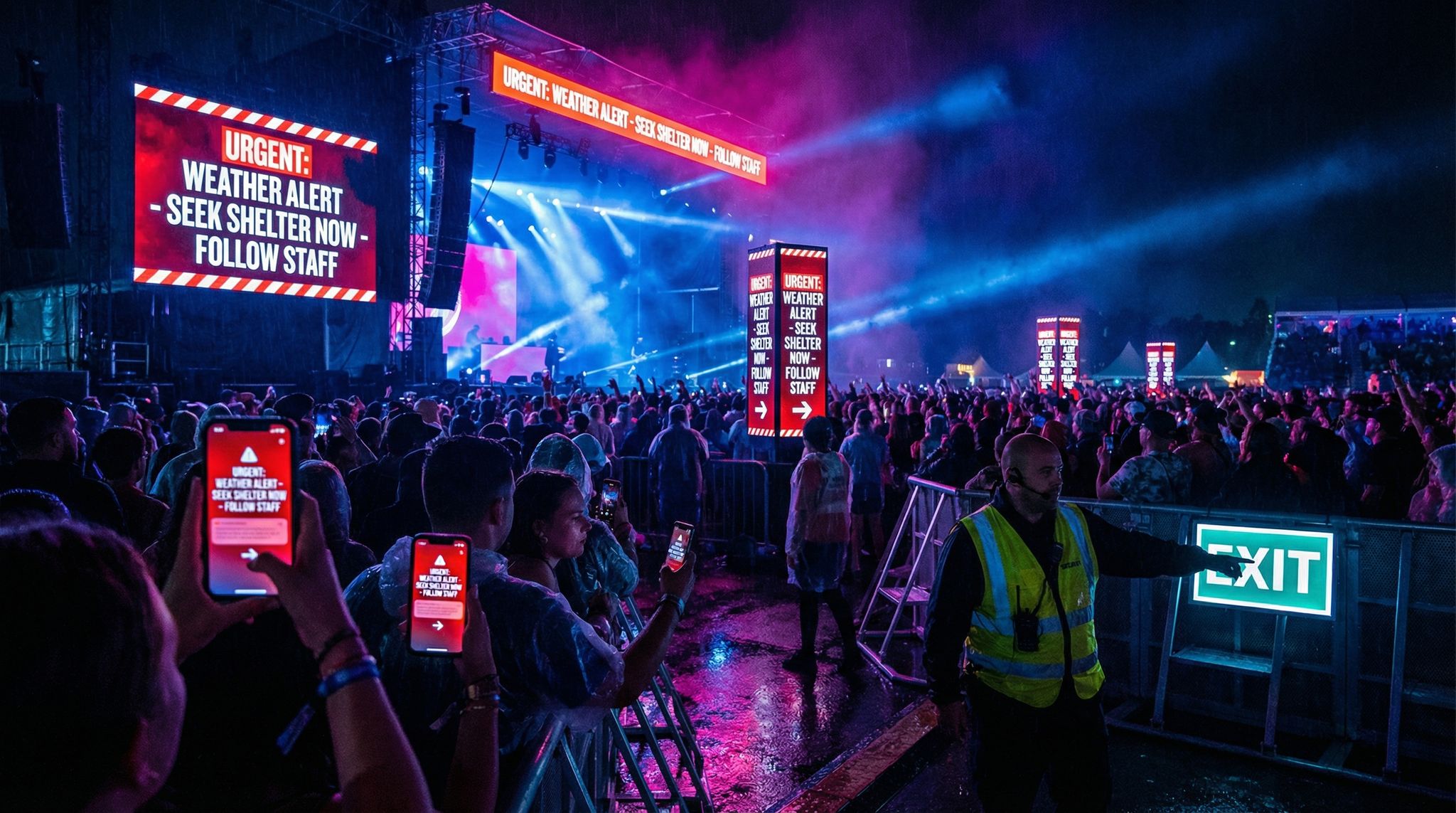
Real-time integration also involves alerting. It’s not enough to have data streaming in if nobody notices a brewing issue. Set thresholds for key metrics that will trigger alarms or notifications. For example, you might configure: if any zone’s occupancy exceeds 85% of capacity, flash an alert on the dashboard (or text the security lead). Or if average concession wait time goes above 10 minutes as measured by camera analytics, send an alert to operations to possibly open another booth. Modern “smart venue” dashboards like Virtual Venue’s system focus on exactly this – unifying live data and providing instant alerts so teams can respond within seconds via real-time tracking dashboards. That responsiveness can be the difference between a minor hiccup and a viral social media nightmare about poor crowd control.
Finally, make the real-time data digestible. In a busy command center, staff can’t stare at dozens of charts nonstop. Consider a single pane of glass view – one screen that shows the vital signs of the event (attendance count, crowd heat map, number of support tickets open, etc.). If needed, have different role-based dashboards: security team sees crowd and security alerts, the VIP guest services team sees VIP check-in counts and issues, etc., utilizing role-based dashboard views. By customizing views for each functional area, you ensure everyone focuses on relevant data without distraction. Integration and real-time pipelines are not trivial to set up, but when done right, they essentially give you a live “mission control” for your event.
Data Warehousing for Post-Event Analysis
While real-time action is important, don’t neglect the post-event integration of data as well. After the event concludes, you’ll want to bring together all the data collected into a central repository for comprehensive analysis. This is where a data warehouse or at least a well-managed database comes in. By warehousing the data, you can run powerful queries and cross-tabulations that might be impractical to do live during the event. For example, you could analyze longitudinal trends, like comparing session attendance patterns between Day 1 and Day 2, or see if people who arrived early tended to spend more on food overall. Or you might join data sets to find correlations, such as whether attendees who visited sponsor Booth A also tended to attend the sponsored workshop (indicating that sponsor got extra benefit).
If you run multiple event editions or a series of events, warehousing becomes even more valuable – it allows year-over-year or event-to-event comparisons. You can benchmark metrics like average dwell time or NPS (Net Promoter Score) and see if your changes are making an impact. Many enterprise event organizers now maintain a permanent data lake of all their event data. They apply business intelligence (BI) tools on top of it (like Tableau, Power BI, or Looker) to create reports that update after each event. For instance, a conference organizer might have a dashboard showing the top 10 most attended sessions for each event in the past 5 years – useful for spotting content trends and guiding future content programming.
When consolidating post-event data, ensure consistent identifiers across data sets. A common practice is to use a unique attendee ID (often the ticket confirmation number or an internal user ID) that ties together that person’s ticket purchase, scans, app interactions, and purchases. That way, you can do per-attendee analysis, like clustering attendees by behavior (e.g. a segment that attended only keynotes and spent little vs. a segment that attended many breakouts and networked a lot). These insights feed into personas for marketing and experience design. Of course, careful anonymization or aggregation might be needed here for privacy (more on that in the Privacy section), especially if you’re combining deeply personal data. But even aggregated, the unified data set is a gold mine for improvement opportunities.
A quick example: after one large expo, the organizers warehoused all their data and discovered that attendees who participated in at least one of the event’s interactive games (a scavenger hunt via the mobile app) visited 3x more booths on average than those who didn’t. This insight showed the team the value of interactive engagement in driving traffic to exhibitors. At the next event, they invested more in these app-based engagement features, resulting in happier sponsors and attendees who reported a more fun experience. Such cross-analysis is only possible when you merge data sources after the event.
Choosing Analytics Tools and Platforms
With data unified, you need the right tools to analyze and visualize it. The market is full of options in 2026, so it’s important to choose tools that fit your team’s capabilities and your event’s needs. Here are some considerations:
- Built-in Analytics vs. External BI: Many event management platforms (Ticket Fairy, Bizzabo, Cvent, etc.) offer built-in analytics dashboards. These are convenient (no setup required) and often real-time. However, they might be limited to the data within that platform. If you are mostly within one ecosystem, the built-in tools can be powerful – e.g. seeing live ticket sales, check-in counts, and app engagement in one vendor’s dashboard. If you have multiple data sources or want custom metrics, external BI tools might be better. External tools (like Tableau or Microsoft Power BI) let you pull in any data and create tailored visualizations, but require more expertise. Implementation specialists recommend evaluating the complexity of your analytics needs: for straightforward KPI tracking, built-in dashboards suffice; for deep data mining, a custom BI solution might pay off for accurate and scalable ROI tracking (especially if you have an analyst on the team or access to one).
- Dashboard Customizability: Ensure the tool you pick allows role-based or filterable dashboards. As mentioned, different stakeholders need different views. For example, your sponsorship manager might need a report highlighting foot traffic and scans at sponsor booths, whereas your operations lead cares about entry throughput and incident response times. Some platforms let you create multiple dashboards or logins with specific data permissions. Flexibility here is key to avoid one-size-fits-none reporting.
- Integration Capabilities: This ties to our previous integration discussion – your analytics or dashboard tool must be able to ingest data from all your necessary sources. If a vendor’s analytics module can’t import data from, say, your separate cashless system, that’s a gap. When evaluating tools, ask about integrations or API connectors. According to event tech integration best practices, having a cohesive tech stack that shares data is crucial for building intelligent and scalable infrastructure, so your analytics layer should be the place where it all comes together.
- Real-Time vs. Batch Analysis: If on-site responsiveness is a priority, lean towards solutions that support real-time data push. Some BI tools have to refresh on a schedule (say, every hour) which may not be fast enough for an unfolding event. Other platforms are built for streaming data. In a hybrid approach, you might use a fast, real-time ops dashboard during the event (to make decisions on the fly) and then a more in-depth BI report after the event (for comprehensive analysis and board reporting).
- User Experience: All the fancy analytics is useless if your team can’t interpret it. Look for tools that present data clearly and are user-friendly for non-analysts. Interactive charts that allow zooming into a time window, or maps that visualize data geographically (like plotting heat map data onto a venue layout), can make insights intuitive. Some event analytics platforms now include AI assistance – for example, you can query the data in natural language (“which session had the longest average dwell time?”) and the system will generate the answer. While not perfect, these AI features are evolving and can help teams who don’t have a dedicated data person on staff.
Remember, the fanciest tool isn’t always the best. It’s about actionable information, not fancy graphics. Vet your choices by imagining a real scenario – e.g. an hour into doors opening, could my team figure out from this dashboard if we have a bottleneck at security? If the answer isn’t obvious, either the tool or the configuration might not be right. Sometimes a simple custom dashboard (even built in Excel or Google Data Studio specifically for your event) can outperform a generic all-purpose analytics platform, because it’s tailored to exactly your KPI story. Take the time to design what you want to see and then find a tool that can show that.
Real-Time Analytics: Improving Events as They Happen
One of the most exciting aspects of event data in 2026 is the ability to adjust and improve the event while it’s happening, not just after the fact. Real-time analytics empower organizers to be proactive rather than reactive. When done well, attendees won’t even realize an issue was looming because you solved it before it blew up. Here’s how events are leveraging real-time data on site:
Monitoring Live Attendance & Crowd Flow
The first and most basic real-time metric is simply: How many people are here right now, and where are they? Answering this used to be surprisingly hard for large events. But with networked ticket scanners and RFID portals, you can watch the attendee count tick up as people arrive. A giant festival might have a screen in the command center showing “Attendance Admitted: 45,000 / 50,000” updated by the minute. This helps, for instance, to know if a majority of the crowd is still outside the gates close to show time (perhaps an entry bottleneck) or if nearly everyone is inside early (indicating you could start programming sooner or deploy more staff inside).
Beyond the entry gates, crowd flow monitoring is crucial. Tools like live heat maps or occupancy gauges per zone give a bird’s-eye view of crowd distribution. For example, the control center might see that the main stage lawn is at 95% capacity while a secondary stage is only at 50%. They might then decide to trigger a content announcement like “Surprise guest at Stage B in 10 minutes!” to entice some crowd to redistribute. At a multi-venue urban event, organizers used a dashboard showing each venue’s real-time capacity status, introducing heat map data. When one venue filled up (red), they communicated to attendees via the event app and signage which nearby venue still had space, smoothing out the crowding issues. In that case, they even made the venue capacity data public through a live attendee-facing heat map to enhance the visitor experience – an innovative move that let the attendees themselves make smarter decisions about where to go next.
Real-time attendance data also helps with crowd safety interventions. If you see a sudden surge of people moving toward one area, you can investigate why (Did an impromptu artist pop-up happen? Or is there an evacuation from elsewhere?). If you detect a long stagnation in flow, maybe an exit got blocked or an attraction people are queuing for is delayed. By keeping eyes on these metrics, organizers can dispatch teams instantly to trouble spots or announce information to ease uncertainty (“The show will resume in 5 minutes”). Large events often have a designated crowd monitoring team in the ops room whose sole job is to watch these numbers and camera feeds. They leverage AI now too – some systems automatically flag unusual crowd movements or densities using predictive algorithms found in crowd management tech for festivals. But even without fancy AI, just having the counts and maps in real time is a game-changer. You’re no longer guessing where the crowd is – you know and can act on it.
On-the-Fly Operational Adjustments
Data is only as good as the actions you take from it. The best event teams develop playbooks for common scenarios, so when the data triggers an alert, there’s a predetermined response. Let’s look at a few examples of real-time adjustments powered by analytics:
- Reducing Wait Times: Suppose your live data shows that the average wait at the main entrance is climbing above 20 minutes. You’ve set an alert for this threshold. Immediately, you can react by opening additional screening lanes, redeploying staff from quieter gates to busy ones, or sending a push notification advising attendees of an alternate entrance with shorter lines. Many music festivals have cut entry wait times dramatically by using such flexible staffing responses, guided by real-time people counts at each gate. Similarly, if beverage sales data shows a particular bar has twice the queue length of others, a manager can be sent to redistribute stock or staff, or signs can direct people to less busy bars on the opposite side of the venue.
- Schedule Pacing: Real-time analytics can reveal if your schedule is running ahead or behind. For instance, if RFID session scans show a session is still half-full 5 minutes after it was supposed to start, it likely started late – a ripple that could affect later sessions. Organizers can then announce slight schedule adjustments or at least inform the next speaker of the delay. Conversely, if things are ending early and the next area is getting filled faster than expected, you might bring on the next act a few minutes sooner to keep people engaged. Live streaming data is another input here – if you see online viewership spiking because an act is running long (everyone’s tuning in for the climax), you might choose not to cut them off exactly at the scheduled end.
- Issue Response and Support: Events often have a ticketing helpdesk or technical support. By monitoring the volume and type of customer support requests coming in (through your helpdesk system or social media mentions), you can detect widespread issues. For example, if 50 people in 10 minutes ask “Why isn’t Stage 2 audio working on the live stream?”, you know there’s an AV issue to fix and perhaps need to put out a message. Or if multiple attendees report in-app that a particular restroom is unclean, you dispatch housekeeping. Some events integrate their helpdesk software into the ops dashboard, so incoming issues are tracked as KPIs (number of open issues, average resolution time). One conference had a metric of “speaker slide upload issues” being tracked – when it spiked during the morning, they realized the speaker portal was glitching and fixed it before most afternoon presenters came to upload slides.
- Engagement and Programming Tweaks: Real-time data isn’t just about problems – it can highlight successes and opportunities. If you see attendees are loving something, you can amplify it. For instance, suppose your event app shows extremely high engagement for a particular speaker (tons of upvotes on questions, lots of chat activity). If that speaker has another session later or a book signing, you might move it to a larger space or give it more time. Or you might spontaneously ask that speaker to join a panel discussion that had an open slot. At a festival, if data shows an experiential art installation is drawing huge crowds (more RFID taps at that zone than expected, social media mentions trending), the organizers might decide to extend its hours into the night or adjust lighting to accommodate evening viewing, capitalizing on its popularity. In another case, a tech expo saw that one demo booth was getting far less traffic than others (via zone footfall counts). The team quickly realized the booth was in a hard-to-find corner; they promptly put additional signage and a live demo teaser in a central hall to drive interest. By day two, that booth’s traffic had doubled. Without real-time awareness, they would have written off the low interest as inevitable, rather than salvaging it with a swift change.
The point is, agility is the name of the game. Data gives you the what and often the where; your team’s preparedness provides the how. Smart events create an “action matrix” – for each key metric trending badly or well, they have a menu of actions ready. If crowd density too high -> open overflow space, pause entry, notify safety officer. If session interest way beyond capacity -> deploy staff to manage line, schedule repeat session if possible, or enable video overflow. If merchandise sales lagging -> maybe push an in-app discount code to attendees to stimulate purchases. All these moves turn an average attendee experience into an excellent one by responding to needs in the moment.
One real-world illustration of on-the-fly adjustment comes from a multi-venue city festival in Belgium (20,000+ attendees across 35 venues). Organizers there used live attendance tracking and a public heat map of venue fullness to improve visitor flow. When several popular venues filled up one evening, they immediately communicated which nearby venues still had room via the festival app and screens, effectively smoothing out the crowd. Attendees appreciated not wasting time stuck outside full venues, and overall satisfaction rose. Meanwhile, the data collected – detailed logs of movements – gave organizers insights for the future, like which venues consistently hit capacity and might be worth expanding or upgrading based on heat map data analysis. In conversations after, the festival producers said this data-driven crowd management was key to the event’s success and safety. It’s a powerful example of how real-time analytics and swift operations teamwork can turn a potential problem into a win in the eyes of attendees.
Personalizing the Live Experience
Real-time data isn’t only useful to staff – increasingly, it’s being leveraged to personalize the attendee experience as it unfolds. Attendees generate data and in return can get a personalized journey. A simple example is the usage of beacons or geolocation: if an attendee’s app opt-in reveals they’re near the entrance of a busy exhibit hall, the app can automatically suggest, “Hall is crowded – check out the quieter networking lounge nearby for a break,” providing a helpful nudge that improves their comfort. This kind of feature uses sensor data (crowd density) combined with the attendee’s location to deliver tailored advice.
Another personalization angle is based on interest data. For example, an attendee who scans into several sessions all on the topic of renewable energy at a conference has clearly indicated their interest area. In real time, the event’s recommendation engine might highlight an impromptu meetup or sponsor demo related to renewable energy happening later and send it as a push notification: “Interested in today’s talks on solar? Swing by Booth 22 at 5 PM for a live demo on solar panels.” This delights attendees by surfacing content they likely want to see but might have been unaware of. It’s essentially the Netflix/Amazon style recommendation, but live at an event. Some advanced event platforms are starting to roll out AI-driven personalization features exactly like this – moving “beyond chatbots” and into smart personal assistants for attendees, helping in balancing festival decisions with big data. These AI tools analyze an attendee’s data (profile, choices, behavior) and can suggest schedule changes (“the panel you’re interested in is starting in 10 minutes two halls over”) or networking connections (“You and Alex both favor startup pitches – consider connecting at the mixer”) using smart tools for planning and engagement.
Personalization in real time can also mean giving attendees control informed by data. For instance, a festival app might show each user a personalized heat map of the grounds highlighting where their friends (opt-in) are congregating, or which stages align with their saved artists, etc. By seeing live that “Stage Y has lots of your friends right now and an act you liked on Spotify”, they may head there, enhancing their enjoyment. On the organizer side, this disperses crowds organically towards where people have personalized interest, rather than everyone blindly rushing the main stage.
From the operations perspective, implementing this requires a robust data backend and respect for privacy choices. Attendees must opt in to share things like location or preferences, and all recommendations should feel helpful, not creepy. When done right, though, the event starts to adapt around each attendee. A great example is how some tech conferences now generate on-the-spot recommended agendas for attendees each morning, based on which sessions they attended (or missed) the day before and which exhibitors they interacted with. If John visited mostly AI companies on day 1, his day 2 recommendation might prioritize the AI-focused breakout or direct him to the AI startup pitch contest in the afternoon. These micro-adjustments can dramatically increase an attendee’s satisfaction because the event feels tailored to them. And happy attendees tend to stay longer, spend more, and come back next time – a win for organizers.
It’s worth noting that implementing such personalization requires both tech and strategy. Many events start with simple segmentation (e.g. first-time vs returning attendee messaging) and build up to more complex personalization as they become comfortable with the data. It’s fine to start small: even something like a personalized welcome message on the app (“Welcome back, Maria! Based on your interests, here are 3 things not to miss today…”) is a nice touch that uses data you likely already have. As your data integration improves, you can get more creative. The key is remembering that data is not just for internal spreadsheets – it can actively shape the attendee’s live journey for the better.
Case Study: Real-Time Decisions in Action
To illustrate the power of real-time analytics, let’s walk through a brief case study combining many of the elements discussed. Imagine a three-day, 50,000-person music festival in 2026. The festival has invested in a comprehensive tech stack: RFID wristbands for entry and payments, a mobile app for schedules and messaging, multiple crowd density sensors, and a central command dashboard that integrates all this data.
Day 1, 3:00 PM: Gates opened at 2:00 PM. The ops dashboard shows 30,000 people have already entered (via RFID gate scans). However, one of the parking lot shuttle stops is lagging – footfall sensors there indicate a large crowd still waiting. The team gets an alert as shuttle wait times exceed 15 minutes. In response, they send an extra shuttle to that location and push an app notification to those still arriving to consider a secondary entrance that’s clear (since ticket scans show another gate is under capacity). As a result, they smooth out the ingress and avoid a social media rant about “chaotic entry.”
Day 1, 8:00 PM: The headline act on the main stage is about to start at 9 PM. Heat maps and BLE (Bluetooth) sensors around that stage are blinking red – people are camping out early. The crowd density is reaching safety thresholds. Security teams are alerted and pre-positioned. Meanwhile, the organizers decide to proactively entertain the waiting crowd (sometimes restlessness can cause surges). They deploy roving performers to the area and trigger the sponsor to start a free water giveaway (since environmental sensors show it’s a warm evening and crowd temperature can contribute to discomfort). The water distribution locations are announced via screens before people get too packed to move. All of this was prompted by seeing that giant red blob on the crowd dashboard and having safety protocols tied to those indicators.
Day 2, 1:00 PM: Reviewing Day 1 data overnight, organizers noticed a curious pattern: the new EDM stage on the far end had relatively low attendance compared to expectations, and cashless spend over there was low too. Combining the data, they suspect awareness might be an issue – perhaps not enough people realized it was there or it was too out of the way. So on Day 2, they adjust by adding better signage pointing to that stage, and mention it on the main stage video screens between acts (“Don’t miss our new EDM stage featuring X at 3 PM!”). By evening Day 2, the RFID scans show a 40% uptick in unique visitors to that stage, and the beverage sales there doubled – a direct result of using data insights to drive promotional action.
Day 2, 9:30 PM: A sudden situation – one of the generators powering lights in a back area fails. Normally it might take a while for staff to notice, but an IoT sensor reported the outage. The ops center sees an alert on infrastructure status and also notices on CCTV (which they checked immediately) that it’s gone dark near a pathway. Maintenance is dispatched within minutes and fixes the generator. In the meantime, to ensure safety, the team uses the app to send a quick alert to attendees: “Lighting issue in Oak Tree path, please use Maple path for now.” Because the data caught it early, a potential hazard (dark pathway) is mitigated and attendees are informed – likely few even realized there was a problem because an alternative was communicated so fast.
Day 3, 11:00 PM: Festival finale. Right after the last act, typically everyone heads for the exits or after-parties. By integrating rideshare and transportation data into their dashboard, organizers can see an immediate spike in rideshare requests and shuttle boardings. It looks like a heavier than normal exit wave. They respond by coordinating with traffic control to temporarily open additional egress lanes for cars and extend shuttle hours by an extra 30 minutes. They also push a message offering a late-night DJ set at the on-site lounge until 1 AM – to stagger departures and encourage some people to linger (this can prevent everyone leaving at once). These steps, guided by real-time departure data, help prevent the dreaded post-event gridlock. Indeed, later surveys show attendees were pleasantly surprised how quick and safe the exit was, compared to other festivals – a direct payoff of data-driven logistics.
This hypothetical (but very plausible) scenario shows how practically every department – entry, security, entertainment, facilities, and egress – can benefit from real-time analytics. The festival’s ability to adjust in the moment created a safer, more enjoyable experience. It’s the kind of outcome that turns one-time attendees into loyal fans. Experienced event technologists often quip that when your real-time data operation is really dialed in, attendees will have no idea because problems get solved before they see them. The event “just feels smooth.” That’s the quiet victory of data-driven event management.
Post-Event Analytics: Continuous Improvement
After the lights come up and the attendees go home, the work with data is far from over. In fact, some of the most valuable insights emerge after the event, when you can take the time to analyze everything holistically. Post-event analytics is about turning the myriad data points into a narrative of what happened, why it happened, and how you can do better next time. Let’s break down key focuses for post-event analysis:
Attendee Behavior Trends
One of the first things to explore post-event is overall attendee behavior patterns. This means looking for trends in how people moved, what they attended, and how they engaged. For instance, you might analyze time-based patterns: identify at what times of day were certain areas busiest. A conference organizer might find that the expo hall consistently emptied out during keynote times – maybe the keynote needs a more engaging format or the expo could offer draws during those lulls. A festival might see that food court lines peaked at 7 PM across all three days, suggesting they should stagger major stage performances so everyone isn’t free to eat at the exact same time.
Another trend could be session popularity and content interest. By ranking sessions or attractions by attendance and engagement, you can gauge attendee interests. Perhaps your data shows that workshops with interactive elements had 25% higher attendance than pure lectures – a sign to incorporate more interactive sessions next time. Or maybe one content track (say, “Beginner 101” track) had low attendance compared to the “Advanced” track – indicating your audience was more experienced than expected, so you adjust the level of content for future. If you have tagged sessions by topic, you can even see which topics drew the most people. For example, a marketing conference might discover “AI in marketing” sessions were packed, whereas “Email marketing basics” were not – clear evidence to double down on AI content next year.
Path analysis is another useful behavior insight. If your data allows (via RFID or app check-ins), you can attempt to map common “journeys.” Did many attendees go from the opening plenary straight to a particular booth, or from one stage to a specific food area? Identifying popular paths can validate your layout or highlight missed opportunities. Say a large portion of attendees all flocked from the main stage to the merch tent after the headliner – that’s expected, but if you see they struggled (maybe data shows it took 20 minutes and there were bottlenecks), you might redesign that pathway or relocate the merch tent closer. If few people went to a far-off zone, maybe that zone needs better integration or shouldn’t be in the same location next time.
Also look at engagement decay or retention. For multi-day events, did a significant number of attendees leave early or skip the last day? Ticket scan data could show that by Day 3 morning, only 70% of attendees had checked in again. Why? Was the Day 3 content weaker, or was it a weekend event where locals didn’t return Sunday? If certain ticket types (like those who bought single-day passes) correspond to different behaviors, note that too. It might inform offering different programming or incentives to keep people around, or simply adjusting your ticket offerings.
Crucially, correlate behavior with outcome where possible. For example, did the attendees who engaged heavily (went to many sessions, used the app often) give higher post-event satisfaction ratings? If yes, those behaviors likely contributed to a better experience, so think how to encourage more attendees to do those things (maybe clearer guidance on using the app, or gamification like badges for attending sessions). On the flip side, if a cohort has low engagement and also lower satisfaction, they might have felt lost or uninterested – a signal to do more onboarding or content matching for them.
Operational Efficiency Metrics
From an operations standpoint, you’ll want to evaluate how well various aspects of the event ran, using the data as evidence. Start with throughput metrics: How quickly did people get in? If you have time stamps for each entry scan, you can calculate average entry processing rate (e.g. 500 people per gate per hour) and identify if/when waits got excessive. This could lead to changes like more entry staff or better training if one day was slower than others. Similarly, look at how lines moved at concessions or registration desks if you captured those times (some events log when people join a queue via app or scan points). If average queue times were, say, 5 minutes for beer but 15 for merchandise, that’s a clue that merch checkout was understaffed or needed more points of sale.
Another key operational metric is utilization of resources. For example, how much were various zones or features used compared to their capacity? If you had a lounge that could hold 200 but logs show max 50 ever used it at once, maybe the space was under-utilized (perhaps poor location or simply not needed). Conversely, if your shuttle buses were constantly full with people waiting, maybe you needed more shuttles. Venue sensors and counts help here. One event we consulted on found their first-aid tents saw very low visits in some locations – they consolidated them for next year to save cost, reallocating medical staff to roaming teams instead. They only knew that because they tracked every first-aid check-in and incident report location.
Incident and issue data should also be reviewed. How many security incidents occurred, and were there patterns (time of day, specific stage)? If RFID or cameras noted any breaches or unauthorized entries, how did the system and staff respond? This overlaps with safety analysis, but it’s operational too – ensuring procedures worked or need updating. If numerous minor incidents happened right after the headline act (common when crowds move), maybe next time you stage the exits better or schedule calmer activities immediately post-show. Or if many support tickets were about the same issue (like Wi-Fi not working in one hall), that tells ops to fix that infrastructure for the future.
Look at staff performance metrics if available. Some events track how quickly staff responded to tasks (e.g., how long from a help request being posted to it being resolved). If you used any workforce management apps where staff check in/out of tasks or report completion, analyze that. Perhaps the average response time to a spill cleanup was 10 minutes on Day 1 but improved to 5 minutes after changes on Day 2 – what changed? Did a new communication protocol help? Document these lessons. If response was slower than targets, identify bottlenecks (communication issues, unclear responsibilities, etc.). Given 2026’s labor challenges, many events also assess if they had enough staff or volunteers. Data points like volunteer check-ins and how many hours positions were unfilled can support decisions on hiring for next time.
Don’t forget financial operations in the efficiency review. For instance, if you have data on how quickly funds moved or where you lost money (e.g. refunded tickets, etc.), analyze that. If a lot of refunds are requested right after purchase (maybe due to accidentally buying the wrong ticket tier), that’s a hint to improve the ticket purchase UX or clarity. If in-app purchases or top-ups were under-used, maybe the process was confusing or not promoted. All these are operational facets that data shines light on.
Feedback and Satisfaction Analysis
Numbers only tell part of the story. Attendee feedback, whether through surveys, app ratings, or social media sentiment, provides context and qualitative depth to the quantitative data. After the event, combining these sources can validate or explain the trends you observed.
Start with any formal surveys (post-event emails or in-app surveys). Analyze the responses and look for patterns. Key metrics like Net Promoter Score (NPS) will tell you overall satisfaction and likelihood to recommend, providing insights into attendee experiences. Segment NPS if you can – perhaps VIP ticket holders had an NPS of 80 (very high) but general admission was 50, pointing to disparities in experience. Or first-time attendees vs return attendees might score differently. Understanding these differences can guide where to focus improvements (if return attendees are less happy, maybe the event didn’t live up to previous year expectations, etc.).
Look at specific question responses too. If you asked “What was your favorite part of the event?” the top answers by frequency can highlight what you did right – those are things to definitely keep or even expand. The “least favorite part” or suggestions question is gold for pinpointing issues. Perhaps numerous attendees mention “the lines for water were too long” – cross-check this with your data: did your water station counts indeed show heavy usage and slow service? If yes, it corroborates the complaint and justifies adding more water stations or distributing free water differently. If an issue pops up in feedback that doesn’t show in your data, investigate why. For example, attendees complain “It was hard to find Stage X,” but your crowd flow data didn’t indicate abnormal patterns. Possibly the signage was poor but people eventually found it (so data didn’t flag it strongly). The lesson: sometimes data won’t directly show a pain point that attendees felt, so trust the feedback and see how to address it (better signage and map directions in the app in that case).
Social media sentiment analysis is another aspect. Scrape or search the event hashtag and see what people were saying. Were there particular moments that garnered lots of praise or criticism? There are tools that can do sentiment analysis (count positive vs negative tone) across posts. If you find a spike of negative sentiment at a certain time, correlate what was happening then. Maybe a long entry wait or a sound issue – it might align with an incident you know of. See how quickly it died down or if it persisted (which could indicate how well you responded). On the flip side, a big positive buzz during a main event or after a particular activity suggests you created a memorable highlight – leverage that in marketing the next edition!
Also consider feedback from your staff, crew, and vendors. They often fill out their own reports or debriefs which contain valuable observations (and often data, like inventory leftover numbers, etc.). For example, a food vendor’s report might show they sold out of vegetarian options each day in 3 hours – data that indicates you should require more stock or additional vegetarian vendors. Or a stage manager might note that the turnover times were consistently 5 minutes longer than scheduled due to a certain technical complexity – leading you to adjust schedule buffers next time. These qualitative datapoints, when recorded systematically, effectively expand your data set with operational insights not captured by automated means.
Compiling all this post-event feedback alongside the hard stats provides a 360° view of event performance. It’s a lot of information, so it helps to structure a post-event report that distills the key findings. Many organizers create a report covering major areas: Attendance vs goals, Satisfaction scores, Engagement metrics, Revenue outcomes, Operational metrics, Sponsor outcomes, and Key issues/recommendations. Within each, use both data and quotes/comments to paint the picture. For instance: “Session attendance increased 15% on Day 2 after we adjusted room allocations (from 200 on Day 1 to 230 on Day 2 for popular sessions), and attendee feedback mentioned appreciation for ‘more space in popular talks.’” This ties the data to a real outcome and a human response, making it very powerful for internal learning and for demonstrating to stakeholders what was achieved or needs improvement.
Informing Future Decisions
The ultimate goal of all this analysis is actionable insight for future events. By identifying what worked and what didn’t, you can make data-driven decisions in planning, budgeting, and designing your next event. Here are some ways events use analytics to drive future decisions:
- Content and Programming: Decide which sessions or entertainment acts to repeat, drop, or add more of. If data showed a particular genre of music drew far more engagement, you might allocate more slots to it next time. If a workshop series had poor attendance, maybe remove or replace that speaker or topic. Over multiple events, you might even predict attendance for certain session topics based on past patterns (e.g., tech demos always fill up in a tech conference, so plan bigger rooms for them). Savvy festival producers now blend data and gut feeling to curate lineups – using streaming data, past crowd responses, etc., to choose headliners that will both sell tickets and satisfy fans by balancing gut instinct with big data.
- Scheduling: Maybe your analysis shows attendees were exhausted by too many back-to-back sessions without breaks (engagement dropped in late afternoon). Next time, build in longer breaks or add a light activity in that slump period to re-energize the crowd. Or if the after-party was poorly attended, perhaps it was too late or conflicted with travel schedules, so adjust timing or format. For multi-day events, day-by-day retention data will guide which days to load with more content (e.g., Day 2 might need the strongest lineup if Day 3 historically has drop-off).
- Resource Allocation: Data can directly show where investing more resources yields returns. If upgrading to more Wi-Fi access points drastically cut connectivity complaints and increased app engagement, that’s evidence to support similar or greater network budget next time (and perhaps a marketing point: “seamless connectivity on site”). If one activation (like a photo booth) was barely used, reallocate that budget to something attendees did enjoy more. Essentially, you can justify increasing spend on high-impact areas and cutting spend on low-impact ones, making your budget more efficient. This ties into ROI analysis – spending $X on an analytics tool or a new tech is worth it if it solved a major pain point; use the data to prove it to stakeholders.
- Venue and Layout Choices: Perhaps crowd flow data indicated a particular area was consistently overcrowded. For the next event, you might redesign the layout or even choose a different venue that has more space or a better configuration. If data showed many people left the venue for lunch (maybe food lines inside were too long or options too few), you could bring in more food vendors or allow re-entry more smoothly. One venue-related insight we saw was an organizer realizing that a significant portion of attendees never found their way to a second floor exhibition area – next year, they put a primary attraction (registration or main stage) on that floor to force discovery of the whole space.
- Marketing and Sales: The analytics also inform how you sell the next event. Knowing what was most popular, you can highlight those features in marketing materials (“95% of attendees rated our networking opportunities as excellent – join us next year to experience even more!”). Also, if certain attendee segments were more engaged (say, students vs professionals), tailor marketing to those segments accordingly. Additionally, sponsor ROI data (which we’ll discuss next) might influence what packages you offer sponsors next time – if some digital activations provided great measurable ROI, you can upsell those.
- Setting Targets: Having baseline metrics from this event means you can set concrete goals for the next one. For example, if your average session attendance was 75% of room capacity, maybe aim for 85% next time by better content selection or schedule coordination (and measure against it). Or if sponsor lead generation was, say, 500 leads per sponsor on average, aim to improve that to 600 by changes to how attendees interact with sponsor booths (maybe implementing a gamified passport system to encourage visiting all sponsors). Data turns goals into numbers, which makes success measurable.
One thing to emphasize: share these insights with your team and stakeholders. Data-driven decision making is most effective when everyone, from the CEO to the front-line coordinator, understands the why behind changes. A festival we worked with started an annual tradition of a “data findings workshop” where all department heads reviewed key analytics from the previous year and brainstormed improvements. This fostered a culture where decisions weren’t just gut feel or loudest voice – they were grounded in evidence combined with expertise. When you approach planning the next event, you’ll find you have the answers to many questions readily available because the data from last time guides you. In essence, each event’s data becomes the blueprint for the next event’s success, creating a cycle of continuous improvement.
Measuring and Proving ROI for Sponsors and Stakeholders
Events aren’t just experiences; they’re investments. Whether it’s a sponsor wanting return on their sponsorship dollars, or your own organization looking at event profitability, data analytics and reporting are the keys to measuring ROI (Return on Investment). In 2026, simply claiming an event was “a success” isn’t enough – stakeholders expect proof in numbers. Here’s how data helps demonstrate value:
Tracking Sponsor Engagement & Value
Sponsors are often a major revenue source for events (and in some cases, the entire business model for free events). To keep sponsors happy – and coming back – you need to show them that they got a good bang for their buck. Data can substantiate everything a sponsor achieved through their presence at your event. Important metrics include:
- Foot Traffic to Sponsor Activations: If sponsors had physical booths or zones, use RFID or manual counts to report how many unique attendees visited. For example, “Your sponsored lounge saw 5,200 visits over the weekend, which is 43% of all attendees – excellent exposure.” Some events use heat sensors or smart mats at booth entrances to count foot traffic automatically. If you have a mobile app, you might also track scans or check-ins at sponsor booths via QR codes or gamification (like a digital passport where attendees check in to each sponsor for a prize entry). This gives hard numbers on reach.
- Dwell Time: How long did people engage with each sponsor? If you can measure this (via RFID dwell times or app interactions), it’s powerful. Telling a sponsor that attendees spent an average of 5 minutes at their exhibit is more meaningful than just the count, as it suggests deeper engagement than a quick pass-by. Longer dwell might correlate with lead quality or brand impression depth.
- Lead Capture and Interactions: Count how many leads a sponsor collected (e.g. badge scans at their booth) or interactions like demos given, samples handed out, contest entries, etc. For instance, “Your booth staff scanned 800 attendee badges into your CRM, and you got 250 contest entries – that’s 800 potential leads to follow up.” This directly ties the event to their sales pipeline. If the sponsor used a lead retrieval app, pull those metrics. If they sponsored a session or workshop, provide the attendance numbers for that and any engagement (questions asked, poll responses) from that session.
- Brand Impressions: Sponsors also care about brand visibility. Use data from your event app and marketing channels: How many impressions did their logo/ad get in the app or on the event website? If you had push notifications or emails featuring the sponsor, what was the reach and open/click rates? On social media, how many times was the sponsor mentioned or appeared in event posts? For onsite signage, impressions are trickier to measure, but sometimes you can extrapolate from attendance (e.g. if 10,000 people were in the arena for the keynote where the sponsor’s banner hung, that’s 10,000 impressions at that moment). Some events even use eye-tracking studies or surveys (“Did you notice the XYZ sponsor banner?”) for a rough gauge. But any quantifiable stat helps – e.g. “Sponsor logo was displayed on the main screen 12 times throughout the event for a total of 18 minutes of exposure to the full audience of 5,000 each time.”
- Digital Engagement: If the sponsor has digital activations – say, a sponsored Wi-Fi with a splash page, or a scavenger hunt on the app – report those interactions. “2,000 attendees engaged with your sponsored AR photo booth, sharing 500 photos to social media (estimated 50,000 impressions off-site).” Or “Your event app banner received 1,200 clicks, making it the most clicked sponsor banner.” These figures show engagement beyond just physical presence.
- Sentiment and Feedback: If you collected any feedback about sponsor-related elements (maybe a question in the survey like “Which sponsor activation did you like most?”), share qualitative highlights. For instance, if many attendees wrote “Loved the cozy lounge provided by [Sponsor Name]”, that’s testimonial evidence of positive impact.
By compiling these metrics, you create a sponsor report card. Many events now provide each major sponsor a tailored report summarizing their ROI. It might include charts and tables – e.g., a table of key metrics:
| Sponsor Activation | Metric | Value Measured |
|---|---|---|
| Booth traffic (unique visitors) | Count of attendees visited | 5,238 visits (42% of attendees) |
| Average dwell time at booth | Time per visitor (hh:mm:ss) | 00:05:30 (5 minutes 30 seconds) |
| Leads captured (badge scans) | Number of scanned contacts | 810 leads collected |
| App banner impressions | Number of views in app | 18,500 impressions |
| App banner click-throughs | Clicks on banner | 1,245 clicks (6.7% conversion) |
| Sponsored session attendance | Attendees in “Tech Talk by Sponsor” session | 320 attendees (standing room only) |
| Social media mentions | Hashtag mentions of sponsor | 180 mentions (during event week) |
| Brand sentiment (survey) | Attendee feedback on sponsor presence | 92% positive / neutral (“valued the free samples at X”) |
Note: The above numbers are illustrative examples.
Such a table (like the one above) in a post-event report makes the value tangible. It moves the conversation from “we think it went well for you” to “here’s exactly what you got.” Sponsors, being data-driven marketers themselves these days, love this. It also builds trust – you’re showing transparency and a commitment to delivering value. And importantly, if some metrics fell short of expectations, you can address them in renewal talks (“Foot traffic was a bit lower on Day 3 due to rain; next year we’ll reposition your booth to a higher traffic area or have a backup engagement plan”). That proactive approach, backed by data, can turn a potential disappointment into a collaborative plan for improvement.
Demonstrating ROI to Internal Stakeholders
Beyond sponsors, you likely have internal stakeholders – executives, finance departments, maybe board members or public funders – who want to know if the event was worth it. Here, analytics feed into ROI calculations and storytelling about success. Some key internal metrics:
- Financial ROI: At the simplest, calculate the event’s direct ROI: (Total Revenue – Total Cost) / Total Cost * 100%. But events create non-monetary value too. Break down revenue streams (tickets, sponsorships, merch, concessions) and costs, and contextualize them. If revenue grew 10% from last year and cost grew 5%, that’s a positive signal. If certain costs blew out (say security overtime), use data to explain why (e.g. “Storm caused delay, extra hour of staff” – it’s easier to swallow when reasoned). If applicable, include the broader economic impact (some events show how they drove tourism dollars or community benefits).
- Attendance vs. Target: Did you meet or beat your attendance goal? Show final attendance and unique attendees, plus perhaps how many were new vs returning (if tracked). For a non-profit or free community event, attendance itself may be the KPI. If short, analyze why and propose data-backed fixes (e.g. marketing conversion data showed lower click-through from a certain channel – adjust strategy next time). If above target, you might justify expanding capacity or raising ticket numbers next time.
- Engagement & Satisfaction: High satisfaction scores and engagement indicate the event delivered quality, which supports repeat business. For instance, if 90% of attendees said they’d attend again, that’s a strong sign. Highlight NPS and how it compares to industry benchmarks if known. If the event had learning objectives or other outcomes (like for a training conference, how many got certified, etc.), report those achievements. Internal stakeholders often look for alignment with mission: e.g. a company’s user conference might measure how much product education was delivered (via session attendance stats), which ties to customer success ROI.
- Media Reach & Brand Impact: If your event garners media or social media exposure, quantify it. “We got 15 million social impressions and 30 press articles, equivalent to $X in advertising value.” This shows ROI in marketing terms – the event boosted brand visibility, which has indirect revenue impact. If you run a fandom or community event, metrics like social engagement growth or livestream views might be critical to show momentum and reach.
- Comparative Performance: Use analytics from past events (if available) to show growth or improvement. For example, “Attendance increased 20% over last year, and attendee dwell time on the expo floor rose from 2 hours to 3 hours on average – indicating higher engagement with our content.” This demonstrates the event is evolving positively. If something went down, explain with data and plan (perhaps last year had a superstar keynote driving attendance, this year was smaller but those who came spent more time – deeper engagement vs quantity trade-off). Stakeholders appreciate honesty and insight more than excuses, and data provides a factual basis for both good and bad news.
- Sponsor/Partner Satisfaction: If you do sponsor satisfaction surveys or simply note repeat sign-ups, that’s part of ROI too – a satisfied sponsor likely returns, securing future revenue. So mentioning “X% of sponsors have already expressed interest in returning, citing quality leads” is powerful. It implies the event provides long-term business value.
All these points should ideally roll up into a concise executive summary. Many executives won’t pore over the detailed tables, but they want key takeaways: e.g. “Event XYZ achieved a 150% ROI, attracted 10% more attendees than projected, delivered high attendee satisfaction (NPS 60), and generated significant brand exposure, all while coming in 5% under budget due to efficiency gains from our new tech platform.” That sounds like a win – and it’s backed by the data points in your full report.
One technique is to include infographics or data visualizations in stakeholder reports. A pie chart of revenue sources, a bar graph of attendance growth, or a heat map of attendee origins can make the data more digestible and impactful. Also, highlight any marquee stats or achievements (e.g. “First time selling out since 2018” or “100,000th attendee milestone reached”). These become talking points for PR or internal celebrations.
Using data for ROI also means being prepared to answer tough questions: e.g. “Why did we spend $50k on that new event app?” With analytics, you could answer: “It contributed to a 15% increase in attendee engagement and helped us collect 800 extra leads for sales – likely paying for itself in conversions when measuring ROI of virtual events.” Or if something didn’t pay off, own it and show you measured it: “The premium lounge cost $20k but only 5% of attendees used it; we recommend reallocating that budget to more inclusive experiences that data shows 50%+ will engage with.”
This kind of transparency builds trust. In the age of data, decision-makers expect this level of analysis. And when you provide it, you elevate the conversation from subjective opinions to evidence-based strategy. This is how many events are now justifying their technology investments: by showing the clear ROI in terms of faster entry, higher spend, better data capture, etc. They cut through hype by measuring what matters and balancing decisions with data. The result is smarter budgeting and a focus on technologies and initiatives that truly drive value.
Optimizing ROI for Future Events
Finally, the analytics should feed back into maximizing ROI in the future. Identify where the biggest returns came from and double down on those. If sponsor X’s activation was hugely successful, offer it to more sponsors (or raise the price, since it’s proven). If certain marketing tactics filled 80% of the attendee list, invest more there and cut the underperforming channels (as indicated by your attribution data). This is very similar to informing future decisions as discussed earlier, but with an ROI lens – focus on what increases revenue or decreases cost while maintaining or improving experience.
For example, say you find that offering an early-bird ticket tier at a slight discount didn’t significantly hurt revenue per attendee but did boost overall ticket sales volume. That could mean the slight revenue trade-off per ticket was worth it for bigger reach – an ROI-positive strategy to repeat. Or perhaps data shows that adding a virtual component (livestream tickets) had low additional cost but brought in 15% more revenue from remote attendees, yielding a high ROI. That suggests investing more in hybrid infrastructure could be wise going forward.
On the cost side, maybe analytics revealed you over-provisioned some aspect (like too many staff idle during certain hours). Next time, you can schedule leaner or cross-train staff to be usable elsewhere, saving money. We often see events tweak their schedules for efficiency thanks to data – e.g., closing a secondary stage a bit earlier if data showed minimal audience after 10 PM, reducing crew overtime. Similarly, if one stage’s equipment was underutilized, maybe share equipment between stages next time instead of renting duplicates.
It’s all about fine-tuning. Over multiple iterations, these adjustments compound. A 5% saving here, a 10% revenue boost there, and soon your event’s ROI can grow substantially year over year, even without massive attendance growth. Data allows events, big and small, to operate more like optimized businesses – finding the levers that yield the best returns and pulling them deliberately.
In conclusion for ROI: The era of vague ROI is over. With robust analytics, events in 2026 can quantify nearly every facet of value creation. This not only satisfies those footing the bill, but it arms event professionals with knowledge to negotiate, innovate, and improve. It’s quite telling that in surveys, 68% of event organizers use data analytics to measure event success, focusing on data analytics, security, and measurement, and this trend will only rise as stakeholders demand data-driven justification for every dollar spent.
Dashboards and Reporting Best Practices
Collecting data is one thing; presenting it clearly and meaningfully is another art altogether. A well-designed dashboard or report can illuminate the path to action, whereas a poorly designed one can confuse or mislead. Here we’ll cover how to effectively turn raw data into digestible, actionable reporting for your various audiences (from your internal team to sponsors to executives).
Defining Key Event KPIs
The foundation of any good report or dashboard is focusing on the right Key Performance Indicators (KPIs). Not every data point is a KPI – KPIs are the metrics that most closely align with your event’s objectives. Start by revisiting the goals of the event: Was it to maximize attendance? Drive revenue? Increase attendee engagement? Deliver sponsor value? Likely a mix of these, weighted according to your event’s nature. Define 5-10 core KPIs that measure these goals. Examples might include:
– Total tickets sold (attendance goal)
– % of attendees who engaged in X activity (engagement goal, e.g. used the app or attended a session)
– NPS or satisfaction score (experience goal)
– Gross revenue and profit margin (financial goal)
– Number of leads generated for each sponsor (sponsor ROI goal)
– Social media reach (marketing/brand goal)
– Average dwell time on site or at expo (engagement depth goal)
Make sure each KPI is well-defined (everyone knows what exactly counts) and ideally have a target or benchmark (so you know what success vs underperformance looks like). For instance, if past events had an NPS of 50, perhaps your target was 55 this year, so you know 60 is excellent, 45 would be a warning sign. Clarity here is critical; as the saying goes, if you chase too many rabbits, you catch none. So zero in on KPIs that truly matter. It can help to differentiate primary KPIs (core outcomes) and secondary metrics (diagnostic measures that help explain the KPIs). A dashboard might show primary KPIs prominently, with secondary metrics in a supporting role.
Designing Actionable Dashboards
An actionable dashboard is one that someone can look at and immediately grasp the health of the event and what might need attention. For on-site dashboards, simplicity and clarity rule. Use visual cues like color-coded indicators (green/yellow/red) for status of key metrics – for example, crowd density in each zone might be green (safe), yellow (getting high), or red (near capacity). Role-based design, as mentioned earlier, is very useful: an executive summary dashboard for leadership, an operations dashboard for the ops team, a marketing dashboard for the comms team, etc. This way each sees information relevant to their decisions.
When designing dashboards:
– Avoid clutter: Don’t try to show every metric on one screen. It’s better to have multiple tabs or views than a single overcrowded one. A cluttered dashboard leads to analysis paralysis. As an experienced production manager might advise – highlight the “vital signs” just like a patient monitor in a hospital, you don’t need to see every lab result constantly, just the pulse, blood pressure, etc., providing a unified, real-time view. Figure out your event’s vital signs (e.g. attendee count, crowd alerts, system health, sales pace) and make those prominent.
– Use intuitive visualization: Match metrics to the right visual. Time-series data (like ticket sales over time) does well as a line chart. A current-status metric (like current attendance) might just be a big number with an icon. Percentages can be shown as gauges or progress bars (e.g. “80% tickets sold” could be a filling bar). Geographical or venue layout data should go on a map/diagram – if your platform doesn’t support that, even a simple overlay on a static map image with color coding can work.
– Include comparisons: Context is key. A number is only meaningful relative to something. So include vs last year, vs target, or vs different segments. If you have day-by-day comparisons, display yesterday vs today for things like sales or check-ins, to spot trends. Or show current figures vs goal (e.g. 4,000/5,000 tickets sold, maybe as a progress). This helps the viewer quickly see if things are on track.
– Interactive filtering: If using a modern BI dashboard, enabling filters (by time, by ticket type, etc.) can let users drill down without needing separate charts for each category. But be cautious – too many interactive controls can confuse in a live setting. Ensure any team member can use it easily; if needed, pre-make views rather than expecting a lot of on-the-fly slicing and dicing.
– Mobile-accessible: On event day, not everyone will sit in front of a monitor. Ensure that critical dashboards (or at least critical alerts) are accessible via mobile devices or tablets for roaming staff and executives. Some platforms allow a mobile view, or you may set up SMS/email alerts for certain triggers so people on the ground get pinged. If a VIP or executive wants to keep an eye on stats from their phone, have that capability ready, even if it’s just periodic PDF updates sent to them.
The design process should involve the end users. Before finalizing, maybe do a quick run-through with staff using dummy data: “If you saw this dashboard, would you know what to do if anything?” It should be obvious – e.g., a big red section on a crowd map clearly means “Check this area now,” or a dip in check-in rate might mean “Deploy more staff to the door.” Whenever possible, word things in human-readable form. Instead of a cryptic label like “Zone 12 occupancy,” label it “VIP Lounge Occupancy” and maybe even add “(Capacity 500)” so context is built in. The less mental translation people have to do, the faster the insight.
For post-event reporting dashboards (which aren’t real-time, but compiled data), similar principles apply. They should tell the story of the event at a glance. Common practice is an “Event Summary” dashboard or report that highlights all the primary KPIs and whether goals were met, followed by supporting sections for deeper dive. One might even use a traffic light system post-event: green for met/exceeded goal, yellow for within 10%, red for fell short – for each major goal metric. It quickly shows what was good or needs attention. Resist the temptation to dump every stat into the summary; keep it strategic. The detailed annex can hold exhaustive tables for analysts, but most readers want the high-level conclusions.
Customized Reports for Different Stakeholders
We touched on this, but it’s worth emphasizing: one size does not fit all in reporting. The information needs of a sponsor vs an attendee vs a venue owner vs your CEO are all different. You will likely prepare distinct reports or at least report sections for each stakeholder group, focusing on what matters to them.
- Internal Team Debrief: This report (or presentation) digs into operational details and improvement points. It might be more candid and detailed about failures and fixes. Include staff feedback, and focus on process improvements. Lots of charts and granular data can be fine here since the team is presumably data-literate about the event. The tone is “lessons learned.”
- Executive/Board Report: High-level, outcome-focused, often financial and strategic. Emphasize achievements, ROI, high-level stats, and align with broader company goals (“This event contributed X leads worth an estimated Y in pipeline” or “enhanced brand loyalty as seen by Z% repeat attendees”). Keep it concise – likely an executive summary with supportive data as backup. Visuals and clear narratives matter here. They’ll also care about risk management and compliance, so you might include notes on safety outcomes (like “zero major incidents, demonstrating effective crowd management technology”) – again, positive and strategic.
- Sponsor Reports: As discussed in the sponsor ROI section, these are customized per sponsor. They focus almost exclusively on that sponsor’s impact and ROI, not the whole event. Each sponsor gets their numbers, possibly benchmarked against event averages (“Your booth had 5,000 visits vs an average of 3,000 across all sponsor booths”). A bit of friendly competitive data can even encourage renewal (“You had the second highest engagement of all sponsors!”). And always thank them and frame the data as demonstrating the value they received.
- Attendee Communication: Sometimes events share some post-event stats with attendees, especially for community-driven events. This could be via an infographic in a thank-you email or blog post: e.g. “Together, we raised $10k for charity, consumed 5,000 slices of pizza, and networked in 2,000+ meetings!” – fun stats that build a sense of community accomplishment. Or at a tech conference, “500 commits were made at the hackathon, 300 questions asked, slides are now available, etc.” This isn’t about ROI but about engagement and reinforcing that the event was vibrant. It can also spark FOMO in those who missed it, if the stats are shared publicly.
- Public/Media Report: If applicable (like for city festivals or events with public funding), a report might highlight tourism impact, community engagement numbers, and any records set (“Largest festival in our city’s history with 50k attendees from 20 countries”). This overlaps with marketing – it’s about showcasing success and setting the stage for next time.
The key across all these is contextualizing the data to what the audience cares about. Avoid overloading any one group with metrics that are irrelevant to them. Also, consider the format: internal might be a live presentation with slides, sponsors might get a polished PDF, executives might want a short memo in addition to slides, attendees see a blog or social media snippet. Tailor the medium as well as the message.
Tools for Visualization and Reporting
We’ve mentioned a few tools in passing; here we’ll outline categories and some examples (without endorsing a specific brand, but to give a sense):
- Built-in Event Platform Dashboards: If you’re using a comprehensive platform, leverage its dashboards first, as they often require no additional setup. For instance, Ticket Fairy’s platform provides real-time sales and check-in dashboards out of the box, so you can see how many people have entered or how many tickets sold today. Other platforms like Eventbrite (for smaller events) have analytics on ticket sales demographics, etc. These are great for quick access, but may be limited in customization. Use them for core metrics and on-site monitoring if they’re real-time.
- Business Intelligence (BI) Tools: Tools like Tableau, Power BI, Looker, and Google Data Studio are widely used for custom reporting. They allow you to connect multiple data sources and create tailored visualizations. Google Data Studio (now part of Looker) is free and fairly user-friendly for basic dashboards – for example, you can import Google Analytics data (if you tracked website traffic for your event site), social data, plus CSVs of event data, and blend them. Tableau and Power BI are more powerful and can handle bigger data with more sophisticated visuals, but need more expertise. If you have the resources, building a Tableau dashboard that combines, say, RFID scans (from a database), app data (via API), and sales (CSV import) can give an impressive all-in-one view. Just be mindful of data refresh and connectivity – sometimes you’ll have to do manual data dumps if connectors aren’t available.
- Specialized Event Analytics Tools: A number of event tech companies now offer analytic platforms specifically for events. These might integrate with common registration or app systems and provide event-specific KPIs (like session attendance heat maps, exhibitor engagement stats, etc.). Examples include systems from companies like ExpoLogic or fielddrive, or even some all-in-one like Bizzabo which heavily focuses on analytics. If analytics is a critical need and you have budget, these specialized tools can save a lot of custom work. They’ll come with templates for things like sponsor ROI reports and survey analysis. Evaluate them like any vendor – ensure their data model fits your event and verify with references if they deliver the insights promised.
- Spreadsheets and Custom Coding: For smaller events or for highly unique analyses, don’t underestimate the power of Excel/Google Sheets or writing some code (Python with pandas is great for data analysis). We’ve seen events where a simple Excel pivot table was used to generate the post-event report – it did the job for their scale. If you’re analytically inclined, using Python/R to crunch data and then output graphs can provide ultimate flexibility. This might be overkill for many, but for an event with a data scientist on the team, custom code can unlock deeper insights (sentiment analysis on comments, predictive modeling for next year’s no-show rate, etc.). If you go this route, just remember to present results in an accessible way; stakeholders won’t care that you used fancy algorithms, only the insight it yields.
- Real-Time Ops Dashboards: For the control center during live events, some ops teams use physical tools: a wall of monitors showing CCTV and maybe a custom web dashboard. There are products like Splunk or even network monitoring tools that some have repurposed for event data streams (since they’re built for real-time anomaly detection). More commonly, events will have a web-based dashboard shown in a browser. Ensure it can auto-refresh and handle real-time input. Virtual Venue’s Real Time Dashboards is one example that’s built for complex, high-stakes events. Others might piece together multiple screens: one for crowd metrics, one for ticket scans, one for social media feed, etc. If possible, unify them or at least physically arrange them so one glance can cover critical info. A giant screen with a multi-view (like a TV wall) is great if you have the means.
No matter the tool, two final pieces of advice: (1) Test everything ahead of time. Make sure data flows correctly, dashboards load on the venue internet, permissions are sorted (nothing worse than clicking your dashboard at show time and getting an access denied!). (2) Have a backup plan for reporting. If the fancy dashboard fails, can you quickly pull numbers manually? For live events, have someone able to manually tally or an alternate way to get info if needed (like a direct line to the ticketing team to report entry count every 30 minutes if the system view goes down). For post-event, keep raw data files safe – if you find an error in your analysis a week later, you want to be able to correct and re-issue reports if needed.
Ultimately, good reporting closes the loop of the data lifecycle: collect ? analyze ? decide ? communicate. It’s the communication part that ensures the insights lead to understanding and action by others. Mastering dashboards and reports means your hard-won data insights will actually drive decisions, rather than sitting unused in a spreadsheet. As event tech experts like to say, data is only as valuable as the decisions it influences. Clear, compelling reporting is what influences those decisions.
Privacy, Ethics, and Security in Event Analytics
Amidst all the enthusiasm for data, it’s essential to handle attendee information with great care. Events deal with personal data – names, emails, payment info, location tracking, behavioral data – which carries serious responsibilities. In 2026, privacy laws are stricter than ever (think GDPR, CCPA, and others), and attendees are more aware of data usage. A misstep in this area can not only break trust, but also lead to legal penalties. Here’s how to leverage analytics while respecting privacy and ensuring security:
Complying with Privacy Regulations (GDPR, CCPA, etc.)
If your event has attendees from regions with privacy laws (which is likely, as EU’s GDPR has global reach if you even have EU residents in your data, and many other places have similar laws), you must design your data practices to comply. Key principles include:
– Consent: Obtain clear consent for data collection beyond what’s operationally necessary. For instance, if your mobile app tracks location or usage, the user should opt in and know what it’s for. Registration forms should have checkboxes for things like “I agree to receive communications” or “I agree to be included in attendee list visible to others” etc. Under GDPR, certain data use (especially anything considered not strictly required for contract fulfillment) needs consent. Even for RFID or tracking, it is good practice to inform attendees that by attending and scanning, their data will be used to improve the event and for safety, etc. Consent can also be implicit in terms if clearly stated (e.g. “by entering, you acknowledge that the organizers may collect and use data for X purpose”). But best is explicit opt-in for things like marketing follow-ups.
– Minimization: Only collect data you actually need and will use. Don’t collect superfluous personal details “just because.” If you can achieve your goal with aggregated anonymized data, do that rather than storing personal profiles. For example, you might not need individual names attached to session scan data – it could be enough to know aggregate counts or perhaps just ticket category. If you only need birth year for demographics, don’t collect full birthdate. Minimization not only helps compliance but also reduces risk if there is a breach.
– Transparency: Be upfront in your privacy policy and attendee communications about what data you collect and why. If you’re using facial recognition for entry (which is an emerging tech in 2026 for security or fast entry), you absolutely need to inform attendees and likely get explicit consent (for biometric data under GDPR). If you track movement via their phone Wi-Fi, let them know in signage or policy (“We use passive tracking to monitor crowd flow for safety”). People are more accepting if they understand the benefit (safety, experience) and trust that it’s not for nefarious purposes. Also, provide a way for attendees to ask questions about data (like a contact email for privacy inquiries).
– Rights of individuals: Under laws like GDPR, attendees have rights to access their data, correct it, or request deletion. Be prepared with a process in case someone after the event says “I’d like to see all data you collected on me” or “Please delete my personal data.” Typically, this means your databases should be organized to retrieve an individual’s records, and you should have a policy for how long you keep data. Many events choose to anonymize personal data after a certain period (say, 1 year) so that historical analytics remain but personal identifiers are removed, thereby limiting exposure.
– CCPA/CPRA specifics: If you have California attendees, they have the right to opt-out of the sale of personal data. Most events don’t “sell” data in the traditional sense, but if you share attendee lists with sponsors, that could be considered a sale under CCPA definitions. You might need to obtain consent or at least provide an opt-out (“Do not share my info with sponsors”). Watch out for things like using attendee info in marketing that might cross lines. Also, include a “Do Not Sell My Personal Information” link on your website if subject to CCPA – even if you believe you don’t sell, it’s often safer to include and clarify data sharing practices in a CCPA-compliant way.
– Emerging laws: By 2026, more regions have their own laws (e.g., Brazil’s LGPD, Canada’s updated PIPEDA, etc.). Generally they echo GDPR principles. It’s wise to adopt GDPR-level compliance as a baseline globally – it’s among the strictest, and meeting it usually satisfies other locales. Better to be overly cautious with privacy than to have multiple regimes. If you are a global event, you might segment data by region to comply (but that’s complex). Many just take the highest standard approach.
A complete guide on event data privacy would cover all these in depth, but the takeaway is: integrate privacy considerations from day one. Consult with legal or privacy experts if your data operations are extensive or novel. The goodwill of attendees also matters – privacy is part of attendee experience. Make them feel respected and safe about their data.
Anonymization and Data Minimization
From an analytics perspective, ask yourself: do I need to know who did something, or just what happened in aggregate? Often, for event improvement, aggregate data suffices. For instance, you don’t need to know that John Smith specifically spent 5 minutes at Booth A and bought a beer; you just need to know 500 people visited Booth A and average dwell was 5 minutes, etc. Many modern analytics tools allow you to anonymize or pseudonymize data at source. You could replace names with unique IDs and not even link them back to identities for analysis. Or use grouped data – e.g. instead of a list of attendee ages, store them in age brackets.
If you do need personal data (like to follow up individually or for VIP treatments), then secure it properly (more on security soon). But consider performing anonymization after collecting detailed data – a technique is to keep raw data with personal identifiers separate and then use a process to strip identifying info when handing to the analytics team. For instance, your registration system might have names and emails, but the data exported for analysis replaces emails with a hash or an ID. This way, if analytics data leaks somehow, it’s not immediately tying actions to real world identities.
Another area is reporting. When presenting data, especially if any reports are public or go to sponsors, ensure you’re not exposing personal info without consent. E.g., a sponsor doesn’t need the list of names of who visited their booth unless that was part of the deal (lead scanning in which attendees consented). Generally, give sponsors aggregate numbers unless individuals opted in to share details (like scanning badge meant they agreed to give contact info).
Minimization extends to retention – only keep data as long as necessary. We hinted at this: have a retention schedule (maybe purge or aggregate after X years). Raw logs from RFID might not need to live forever, especially if they have sensitive detail. Summarize what you need and clear out the rest. Not only is this good legally (some laws say don’t keep longer than needed), but it also reduces the amount of data at risk if a breach ever occurs.
Attendee Trust and Transparency
Attendee trust is critical. If people trust you with their data, they’re more likely to engage fully (download the app, enable tracking features, etc., which in turn gives you more insight). Breach that trust and you risk losing participation and getting bad PR. Some strategies to maintain trust:
- Communicate benefits: Clearly explain to attendees how data collection enhances their experience. For example, point out that by allowing tracking, you can provide better crowd control (safety) and more personalized recommendations. Or that by sharing their interests in the app, you can connect them with relevant peers or content. People are often willing to share data if there’s a perceived fair trade of value, balancing data usage with attendee benefits.
- Opt-in for extras: Make any data collection that isn’t essential optional. For instance, at registration you could have an opt-in to share their email with carefully selected sponsors for offers – and explain those offers could be discounts or freebies they might want. If they opt out, honor it scrupulously (don’t hide it in fine print). Attendees appreciate having control. Some events even allow opting out of RFID tracking (like giving an alternative badge with no RFID) for those extremely privacy-conscious – though that might mean they can’t use fast lanes or cashless, etc. Very few will choose it if the benefits are clear, but offering the choice signals respect.
- Privacy by design in the app: If you have an event app, have privacy settings that let users toggle certain data sharing. For example, the app might let them hide their profile from others (for networking) if they prefer, or disable location if they want (with a note that certain features won’t work without it). Also, don’t display personal data by default publicly – e.g. if you have an attendee list feature, maybe opt-in to be listed. One common approach: make name and company visible, but not contact info unless the user shares it with connections. This prevents unintended contact sharing.
- Be prepared for questions: Equip your staff (especially customer support or on-site helpdesk) to answer questions about data use. Occasionally an attendee might ask, “Are you tracking us with these wristbands?” Train staff to honestly explain what is tracked and why, and how it’s used (and what’s not tracked, like personal conversations etc., obviously). This builds confidence that you have nothing to hide. You might even publish a short “data and privacy at our event” FAQ on your website or program.
- Responding to incidents: If there is any data incident – say a tablet with registration info gets lost, or a minor breach – transparently communicate to affected attendees as required by law. Own the issue and fix it. Earning trust is also about how you handle problems, not just preventing them.
Ethically, consider whether certain data uses cross a “creepy” line. Just because you can do facial recognition to track every attendee’s mood doesn’t mean you should. Always weigh if a data practice truly benefits the attendee experience or safety. If it’s primarily benefiting only the organizer or sponsors with negligible attendee upside, be careful with it. Many events draw the line at things like selling attendee data, or doing individualized targeting that might surprise people (“Why does that vendor know my name when I didn’t talk to them?” – likely because the organizer shared the list). Keep the attendee perspective in mind and generally steer toward aggregate insights over individually targeted ones unless explicitly part of the experience.
Securing Data Systems
All these rich data streams also make you a target for cybersecurity threats. Event data systems need solid security posture – the news has had instances of ticketing databases hacked or mobile app vulnerabilities leaking personal info. To avoid being the next headline:
– Secure infrastructure: Work with IT specialists to ensure your databases, servers, and networks are secured with appropriate measures. This includes encryption of data at rest and in transit (use SSL for any data transmission, encrypt sensitive fields like passwords, credit card info – though ideally you’re not storing cards directly, use tokenized payments via a PCI-compliant processor). Limit access to the data – not every staff member needs admin rights to the registration system. Principle of least privilege: people and systems should only access what they absolutely need. Use strong authentication (if cloud dashboards are used, enable multi-factor authentication, etc.). If you have on-site networks for operations, secure them with proper firewalls and segmentation so an attendee trying to hack the Wi-Fi can’t jump into the ops network.
– Vendor security: Vet your tech vendors for security standards. Ask about their certifications (ISO 27001? SOC 2 compliance? PCI DSS for payment-related?). Reputable event tech vendors will have answers and documentation. Ensure in contracts they commit to data protection and have breach notification protocols. If you’re integrating via APIs, understand the flow – e.g., does an integration mean personal data is stored on another server? If yes, that chain is only as strong as the weakest link. Many breaches come through third parties. So only integrate with trusted parties and ideally anonymize data if sending to any external analytics service.
– Penetration testing: For large events handling lots of personal or payment data, consider a security audit or pentest on your systems, especially if you built custom integrations or apps. Better to find and patch a vulnerability pre-event than to have someone exploit it during. Even simple things: one event app had a flaw where anyone could see all attendee info by changing a user ID in the browser – such vulnerabilities can be caught with testing.
– On-site device security: If you’re using tablets for check-in or collecting leads, secure them (use device management to remotely wipe if lost, use app lockdown modes so someone can’t exit the check-in app and browse data). Train staff to keep an eye on devices. Paper schedules can be stolen too, but digital devices are juicier targets. For example, ensure your registration laptops aren’t left logged in unattended. It sounds like basic IT hygiene, but in busy events, sometimes people forget and a curious attendee could potentially poke around a staff laptop if it’s unlocked.
– Data backup and recovery: Part of security is also availability. Make sure your data is backed up. If a system outage happens, have backups or exports of critical lists (like attendee lists, emergency contact info) in a secure but accessible place. Cyberattacks like ransomware could theoretically target events to disrupt them – having offline backups means you can recover. Also, have a plan if your primary analytics or ticketing system goes down: can you still operate (e.g., switch to offline mode, or use a backup system)? A resilient system is part of security.
– Monitoring and response: Use tools to monitor for suspicious activity. For example, if someone tries a SQL injection on your website or there’s unusual download of data at odd hours, you’d want to catch that. Many cloud services offer alerting on such patterns. Know your incident response steps: who to call (security expert, legal, PR) if a data breach is suspected, how to contain it, and how to notify those affected if needed. Under GDPR, serious breaches must be reported to authorities within 72 hours to ensure GDPR and legal compliance, so you don’t have time to scramble – have a plan beforehand.
In essence, treat attendee data with the same seriousness you treat attendee safety at the physical event. Just as you have security guards and first-aid for physical well-being, have cybersecurity and privacy measures for data well-being. The good news is that by prioritizing security and privacy, you not only avoid pitfalls, you can actually use it as a selling point. For instance, some event marketing now highlights privacy-friendly features as a plus (like “our matchmaking is done on-device, so your personal info isn’t shared without consent”). Showing you care about data protection can enhance your reputation in an era of constant data leaks.
It’s a lot to manage, but the trust of your attendees and partners hinges on it. And beyond trust, as noted, regulations require it. By 2026, 60% of event organizers value data security highly when selecting event technology vendors, reflecting how central this has become. Make sure you’re among that 60% – or better yet, leading the way in secure, ethical event data practices.