Why Accessibility Matters for Festivals
At its heart, festival production is about inclusivity and shared experience. An accessible website ensures that all potential attendees – including those with visual, hearing, motor, or cognitive disabilities – can participate in the excitement. The global disabled community is significant (an estimated 1.3 billion people worldwide, according to AudioEye’s accessibility statistics), so an inaccessible site simply shuts out a large audience. In practical terms, accessibility often translates directly into business benefits: more ticket sales, better brand reputation, and loyalty. For example, research shows disabled visitors are nine times more likely to struggle with online ticketing if a site isn’t accessible, as noted in Spektrix’s best practices guide. Conversely, a truly inclusive site can convert those visitors into customers.
- Audience Diversity: Festival fans come from varied backgrounds and abilities. Consider someone with a visual impairment using a screen reader, or a Deaf fan who needs captions for video content. Catering to these needs boosts attendance and goodwill.
- Expanded Reach: Making your site accessible opens your festival to a broader crowd, including friends and family of people with disabilities.
- Legal and Ethical Imperatives: Many regions require digital accessibility by law. In the U.S., the ADA (Americans with Disabilities Act) is interpreted to cover websites, while in the UK and EU, public-interest events must meet WCAG (Web Content Accessibility Guidelines) standards. Adhering to these avoids costly compliance issues and lawsuits down the road.
- Statistics Spotlight: Industry scans have found only ~3% of websites fully meet WCAG guidelines, with most failing on basics like missing image alt text or poor contrast, based on AudioEye’s findings regarding common accessibility failures like missing alt text. Knowing this, a well-designed accessible site immediately sets you apart. It also aligns with the trend that disabled audiences want clear access information: one survey found 52% of venues lacked proper online access details, deterring many potential visitors, highlighting the need for access communications with photos and measurements.
| Attendee Group | Web Accessibility Needs | Inclusive Website Feature |
|---|---|---|
| Visual Impairment / Blindness | Screen-reader compatibility, high contrast, large text | Provide descriptive alt text for images, use ARIA labels and headings for structure, and ensure strong text/background contrast, a key element of festival websites that convert. |
| Hearing Impairment / Deaf | Captions, transcripts, visual cues | Caption all video content and provide written transcripts for audio (e.g., visa cues for announcements). For example, the Busan Film Festival ensures trailers have captions, ensuring the player supports captions for dialogue. |
| Mobility / Motor Impairments | Keyboard navigation, touch-friendly design | Ensure all site functions (menus, forms, buttons) can be controlled via keyboard or large tap targets. Logical tab order and visible focus outlines are a must, allowing the site to be operated via keyboard alone. |
| Neurodivergent / Cognitive | Clear, consistent layout; minimal distractions | Use plain language and consistent headings for every page. Keep layouts tidy, with clear labels and hints (e.g. format examples). Limit flashing elements to reduce overload, ensuring core website code remains clean. |
| Aging / Multi-lingual Audiences | Larger text, responsive layout, language options | Allow easy text resizing or alternate viewing modes. Offer key information in main languages (Ticket Fairy’s platform supports multi-language content and even multiple currencies for ticket sales, building trust in potential attendees). |
Providing these features means no fan is left behind and positions your festival as welcoming and modern.
Building a Comprehensive Festival Web Strategy
When developing your overall festival web presence, accessibility must be foundational rather than an afterthought. A robust digital strategy integrates ticketing, lineup announcements, and access information into a single, cohesive hub. For event producers, treating your festival web platform as the primary digital venue means ensuring that every interactive element—from the initial landing page to the final checkout screen—is optimized for all users. This holistic approach to festival web design not only improves the user journey but also streamlines operations for your marketing and customer support teams by reducing inquiries related to site navigation.
Accessibility Standards and Compliance
Festival websites should target the current WCAG (Web Content Accessibility Guidelines), internationally recognised standards (latest is WCAG 2.2). WCAG defines levels A, AA, AAA for criteria like text alternatives, navigation, and readability. Most organisations aim for WCAG 2.1 Level AA (or higher) to cover common needs. For example, WCAG requires a minimum contrast ratio of 4.5:1 for normal text against its background and 3:1 for large text (or WCAG 2.2’s new guidelines). WCAG 2.2 was updated recently and provides additional recommendations (e.g. focus visibility for keyboard users). Meeting these guidelines is more than a checkbox – ticketsEY’s website, for instance, explicitly outlines compliance by publishing a detailed accessibility statement applying WCAG standards across its code.
Free Tool: Size Your Festival Site
Zoned capacity planning for arena, campsite, parking and entry lanes — against UK Purple Guide and NFPA density standards. Finds your bottleneck zone.
Regionally, laws reinforce these standards. In the USA, the ADA is increasingly interpreted to cover active websites (Title III applies to “places of public accommodation” – arguably including event sites). In the UK, the Equality Act and upcoming Accessibility Regulations compel many venues and cultural sites (including festivals) to achieve AA. EU countries follow the European Accessibility Act and national laws requiring accessible digital content. Even if your festival starts small, adopting WCAG early avoids future headaches. Many professional events publish an “Accessibility Statement” page showing commitment. For example, the Golden Road Festival includes a detailed statement noting they’ve “adapted this site in accordance with WCAG guidelines and made it accessible to Level AA” as seen in Golden Road Festival’s accessibility commitment, listing features like alt text, clear headings and contrast-compliant color schemes. Such transparency boosts user trust and meets legal expectations.
Maintaining compliance is an ongoing task. Regulations often require periodic reviews. It’s wise to document your efforts: keep an internal checklist of WCAG checkpoints and record fixes. Having an accessibility policy page (or combining it with ticketing info) not only informs users but also shows regulators and potential investors that inclusion is a festival priority. Remember: an accessible site sends a powerful message that the festival values all participants, which enhances reputation and word-of-mouth.
Planning a Festival?
Ticket Fairy's festival ticketing platform handles multi-day passes, RFID wristbands, and complex festival operations.
Designing Inclusive Navigation and Layout
A festival website must be easy to navigate for everyone. This starts with clear, consistent structure. Use semantic HTML (proper headings, lists, landmarks like <main>, <nav>, <header>) so assistive technologies can map the page. For example, add a “Skip to main content” link at the top of each page; screen-reader users and keyboard navigators will appreciate jumping straight to the lineup or ticket section. Menu and button labels should be self-explanatory (“Buy Tickets”, “See Schedule”) – avoid vague link text like “click here”. Keep navigation menus uniform across pages so returning users don’t get lost.
- Keyboard Accessibility: Ensure every interactive element can be reached by tab and activated via Enter or Space. Festival producers often overlook this. Test payment forms, dropdown schedules, or pop-up modals with keyboard only. The tab order should follow a logical reading order. Visible focus indicators (an outline or highlight) are essential so users see where they are on the page.
- Responsive and Mobile Navigation: Since many fans use phones, your design must adapt. A hamburger menu on mobile should be accessible (use
aria-expandedand ensure the open/close icon is labelled). Buttons must be large enough to tap (WCAG suggests 44×44px minimum). Ticket pages, maps, and schedule tools should scale or reflow gracefully. - Consistent Layout: Use a uniform grid or layout. Crooked or shifting layouts can confuse users with cognitive challenges. Group related information together (e.g., lineup by date, then by stage). Keep the festival branding (logo, colors) but make sure branding elements also have text labels or alt text. For injected widgets (like Google maps or social feeds), ensure they are framed in accessible containers with titles.
- Meaningful Links and Headings: Each heading (H1, H2, etc.) should convey the section topic clearly. Screen readers allow jumping by headings, so structure matters. Similarly, descriptive link text helps everyone (e.g. “Read the schedule PDF” instead of “Download here”). Use charts or codes for schedules accessible via text (e.g., HTML tables with headings). The bottom line: simplicity and predictability go a long way.
Visual Readability: Contrast, Fonts, and Color
Good visual design supports accessibility. Text should be easy to read: use a legible font family and ensure size is comfortable (base font at least 16px, and allow users to zoom). Provide plenty of line/spaces so content doesn’t feel cramped. Key information (event dates, ticket buttons) should stand out with larger, bold text. If you include “small print” (like terms or footnotes), ensure it’s still at readable sizes.
- High Contrast: Many users need strong contrast between text and background. WCAG requires at least 4.5:1 for normal text and 3:1 for large/heading text. Test your color choices with contrast analysers. For example, light gray text on white is failing. Consider offering a High Contrast Mode toggle (some sites do this) or a Dark Mode. It’s not just trendy – it’s functional. Implementing a dark-on-light mode and vice versa, possibly with a button, can help.
- Color Choices and Color Blindness: Don’t rely on color alone to convey meaning. For example, avoid “Tickets: Green = Available, Red = Sold Out” without also adding text labels or icons. Use accessible color palettes that are known to be colour-blind friendly. There are tools (like BrowserStack’s guide on inclusive palettes) to pick such schemes. If possible, indicate statuses with patterns or shapes in addition to color.
- Font Adjustability: Let the base font size respond to browser zoom or offer a simple control on the page to increase text size. Some festival sites include a “Text Size” toggle. Ensure that your layout breaks (reflows) nicely when text is enlarged.
- Minimal Distractions: Avoid tiny moving text or blinking banners. If you include animations or carousels for sponsors or highlights, allow a way to pause or disable them (for example, a stop button on slideshows). This benefits neurodivergent and attention-sensitive visitors.
In short, clarity is key. A clean, high-contrast design not only meets guidelines but also makes the festive imagery and messaging pop. Concert posters may be bold, but on your site, balance creativity with readability. (As one festival pro quipped, the goal is that tickets sell because people can actually read “headliner” and not click away frustrated.)
Creating highly readable festival websites (a concept universally valued, sometimes referenced in European markets as building “leesbare festival websites”) goes beyond just font size. It involves typographic hierarchy, adequate line spacing, and avoiding text placed directly over busy background images. For promoters, ensuring that your site’s text remains legible across different devices and languages is a cornerstone of digital hospitality.
Grow Your Social Following With Every Sale
Require social media follows, shares, or playlist adds to unlock presale access or special pricing. Turn every ticket purchase into audience growth.
Accessible Multimedia and Content
Festival websites often showcase media-rich content: photo galleries, video trailers, interactive maps, and more. Each medium needs special handling:
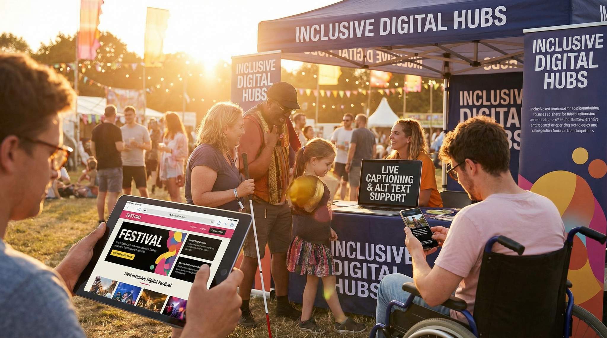
- Images and Alt Text: Provide meaningful alt text for all important images. If you show headshots or art banners, alt text should describe the scene or said content (e.g., “Two guitarists on stage with blue spotlights”). This lets screen readers convey the info. Avoid alt text like “image001.JPG” or filling it with keywords. If an image is purely decorative, it can have empty alt (
alt=""). Notably, many ticketing platforms (including Ticket Fairy’s listing pages) support adding alt text to event images during setup. Training photographers or designers to supply alt descriptions during content intake (as the Adelaide Fringe does in its registration process, as Adelaide Fringe explains regarding image descriptions) is a great practice. - Video Content: Any video – such as event trailers, highlight reels, or live streams – must be captioned. YouTube and Vimeo offer auto-captioning (but always review and edit for accuracy). Even better, upload your own transcript or subtitles that match the audio. Embed videos in a player that supports closed captions. For live events, consider real-time captioning or note if a stream is not captioned. Also for Deaf festival-goers, Busan Film Festival’s site serves as a model: their embedded trailers include subtitles for dialogue. For audio-only media (like podcast announcements), include a written transcript or summary.
- Interactive Elements: If your site has things like crowd-sourced playlists or Q&A widgets, ensure they’re keyboard-accessible and announced properly (use ARIA live regions if content updates dynamically). Otherwise, some users may never see interactive content.
- PDFs and Brochures: Sometimes lineups or maps are offered as downloadable PDFs. These should also be accessible (searchable text, built-in tags, alt tags for images). If converting your schedule to PDF, use a tool that maintains headings and text layers. If in doubt, provide an HTML alternative or formatted text page.
- Social Media Feeds: If embedding Instagram or Twitter feeds, enable captions on those posts and add
aria-labelortitleattributes to the embed container. Don’t let rich media from other platforms become invisible to assistive tech. - Translating Information: For an international audience, consider content in multiple languages. Even a single multi-language toggle on key pages can vastly improve understanding (think: programme details or site navigation in your main audience’s language). Small audiences in large festivals always appreciate at least English and one other local language option. Ticket Fairy’s infrastructure, for instance, allows events to display prices and text in different currencies and languages, which aligns nicely with accessibility goals, building trust in potential attendees.
- Live Streaming and Chat Accessibility: For hybrid events broadcasting performances online, platform configuration is crucial. If you are utilizing platforms like Twitch, ensure your moderation tools and chat overlays are set up to support screen reader auto-announce features for pinned messages. This allows visually impaired virtual attendees to follow official live announcements or schedule shifts in the chat without being overwhelmed by rapid-fire user comments.
By taking care of alt text and captions, you are not just checking boxes – you’re telling the festival story to everyone. A traveler with hearing loss will plan their trip much better if they can read a trailer’s subtitles or a site map’s alt-description, ensuring clarity on how to buy tickets.
Need Festival Funding?
Get the capital you need to book headliners, secure venues, and scale your festival production.
Assistive Technology and Inclusive UX
Beyond content, the underlying code must work seamlessly with assistive technologies. This ensures that screen readers, magnifiers, and other tools can navigate your site as intended.
- Screen Readers: Test your site with popular screen readers like NVDA (free/Open Source) on Windows, VoiceOver on Apple devices, and TalkBack on Android. These don’t just read alt text; they also announce page landmarks, headings, buttons, and form labels. Ensure you set the correct page title and use
lang="en"(or whichever language) in the HTML so screen readers use the right voice and rules. - ARIA Roles and Labels: Where HTML semantics fall short (e.g., a custom slider or modal), use ARIA attributes. For instance, a modal dialog should have
role="dialog"andaria-modal="true", with a properaria-labelledbyfor its title. A common mistake is usingaria-for everything; it should augment, not replace, good HTML. Always test after adding ARIA to avoid conflicts. - Form Accessibility: Label every form field (e.g., name, email) with
<label>elements. Include placeholder text only as helper text, not as a substitute for labels. Show clear error messages in text if a user misses a field or types an invalid date. For example, if a date field needs YYYY-MM-DD format, indicate that next to the field and in any error message. Keep forms short and logical (break into steps if needed). - Focus Management: Some festival sites create pop-ups (like subscribing to a newsletter or scheduling reminders). When such elements open, shift keyboard focus into the popup. Likewise, ensure focus returns to a logical place when it closes. This prevents keyboard users from “getting lost” on the page.
- Visible Cues: Always include a clear focus ring for interactive elements. Many reset styles remove it, but that forces guide. Users should see which button or link is currently in focus. Also, avoid hiding content with
display:noneorvisibility:hiddenif it’s useful. Alternatively, usearia-hidden="true"on purely decorative elements so screen readers skip them.
Keep language clear and navigation consistent. When writing announcements or FAQs, use plain English (or your main language). An example of clear language: instead of “procure your pass via the button below,” say “Buy your ticket here.” A festival CEO once summarised this as: “Design your site so an 80-year-old and an 8-year-old can both find what they need.” Inclusive UX might also mean avoiding jargon – e.g. call the ticket page “Buy Tickets” not “Secure Your Entry”.
Mobile App Accessibility
Many festivals now offer official apps or rely on web apps, so accessibility extends to mobile. Whether you have a standalone app or a progressive web app (PWA), the same principles apply:
- Native UI Accessibility: In mobile apps, use platform accessibility features. On iOS, label buttons and images with
AccessibilityLabel; on Android, useandroid:contentDescription. Test with VoiceOver (iOS) and TalkBack (Android) by turning on the screen reader in settings. Make sure any custom UI control announces properly. For example, if your app has a “Festival Map” button, ensure VoiceOver reads “Festival Map button” not just “button”. - Responsive Web Apps: If your website is a PWA or has mobile pages, ensure touch targets are large (at least 44×44 points) and that content reflows well. Avoid using small carousels or sliders that are impossible to swipe for some users. Provide skip links or menu access on the mobile layout as well.
- Font Scaling: Allow text to scale with the device’s accessibility settings. In Android development, use
spunits for text size, and in iOS use Dynamic Type. This means elderly attendees who set large fonts on their phone can still read your content. - Colour and Contrast on Mobile: The same contrast rules apply. Modern phones have “Dark Mode”; ensure your app or site respects it if possible. Many native maps or timetable widgets also have night modes that consider contrast.
- Offline and Notifications: For some festival apps, offline caching is important. Make sure offline-stored pages are still navigable by those with disabilities. When sending push notifications (e.g., schedule updates), provide clear text and avoid reliance on tones or colours alone. Include a text alternative for urgent alerts.
- Voice Control and Shortcuts: Users with motor impairments may use voice commands. While you can’t predict user speech, you can ensure your tappable items have straightforward names. Check that Siri or Google Assistant can launch key app sections by using well-named intents.
- Third-Party Discovery Platforms: Promoters frequently list their events on external platforms to boost reach. However, operators should be mindful of family friendly event discovery apps accessibility issues. If a third-party aggregator has poor screen reader support, low contrast, or confusing navigation, it can block parents with disabilities from purchasing tickets. Always audit the accessibility of the ticketing and discovery partners you choose to integrate with your campaign.
Overall, a mobile app removes many traditional web constraints, but still requires attention to detail. Festival apps from organizations like TIFF (Toronto Int’l Film Fest) show that integrating accessibility early (e.g. built-in zooming, read-aloud for program notes) is easier than retrofitting later.
Free Tool: Project Your Bar Revenue
Per-head spend benchmarks by event type turned into projected bar and food revenue, with a stock-mix estimate and gross-margin line. Free calculator.
Testing, Tools, and Continuous Improvement
Launching the site isn’t the end – rigorous testing and ongoing adjustments are critical. Here are practical steps and tools:
- Automated Testing Tools: Use tools like Chrome’s Lighthouse (built into DevTools), the WAVE browser extension, or Deque’s axe DevTools. They scan pages for WCAG violations (missing alt text, bad links, low contrast, ARIA issues). For example, running Lighthouse on your home page will output an “Accessibility” score and list problems. These tools won’t catch everything, but they’re great for quick checks.
Figure: Automated accessibility tools (Lighthouse, WAVE, axe) flag common issues like missing alt text or poor contrast.
| Tool | Type | Key Features |
|---|---|---|
| Lighthouse | Chrome DevTools | Automated audit of accessibility, performance, SEO; highlights missing alt text, form labels, etc. |
| WAVE | Browser Extension | Visually highlights issues on page (missing alt text, contrast problems, missing form labels). |
| axe DevTools | Browser Extension | Deep WCAG compliance checks with guidance; integrates into development workflows (paid upgrades). |
| Color Contrast Checker | Desktop/Web | Calculates text/background contrast ratios to meet WCAG thresholds. |
| Screen Readers (NVDA, VoiceOver, JAWS) | Software | Reads out content, allowing full manual test of navigation, headings, form labels, etc. |
- Manual and Real-User Testing: Automated tools miss things like confusing language. Recruit volunteers who use assistive tech or have disabilities to try the site. Ask them to perform tasks: find a band schedule, buy a ticket, or locate access info. Watch where they get stuck. Their feedback is gold. Also, use tools like browser zoom to 200% to see if layout breaks.
- Keyboard-Only Test: Turn off your mouse and navigate with keyboard/tab. Every link, button, and form should still work. If a menu won’t open with Enter, or a form field has no label announcement, fix it.
- Analytics and Feedback: Monitor analytics for high bounce rates on certain pages (e.g. ticket purchase). It could signal an issue. Provide an obvious “Accessibility Feedback” email link on the site or a form for users to report problems. Respond quickly and note recurring issues.
- Iterate and Record: After initial launch, schedule periodic audits (e.g. quarterly). Each festival edition likely adds new content or features (lineups change, etc.), so re-test those changes. Keep a checklist of fixes and mark them done. Over time, your site will become more polished.
By combining automated scans with human testing, you’ll catch most issues. The key is never to assume “it’s fine.” In fact, one post-mortem of a festival site found that 95% of home pages had at least one accessibility error, according to Spektrix’s analysis of arts venue websites. Learning from each festival cycle means packing the next edition’s site with fewer barriers. And remember: every small fix (like adding a missing alt attribute) can translate into an enthusiastic attendee who otherwise might have been left out.
Frequently Asked Questions
How does an accessible festival web presence impact ticket sales?
An inclusive digital platform removes purchasing barriers for disabled attendees, directly increasing conversion rates. When your festival web infrastructure is easy to navigate with screen readers or keyboard-only controls, you capture a wider audience that might otherwise abandon a frustrating checkout process.
What are the most common accessibility failures in festival web design?
Common issues include missing alt text on lineup posters, poor color contrast between text and background images, and ticketing widgets that cannot be navigated via keyboard. Addressing these core development areas ensures compliance and a better user experience for all prospective attendees.