Organizing a festival in a dense urban environment presents a unique navigation challenge. Unlike open fields or contained venues, inner-city festivals sprawl across city blocks, intertwining with public streets, transit stations, and towering skylines. Attendees might be arriving from multiple directions – stepping off trains or buses, emerging from subway stations, or walking from downtown parking. Clear wayfinding isn’t just helpful; it’s essential to keep crowds moving safely and happily in this urban maze. A signage system that exploits existing city landmarks – from transit stations to iconic towers and main street arteries – can transform a potentially confusing journey into an intuitive adventure for festival-goers.
Modern festival producers know that great wayfinding is part art and part science. It’s about blending practical signage with the psychological cues that humans instinctively follow. In a busy cityscape, people often navigate by landmarks (“turn left at the clock tower”) and by following the crowd flow. By building a navigation plan around well-known landmarks and clear visual cues, a festival organizer can make even first-time visitors feel like locals. The goal is to create an environment where guests instinctively navigate, hardly needing to stop and ask for directions. Below, we delve into how to achieve this through smart design: using transit hubs as starting points, leveraging skyline features as beacons, marking routes along major roads, employing universal icons, and integrating digital maps via QR codes.
When developing an overarching event wayfinding strategy, producers often ask: exactly what are the landmarks that work best for crowd orientation? In an urban or sprawling outdoor setting, effective landmarks are highly visible, static structures that stand out from the surrounding environment. These can be permanent architectural features like clock towers, prominent bridges, and unique public art installations, or temporary focal points erected specifically for the event, such as towering art pieces, branded inflatables, and Ferris wheels. The key is that they provide an unmistakable visual anchor from almost any vantage point on the grounds.
Stations and “Spines”: Guiding Attendees from Transit Hubs
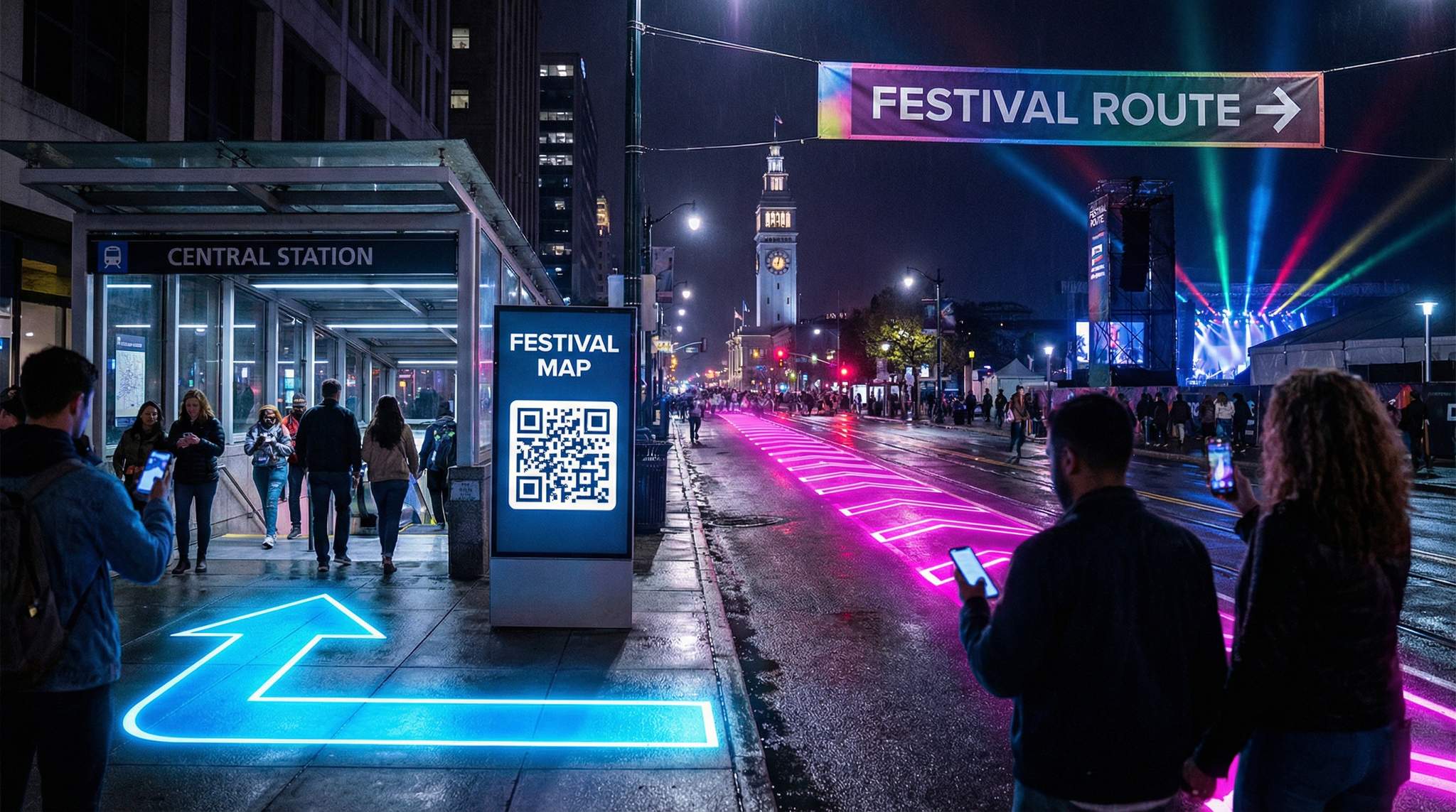
For inner-city festivals, many attendees will begin their journey at transit hubs – major train stations, subway stops, or bus terminals. These stations become the first opportunity to capture your audience’s attention and set them on the right path. Placing festival signage at station exits and nearby sidewalks is crucial. Work with city authorities or transit operators to install temporary directional signs inside stations or right as people step onto the street. For example, large arrows labeled with the festival name or logo (and a distinctive color) can point the way from Central Station towards the festival site. If possible, include estimated walking times or distances – e.g. “Festival Main Entrance – 10 minute walk”.
Interactive Seating for Every Venue
Let fans pick their perfect seat with interactive venue maps. Supports reserved seating, section-based pricing, and real-time availability.
One innovative strategy is to create color-coded “spines” – clear pathways emanating from transit hubs that lead directly to the festival. These spines could be marked by colored banners on light poles, painted sidewalk lines, or even projections on the pavement. Color is a powerful navigational cue; human eyes tend to notice a bold splash of color even before they can read the words on a sign. During the 2012 London Olympics, organizers famously chose a single vibrant color (bright magenta pink) for all spectator guidance. Pink signage was deployed from public transport hubs through to the venues – an unusual choice that proved highly effective according to event wayfinding case studies. Visitors quickly learned to simply “follow the pink” to reach Olympic event sites.
Physical implementation of a color-coded spine can be creative. Some festivals lay down temporary floor markings – for example, a series of painted footprints or a thick colored line on the sidewalk leading toward the venue. A real-world inspiration is the Freedom Trail in Boston, which is literally marked by a continuous red line along sidewalks and streets to guide tourists between historic sites, similar to the Boston red line sidewalk markers. In a festival context, a festival organizer might emulate this by laying a removable colored tape or carpet from a subway station to the festival gates. Balloons or flags in the chosen color can be attached to lampposts at intervals, providing visible cues down a long city block. The key is consistency: maintain the same color and design from start to finish so that it forms an unbroken “artery” of guidance.
Planning a Festival?
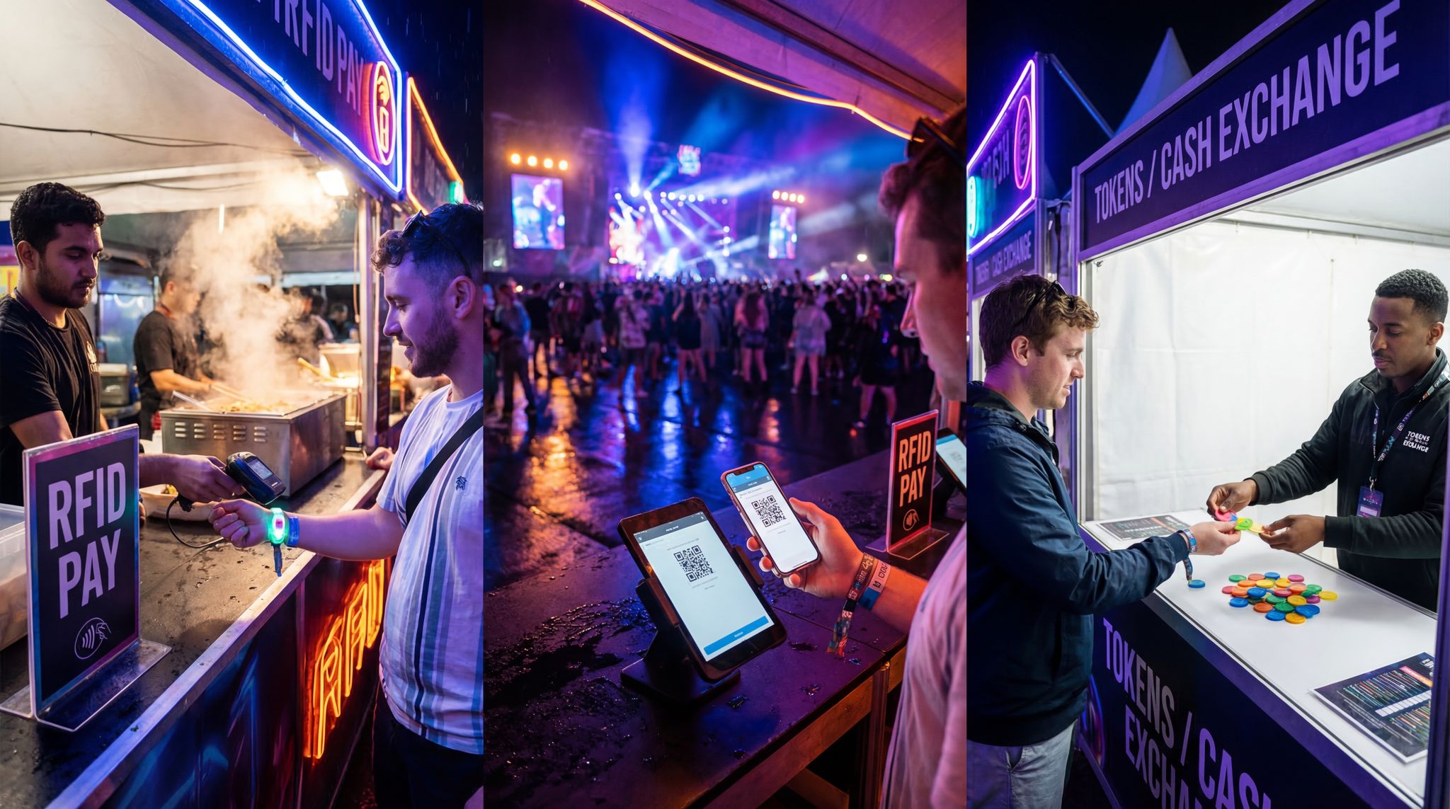
Ticket Fairy's festival ticketing platform handles multi-day passes, RFID wristbands, and complex festival operations.
Keep in mind that these transit hub spines should also consider return journeys. After the show or late at night, attendees will need to find their way back to stations. Ensure that signage is two-way (or duplicated in reverse) – when people are tired or the city is dark, they should see those same colored markers pointing back to the train or bus. Lighting is important here: use reflective materials or even LED-lit signs for night visibility on your routes. For instance, colored LED beacons or string lights can line the walkway on the main path, effectively becoming a glowing spine that’s hard to miss.
Towering Landmarks as Natural Signposts
Every city has its landmarks – the tall TV tower visible from most neighborhoods, a historic clock tower, skyscrapers, bridges, or even art installations. These towers and iconic structures can become reference points in your festival’s navigation plan. Incorporating landmarks into signage gives people a mental anchor: if they can see the landmark, they know they’re orientated correctly. For example, if your inner-city festival is near a well-known tower or cathedral spire, your signs can say “Festival Name – this way (towards the Tower Name)”. Guests then move in the direction of that landmark, a process that feels instinctive because humans often navigate by choosing a visible target in the skyline.
Beyond text references, you can graphically integrate landmark imagery into your signage. A simple silhouette icon of the landmark on a directional sign reinforces the message. This technique was used to great effect in public transit design. Mexico City’s metro, for instance, assigned each station a unique pictogram drawn from the local area’s identity – instead of relying on just names, the station signs depict familiar objects or features from above-ground, a design strategy highlighted in The Guardian’s feature on symbolic simplicity. One station is represented by a cannon image referencing a nearby historical monument, another by an Aztec pyramid symbol for ruins found in that district. Festival wayfinding can apply this principle by using pictorial cues that match the city’s landscape. If there’s an iconic bridge on the way to your site, an image of that bridge with an arrow can subtly reassure people they’re on the correct route to the festival entrance.
Festival producers can also create temporary landmarks if needed. Large inflatable art, lighting towers, or sky-tracker beams can serve as beacons that people see from afar. Imagine a powerful spotlight beam or a branded blimp hovering above the main stage – attendees around the city can literally look up and head in that direction. In Singapore’s city center, for example, spotlights and giant LED art installations during the Night Festival act as wayfinding beacons visible for blocks. In crowded urban Japan, some festivals raise balloons or koinobori (carp streamers) high above street level to mark venues. These visual markers tap into the same intuition as using a permanent landmark: they draw the eye and orient people from a distance. Just be sure to communicate what the marker means (e.g. in your festival app or info boards, “Look for the giant red balloon over Main Square – that’s where the festival starts”). Combining the permanent and temporary landmarks – say, guiding people to turn at a famous statue where a festival volunteer with a flag is stationed – can seamlessly blend city geography with event-specific directions.
Smooth Entry With Mobile Check-In
Scan tickets and manage entry with our mobile check-in app. Supports photo ID verification, real-time capacity tracking, and multi-gate coordination.
Urban Arteries: Mapping Main Routes and Intersections
Cities are crisscrossed with roads and footpaths, but not all are equal for guiding a crowd. Identifying a few main arteries – wide, well-known streets or pedestrian boulevards – as the primary festival routes will help concentrate wayfinding efforts. Ideally, you want to funnel attendees along routes that are safe, direct, and easy to follow. Work with city officials to determine which streets can handle heavy foot traffic and whether any can be pedestrianized during the event. For instance, if a popular shopping street runs from the transit station to your venue, consider asking the city to partially close it to vehicles and make it a temporary “festival avenue”. This not only gives more space for attendees but also simplifies navigation (there’s less chance of people straying down side alleys if the main road is clearly the festival path).
Once your key routes (arteries) are chosen, saturate them with clear signage and wayfinding cues. Corners and junctions are critical points – at every turn or intersection along the route, place a sign or ground markings so that even if someone is in a group or distracted, they catch a hint of where to go next. A common tactic is to use ground-level cues in addition to eye-level signs: for example, large painted arrows on the pavement at an intersection complement the street pole signs. During Sydney’s Vivid Festival, colored projection lights on the ground have been used to point towards different precincts of the event, essentially forming illuminated trails on the pavement. In crowded European city festivals, some organizers have used volunteer “human signposts” at key junctions – staff or volunteers wearing bright directional arrow signs or holding pointer boards to shepherd people along the correct artery.
Need Festival Funding?
Get the capital you need to book headliners, secure venues, and scale your festival production.
Color-coding can extend along these main thoroughfares too. If you have multiple major routes (perhaps feeding into different entrances or sections of a spread-out festival), give each route a distinct color or name and promote that in your communications. For example, “Follow the Green Path from Lexington Avenue for the East Gate” versus “Follow the Orange Path from Waterfront Station for the West Gate.” Mark the path accordingly with green or orange banners and sidewalk decals. This way, locals and repeat attendees might quickly learn the route names, and newcomers can simply match the color from the sign in their handout or phone to what they see on the street.
Also, leverage the names and features of the streets themselves as cues. City streets often have landmark features like unique public art, well-known stores, or consistent numbering. Incorporating these into directions personalizes the experience. Instead of a generic “Walk north 500m”, tell attendees “Walk past the fountain sculpture and continue until you see the festival gates.” Such instructions stick in people’s minds better, especially for those unfamiliar with cardinal directions or metric distances. It paints a mini mental map using the city’s own points of interest.
Figuring out how to navigate multi-stage music festival sites requires an extra layer of strategic routing. When attendees are rushing between overlapping set times, the arteries connecting different stages must be exceptionally wide and clearly marked to handle bi-directional surges. Organizers should deploy overhead gantry signs at major intersections, ensuring that sightlines to stage-specific directional cues remain unobstructed even when the pathways are packed with thousands of moving fans.
Language-Light Iconography for a Global Audience
Inner-city festivals, especially large ones, tend to attract a diverse crowd – locals mingling with visitors from other regions or countries. Relying solely on text-based signs can be problematic when not everyone speaks the same language fluently. A language-heavy approach can also overwhelm people with too much reading, slowing down wayfinding. Instead, the best practices in event signage favor language-light iconography: using pictograms, symbols, and minimal text so that nearly anyone can grasp the message at a glance.
Think of the universal icons we see in airports or international events: a fork and knife symbol for food, a tent icon for camping, the “??” for information, or simple male/female figures for restrooms. Festivals should adopt or create a consistent icon set for common needs (info booth, first aid, toilets, exits, stages, transportation, etc.). By placing these symbols on your signs, you cater to an international audience without needing to print multiple languages. For navigation, arrows combined with icons can do a lot of heavy lifting. A sign with a train icon and an arrow pointing left immediately tells anyone that the train station (and likely the way out or to transit) is in that direction. Similarly, a ?? (parking symbol) and arrow points drivers back to the parking area, no translation needed.
When designing icons for your festival, keep them very simple and tested for recognition. Use high contrast colors and avoid intricate detail. The icons should be distinguishable from a distance and under various lighting conditions. It’s wise to follow international standards where possible (for example, use the standard first-aid cross or snake-and-staff symbol for medical, a commonly recognized baby stroller symbol for family areas, etc.). If your festival has unique locations (say a “Silent Disco” or a “Cosplay Zone”), create intuitive pictograms for those and include a legend on the festival map or website so people can learn them. Test these icons with a sample of people, including non-native speakers or even someone’s grandparents, to see if the meaning is clear without words. If many testers can’t guess an icon’s meaning in a few seconds, go back to the drawing board.
Being language-light doesn’t mean no text at all – often a combination is best. A small text label in one or two key languages under an icon can reinforce understanding. But by prioritizing the visual, you ensure even those who don’t read the text still get the message. This was a lesson learned by many global events. The Olympics, for instance, develop an entire set of sport pictograms for each games to aid international visitors. Many music and art festivals do the same for their map legends and on-site signs. By investing in a good iconography system, you build a visual language for your event that becomes instantly recognizable year to year.
Another benefit to icon-driven signs is speed. In a fast-moving crowd, people don’t have time to stop and parse sentences. An arrow and a cup icon at eye level (“drinks this way”) will register much faster than a multilingual sentence saying the same. This keeps crowd flow efficient. It also reduces sign clutter – one symbol can replace words in three different languages, making the signage cleaner and more attractive (which your graphic designers will appreciate).
QR Codes and Smart Maps: Blending Physical and Digital Wayfinding
Even with excellent physical signage, modern festival-goers will often turn to their smartphones for help. Embrace this by integrating QR smart maps into your wayfinding system. QR codes are those scannable black-and-white squares that can instantly launch information on a user’s phone. By placing QR codes on signage, maps, or info boards, you provide a quick bridge from the physical world to a digital navigation aid.
For example, at entrances or transit hubs, a poster might say “Scan here for a festival map on your phone.” A guest coming out of a station can scan the code and have an interactive map with GPS on their screen within seconds. This is far more convenient than handing out paper maps (and it avoids litter). QR code usage for navigation skyrocketed during the COVID-19 pandemic because it offers a touchless, instant way to get information, which is why QR code usage for wayfinding skyrocketed. Now, scanning a QR code is second nature for most people.
A digital festival map can be updated in real-time, which is a huge advantage. If an entrance is closed or a stage’s schedule changes, you can push the updates to the online map that all these QR codes point to. You might use a service that creates a mobile-friendly web app or even integrate with a festival app (if your festival has one). Many platforms and map services allow adding points of interest, “you are here” features, and even augmented reality arrows for navigation when looking through the phone’s camera. While AR wayfinding is a cutting-edge feature, even a basic Google Maps custom map with festival points pinned can do the job.
Make sure the QR code is paired with context on the sign. In other words, tell people what they get by scanning. For instance: “Lost? Scan for directions to all stages and facilities.” Use a short URL alongside it as a backup (some people prefer to type a URL or can’t get their camera working to scan, so something like www.festmap2025.com on the poster is helpful). Also, ensure that once loaded, the map or guide does not require constant internet connectivity if possible – the cellular networks at big events can get jammed by thousands of users. A downloadable map or an app that saves data offline is ideal for reliability.
For multi-lingual needs, digital maps truly shine. You can often toggle languages within the app or have pins labeled in several languages, without making the physical signage messy. QR-linked content can detect the phone’s default language and show info in that language. This way, your Chinese or Spanish speaking visitors get directions in their own language on their phones, even if all the physical signs in the city were only in English and symbols. It’s an elegant way to be inclusive.
One more tip: use QR codes for more than just maps. You can have different codes for different needs: a code on a sign near a stage could pull up the stage schedule, or a code at a food court could bring up a vendor list. But for pure navigation, keep the map QR code consistent and widely available. Print it on pamphlets, posters, entry wristbands, and volunteer t-shirts if you want – make it ubiquitous so nobody misses it. And don’t forget to test each code in advance (and again on event day) to be sure it loads quickly and correctly.
For complex, sprawling events, producers increasingly rely on specialized multi-day festival mapping services. These professional platforms go beyond basic static maps, offering dynamic, interactive GIS (Geographic Information System) solutions that integrate with the official event app. By utilizing these advanced mapping tools, organizers can push real-time updates to attendees—such as highlighting shaded routes during a heatwave or rerouting foot traffic away from a temporarily closed stage—ensuring the digital wayfinding experience remains accurate throughout the entire weekend.
Beyond real-time updates, utilizing dedicated platforms for events wayfinding allows production teams to analyze crowd flow data post-event. By reviewing heatmaps and user interactions within the digital map, organizers can identify which intersections experienced the most congestion and adjust their physical signage or barrier placements for the following day. This data-driven approach transforms a static site plan into a responsive crowd management tool, ensuring that multi-day operations become progressively smoother as the weekend unfolds.
When coordinating complex site plans, organizers often ask about the role of FAS in the context of large venue maps and wayfinding. In mega-event production, FAS stands for Functional Areas—the distinct operational departments such as medical, transport, catering, security, and artist relations. Effective event wayfinding must account for the specific routing needs of every functional area. For example, a comprehensive digital map should include restricted layers that guide vendors to loading docks or direct medical staff along dedicated emergency arteries. By integrating these operational zones into your overarching navigation strategy, you ensure that back-of-house logistics run just as smoothly as the public-facing crowd flow.
Testing, Safety, and Accessibility in Wayfinding
Designing a brilliant wayfinding system is only half the battle – you must also test it in realistic conditions. Before the festival begins, do a walkthrough (or several) from each major approach path: arrive by train, by car, by foot from various directions, and follow your own signage. Ideally, have people unfamiliar with the festival do this test as well. See if there are any confusing spots where additional signs are needed or where a planned route isn’t obvious. Sometimes an extra arrow on the ground or a banner at a higher vantage point can clarify a tricky turn. It’s much better to discover these issues in a test with a few staff than when tens of thousands of attendees are on the move.
Safety considerations are paramount. Wayfinding isn’t just about convenience – in emergencies, good signage can save lives. Ensure that emergency exits and evacuation routes are clearly marked with the same thoroughness as your entry routes. Use universally recognized symbols (green “EXIT” running man signs, for example) and lighting for these emergency signs. Crowd disasters in the past have been exacerbated by confusion and lack of clear egress routes. Don’t let your festival contribute to those tragic case studies. If an area must be evacuated, people should be able to follow exit signs and routes out to safe zones or back to transit without hesitation. Coordinate with city emergency services to plan these routes and practice if possible.
Another aspect of safety is avoiding bottlenecks. Urban layouts can sometimes inadvertently funnel all foot traffic through a narrow chokepoint. If your wayfinding plan directs everyone down one street, check that the street can handle it. Are sidewalks wide enough? Is there an alternative path if it gets overcrowded? For instance, the Love Parade tragedy in 2010 was partly due to routing all attendees through a single tunnel-like exit/entrance which became a deadly bottleneck. Learn from such failures: provide multiple routes or a sufficiently broad pathway for major flows, and indicate them clearly. If you expect 50,000 people at closing time, you might need two different “streams” leading away from the venue – your signage and staff should split the crowd and direct them to, say, two different train stations or parking areas to prevent overload on one route.
We have recent examples as well. When Ultra Music Festival in Miami moved to a new island location in 2019, insufficient planning and signage for post-event transport led to chaos. On the first night, shuttles failed to accommodate the crowds, and with poor wayfinding, thousands of attendees ended up walking miles across a causeway at 2 AM to get back to the city, a chaotic scene described by Miami New Times regarding the shuttle failure. Angry and exhausted attendees wandering on roads is a festival organizer’s nightmare – and a serious safety hazard. The lesson is clear: plan and communicate exit routes and transportation options as clearly as entry routes. Use signage to direct people to taxi pickups, rideshare zones, late-night buses, or train services. If one route fails, have a backup plan and announce it (e.g., via public address or push notification through that festival app).
Accessibility is another critical component. Not all festival-goers navigate in the same way – consider those with disabilities or special needs. Make sure your signage is visible to someone in a wheelchair (not all at high placement), and that accessible pathways are marked (ramps, elevators, or step-free routes should be indicated with the standard wheelchair icon and arrows). For vision-impaired guests, tactile guidance or audio announcements can complement visual signs. Some cities have tactile paving (raised strips on sidewalks) leading to major destinations – if your festival can tap into those existing tactile paths from a station, great. If not, consider temporary mats or guided assistance for blind or low-vision attendees from key transit points. QR code based wayfinding can also assist here, since smartphones have accessibility features (like voiceover reading directions aloud). So be sure the digital maps are compatible with screen readers and have text alternatives for key icons.
Finally, train your staff and volunteers on the wayfinding plan. They are the human element of the system. Equip them with maps and have them station at critical junctures (especially during opening hours when everyone is arriving). A friendly face in a festival staff shirt who can answer “Which way to Stage 2?” makes a huge difference alongside all your signs. Sometimes volunteers can even hold portable signage (like a big arrow sign) to plug any gaps in the fixed signage. During the event, keep evaluating: if you notice bunching or confusion somewhere, dispatch someone to adjust signage on the fly or actively direct people.
Frequently Asked Questions
How can festival organizers guide attendees from transit hubs effectively?
Organizers can create color-coded “spines” or pathways leading directly from stations to the festival using colored banners, painted sidewalk lines, or projections. For example, the 2012 London Olympics used a single magenta pink color for all signage to help visitors instinctively follow the correct route from transit to venues.
How do landmarks improve festival wayfinding in urban environments?
Incorporating landmarks like towers or skyscrapers into signage gives attendees a visible mental anchor for orientation. Organizers can use text references or silhouette icons of structures on signs. Temporary beacons like spotlights or balloons also allow crowds to “look up” and navigate instinctively toward the venue from a distance.
Why is language-light iconography important for festival signage?
Language-light iconography uses universal pictograms and symbols instead of text to assist diverse, international crowds. Simple icons for trains, food, or first aid allow attendees to grasp messages instantly without reading. This approach speeds up crowd flow and reduces sign clutter by removing the need for multiple translations.
How can QR codes enhance festival wayfinding systems?
QR codes on physical signage bridge the gap to digital navigation by instantly launching interactive maps on smartphones. These digital maps offer real-time updates on schedule changes or closed routes and can support multiple languages. This provides a touchless, convenient alternative to paper maps that can function even offline.
Why is wayfinding critical for festival safety and crowd management?
Effective wayfinding prevents dangerous bottlenecks and ensures clear access to emergency exits. Poor signage can lead to overcrowding or stranded attendees, as seen when Ultra Music Festival’s shuttle failure forced thousands to walk unsafe routes. Clear directional cues for exits and transport are essential to prevent crowd disasters.
How should festival signage be designed for night and return journeys?
Signage must be two-way or duplicated in reverse to guide tired attendees back to transit hubs after the event. Organizers should use reflective materials, LED beacons, or string lights to ensure visibility in the dark. This ensures the navigational path remains effective and safe when the city is dark.
What are the best practices for routing crowds at multi-stage music festival sites?
To effectively manage crowd flow between multiple stages, organizers should design wide, bi-directional arteries and use overhead gantry signage. Clear, unobstructed sightlines and distinct color-coding for each stage help attendees move quickly and safely during overlapping set times.
How do multi-day festival mapping services improve event wayfinding?
Professional mapping services provide dynamic, interactive digital maps that integrate with event apps. They allow organizers to push real-time updates, such as route changes or emergency alerts, ensuring attendees have accurate navigational tools throughout the entire duration of the event.
How does digital event wayfinding software improve crowd management?
Digital event wayfinding software provides organizers with real-time data on attendee movements and search queries within the festival app. This allows production teams to identify congestion points, deploy staff dynamically, and update digital maps on the fly to reroute foot traffic, ultimately enhancing both safety and the overall guest experience.
What is FAS in the context of large venue maps and wayfinding?
In event production, FAS stands for Functional Areas, which refer to distinct operational departments like medical, transport, catering, and security. In the context of large venue maps and wayfinding, integrating FAS ensures that both public attendees and back-of-house staff have clear, dedicated routes, preventing logistical bottlenecks and keeping operations running smoothly.