Introduction
It’s midday at a country music festival and a fan is squinting at the schedule poster. The design looks delightfully rustic – curling fonts like old saloon signs – but under the glaring sun and swirling dust, it’s almost impossible to read. Moments like this show why branding isn’t just about looking pretty; it’s about clear communication. Festival environments are chaotic by nature – crowds, weather, noise – and a strong brand system can be a festival organizer’s secret weapon to cut through that chaos. A well-crafted “rustic meets readable” brand identity captures regional charm and ensures every sign, screen, and schedule is easy to digest at a glance. This guide shares veteran insights on achieving that balance, from typography and iconography to real-world testing and consistency.
Embracing Rustic Yet Readable Typography
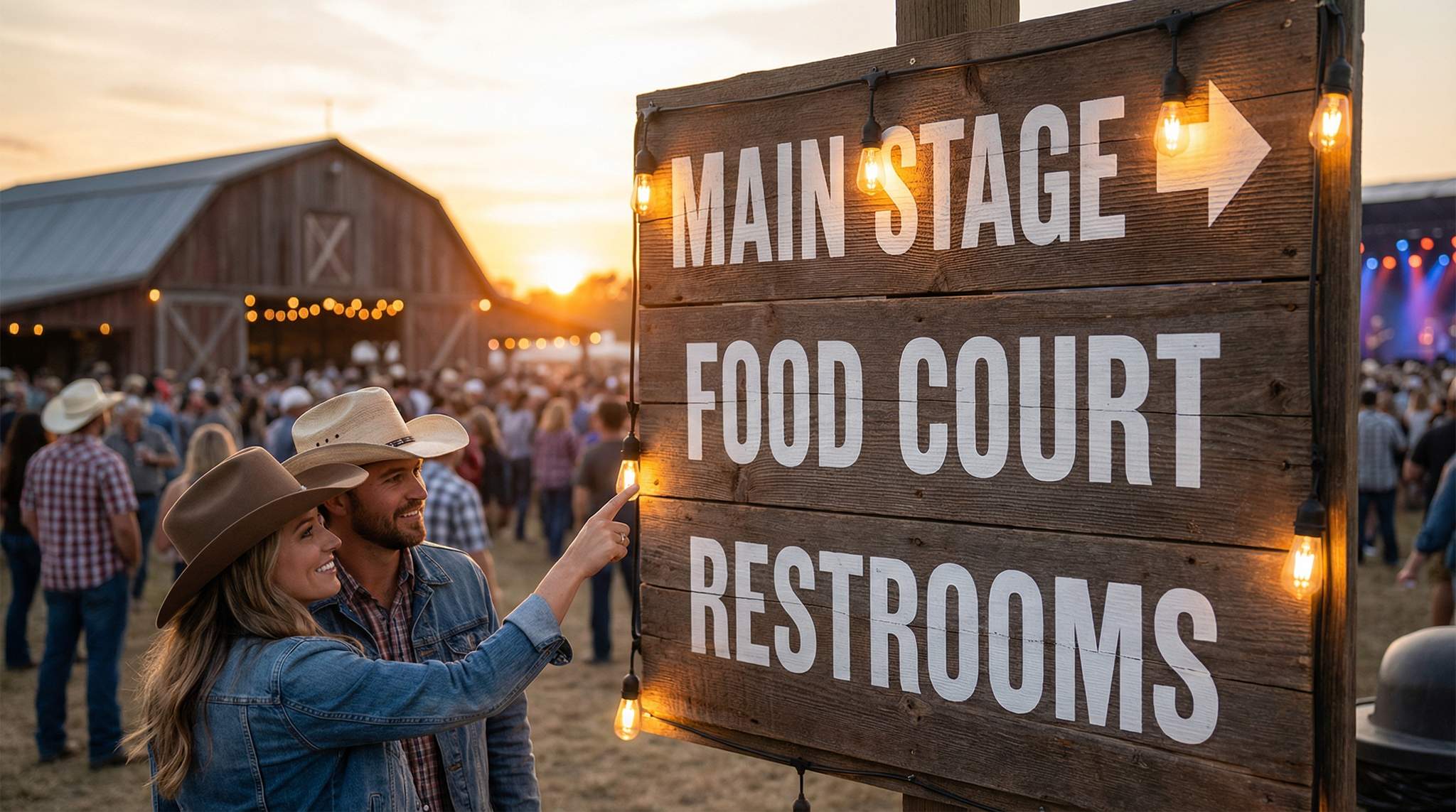
Choosing the right typefaces is a cornerstone of a festival’s brand, especially for a country music festival where the look needs to feel regional and authentic. Bold slab serifs, western-style woodblock fonts, or weathered “wanted poster” lettering can instantly evoke cowboy boots and country barns. For example, the CMA Music Festival in Nashville has used graphics inspired by classic letterpress posters to tap into country music’s history. However, while decorative fonts set the tone, readability must never be sacrificed. Reserve those ornate typefaces for big headlines or logos, and pair them with a clean sans-serif or simple serif for body text and details.
Think about who’s reading: Country festival audiences span generations, so fonts should be legible for both youthful eyes and older fans. Ensure there’s strong contrast between text and background – no light gray letters on wood-grain brown, for instance – so that words stand out even in harsh lighting. High contrast is not just a nicety, it’s an accessibility must. In fact, signage experts note that bright sunlight demands bolder fonts and higher color contrast to stay legible. If your event is outdoors (and most country festivals are), test your font choices under direct sun. A decorative font that looks charming on a computer screen might become unreadable when the noon sun hits it. As a rule of thumb, aim for color combinations that meet accessibility standards (such as the WCAG contrast guidelines) – for instance, dark navy text on a dusty yellow background can give a rustic vibe but still pass contrast tests, whereas pastel orange on white would wash out.
Another tip: Consider outline and shadows on text. Some festivals add a subtle dark outline around light-colored text to boost contrast against a bright backdrop. And if you use any textured effects (like a distressed, stamped look on letters), make sure the core letterforms are still easily distinguishable. A “rustic” font that’s too distressed can quickly become a puzzle to decipher from a distance. Legibility comes first; you can always capture the country feel in other ways too (through colors, icons, patterns) if you have to compromise on an overly decorative font. Remember, the goal is for a newcomer to glance at a sign or social media post and instantly both feel the country vibe and read the info without strain.
Designing an Icon Set that Says “Country”
Beyond text, icons and graphics are key parts of a festival brand system. For a country music festival, think of the visuals that signal “country” at a glance: cowboy hats, boots, guitars, maybe a barn or a dancing silhouette. Building a set of iconic symbols reinforces your theme in a way that transcends language. A neat set of custom icons – used on your maps, schedules, website, and merch – can communicate concepts faster than words. For example, a cowboy hat icon might denote the main stage (a nod to headliner “hats”), a guitar icon could label guitar workshop areas or music stages, a boot print might mark dance floors or line-dancing zones, and a campfire icon could symbolize campground jam sessions. When designing these, keep the style consistent: if you go with a simple outline style for one icon, they should all use that outline style, so they look like a family. Consistency in icon design (stroke thickness, level of detail, color fill) makes your materials look professional and unified.
Real festivals do this to great effect. Boots & Hearts Music Festival in Canada, for instance, plays on its name by incorporating a boot and heart motif in much of its branding – on posters, stage graphics, and online – instantly telegraphing the event’s theme. For a transatlantic example, Europe’s Country to Country (C2C) festival uses a unified branding (with motifs like guitars and national flag colours) across its London, Dublin, and Berlin editions, proving that consistent iconography and style can tie together audiences across different countries under one festival identity. Another example: The team behind CMA Fest developed a whole mark language of symbols and logos for different stages and areas, each with unique flair but all clearly part of the same visual family. This meant a fan wandering downtown Nashville could see a particular colour and icon and know which stage or zone they were headed to.
Planning a Festival?
Ticket Fairy's festival ticketing platform handles multi-day passes, RFID wristbands, and complex festival operations.
When creating your icon set, also consider practical use: they shouldn’t be overly intricate. Festival signage might be viewed from 30 feet away, or on a tiny mobile screen in glaring sun. So, make icons bold and clear. A silhouette of a cowboy boot will read better from far away than a detailed illustration of a boot with spurs. Choose colours for icons that contrast well with their background (for instance, a solid white icon on a dark background, or vice versa) to enhance visibility.
Lastly, apply icons thoughtfully alongside text. On a directional sign, for example, put the text “Dance Hall” next to your boot icon – the image reinforces the words. In an event app or program, little guitar and hat icons can replace or accompany section headers, adding personality. And if your festival draws international visitors or operates in a bilingual region, icons become even more valuable for universal understanding. A well-recognizable symbol can bridge language gaps (a music note or guitar pictogram says “music” no matter what language you speak).
Consistency Across Screens and Print
A brand system isn’t just a logo or a typeface – it’s a set of rules and assets that ensure everything your festival produces looks and feels like it came from the same place. This is crucial when your marketing and communications span many media: from websites and mobile apps to tickets, posters, stage banners, and wristbands. Consistency means a fan scrolling through Instagram, holding a printed festival map, or scanning a ticket at the gate always gets a cohesive impression. It builds trust and recognition – attendees learn to instantly spot your festival’s posts or signs because the visual cues are consistent.
Start by defining your core elements: logo usage, primary and secondary colours, fonts (and backup fonts for web use), icon style, and any graphic motifs or patterns (maybe you use a wood texture background or bandana-pattern trim on all designs). Document these in a brand style guide that you share with every team member and vendor. For example, if one of your colours is a deep barn red, specify the exact HEX/RGB for screens and CMYK for print, so the hue doesn’t accidentally turn out pink or maroon in different materials. The same goes for fonts – if your western headline font isn’t web-safe, find a close alternative or use web fonts so the website still carries the look. Many festivals create template files for common needs: a social media post template, an email header, a poster layout, volunteer T-shirt design, etc., all following the same style. This makes it easier to churn out new content quickly without reinventing the wheel each time.
Consider the difference between screen and print early on. Colors can appear differently on a backlit screen versus printed on paper or fabric. Do test prints of your posters and signage to ensure the “rustic mustard yellow” you chose doesn’t print as an ugly brown. Likewise, test your logo and text on mobile screens – does that detailed logo still look good when shrunk down on a phone? You might need alternate versions (e.g., a simplified logo without the long tagline for small uses).
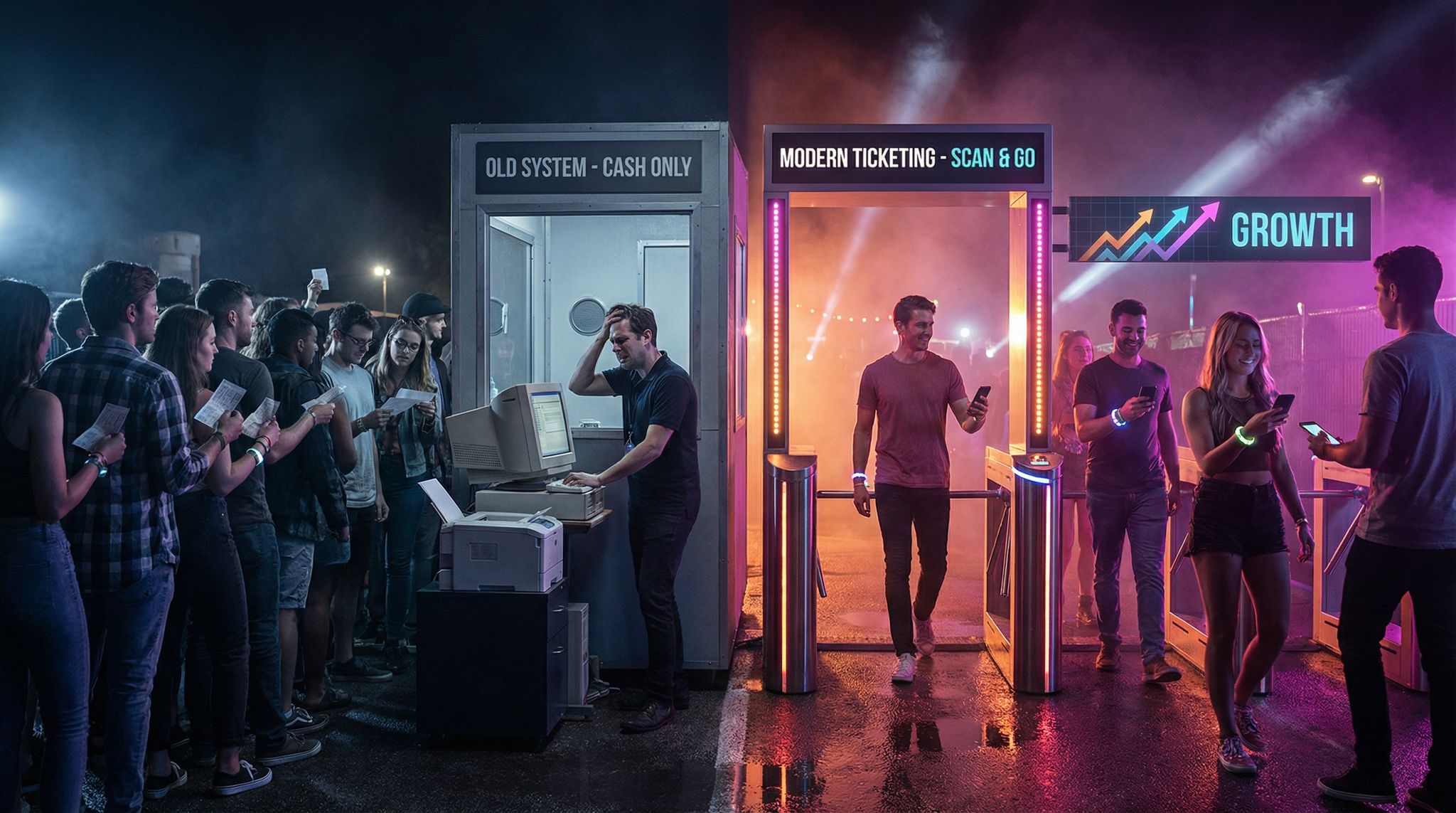
Another consistency aspect is aligning your ticketing and online presence with the brand. If you’re using a ticketing platform, see if it lets you customize your event page with your branding. Fans will appreciate a seamless experience from buying a ticket to arriving at the venue. For instance, Ticket Fairy’s platform allows organizers to add custom logos, colors, and backgrounds and even use a white-label ticketing site for their events. One event creator noted that from the moment people clicked on their ticketing link, the vibe and experience they are selling is maintained throughout. In other words, the ticket purchase page, the confirmation email, and the festival app can all mirror the same rustic, down-home style – which reinforces your brand at every touchpoint.
Need Festival Funding?
Get the capital you need to book headliners, secure venues, and scale your festival production.
Consistency also extends to how you integrate sponsors and partners into your visuals. Sponsors are often critical in festivals (some even have naming rights). You want to give them love and visibility, but without jarring your aesthetic. A good practice is to define how sponsor logos appear on your materials: perhaps all sponsor logos are shown in white on a dark background if your theme is dark and rustic, or contained within a stylized frame that matches your design. Look at Tamworth Country Music Festival in Australia – with Toyota as a title sponsor for over 25 years, leveraging assets across numerous contractual touchpoints, they’ve learned to incorporate the Toyota logo in a way that feels natural (often pairing it with the festival logo in one lockup on signage and using festival-themed colours around it). The key is planning for this: if your posters will have a sponsor section, design a template for it that aligns with your brand guide (same fonts, colors, icon style for any “Sponsored by” text). That way, even sponsor banners and ads feel like part of the festival family. When fans see your festival’s message or artwork, they should recognize it instantly, whether it’s a Facebook post or a stage schedule board on-site. Achieving that one-look unity is exactly how world-class festival producers keep their event image strong year after year.
Testing Your Design in Sun & Dust
Designing a beautiful poster or website is one thing; making sure those designs work in the wild is another. Festivals, especially country festivals, often happen outdoors – in fields, fairgrounds, or ranches – where you’ll contend with bright sun, dust, mud, wind, and all sorts of weather. To ensure your branding truly holds up, you need to test it under real-life conditions. This is a step many first-time festival organizers overlook, to their peril.
Imagine you’ve crafted a lovely wooden-background entrance sign with dark red lettering. It looks perfect on your computer. But on festival day, the sun is so bright that the red letters fade into the background, or a layer of dust from the dirt road coats the sign, dulling the contrast even more. Attendees can’t read it from a distance, and now you’ve got confusion at the entrance. Avoid scenarios like this by testing early and often.
Sun glare testing: Print out samples of key signage (directional signs, schedule boards, sponsor banners) at full size if possible, and take them into the midday sun. How do the colors look? Does the text still pop, or do you suddenly wish you had made the font thicker? You might find that what worked on a backlit laptop needs an extra punch of contrast outdoors. One rule of thumb from the signage world: white or light-colored text on a very dark background tends to hold up well in sunlight (the high contrast helps), whereas thin or subtle type can vanish in glare. Also consider the material and finish: a glossy poster or laminated sign might reflect so much sunlight that it becomes a mirror. Using matte finishes can reduce glare and improve legibility. Many experienced festival producers opt for matte vinyl banners or non-reflective boards for outdoor signage so that information can be read even under direct sun.
Dust and weather testing: If your festival is in a desert or dusty farm environment (think of Stagecoach in California or Australia’s outback Big Red Bash), anticipate that everything will get a fine coat of dust. Colors will look less vibrant. So choose color palettes with dust in mind – for example, some festivals avoid light yellow or pale gray text because once dust settles, those light colors nearly disappear against a light background. Dark, saturated colors (like black, deep blue, bold red) hold up better after a dust coating. It can be useful to take a sample sign or flyer, sprinkle some fine dirt on it, and see if it’s still readable. It sounds odd, but this gives insight: perhaps you’ll add a thin white border around letters so they stand out even if edges get dirty.
Also think about durability: Outdoor festivals see wind and rain too. A brand system includes guidelines for materials as well – use weather-resistant and UV-resistant inks so your banners don’t fade after a full day of sun. Use sturdy signage that won’t flop or tear. If you have digital screens (LED screens for schedules or sponsor messages), test their content in daylight and nighttime. Sometimes colors that look fine at night might be too low-contrast under midday sun. Many festivals program their screens with a special high-contrast mode for daytime. If attendees will use a mobile app, encourage the UX designers to consider an “outdoor mode” or simply test the app under sun and with sunglasses on (polarized sunglasses can make certain color contrasts on screens harder to see).
In one real-world example, a country festival in Arizona learned this the hard way when an unexpected dust storm blew through, turning the sky orange and blanketing their signage with sand. The pale-yellow stage signs became nearly illegible. The next year, organizers switched to bright white text on dark brown signs and raised them higher off the ground – a simple change that kept signs readable even with dust in the air. The lesson: prototype and test. Bring samples to the venue beforehand if possible, check visibility from various distances, and get feedback from people of different eyesight levels. It’s much cheaper to adjust your design before printing 100 signs than to struggle on event day.
Managing Chaos with a Cohesive System
All the effort put into fonts, colors, icons, and testing culminates in one important outcome: clarity. When your festival’s visual presentation is cohesive and well thought out, it helps calm the chaos on-site. Attendees know where to look and what to expect – the consistent style becomes a visual language guiding them through the event. For instance, the CMA Fest team’s unified branding of stages and clear color-coded signage made navigation around the many downtown venues far easier for fans. A good brand system also streamlines communication among your staff and partners. Everyone from the social media manager to the signage printing crew operates from the same playbook, which reduces last-minute errors and mismatches.
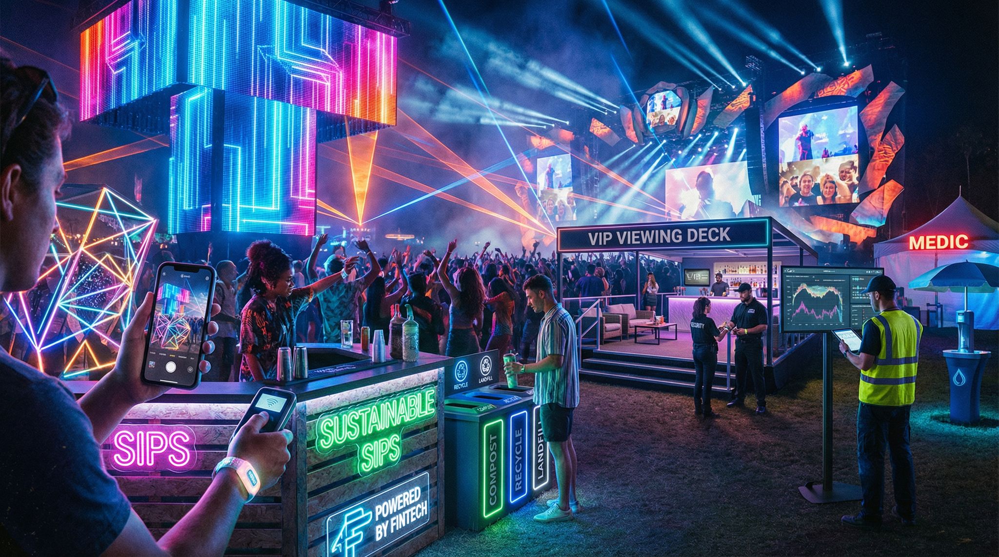
Crucially, an effective brand system balances that charming sense of place – the regional, rustic character that gives your festival personality – with modern needs like readability, accessibility, and adaptability. The Stagecoach Festival, produced by Goldenvoice in California, provides a great example. Its design language merges time-honored Western symbols (think weathered leather textures, denim backgrounds, vintage type) with contemporary touches like neon signage and cutting-edge stage visuals linking nostalgia with modern tech. The result is a vibe that’s nostalgically country and easy to navigate for today’s crowds. Attendees marvel at the atmosphere but also subconsciously benefit from the clarity: they see the big cowboy-boot icons denoting the dance tent, or they recognize that the same shade of orange on a flag means “cowboy campground” across the grounds. Consistency breeds familiarity, and familiarity reduces confusion.
Finally, keep your brand system alive. Treat it as a dynamic part of your festival planning. After each event, gather feedback: Did people struggle to find information? Were some signs hard to read at night? Use those lessons to refine the guidelines for next time. Perhaps you discover that your beautiful vintage-script stage signage looked great in daytime but was unreadable once the sun set and the lights hit it – next year, you might print stage names in a bolder font or add backlighting. Continuous improvement is the mark of a seasoned festival producer.
In the end, designing a “rustic meets readable” brand system for a country festival is about sending a warm hug of local charm through every poster and post while keeping things crystal clear. It’s a balancing act of art and practicality. But when you get it right, your festival’s identity will shine through the dust and sun, your audience will feel at home and informed, and your whole team will run things more smoothly. As veteran festival organizers like to say, a good system calms chaos – and nowhere is that more true than in the beautiful chaos of a music festival.
Frequently Asked Questions
How do I choose the best fonts for a country music festival?
Select typography that balances regional authenticity with legibility by pairing decorative, rustic fonts for headlines with clean sans-serifs for body text. Ensure high contrast between text and background, such as dark navy on dusty yellow, to maintain readability under bright sunlight and meet accessibility standards.
What are effective icon designs for country music festival signage?
Effective country festival icons utilize recognizable symbols like cowboy hats, boots, and guitars to communicate location and function instantly. These graphics should feature bold silhouettes and consistent styling to ensure visibility from a distance, helping attendees navigate the event environment regardless of language barriers.
How do I ensure festival signage is readable in bright sunlight?
Ensure outdoor signage remains legible by using high-contrast color combinations, such as white text on dark backgrounds, and opting for matte finishes to reduce glare. Designers must test full-size samples in direct midday sun to verify that text does not fade or become unreadable due to reflection.
Why is a consistent brand system important for music festivals?
A consistent brand system builds trust and recognition by ensuring every touchpoint, from tickets to stage banners, feels cohesive. This visual unity helps “calm the chaos” of a busy festival environment, allowing attendees to instantly recognize official communications and navigate the venue with greater ease.
Which colors work best for outdoor festival signage in dusty environments?
Dark, saturated colors like black, deep blue, or bold red retain visibility best in dusty outdoor environments. Light colors such as pale yellow or gray often disappear once coated with dust, so designers should prioritize high-contrast combinations and durable, weather-resistant materials for longevity.
How should organizers integrate sponsor logos into festival branding?
Integrate sponsor logos by creating specific design templates that align with the festival’s aesthetic, such as using monochrome white logos on dark, rustic backgrounds. This approach ensures partner visibility without disrupting the event’s visual identity, making sponsor banners feel like a natural part of the festival family.
How do festival branding colors differ between screen and print?
Branding colors often appear vibrant on backlit screens but may look dull or different when printed on materials like paper or fabric. Organizers must define specific color codes for both digital (HEX/RGB) and physical (CMYK) formats and conduct test prints to ensure the intended rustic aesthetic translates correctly across all media.
What does “rustic meets readable” mean in festival design?
“Rustic meets readable” refers to a design strategy that balances regional country charm with clear communication. It involves using thematic elements like wood textures and western fonts to evoke a specific vibe while strictly adhering to accessibility standards, ensuring information remains legible amidst the noise, crowds, and weather of a festival.


