Introduction
Outdoor festivals — especially country music festivals out on sunny fields and dusty fairgrounds — present unique challenges for signage and typography. The blazing midday sun can wash out colors and turn even bold letters invisible with glare. Dust, mud, and rough weather can quickly deteriorate flimsy signs or obscure fine print. Effective festival wayfinding requires sun-legible signage and dust-proof typography that hold up in real-world conditions. Attendees in cowboy boots and sun hats shouldn’t have to squint or search for directions; they should spot clear signs at a glance, whether it’s high noon or after dusk. This guide draws on decades of festival production wisdom to ensure your event’s signage is easy to read in any light, on any terrain, keeping your crowd safe, informed, and happy.
Use High-Contrast Typography on Sturdy Materials
One of the golden rules for festival signage is using high-contrast text and heavy-duty materials. High contrast means bold, clear lettering that stands out starkly from its background. For example, black or deep navy text on a bright white or neon yellow background is highly visible under intense sun. In fact, many signage standards recommend at least a 70% contrast difference between text and background for signage, so aim to exceed that minimum. Many country music festivals in desert climates (like California’s Stagecoach Festival) choose black letters on yellow signage because that combination remains readable even with sunlight glare and a coating of dust. Avoid subtle colour pairings or lightweight fonts that disappear at a distance. Instead, opt for thick sans-serif typefaces with strong lines – these are easier to read quickly from afar and are more “dust-proof” (able to remain legible if dirt settles on the sign).
Equally important is the substrate – the physical material of your signs. Outdoor festivals demand sturdy, weather-resistant materials. What good is high-contrast text if it peels off or washes out? Budget for substrates like PVC board, aluminium dibond panels, weatherproof canvas, or heavy-duty coroplast. These can withstand UV rays, wind, and rain without disintegrating. Industry suppliers emphasize that outdoor signs must endure harsh sun, sudden rain, and wind while staying legible. For instance, the Tamworth Country Music Festival in Australia (staged during hot summer) prints its wayfinding signs on UV-resistant poly materials to prevent fading in the sun. In muddy UK festivals like Glastonbury, organizers mount directional signs on waterproof plywood and tall stakes, keeping them above ground muck and intact through downpours. Laminate or waterproof-coat your prints so that moisture or dust can be wiped off. Durable grommets and reinforced edges on banners prevent tearing in high winds. A little extra spend on robust materials saves a lot of headaches during the event – your signs won’t droop, tear, or become illegible after a day of festival wear-and-tear.
When organizers ask me about the best font for festival environments, I always steer them away from novelty or overly stylized typefaces. For critical wayfinding, you want highly legible, heavy-weight sans-serif fonts like Helvetica Now, Futura, or Montserrat. These typefaces offer excellent readability from a distance and maintain their structural integrity even when printed on textured substrates or viewed through a haze of stage smoke and dust.
Test Signage in Noon Glare and at Dusk
Designing festival signage isn’t done once the graphics look good on a computer screen. Testing in real lighting conditions is essential. A sign that seems perfect indoors might become unreadable under the noonday sun or get lost in the shadows at dusk. Wise festival producers take prototypes of their signs on-site beforehand and view them at different times of day. Set up a sample directional sign outside around noon – do the colors wash out or become blindingly reflective? If you’ve used a glossy finish, the direct sun might glare off it, making the text hard to read. Many veteran organizers now prefer matte finishes or non-reflective coatings on signage to reduce glare. For example, a Midwest country fair learned that laminated gloss maps became mirror-like at mid-day, so they switched to matte vinyl prints the following year to improve legibility.
Equally, check signs during twilight and nighttime. At dusk, lighting levels drop dramatically; colors that looked distinct in daylight may all fade into grey. If your festival runs into the evening (as many do, especially multi-stage music festivals), walk the grounds after sunset with only the site’s ambient lighting. Do directional signs still stand out? You might find that the dark blue text you chose is nearly invisible in low light, or that colored zone markers aren’t distinguishable under orange floodlights. Adjust your design or add lighting as needed based on these tests. This practice of testing and tweaking under real conditions can catch issues before they affect thousands of attendees. It’s much easier to enlarge a font or swap a color during planning than to watch confused crowds wander because a sign failed when the sun went down.
Planning a Festival?
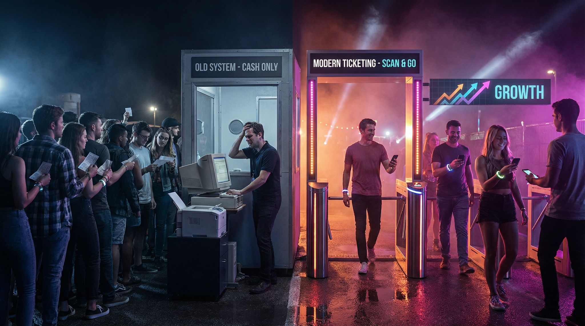
Ticket Fairy's festival ticketing platform handles multi-day passes, RFID wristbands, and complex festival operations.
Backlight Critical Signs (But Don’t Blind People)
For festivals that continue after dark – which includes many country music festivals with evening headliners – illumination is key for certain signs. However, there’s a right way to light up signs that doesn’t inadvertently blind your attendees. The goal is to make critical information visible at night without creating harsh glare or bright lights shining directly into people’s eyes.
Backlighting important signage is an effective solution. This means placing a light source behind or within the sign so that the text is illuminated from behind the surface. Think of the glowing exit signs in theaters or the way a street sign reflects a car’s headlights – both ensure visibility in darkness. At large festivals like Boots and Hearts in Canada, organizers use softly backlit map kiosks and LED-lit tower signs to help guests navigate after sunset. Consider backlit acrylic signs for info booths, or LED strips behind translucent directional signs. Another approach is external lighting with shields: for instance, mounting a hooded light above a sign that shines down on it (like a classic street lamp) which lights the text but hides the bulb from direct view.
Be mindful of brightness and color temperature. A blinding floodlight can ruin night vision and annoy festival-goers (imagine a bright white light dazzling tired eyes). Instead, use diffused lighting or warm-toned LEDs that make the sign readable without excess brightness. Test different intensities – you want just enough light to read the sign from the necessary distance. Additionally, power sources must be planned: if your sign isn’t near a power run, consider portable solar-powered lights or battery-operated LED panels. Prioritize backlighting for safety and directional signs: entrances and exits, emergency information, first aid and water stations, and “You Are Here” map boards. When people feel secure finding their way at night, they’re more likely to enjoy the evening shows and less likely to get lost or frustrated.
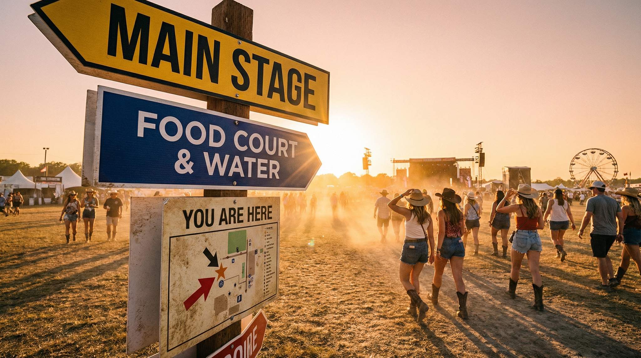
Place “You Are Here” Maps at Key Nodes
Even with great directional signs, festival sites can be sprawling and confusing, especially for first-timers. A proven wayfinding strategy borrowed from theme parks and malls is to install “You Are Here” map boards at strategic points. In a festival context, think of nodes as major decision points or congregation areas: entrances, intersections of major walking paths, near stages or food courts, campground entrances, etc. These are perfect spots to place a large site map labeled with a prominent “You Are Here” marker. This simple addition helps orient attendees instantly – it’s a reassurance that they can figure out where they are and how to get where they want to go.
For example, the CMA Music Festival in Nashville (which spans several city blocks and venues) places big maps at entry gates and shuttle stops so fans can see all stage locations relative to where they stand. At the Glastonbury Festival in the UK, you’ll find colorful “You Are Here” signs near each major zone entrance; given the event’s massive size, these maps become lifesavers for navigation. When designing your map, make it large, colourful, and easy to read: include clear icons for stages, toilets, medical tents, water stations, and other key amenities. Mark the current location with a big star or arrow and the text “You Are Here” in a contrasting color. It can be helpful to orient the map in the direction the viewer is facing (known as “heads-up” orientation) – this way, what’s to the left of the map is also to the attendee’s left in real life, which minimizes confusion.
Don’t forget to waterproof and sturdy-up these map stations as well. They often become gathering points where people will stand and discuss directions, maybe even leaning on them, so build them solidly. Illuminate the maps at night if your festival runs late, using the backlighting principles mentioned earlier. A well-placed “You Are Here” node not only reduces the number of lost attendees, it also enhances their sense of exploration – festival-goers feel more confident wandering off to discover new stages or vendors when they know they can always reorient themselves at the next map.
Need Festival Funding?
Get the capital you need to book headliners, secure venues, and scale your festival production.
Establish a Clear Information Hierarchy for Complex Displays
As part of your design for a summer music festival, you often need to showcase performers, set times, and box office ticket info all in one place. With so many elements in play, how can you help your audience focus? The secret is strict information hierarchy. Use scale, color blocking, and negative space to guide the attendee’s eye. Make the stage name or current day the largest element (the anchor), followed by performer names in a bold, medium-sized font, and set times in a lighter or smaller weight. Group related details—like VIP upgrade pricing or box office hours—inside distinct visual containers or colored boxes. By breaking dense scheduling data into digestible, scannable chunks, you prevent cognitive overload and keep the crowd moving efficiently.
Prioritize Accessible Signage Across All Venue Sizes
Whether you are producing a sprawling 100,000-cap outdoor event or looking for the best materials for accessible signage in small DIY music venues, ADA compliance (or your local equivalent) is non-negotiable. Accessible music festival signage must include tactile characters, Braille, and non-glare finishes for permanent or semi-permanent installations like restrooms and medical tents. For independent promoters and DIY spaces operating on tight budgets, materials like matte-finished acrylic, routed PVC, or even high-density urethane (HDU) offer cost-effective, compliant solutions. These substrates are rigid enough to support tactile lettering while remaining affordable to produce, ensuring that all attendees, regardless of visual ability, can safely navigate your event space.
Design for Boots on the Ground (Real-World Readability)
Finally, always remember the context: your audience is not viewing signage in a calm gallery; they are in a field, wearing boots, possibly sunburnt or rained on, and often juggling bags, drinks, or kids (sometimes not entirely sober). As noted in resources about navigating the Glastonbury Music Festival, these factors—rain, crowds, and tents—create a challenging environment. Reading should be easy even in these less-than-ideal conditions. This means designing for maximum real-world readability and convenience.
First, consider the height and angle of your signs. Signs that are too low might be blocked by crowds or even parked vehicles, and nobody wants to stoop down in mud to read a map. Position signs at eye-level or higher for an adult of average height (around 5 to 6 feet / 1.5–1.8 m off the ground for text). In crowded festivals, mounting directional signs overhead (like banners across pathways or tall signposts) can ensure they’re visible from a distance over people’s heads. For example, Stagecoach uses tall vertical signposts at busy crossroads so even a throng of cowboy-hatted fans can spot stage directions from afar. If your festival has a lot of milling crowds, double-sided signs (visible from both directions) or even rotating signs can help catch attention from any approach.
Next, think about font size and wording. As a rule of thumb, letters need to be large enough to read from the typical distance an attendee will see the sign. A directional arrow sign on a pathway might be read from 10–20 meters away, which calls for big, bold letters (at least a few inches tall in print). Keep language on signs short and intuitive: “Restrooms” with an arrow, “Main Stage ?” or universally recognized icons (e.g. the classic fork-and-knife for food, tent icon for camping). In multilingual settings or international festivals, consider dual-language signs or simple pictograms to communicate across language barriers. The key is instant recognition – an exhausted festival-goer should not have to decipher jargon or tiny print.
Also, account for environmental grime. In dusty or muddy terrain, cleanliness becomes part of readability. If dust is heavy (like at Nevada’s Burning Man or any desert rally), station volunteers or staff to wipe off critical signs periodically, or design signs that naturally shed dust (using slick surfaces or downward angles). “Dust-proof typography” also means choosing letter styles that remain legible even if a bit obscured – for instance, solid block letters rather than thin outlined text that could fill in with dirt. In rainy conditions like some European festivals, mud splashes are inevitable – so maybe avoid pure white backgrounds near ground level, or you’ll have illegible brown smears by day’s end. Some organizers in muddy environments use elevated chalkboards or LED screens under tents for things like schedules, because they can be updated and are less likely to get dirty than paper posters on a fence.
Lastly, embrace the perspective of your attendees: walk the routes as if you were a guest (ideally wear those boots!). Is every junction clear on where to go next? Are stage areas and exits clearly marked from a distance? If you find yourself wondering or backtracking, that’s a sign (pun intended) you need better signage there. Empathy and field-testing are a festival producer’s best tools — by experiencing the venue as festival-goers do, you can spot shortcomings in your wayfinding and fix them before showtime.
Frequently Asked Questions About Festival Signage
What is the best font for festival wayfinding and stage banners?
In my decades of production experience, the best font for festival environments is always a heavy-weight, highly legible sans-serif typeface like Helvetica Now, Montserrat, or Futura. For optimal music festival signage, avoid decorative or script fonts that become unreadable from a distance or when obscured by dust and stage smoke. Ensure you use generous kerning (letter spacing) so characters don’t blur together when viewed from 50+ feet away across a crowded field.
How do you organize complex scheduling and ticketing displays?
As part of your design for a summer music festival, you often need to showcase performers, set times, and ticket info simultaneously. With so many elements in play, you can help your audience focus by establishing a strict visual hierarchy. Make the stage name or day the largest anchor element, use bold medium fonts for artists, and lighter weights for times. Grouping related details into color-blocked containers prevents cognitive overload and keeps foot traffic moving efficiently.
What are the best materials for accessible signage in small DIY music venues?
For independent promoters needing ADA-compliant solutions on a budget, the most effective substrates include matte-finished acrylic, routed PVC, and high-density urethane (HDU). These materials are cost-effective, reduce glare, and are rigid enough to support the tactile lettering and Braille required for accessible venue navigation, ensuring compliance without breaking the production budget.