Introduction
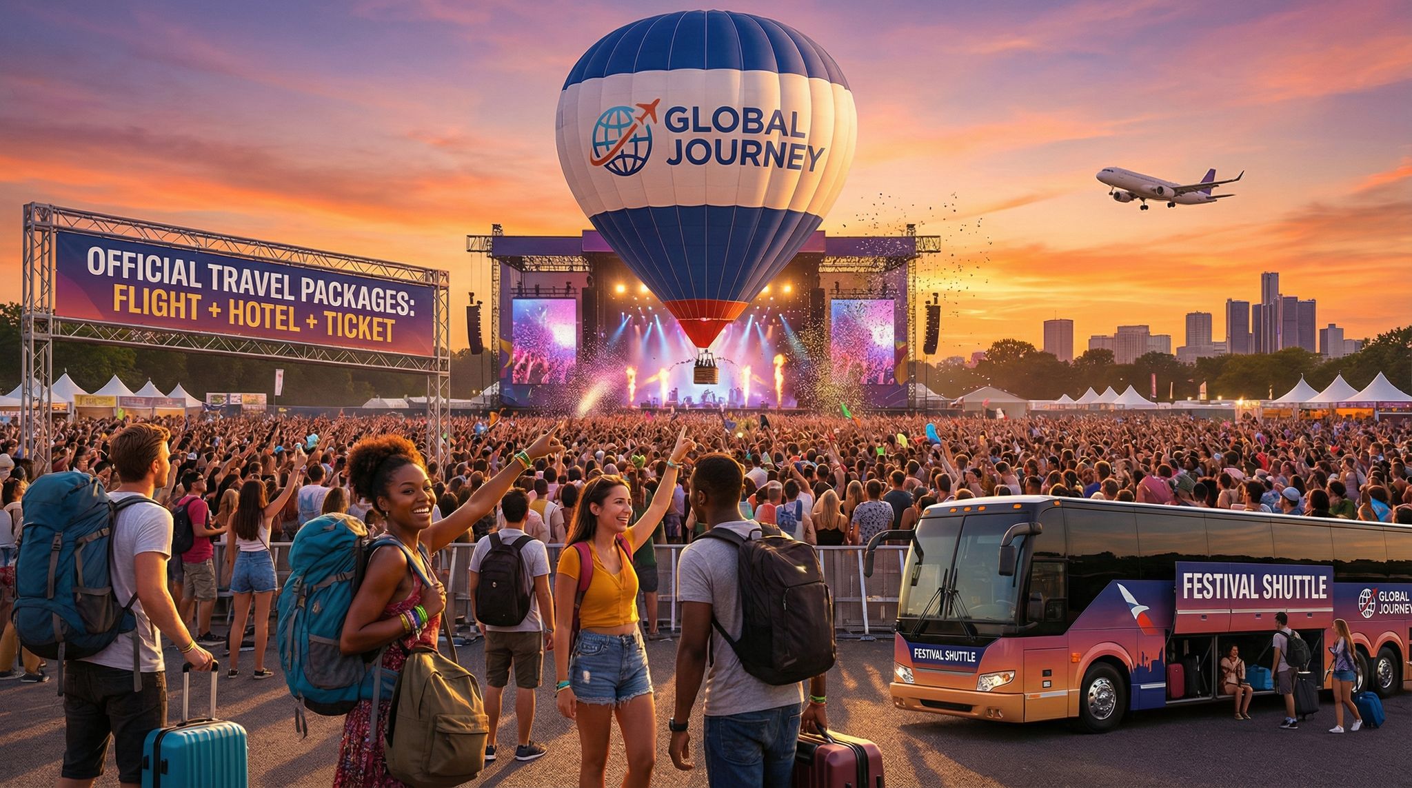
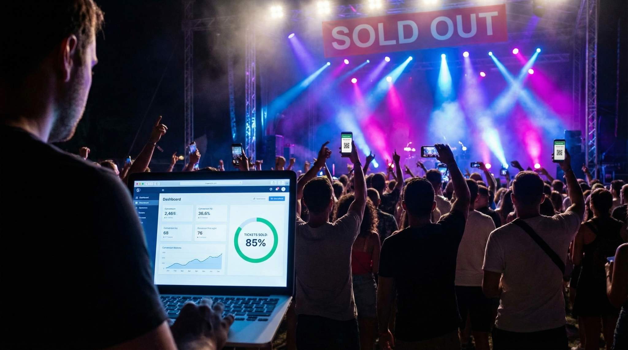
Every marketing campaign drives a flood of clicks to your event page – but how many of those clicks actually turn into ticket sales? In 2026, digital ad costs are high and privacy changes make retargeting harder, so converting existing web visitors is mission-critical. Whether you’re promoting a 200-person indie gig or an 80,000-strong festival, improving your website’s conversion rate means more tickets sold without spending extra on ads, effectively maximizing revenue from your existing payment platform traffic and segmenting your event marketing strategy for 2026 success. This guide will show event marketers how to optimize event landing pages, ticketing pages, and checkout flows to turn more curious visitors into confirmed attendees. We’ll share actionable tactics – from persuasive copy and urgency cues to mobile-friendly design, faster load times, and trust signals – plus real examples of small shows and large festivals that boosted their conversion rates through smart A/B testing, streamlined UX, and localization.
By implementing these conversion optimization strategies, event organizers can maximize ticket sales from their existing traffic, dramatically improving ROI on every marketing channel by understanding conversion rates on online payment platforms. Let’s dive into the step-by-step tactics that will help you turn clicks into tickets in 2026.
Crafting High-Converting Event Landing Pages
Your event landing page is often the first point of contact for potential attendees. A well-crafted page can take visitors from “looks interesting” to “I’ve got to be there.” This section covers how to design an event page that grabs attention and drives action.
Focused Headline & Compelling Event Copy
In 2026, attention spans are short – you have mere seconds to convince a visitor your event is unmissable. Start with a clear, compelling headline that highlights the main appeal of your event (artist name, unique experience, date or location) and creates urgency. For instance, a headline like “One Night Only: DJ Apex Live in London – Tickets Going Fast!” immediately delivers the what, when, and urgency. Follow it with punchy copy that conveys the event’s value proposition and vibe. Use sensory language and power words that resonate with your target audience (e.g. “immersive soundscapes,” “legendary reunion show,” “limited VIP experience”). Keep the messaging laser-focused on driving ticket purchases – avoid cluttering the page with unrelated info or too many goals, as seen in creating high-converting event landing page examples. Experienced event marketers know that a landing page should have one primary call-to-action: getting the visitor to start the ticket purchase by focusing on a single conversion goal.
Data-Driven Event Marketing
Track ticket sales, demographics, marketing ROI, and social reach in real time. Exportable reports give you the insights to make smarter decisions.
Tips:
– Front-load the excitement: Put the biggest draw (headline act, headliner, or unique selling point) right at the top in bold text.
– Use urgent language carefully: Words like “today,” “limited,” and “last chance” can prompt action, but use them truthfully (more on ethical urgency later).
– Match audience tone: Tailor the wording to your demographic (a family festival may use a friendly tone, while a tech conference might be more professional).
Engaging Visuals and Clear CTAs
Humans are visual creatures – strong imagery or video can immerse visitors in the event experience from the start. Use high-quality images of the performers, venue, or past event highlights to spark interest. Many festivals use short hype videos or hero images that convey the energy of the crowd. Ensure visuals support conversion: avoid giant media files that slow the page (which hurts conversion, as we’ll discuss) and steer clear of images that don’t relate to the event. Overlay a clear call-to-action (CTA) button where it’s immediately visible without scrolling – typically “Buy Tickets,” “Register Now,” or a similar action phrase. The CTA should stand out in color and size. For example, use a contrasting button color and surround it with white space so it’s unmissable. Don’t bury the ticket purchase link amidst text; make it a prominent button or booking module.
Ready to Sell Tickets?
Create professional event pages with built-in payment processing, marketing tools, and real-time analytics.
If your landing page is separate from your ticketing page, include multiple CTA buttons throughout (after each section or when scrolling) to catch ready buyers at different points. Repetition helps – a visitor who scrolls to read details should always have a purchase button nearby when they’re convinced. Also, use directional cues (arrows or images of fans pointing toward the CTA) to subconsciously draw eyes to the action button. On mobile, design CTA buttons that span the width of the screen and are thumb-friendly to tap.
Social Proof and Trust Elements
Building trust on your event page is crucial – especially for first-time visitors who don’t know your brand or event. Social proof elements reassure people that this event is real and worth attending. Include attendee testimonials (“The most amazing night of my life – 5/5 stars!”), or quotes from media reviews if available (“Named Best New Festival by EDM Magazine”). If a past event sold out or has celebrity attendees, mention it. Showing real attendance numbers can nudge undecided visitors – e.g. “Join 5,000+ fans at the concert of the year!” or a live counter of tickets sold. Social proof taps into the fear-of-missing-out dynamic: if others are going, they don’t want to be left out, a key factor in adapting your 2026 event marketing strategy for last-minute rushes.
Trust elements are equally important to overcome skepticism. Nearly half of people judge a website’s credibility based on design and professionalism, which is crucial for preventing ticket page abandonment. That means your page should look modern and error-free – no broken links, misspellings, or grainy images that can erode trust. Clearly display the event date, location, and all essential details to show transparency. It also helps to highlight secure payment and refund policies early on the page. For instance, mention “Secure checkout powered by Ticket Fairy” or “100% refund guarantee if event is canceled” near the CTA. Logos of trusted partners or sponsors (especially known brands) can also lend credibility by association. If your event or venue has Covid-safety measures or other assurances, note those to remove doubts. The goal is to answer the visitor’s unspoken question: “Is this legitimate and worth my money?” right on the landing page.
Mobile-First Design Considerations
By 2026, a majority of ticket buyers browse on mobile devices, so your event page must be mobile-optimized from the start. A common mistake is designing a beautiful desktop site that turns into an endless scroll or jumbled layout on phones. Instead, use a responsive design that adapts to smaller screens: large, legible text, single-column layouts, and easy-to-tap buttons. Test that your headline and CTA are visible within the first one or two swipes on a phone – you don’t want key info hidden behind a collapsed menu or require excessive zooming. Also, minimize pop-ups or interstitials on mobile; anything that covers the screen or asks a user to “download our app” before they see event info will hurt conversion and likely prompt a quick exit.
Recover Lost Ticket Sales
Automated abandoned cart emails re-engage potential buyers at the optimal time, recovering lost sales and boosting your conversion rate.
Pay extra attention to mobile loading speed and performance (more on site speed later). Mobile users are often on the go or on slower networks, so heavy pages will lose them. In fact, about 53% of mobile visitors leave a site that takes longer than 3 seconds to load, according to website speed and page load time statistics and analyzing website load time and speed statistics. Ensure images are compressed for mobile, avoid auto-play videos unless necessary, and consider mobile-specific assets (like shorter videos or image carousels that don’t hog bandwidth). Design for “thumb-friendly” navigation: large tap targets for links and buttons, no tiny text links. Finally, test the page on multiple devices (iOS, Android, different screen sizes) to catch any rendering issues. A mobile-friendly event page not only improves conversion but also signals professionalism – a clunky mobile experience will undermine trust with today’s mobile-first consumers.
Optimizing the Ticketing Page & Purchase Path
Once a visitor clicks “Buy Tickets,” your ticketing page and purchase flow need to work flawlessly to capitalize on that interest. This is where the conversion funnel moves from awareness into action. In 2026, event attendees expect a smooth, user-friendly ticket selection process. Let’s look at how to streamline this stage.
Grow Your Events
Leverage referral marketing, social sharing incentives, and audience insights to sell more tickets.
Simplified Ticket Selection and Pricing
Have you ever been excited to buy tickets, only to land on a confusing ticketing page with too many options or unclear pricing? That confusion can be a conversion killer. The ticket selection page should present options in a clean, logical way so buyers aren’t overwhelmed. List your ticket tiers or categories clearly (General Admission, VIP, Early Bird, etc.) with concise descriptions for each. Use straightforward language – for example, “General Admission – $50 – Entry to all areas” or “VIP Package – $120 – Access to VIP lounge + 2 drinks”. If there are multiple dates or seating sections, consider a step-by-step selector (first choose date, then choose section or seats) rather than one giant list.
Also, display pricing transparently and upfront. Nothing causes “sticker shock” like hidden fees appearing only at checkout – surprise extra costs are the #1 reason online shoppers abandon their cart, a major factor in preventing ticket page abandonment due to hidden fees. It’s best to either include fees in the listed price or indicate “+$X booking fee” visibly. If your ticketing platform allows, show the total price per ticket including fees early on, so users aren’t scared away later. Being honest with pricing builds trust and reduces drop-offs from frustration.
Keep the page design uncluttered: plenty of white space and a clear hierarchy (e.g. use larger font or bold text for the ticket name and price, smaller for description). Limit the number of input fields or dropdowns here – usually just quantity selection for each ticket type is enough at this stage. Any additional options like add-ons or merchandise should be presented in a way that doesn’t distract from the primary action of selecting tickets. A common practice is to offer upsells (parking pass, merch pre-order) after the ticket is added to cart or on a confirmation page, so the buyer’s flow isn’t interrupted mid-purchase.
Using Urgency Cues at Point of Sale
The ticketing page is a prime place to gently remind visitors that tickets are limited and time-sensitive – tapping into urgency and FOMO (fear of missing out) can nudge fence-sitters to act. Many successful events use real-time cues like “Only 20 tickets left at this price!” or “Early Bird ends in 2 days!” right next to the ticket options. These cues create a sense that if the visitor delays, they might lose out on a deal or even the ticket itself, so capturing every late sale with strategic pivots is essential. For instance, if you have tiered pricing, show a progress bar or note like “80% sold – Almost Gone!” for the lower-priced tier. This not only pushes people to finalize their purchase but can also encourage upsells (if early bird is sold out, they see others are buying and will take the next tier).
However, ethical use of urgency is key. Only display truthful information – if you have plenty of tickets left, don’t fabricate scarcity as it can backfire and erode trust if people catch on. Instead, find real angles to highlight urgency: upcoming price increases, limited VIP spots, or deadlines (e.g., “Buy by Friday to get your ticket in the mail in time”). A countdown timer can be effective when a deadline is real – for example, a timer showing “Early bird prices expire in 04:12:36” (hours:minutes:seconds) can spur action and help in reigniting ticket sales during mid-campaign slumps. One festival found that adding a countdown clock for the early-bird sale final 48 hours lifted conversion during those days by around 15% (as indecisive visitors realized the deal was about to vanish).
Another powerful motivator is social proof right in the purchase flow. Some ticketing systems (including Ticket Fairy) show how many people are viewing or how many have bought recently (“15 people purchased tickets in the last hour”). Seeing that momentum can reassure buyers that this is a popular event and they should join in. It’s the digital equivalent of a busy box office line – if others are lining up, it must be worth it.
Minimizing Distraction and Friction
At the ticket selection stage, your goal is to funnel the visitor straight to checkout with as little friction as possible. Remove any unnecessary navigation or external links that could lead them away. For example, if the ticketing page is embedded on your event site, avoid having a full website menu at the top – you don’t want someone clicking “Gallery” or “Blog” and drifting off. Many organizers use a simplified landing page or a dedicated ticketing microsite for this reason, keeping the user’s focus on the purchase.
Distraction can also come from too many choices. If you offer dozens of ticket types or add-ons all at once, consider simplifying the presentation (group them or use progressive disclosure where the user clicks “More options” to see less popular add-ons). Highlight the most popular option as a “Recommended” or default selection to guide users – paradoxically, guiding choices can increase overall conversions by reducing choice paralysis.
Additionally, make sure the “Add to Cart” or “Next” button is highly visible and not buried. Use a sticky footer on mobile that has the checkout button always accessible once a ticket is selected. Provide immediate feedback when a user selects tickets – e.g., show the cart summary updating in real time (“2 x GA Tickets added”) so they know the click worked. Ambiguity at this step can cause people to hesitate or double-click.
Finally, consider implementing a short cart reservation window once tickets are selected (e.g., “Tickets reserved for you: 10:00 minutes remaining to checkout”). This does two things: it introduces a bit of urgency to complete the purchase, and it assures them their tickets won’t vanish while entering details. Many large events do this to handle high demand periods. If you do use a timer, make sure it’s generous enough (a few minutes might be too short and cause panic – around 10-15 minutes is common) and clearly visible. This technique can significantly reduce drop-offs during checkout, especially when people know they have a secure window to finish payment.
Streamlining the Checkout Process for More Conversions
The checkout page is where the money changes hands – and also where a huge chunk of potential buyers drop off. Cart abandonment rates average around 70% in online shopping, based on analyzing cart abandonment rate statistics for 2026, and ticket sales are no exception. This section shows how to remove friction in checkout so more folks who start buying actually complete their order.
Reduce Form Fields and Steps
Every extra field a user has to fill or extra step they must click through gives them another chance to abandon the purchase. To maximize conversions, simplify your checkout forms to only the essentials needed to process the order. For ticket sales, usually that’s name, email, and payment info. If you’re asking for postal address, phone number, or other details, consider whether they’re truly necessary. Many events skip mailing address unless physical tickets or merch will be shipped. The shorter the form, the less intimidating it looks. One study found that reducing form fields from 6 to 3 increased conversion rates, as users felt the process was quicker.
If your checkout is multi-step (e.g. Step 1: contact info, Step 2: payment, Step 3: confirmation), make sure to visually indicate progress (like a progress bar or “Step 2 of 3”) so users feel confident they’re nearly done. Otherwise, some may bail thinking it’s an endless process. Better yet, if your ticketing platform allows, move to a single-page checkout where all details are entered on one page and submitted once. Platforms like Ticket Fairy use a streamlined single-page checkout, which means fewer clicks and less waiting for page loads – leading to higher completion rates. Indeed, one ticketing provider reported that their one-page checkout resulted in significantly lower abandonment compared to the old multi-page flow (they saw checkout completion jump from ~60% to 75% after switching to a single-page design).
Also, pay attention to form design: use clear labels and placeholders (“Card Number”, “Email Address”) and mark required fields clearly. Autofill and wallet integrations (like allowing Google Autocomplete or Apple Pay) can pre-populate details, making the process faster for users. Every second saved in checkout matters – a two-second delay or confusion at this stage can cause users to give up. Remember, these are folks who already decided to buy, so losing them here is painful. An extremely streamlined form can salvage many of those almost-sales.
Guest Checkout (No Forced Account Creation)
Nothing derails an excited ticket buyer quite like being forced to “Create an Account” before purchase. In the heat of the moment, people want to grab their tickets and go – making them set up a username/password or verify an email is a conversion killer. In fact, about 24% of users abandon their purchase when required to create an account, highlighting the importance of preventing abandonment by allowing guest checkout. The solution is simple: enable guest checkout. Let people buy tickets by just entering their email and payment info, and optionally offer account creation after the purchase (e.g., “Create a password to save your details for next time”). This way, you remove a major barrier, yet still capture their info and can encourage account signup once they’ve secured their tickets.
Experienced event promoters recommend always keeping the door open for instant, frictionless checkout – especially for first-time buyers or one-off events where users may not see the value in an account. If you’re concerned about collecting attendee data, rest assured you’ll still get the key info through the purchase form itself. You can tie the purchase to a new user ID behind the scenes without forcing the user to do extra work.
Real-world example: A local theater saw a noticeable jump in completed ticket purchases after removing the mandatory sign-up step. Their analysis found many mobile users especially dropped off at the registration page. Once they switched to guest checkout as default, their checkout conversion rate (the percentage of those who started checkout that finished it) climbed from about 55% to 70% – that’s nearly a 27% increase in actual ticket sales, achieved just by eliminating a hurdle.
Multiple Payment Options (Including Local Methods)
If a buyer has made it to payment, the last thing you want is to lose them because their preferred payment method isn’t available. Offering multiple payment options is a proven way to boost conversion rates. At minimum, support all major credit and debit cards (Visa, Mastercard, Amex) and a widely used alternative like PayPal. But to really maximize conversions, especially for international events, consider local and alternative payment methods. For example:
– Digital wallets: Apple Pay, Google Pay, and Samsung Pay enable one-tap purchases on mobile – extremely convenient and fast (which means less chance to abandon). If your audience is tech-savvy or on mobile, wallet payments can significantly improve conversions.
– Buy Now Pay Later: Services like Klarna or Afterpay (if appropriate for your ticket price) let attendees split payments and can increase conversion for higher-priced festivals or multi-day passes.
– Regional methods: Cater to your audience geography. For instance, in the Netherlands, many customers prefer iDEAL bank transfers; in Germany, direct debit and invoice payments are popular (one report showed only ~10% of online transactions in Germany were via credit card, emphasizing the need for increasing online conversion with local payment methods). In China, WeChat Pay and Alipay are dominant for online purchases, whereas in Brazil, Boleto Bancário (cash voucher payments) is common. If you want to sell internationally, integrating these local methods can be game-changing.
Offering the top 2-3 payment methods in each market you target can dramatically improve conversion. Research shows that providing the preferred local payment options can boost conversion rates by up to 30% in those regions by optimizing conversion rates on payment platforms. The logic is simple: people are far more likely to complete a purchase if they see a payment option they trust and regularly use. Conversely, if someone in a country doesn’t commonly use credit cards and that’s all you offer, they’ll abandon the purchase even if they want to buy.
As an example, a large international festival noticed many incomplete transactions from Asia on their site. They added Alipay and WeChat Pay for Chinese customers and saw their conversion rate for that segment jump – anecdotally by 50% more completed sales from China after implementing local payments. Similarly, offering an installment payment plan (Buy Now Pay Later) for a pricey multi-day pass can capture buyers who might balk at the upfront cost. The key is to know your audience and meet them where they are comfortable. The extra integration effort pays off in higher completed orders.
Trust Signals and Transparency at Checkout
By the time someone reaches the checkout form, they’re very close to buying – don’t give them any reason to doubt the transaction now. Displaying trust signals prominently on the checkout page can reassure users that their payment information is safe and that your ticketing process is reliable. These include:
– Security badges: Logos like SSL secure certificates (the padlock icon and “Secure Checkout” text), PCI compliance badges, or even familiar payment icons (Visa, MasterCard, PayPal) all indicate that the transaction is secure. Seeing these can reduce the fear of credit card fraud. For example, many e-commerce tests have found that adding a security seal or lock icon near the payment button increases conversion a few percentage points by easing security concerns.
– Privacy reassurance: A short note like “We value your privacy and will never share your information” or a link to a concise privacy policy can help, especially in the age of data protection regulations. Attendees want to know their email won’t be spammed or data misused.
– Refund policy / guarantee: If you offer refunds (even partial) or a “ticket protection” option, mention it at checkout. A statement such as “100% refund provided if event is canceled/postponed” can remove the risk hesitation, particularly for high-priced tickets or events that might be impacted by travel restrictions, etc. Knowing they won’t be left in the lurch if plans change makes buyers more confident to complete the purchase now.
– Contact info for support: Listing a customer support number, email, or chat for any issues during purchase shows that there are real people behind the event who can help. It’s a small trust builder that can tip the scales for someone nervous about clicking “Pay Now.” Even labeling your checkout button “Pay Securely Now” adds a subtle reassurance.
Transparency is also critical. At the final review stage, clearly show the total charges, including any taxes or fees, before the user enters payment details. No one likes hidden fees revealed after putting in card info. Be upfront to avoid last-second cart abandonment. If possible, allow buyers to review and confirm their ticket details and total price on a summary page before finalizing – this aligns expectations and builds trust that they are getting exactly what they expect.
One more tip: leverage testimonials or trust statements on checkout. It might seem odd, but even a small line like “Join 5000 happy ticket buyers – our secure checkout is trusted worldwide” or a last testimonial (“Can’t wait for this event! – @User”) in the sidebar can maintain excitement and confidence through the final step. The checkout page doesn’t have to be sterile; it can still remind them why they’re making a great choice.
To put these best practices in perspective, here’s a quick overview of common conversion killers during checkout and how to fix them:
Common Causes of Checkout Abandonment and How to Fix Them
| Conversion Killer | Impact on Sales | Solution to Implement |
|---|---|---|
| Surprise fees at checkout | Causes “sticker shock” – top reason for abandonment, as noted in preventing ticket page abandonment (up to ~50% drop-off) | Be transparent from the start: include fees in upfront price or show a fee breakdown before payment. |
| Forcing account creation | ~24% of users abandon when required to sign up, according to preventing ticket page abandonment | Enable guest checkout; make account optional post-purchase for those who want it. |
| Slow or complicated checkout | Every extra step or second can cost conversions (each 1s delay can cut conversions 7–20% based on website load time statistics and website speed and page load time statistics) | Use one-page checkout; minimize form fields; optimize page load and autofill details. |
| Lack of trust signals | Nearly 17% abandon if site seems untrustworthy, a key factor in preventing ticket page abandonment | Show security badges, SSL lock icon, and clear refund/privacy policies to reassure buyers. |
| Limited payment options | Users may quit if they can’t pay their preferred way | Offer popular local payment methods (PayPal, wallets, etc.) and global cards to accommodate everyone by optimizing conversion rates on payment platforms. |
Addressing the issues above can plug the leaky holes in your ticketing funnel and significantly increase the percentage of visitors who complete their purchase. In essence, make checkout as quick, easy, and worry-free as possible – think of it like greasing the slide for your customers straight to the “Thank You for Your Order” page.
Optimizing for Mobile Conversions
Mobile deserves special attention in any conversion discussion, because more and more fans are buying tickets directly from their phones. A clunky mobile experience can silently kill your ticket sales – users won’t convert if the site doesn’t work well on a small screen. Here’s how to ensure your mobile visitors turn into ticket buyers.
Mobile-Responsive Design & Layout
We touched on mobile design for landing pages earlier, but let’s reinforce: your entire ticketing flow – from event page through checkout – must be mobile-responsive. This means the layout adapts to different screen sizes and orientations seamlessly. Test how the ticket selection and checkout forms look on a typical smartphone. Are fonts large enough to read without zooming? Do form fields fit on screen or do they get cut off? Do users have to horizontal scroll (they shouldn’t) or pinch-zoom (avoid it)? If any element requires awkward zooming or scrolling, adjust your CSS or use a mobile-specific template.
A pro tip: design mobile-first. Start by making sure the core content and CTAs display perfectly on a 375px-wide screen (common smartphone width) – including using mobile-friendly fonts and button sizes. Then scale up the design for desktop. This approach often surfaces what matters most (since mobile forces simplicity) and helps prioritize crucial elements, which improves conversion on all devices. Remember that on mobile screens, less is more. Use shorter copy and expandable sections for details (like an accordion for FAQ) so that the page isn’t overly long by default. Hide any decorative elements that aren’t necessary. Users on phones often skim, so use clear headings, icons, and bite-sized info blocks to guide them to the purchase.
One-Tap Payments & Autofill
Mobile users love convenience – and tiny on-screen keyboards mean lengthy typing is a conversion barrier. To improve mobile conversion rates, implement one-tap payment options and form autofill wherever possible. For example, enabling Apple Pay or Google Pay on your checkout allows many users to buy tickets with a fingerprint or face scan, without manually entering card details. This not only speeds things up but also leverages the security and trust of those platforms (the user doesn’t have to share card numbers with yet another site, which can be a relief). Ticketing platforms that integrate with these mobile wallets often see a bump in their mobile checkout completion, especially for impulse buys or last-minute sales when speed matters.
Even if mobile wallets aren’t used, utilize browser autofill for addresses and credit cards. Most modern mobile browsers can recall a user’s info – ensure your form field names are standard so that autofill suggestions appear. For instance, using the <input type="email" name="email"> will cue the phone to suggest the user’s stored email. Little touches like automatically spacing out credit card number entry or jumping to the next field after 4 digits can also reduce friction on mobile.
Another feature to consider: SMS and messaging app integrations for checkout. Some events send a secure payment link via SMS or WhatsApp that opens directly to a pre-filled checkout on mobile – this can be useful for recovering abandoned carts or for social media promotions. Meeting your audience in the communication channels they use on mobile can smooth the path to purchase (for more on reaching audiences through messaging apps, see strategies in other marketing guides). The simpler and faster you make the payment on a phone, the more likely the sale will happen before the user gets distracted by a notification or decides to “do it later”.
Avoiding Mobile Pitfalls
Certain design elements that might be minor annoyances on desktop can be outright roadblocks on mobile. One such element is pop-ups. If a newsletter sign-up or promo pop-up covers the entire screen on mobile, many users will just exit (especially if the close button is tiny or hard to tap). It’s safest to disable unnecessary pop-ups for the mobile view during the ticket purchase flow. If you must have one (say, age verification for an 18+ event), make sure it’s easy to close and doesn’t repeatedly reappear.
Another pitfall: external links or app-switching. While it’s great to advertise your Instagram or an artist’s video, doing so on the purchase page can lead a mobile user away, possibly never to return. Keep outside links off the conversion path on mobile. Also, minimize any forced switches to other apps. For example, avoid a flow that requires the user to check their email for a confirmation code mid-purchase (on mobile, that means leaving the browser, and they might not come back). Streamline everything to happen in one session if possible.
Mobile users can also be more impatient with load times and glitches – in part because mobile connections vary and because multitasking is high (your buyer might be on the bus with spotty signal). As mentioned before, speed is king: a slow mobile site can double your bounce rate, according to website speed and page load time statistics. Use mobile performance testing tools to ensure your pages are lightweight. Consider deferring non-critical scripts and compressing images specifically for mobile. Even serving slightly lower resolution images to phones (which have smaller screens anyway) can shave off valuable seconds in loading.
Lastly, cater to the typical mobile use case. Many people buying tickets on mobile might be doing so during a short break or while multitasking. They might also be sharing the event with friends via their phone. So make sure your mobile page has an easy way to share or save (a share button to send the link via text or social app is a nice touch that can indirectly boost conversions via peer influence). And ensure that if they do share or leave and come back, their selections are saved (e.g., if they added 2 tickets to cart, it should still be in cart when they return). This ties into using cookies or local storage smartly for cart persistence on mobile sessions.
In summary, treat mobile users as first-class customers: optimize the design, remove friction, and test rigorously on actual devices. Often, improving mobile UX lifts not just mobile conversions but also your overall conversion rate, as it forces you to simplify and clarify your funnel for all users.
Speed and Performance: Every Second Counts
No matter how persuasive your copy or beautiful your design, it could all be for nothing if your site is slow. Page load speed has a direct impact on conversion rates – modern consumers simply won’t wait for a sluggish page, especially when buying tickets where excitement can turn to frustration quickly. Let’s examine why performance matters and how to improve it.
The Impact of Load Time on Ticket Sales
Numerous studies have confirmed the obvious: faster pages convert better. But the numbers are still eye-opening. For example, every one-second delay in page load can reduce conversions by anywhere from 7% to 20%, as shown in website load time statistics and website speed and page load time statistics. Users just won’t stick around – about 47% of people expect a web page to load in 2 seconds or less, and 40% will abandon if it takes longer than 3 seconds, according to website speed and page load time statistics. On mobile, as noted earlier, over half of visitors bail after 3 seconds, based on website load time statistics. The ticket buying process is time-sensitive in another way: if you’re running an on-sale, fans know tickets could sell out, so they may blame a slow site for losing their chance and give up.
Real-world anecdotes reinforce this. In late 2022, perhaps the most famous ticketing fiasco of all time occurred when a major ticket platform’s site crashed under unprecedented demand for a superstar’s tour presale, which involved reporting on the Taylor Swift Ticketmaster outage error. Millions of fans experienced errors and timeouts. The company had to cancel the public sale altogether, citing “extraordinarily high demands on ticketing systems” after a “chaotic and glitch-filled presale”, as detailed in analyzing the record-breaking website traffic. While most events won’t reach Taylor Swift-level traffic, the lesson is universal: if your infrastructure and website can’t handle surges, you’ll lose sales (and trust). Even on a smaller scale, think of times you clicked a link and the page hung – did you wait or did you close the tab and maybe try a competitor? Attendees will do the same.
On the flip side, improving speed yields tangible gains. One telecom company (Vodafone) improved its website load times by 31% and saw an 8% increase in sales, plus an 11% jump in the cart conversion rate, demonstrating the value of improving website speed to increase sales and prioritizing speed for better performance. Those are big revenue impacts for shaving off a few seconds. For event organizers, those few seconds could mean the difference between a visitor successfully buying a ticket or giving up and forgetting about it. Speed equals revenue. As an event marketer, it’s crucial to treat site performance as an integral part of your conversion optimization strategy, not an afterthought for the IT team.
Techniques to Boost Page Speed
Improving your site’s speed can get technical, but you don’t have to be a developer to oversee key enhancements. Here are concrete steps and best practices to make your event pages and checkout load lightning fast:
– Optimize images: Images are often the heaviest elements on an event page (they can make up 70-80% of a page’s weight), according to website speed and page load time statistics. Resize images to the maximum size they’ll be displayed (don’t load a 4000px photo if it only shows at 800px width) and compress them using modern formats (WebP, or optimized JPEG/PNG) without noticeable quality loss. Many tools can reduce image file sizes by 50% or more, which can cut load times significantly by compressing data to improve load speeds.
– Minimize third-party scripts: While that social media feed widget or fancy animation library might seem nice, each external script can slow your load (by adding server requests or executing code). Audit your event page for any scripts or plug-ins that aren’t essential. Remove what you can, and for what remains, use async or defer loading so they don’t block the main page content from rendering. For instance, if you have an embedded YouTube video or Instagram feed, see if you can use a static image preview that loads instantly, with the actual embed loading only when clicked or scrolled into view.
– Use a Content Delivery Network (CDN): A CDN hosts your static assets (images, CSS, scripts) on servers around the world, delivering them from the location closest to the user. This can drastically cut down download times, especially for global audiences. Many ticketing platforms or web hosts have CDN options built-in. By 2026, leveraging a CDN is standard practice for large events and festivals that draw international traffic – it’s how your site can load quickly whether the user is in New York, London, or Sydney.
– Enable caching: Ensure that repeat visitors (or even someone going from the event page to checkout) don’t have to reload all elements from scratch. Set proper cache headers so that common files (like your logo, CSS styles) are stored in the browser and reused on subsequent pages. This makes the user’s second page load much faster. Also consider server-side caching if your page has heavy processing – serving static pre-generated pages to most users instead of querying a database each time.
– Clean, efficient code: Work with your developers or platform to minify CSS and JavaScript (remove whitespace/comments, combine files where possible) and eliminate unnecessary code. Also, modern frameworks and updated libraries tend to be more performance-optimized, so keeping your tech stack up to date can help. For example, if your site is on an older content management system with slow plugins, consider a lightweight landing page builder or an updated template for the campaign.
– Monitor and test: Use tools like Google PageSpeed Insights, GTmetrix, or Pingdom to analyze your event pages. These will not only give you a speed score but also specific recommendations (like “enable text compression” or “eliminate render-blocking resources”). You might discover, for instance, that a huge font file is delaying your page render by 1 second – something you can fix by hosting it locally or preloading it. Continuous monitoring helps catch issues, especially when you update content. Set performance budgets (e.g., “landing page should load in under 2.5s on 4G”) and treat it as a requirement just like your marketing copy.
One more aspect of performance is reliability under peak load. If you anticipate surges (for example, when tickets go on sale at 10:00 AM Friday), talk to your ticketing provider or IT team about “load testing” and scaling. You might use a virtual queue or waiting room for extremely high demand events to avoid crashing (some ticketing systems automatically implement this if thousands hit at once). For most events, focusing on general site speed and good infrastructure will suffice. The bottom line: a faster site means less waiting for the user, which means fewer chances for them to drop off. By making pages snappy, you keep the excitement high – users can swiftly move from interest to purchase without frustration.
To illustrate the significance of page improvements, consider these example scenarios from A/B tests and optimizations:
Example A/B Test Results: Speed and UX Changes
| Conversion Test Scenario | Conversion Rate (Before) | Conversion Rate (After) | Uplift |
|---|---|---|---|
| Checkout loading time 5s vs 3s | 3.5% | 4.2% | +20% |
| No image optimization vs optimized images | 1.8% | 2.3% | +28% |
| Standard server vs CDN + caching | 2.0% | 2.4% | +20% |
| No mobile wallet vs Apple/Google Pay enabled | 1.5% | 1.7% | +13% |
(Above figures are illustrative, but they reflect trends seen when performance and mobile convenience improve. Even modest percentage gains translate to dozens or hundreds more tickets sold.)
The takeaway: never underestimate how much site speed and technical performance affect your ticket sales. In an age where people expect instant experiences, a slow or unstable site can silently eat away at your conversion rate. Conversely, a fast, smooth site creates a frictionless path to purchase, letting your marketing and content do their job converting interest into sales.
Leveraging Urgency and Scarcity (Ethically)
We’ve mentioned urgency and FOMO (fear of missing out) in passing – now let’s delve deeper into how psychology can boost your ticket conversions when used ethically. Urgency and scarcity tactics are among the most powerful conversion drivers because they speak to basic human impulses. But the goal is to encourage faster action without deceiving or angering your audience. Here’s how to do it right in 2026.
Limited-Time Offers and Early-Bird Deadlines
One classic way to drive ticket buyers to act now (and not “think about it and maybe forget”) is to offer limited-time pricing or perks. Early-bird tickets are a prime example: a discounted price available only until a certain date or quantity is sold. This creates a built-in deadline that you should promote prominently. When visitors see “Early bird pricing ends Sunday at midnight!”, it injects urgency – if they wait, they’ll pay more. Many events find that a large chunk of sales come right before an early-bird cutoff as indecisive buyers finally pull the trigger to avoid missing the deal, a strategy for adapting your event marketing strategy for last-minute rushes. From a conversion perspective, these deadlines are gold because they compel action within a timeframe rather than letting the visitor procrastinate indefinitely.
Use countdown timers to highlight these time limits (e.g. “72 hours left at $49 price” ticking down). If you have multiple phases (Early Bird, Phase 2, Last Chance), keep updating the messaging as each deadline passes to maintain urgency through the campaign. Staggered price tiers do double duty: they reward early purchase (which helps your cashflow and planning) and provide continual urgency milestones to talk about in your marketing. Just ensure the difference in value is clear and the deadlines are real. Nothing annoys fans more than fake deadlines (“Sale ends today!” and then the same price continues tomorrow) – that erodes trust and future effectiveness of urgency.
Apart from pricing, consider limited-time bundles or perks: e.g., “Buy in the next 48 hours and get a free merch item or drink voucher.” The extra bonus for acting now can be the nudge someone needs. One small music festival offered a free meet-and-greet raffle entry to anyone who bought in the first week; they noticed conversions in that week were 20% higher than a comparable period with no such offer – people didn’t want to miss the extra opportunity.
When using limited-time offers, be sure to communicate them across channels (email countdown reminders, social media posts about ‘24 hours left’, etc.), but also let the landing page do a lot of the work by visibly featuring the deadline. Urgency works best when the user can’t miss it – big, bold, and with a clear call to action to capitalize on it.
Low Inventory Warnings and Tier Scarcity
Another dimension of scarcity is limited quantity. If your event has capacity limits (which almost all do), showing when tickets are running low can push undecided folks to buy rather than risk a sell-out. For instance, messages like “Only 30 spots remaining” or displaying when a ticket tier is 90% sold out create a sense that tickets are finite (which they are) and could be gone soon. E-commerce giants use this to great effect (“Only 2 left in stock!”), and it works similarly for events.
Implementing inventory warnings can be straightforward if your ticketing system supports it – many do: they can display “Allocations Low” or “Last tickets!” automatically when inventory falls below a threshold. If not, you can approximate it manually by updating your site copy at intervals (e.g., if you know you’ve sold 450 of 500 tickets, you can say “<50 tickets left” in the description). The key is to be truthful and not claim scarcity too early or falsely. You don’t want someone coming back later to find “50 tickets left” turns into “100 tickets left” magically – that will break buyer trust. So use this when it’s legitimately nearing the end or in high-demand tiers.
Scarcity messaging can be combined with social proof: “Join over 4,500 who’ve already secured tickets – only a few spots remain!” This both validates the event’s popularity and warns them not to delay. Scarcity works on the principle that people value something more when it’s less available. Psychologically, a fan might have been on the fence, but learning that only a handful of tickets are left triggers the fear of missing the entire experience, which often outweighs their hesitation.
One caution: if you have different ticket categories, be mindful that highlighting one as nearly sold out might inadvertently steer everyone to that category (perhaps to their disappointment if it’s gone). A smart approach is to always offer an alternative. For example: “VIP tickets are almost sold out – secure yours or grab a General Admission pass before those are gone too!” This way, even if someone misses one option, they feel compelled to get the other rather than give up entirely.
Ethical FOMO: Transparency Matters
Using urgency and scarcity should never cross into manipulation or dishonesty. Ethical FOMO means you don’t lie about availability or deadlines – instead, you emphasize the genuine reasons to act now. Modern audiences are savvy and have grown weary of constant fake urgency (like endless countdown timers that reset – we’ve all seen shady sites do this). For event marketers, the long-term relationship with your fans is more important than a few extra rushed sales. If attendees feel tricked (“they said ‘last chance’ but tickets were available for weeks after!”), you could lose credibility and future sales.
So how to do it right?
– Be truthful and specific: If something is limited, give real numbers or real deadlines. Instead of a vague “Selling fast!”, say “500/600 tickets sold” or “Sales close at Friday 5pm for permit reasons” – real context that validates the urgency, as seen in calculating average cart abandonment rates. For example, when a New Year’s Eve event reached 90% capacity, the organizer sent emails and updated the site with “90% sold out – final 100 tickets remaining!” which was honest and extremely effective.
– Don’t overdo it: Constant flashing warnings and aggressive pop-ups (“3 others are looking at this ticket right now!”) can feel like dark patterns if they aren’t accurate and helpful. Use urgency elements in a balanced way on the page – highlight one or two key points (like a timer or a low-stock note). If your entire page is screaming at the visitor, it can actually have the opposite effect and raise skepticism or simply overwhelm them.
– Educate rather than pressure: Frame urgency in terms of benefits to the buyer. For instance, “Secure early-bird pricing now (you’ll save $20)” is a positive spin versus “Prices go up soon!” which is purely pressure. Similarly, “Tickets will likely sell out – get yours now to avoid missing out” is straightforward and about helping the fan not be left out, rather than a vague “Hurry! Going fast!” which might sound like a sales gimmick.
– Plan ethical strategies: Create real urgency through your marketing strategy (like limited early-bird quantities, bonus offerings, etc.) rather than needing to fib. The psychology of ticket sales and ethical urgency tactics is covered in detail elsewhere, but the rule is simple – never claim a false urgency. There’s almost always a genuine angle you can use, because tickets are time-sensitive products by nature (event dates pass, tiers sell out, etc.). Lean into those truths.
When done right, urgency and FOMO can dramatically shorten the purchase decision timeline for customers, boosting your conversion rate. If someone planned to “maybe buy later”, effective urgency tactics can convert that maybe into a yes now. And importantly, they’ll feel excited and relieved to have secured their spot, not duped. That positive buying experience means they’re also more likely to complete the purchase smoothly and even look forward to your future events (where you might employ these tactics again, so trust is key).
A/B Testing and Continuous Improvement
Conversion Rate Optimization (CRO) is not a one-and-done task – it’s an ongoing process of testing, learning, and refining. The year 2026 offers no shortage of tools to help event marketers experiment with their pages and funnels to squeeze out higher conversions. In this section, we’ll cover how to approach A/B testing for events and keep improving your results over time.
What to Test on Your Event Pages
Not sure where to begin with optimization? Start by identifying the elements of your landing page or checkout flow that could have the biggest impact if changed. Common test variables for event pages include:
– Headlines and copy: Test different angles – e.g., “Experience the Ultimate Beach Festival” vs. “Join 5,000 Fans at Sunset Beach Fest”. One might resonate more and drive higher engagement.
– Call-to-Action text: Simply changing a button text from “Buy Tickets” to “Get Your Ticket Now – Limited Availabilty” could lift clicks. Or test placement and color of the CTA button.
– Page layout: Does a simpler page with key details up top convert better than a longer scroll with more info? You might test a minimalistic design vs. a content-rich design to see which yields more ticket clicks.
– Images or media: Try an A/B test with different header images – one featuring a performer vs. one showing a crowd having fun. See which image leads to more conversions. Likewise, video vs. static image could be tested (sometimes videos boost engagement, other times they distract or slow the page – only data will tell for your case).
– Urgency elements: If you implement a countdown timer or a low-stock alert, you could A/B test having it vs. not having it (or test two versions of messaging) to quantify its effect on conversion rate. For instance, does “Sale ends in 2 days” yield significantly more purchases than a version of the page without that notice?
– Form design and steps: On the checkout side, test things like a 1-step combined form vs. multi-step checkout (if your tools allow toggling that), or even the order of fields. Example: some tests find asking for payment info before personal info can sometimes lead to higher completion – a user who has entered credit card details may be more “committed” to finishing. Use caution with such tests (ensure user-friendliness), but these can be very insightful.
It’s wise to focus on one test at a time for clarity. Choose the area you suspect has the largest room for improvement. For example, if your landing page click-through rate (to the ticketing page) is low, start there with headline or design tests. If lots of people start checkout but don’t finish, target the checkout flow with tests (like removing a step or changing messaging around the purchase). Each test should have a clear success metric – e.g., landing page tests measure click-throughs or conversion to add-to-cart, checkout tests measure completed transactions.
Running Effective A/B Tests
To run an A/B test, you create two (or more) variations of a page and randomly split traffic between them, then see which performs better on your chosen metric. There are a few pointers to ensure your tests actually yield useful insights:
– Use a reliable tool: There are many CRO and A/B testing tools on the market – Google Optimize (though check if it’s still available or its successor as Google transitions), Optimizely, VWO, etc. Some ticketing platforms might have built-in support for simple A/B tests of pages. If budget is an issue, Google Optimize (free) was popular, but since it’s sunset, Google Analytics 4 and other free frameworks might be an alternative for basic tests. Make sure whatever tool you use doesn’t slow down your site – speed is still priority.
– Test with adequate sample size: Don’t jump to conclusions with only a handful of visits. You need enough traffic and conversions on each variant to be confident the difference isn’t just luck. For smaller events, this might mean running a test for a longer period or across multiple events to gather data. There are online calculators for A/B test significance – use them to estimate how many conversions you need to detect a meaningful lift. For example, if your baseline conversion is 3% and you hope for a 20% relative improvement (to 3.6%), you might need a few hundred visitors per variant to be sure of the result.
– Split truly randomly and concurrently: Run the two versions at the same time if possible, not one after the other in different weeks (too many other factors could differ between time periods). Random assignment ensures visitor characteristics balance out. Watch out for things like returning visitors – ideally, a person should see the same variant if they come back (most tools cookie them to the variant). If someone sees variant A then later sees variant B, it can skew things. Most A/B platforms handle this assignment properly.
– Measure the right metric: For a ticketing funnel, the ultimate metric is tickets sold (or conversion rate to sale). But tests on the landing page may use interim metrics like click rate to the ticketing page. Be careful though – a change might increase clicks to the next step but could in theory reduce final purchases (if those extra clicks aren’t as qualified). So where possible, measure through to the final goal. Many marketers look at both – e.g., “Variant X got 15% more clicks to the checkout, and resulted in 10% more completed sales overall than Variant Y.” If something weird happens like more clicks but fewer end sales, dig in: it might mean the variant attracted more curiosity clicks but lower intent, which isn’t truly a win.
– Run one test at a time (per segment): If you run multiple overlapping tests on the same audience, their effects can interfere. However, you might run separate tests on separate segments (for instance, one test for mobile visitors and another for desktop at the same time) as long as there’s no overlap. Just avoid conflicting experiments that muddy the results.
Once you declare a winner (with statistical confidence), implement that change as the new default. Then you can move on to the next test. Embrace the mindset of continuous optimization – even if you hit a decent conversion rate, there are always ways to refine. Just be sure to document your test results and learnings, so you build a knowledge base of what works for your audience and what doesn’t.
In the privacy-first era of 2026, one challenge for measuring conversions is the reduced tracking capabilities (due to cookie restrictions and iOS privacy changes). Where possible, rely on your ticketing platform’s first-party data to judge conversions (like reports in Ticket Fairy’s dashboard, which aren’t blocked by browser privacy measures since the platform itself records sales). You can also use techniques from attribution in a cookieless world to ensure your A/B test outcomes are measured accurately, such as using UTM parameters or unique discount codes for each variant as a backup tracking method. The good news is A/B testing on your own site with first-party analytics is still effective – you’re measuring direct user actions on your site, which is data you own.
Iterating on Insights (Successes and Failures)
Not every test will be a winner. In fact, seasoned CRO experts will tell you many tests result in no significant change or even the variant performing worse than the original. But that’s valuable information too. It tells you what doesn’t resonate with your audience. The key is to iterate on what you learn. If a flashy new page design underperforms the original, analyze why – was it distracting? Did it hide some info users needed? You might follow up with a test that combines the best elements of both versions.
Treat conversion optimization as an ongoing cycle:
1. Research & hypothesize: Look at your analytics and user behavior (where do they drop off? How long do they stay? What feedback or support queries do you get?). Identify potential pain points or opportunities. Form a hypothesis like “I think removing the sponsor banner will reduce distraction and increase ticket clicks” or “I think highlighting the date and city in the headline will make the page more relevant and improve engagement.”
2. Test the hypothesis: Launch an A/B test or make a change and observe if you can’t A/B test (e.g., testing small scale or low-tech means might be sequential testing with caution).
3. Analyze results: Did conversion metrics improve? Check segmentation too – sometimes a change helps new visitors but confuses repeat visitors, for example. Are there clues in session replays or heatmaps (if you use tools like Hotjar) showing how users interacted?
4. Implement or ideate new: If it worked, great – roll it out. If not, archive that insight and consider a different approach.
Importantly, listen to qualitative feedback as well. After an event, if you survey attendees or monitor social media, see if anyone mentions the ticketing process. Sometimes people will say “site was slow” or “had trouble on my phone” – direct clues to issues. Or conversely, “checkout was super easy!” which validates what you did right. User testing (having a few people go through the process while you observe or using a user testing service) can also reveal friction points you hadn’t considered, which you can then address and test.
Continuous improvement also means staying informed. Keep an eye on general CRO trends and what other event websites are doing. Maybe in 2026 a new tech becomes common – for example, some events might start offering chatbot-based checkout (“buy via chat”) or integrating with voice assistants. If those start proving effective in conversions elsewhere, you might experiment with them too. The field evolves, and so do user expectations.
Finally, maintain perspective on the big picture: Conversion optimization should not be about tricking people into tickets they don’t actually want. It’s about reducing friction and communicating value so that those who are interested can easily follow through and join your event. By testing and iterating, you ensure your online experience is as enthusiastic and welcoming as your event itself. Campaign veterans will affirm – the best results come from many small improvements compounding over time. For example, a 10% lift here, 5% lift there, and another 15% lift from a big change can multiply to huge increases in final ticket sales. This data-driven approach to marketing is how many events achieve sold-out success even as advertisement costs rise – they’re squeezing more conversions out of the traffic they get.
Localization and Personalization for Global Conversion
If you’re marketing events across different regions or to diverse communities, a “one-size-fits-all” web page may not cut it. Adapting your content and conversion flow to the audience’s language, culture, and preferences – i.e., localization – can significantly improve conversion rates in those segments, as understanding why bilingual UX increases ticket conversion suggests. Similarly, personalizing the experience for different visitor types can yield better results than a generic approach. Let’s explore tailoring your funnel for maximum relevance.
Multi-Language Support
English might be the lingua franca of the internet, but not offering content in the local language can be a barrier for many potential attendees. If you’re promoting a show in Paris, a good chunk of your audience will respond better to French. In 2026, web users expect major events to speak their language – literally. Implementing a multilingual site or landing page can open the door to customers who might otherwise bounce due to language discomfort.
How to do it? If your event draws a significant percentage of traffic from non-English speakers, invest in professionally translated versions of your key pages (landing and checkout, at least). Even a simple language toggle on the page can make those visitors feel seen and more confident proceeding. For instance, an festival in Europe might offer their page in English, Spanish, German, and French to cover different ticket buyer markets. Each translation should also adapt idioms and cultural references (called transcreation) to truly resonate – don’t just literal translate word-for-word. Ensure that the translated pages are kept updated if prices or details change.
The payoff: One study showed that businesses increased international sales by 50% after making their site available in multiple languages, proving that speaking the customer’s language to pay off. That’s huge – imagine doubling sales from a region just by removing the language barrier. Another benefit is reduced support queries – people can find answers themselves on a page they understand. If your ticketing platform doesn’t natively support multiple languages in checkout, consider workarounds like providing a FAQ or summary in key languages about how to complete purchase, or choosing a platform that does support multilingual checkout.
Keep in mind local nuances. Dates and times should be clear (for example, some countries use 24-hour format or day-month-year dates; ensure those are presented in the local norm on localized pages to avoid confusion at conversion). Payment process text should also ideally be translated – nobody wants to navigate a payment form they can’t read. If you absolutely can’t translate the whole flow, at least translate the most important instructions or provide a guide.
Local Currencies and Payment Preferences
Localization isn’t just language. Currency matters too. People are more likely to buy when prices are shown in their own currency – it saves mental calculation and gives a sense of transparency (no hidden conversion fees or uncertainty about price). If you expect a good number of attendees from a different country, consider pricing some ticket tiers in that currency or using a ticketing platform that automatically converts and displays local currency. For example, if you’re a UK event but know you’ll attract EU attendees, enabling euro pricing could remove friction for those guests. Many global events will have separate purchase pages per region to handle this, or a currency toggle on the site.
Beyond currency, as discussed earlier in payments, cater to local payment methods. It’s worth reiterating in context of localization: conversion rates climb when you offer the payment types people are used to. In Latin America, cash-based voucher payments or installment options are popular; in India, UPI payments or digital wallets are common; in Japan, many still prefer convenience store pay codes for events. Adapting to these can be complex but can also unlock entirely new customer segments. According to a study, offering the top three payment methods in a market can improve conversion up to 30% by optimizing conversion rates on online payment platforms. So if you only take international credit cards on your site, you could be leaving a lot of would-be attendees unable to pay even if they wanted to.
Consider an example: A global DJ tour visiting Mexico noticed many locals were not completing the online purchase. The organizer enabled OXXO pay (a local cash payment code system) and saw a surge of completed orders, because fans could reserve online and pay in cash at a convenience store – a common practice there. The lesson: meeting local expectations directly translates to more tickets sold.
Cultural Tailoring and Personalization
Localization also involves cultural elements. The imagery and references that work in one country might not in another. Ensure your visuals and design are appropriate – e.g., photos showing diverse audiences if it’s an international crowd, avoiding any colors or symbols that might be off-putting in certain cultures. Even something like the concept of VIP might need framing differently in different markets. If marketing an event in the Middle East, for instance, featuring content that respects local norms (dress code in images, etc.) could make the difference in conversion, as the page feels more relevant and trustworthy to that audience.
Now, think about personalization beyond just locale. Your website can treat different audience segments differently to improve conversion. For example, new visitors versus returning visitors: A returning visitor might see a reminder “Welcome back – don’t forget to finish purchasing your tickets for X!” if they previously added to cart. Whereas a new visitor sees the standard pitch. If you collect any data (with permission) like someone’s favorite genre via a quiz or from their past purchases, you could highlight the acts or features of the event most likely to appeal to them. This level of personalization can get technically advanced, but even simple rules-based personalization can help (like if a user comes from a partner promo link, show a tailored message “Fans of [Partner] get 10% off today!” on the page).
Email marketing also ties into on-site conversion – personalized email messaging can bring people back to the site in a frame of mind that converts better. For instance, segmenting your email campaigns by audience type (loyal customer vs. first-timer) and sending tailored content will mean when they click through to the site, they’re already more convinced, since seeing higher returns from segmented email campaigns is common. Make sure the landing page continues that personalized journey. If your email said “Because you came last year, here’s a special offer,” then the landing page for that link should acknowledge and perhaps require a code for that offer or otherwise follow through.
A big part of personalization is using your first-party data wisely. Your ticketing CRM or past attendee data is a goldmine for understanding who converts and why, allowing for segmenting your event marketing strategy for 2026 success and harnessing personal data for marketing power. Experienced event marketers recommend tailoring the web experience for different referral sources or demographics. For example, if you run ads in different languages or to different age groups, use corresponding landing pages that match the language or showcase imagery aligning with that demo. Young festival-goers might respond to a very different visual style (edgy, bold) than an older jazz concert audience (classy, info-focused). By segmenting your approach, you speak directly to each group’s interests, which is proven to lift conversion rates dramatically – brands leveraging personalization have seen conversion rates jump nearly 3× higher than those with generic pages, by segmenting your event marketing strategy for 2026 success.
Don’t forget post-purchase localization too: confirmation pages and emails in the user’s language, customer support in local time zones, etc., all contribute to a trustworthy experience. While these don’t change the initial conversion, they affect the likelihood of that buyer returning for future events (loyalty is the long-tail of conversion optimization!).
In summary, think global but act local: if you think global while marketing local, you remove barriers and create a sense of connection that boosts conversions. And whether it’s by language, region, or customer segment, personalizing the journey shows you understand your audience – which builds trust and makes them more likely to complete that ticket purchase. The extra effort to localize can pay off significantly in higher ticket sales and happier attendees who feel the event was for them from the moment they hit your site.
Real-World CRO Wins: Case Studies
Theory and tips are great – but how do these tactics play out in practice for real events? In this section, let’s look at a few examples of how event organizers (from small local shows to large festivals) improved their conversion rates and ticket revenue through optimization. These case studies illustrate the tangible benefits of the strategies we’ve discussed.
Case Study 1: Small Venue, Big Gains with Simplicity
Event: An indie rock show at a 400-capacity club in Los Angeles.
The Problem: Despite decent traffic to the event page (thanks to social media and local press), the promoter noticed many visitors weren’t actually buying tickets – conversion rate from page view to ticket purchase was only about 1%. They were also getting feedback that the ticketing process was confusing.
Changes Implemented: The promoter decided to streamline everything. First, they simplified the event landing page, which originally had a long artist bio, external links to music videos, and even an embedded map. They stripped it down to the essentials: band photo, short punchy description, event date/time/location, and a prominent “Buy Tickets” button. All distracting outbound links were removed. Second, they switched their ticketing to Ticket Fairy’s platform, using a one-page embedded checkout right on the event page (so users didn’t get redirected to a new site or have to navigate multiple pages). They also enabled guest checkout, removing the account sign-up requirement that the previous ticketing service had enforced.
Additionally, the promoter added a little urgency by mentioning “Limited space – this intimate venue only holds 400” on the page and later, when sales hit ~300 tickets, they updated the headline to “Nearly Sold Out”. They also made sure the page loaded fast by compressing images (the old page had a large background image causing 5+ second loads on mobile, which was fixed).
The Results: The conversion rate jumped from 1% to 2.3% – that might sound small, but it’s a 130% improvement. In terms of seats, previously ~4 tickets were sold per 400 page visits; after changes, it was about 9+ tickets per 400 visits. This helped the show sell out a week in advance, whereas similar shows in the past often had ~100 tickets left by showtime. Qualitatively, fans commented on how easy it was to get tickets (“literally 2 clicks on my phone and I was done”). The promoter also saw far fewer support emails about how to buy or whether the purchase went through, etc. In short, simplifying the page content and checkout flow removed friction that had been silently preventing casual visitors from converting.
Key Takeaway: For small events, a clean and direct funnel can dramatically increase sales from the limited traffic you have. Don’t overload with info – drive them to the CTA, make it easy to buy, and reduce the steps. Even with modest site visitors, doubling conversion meant doubling ticket sales for this show.
Case Study 2: Mid-Sized Festival Levels Up Through A/B Testing
Event: A regional 3-day EDM festival in Australia, capacity ~8,000 attendees.
The Problem: The festival team was spending a lot on digital advertising and getting plenty of page visits, but they felt the on-site conversion (~3% of visitors bought tickets) could be higher. They had a decent site and used a reputable ticketing platform, but they hadn’t really optimized the user experience in a few years. They sensed that the site design might be outdated and not fully aligned with current best practices.
Changes Implemented: The team embarked on a series of A/B tests over the course of 2 months leading up to their early bird sale. They used a testing tool to try different variants of their landing and ticket pages. Some of the notable tests:
– Headline test: “Australia’s Wildest EDM Festival – 2026 Lineup Out Now” vs. “Experience BassCity Festival 2026: 3 Nights of Epic EDM”. The latter, more experiential phrasing (“Experience…3 Nights of Epic EDM”) led to a 8% higher click-through to the ticket selection. They rolled that into the live site.
– CTA color test: They tried making the “Buy Tickets” button a neon green (matching their branding) vs. the original black. The neon green button increased clicks by ~12%, possibly because it stood out more on the dark themed page.
– Urgency message test: They added a countdown banner for the end of the early-bird phase on one variant. That variant saw about 15% more sales during the test period. When early bird was ending, they saw a big surge on the countdown version. Thus they kept using timers for each phase, verifying it indeed boosted late stage conversions in those windows.
– Payment method test: They offered a new option – “Buy Now Pay Later” via Afterpay – to half the audience as a pilot. The data showed a slight increase in completed purchases (around 5% uptick) and notably, a 18% higher average order value (as people were more comfortable adding VIP upgrades on installment). Seeing the positive outcome, they rolled this option out to all users.
The Results: The festival’s overall website conversion rate went from ~3% to about 4%. That one percentage point increase equates to hundreds of extra ticket sales given their traffic volume. Indeed, they sold out of their tier 1 tickets two weeks earlier than the previous year’s event, and they attribute a lot of that to the site tweaks and urgency tactics encouraging quicker action from visitors. They also found that mobile conversion improved significantly after some of the redesign (mobile conv. went from 1.2% to 1.8%), thanks to the responsive design optimizations they made along the way (like bigger buttons and faster load). The A/B tests gave them concrete evidence for what changes worked, taking guesswork out of their site revamp.
Key Takeaway: For larger events with steady traffic, systematic A/B testing can lead to continuous gains. Even small percentage improvements compound to sell out tickets faster (or allow higher marketing ROI). Using data to drive design and feature decisions ensures you’re actually improving the user experience, not just changing things based on hunches. The introduction of flexible payment also shows understanding your audience’s needs (young EDM fans appreciated the payment plans) can directly boost conversions.
Case Study 3: Global Audience, Localized Approach
Event: An international esports tournament with live events in multiple countries (venues ~2,000-5,000 capacity each).
The Problem: The organizers noticed stark differences in conversion rates on their site by region. The ticket page (in English and in USD only) was converting decently in the US and Europe but poorly in Latin America and Asia, despite lots of interest (page views from those regions). For example, their analytics showed thousands of clicks from Brazil, but very few ticket purchases for the Brazil event. They realized the one-size-for-all approach might be alienating non-English speaking fans or those without credit cards.
Changes Implemented: They invested in a localized ticketing strategy:
– Language localization: They created separate landing pages in Portuguese, Spanish, Japanese, and Mandarin for the respective event markets. This included translating event details, FAQs, and the purchase flow instructions. They hired local translators to ensure slang and gaming terms were correctly conveyed for authenticity. Each page was on the same site but would auto-serve based on region or a manual language toggle.
– Local currency and pricing: Instead of pricing everything in USD, they listed ticket prices in BRL for Brazil, JPY for Japan, etc., at fair converted rates (and set up those as separate events in the ticketing system to transact in local currency). This meant attendees knew exactly what they’d be charged without doing math or worrying about exchange fees.
– Payment methods: For Latin America, they integrated Boleto (cash voucher) and Pix (popular in Brazil); for China, they worked with a local partner to accept Alipay and WeChat Pay; for Japan, they enabled convenience store payments through their ticketing provider. This was perhaps the most technically involved step, but they prioritized the markets with biggest potential.
– Cultural tweaks: They modified visuals slightly – e.g., using localized imagery where appropriate (the Brazilian page showed a Brazilian flag in the stadium graphic, the Japan page highlighted a famous local team to appeal to that fanbase). They also timed announcements and urgency campaigns around local holidays or peak online times for each locale.
The Results: The conversion rate in every localized market improved markedly. Brazil’s ticket page conversion which was under 0.5% in the initial run skyrocketed to about 1.5% – still lower than the US, but a threefold increase that translated to thousands of tickets sold. China went from almost no direct online sales (previously they relied on a reseller there) to selling out 70% of their available tickets online through the new integrated method – clearly many Chinese fans were waiting for a familiar way to pay. They sold out the events in regions that prior year had struggled, attributing it to removing barriers for those fans. Moreover, customer satisfaction was higher; surveys indicated appreciation for “providing info in my language” and “easy payment options.” The success was such that going forward, they made localization a core part of any event strategy. It required extra setup, but essentially unlocked revenue in markets that had been underperforming.
Key Takeaway: Meeting your audience in their language and preferred payment method can massively boost conversions in global markets. It’s not enough to have one English site and assume everyone will cope. By localizing, you respect the customer’s comfort and they reward you with purchases. This case shows the power of “Think Global, Market Local” in action – tailor your conversion strategy to each key market by thinking global while marketing local, and you’ll convert far more of those interested clicks into actual tickets.
These case studies reinforce a common theme: removing friction and catering to your audience’s needs, whether through simplifying, testing, or localizing, will increase your ticket sales. Small changes can yield big results, and understanding the why behind a drop-off or a hesitation gives you the clues to fix it. Now, let’s summarize the most important learnings from everything we’ve covered.