Effective signage and wayfinding systems are the unsung heroes of festival planning. A well-designed signage plan can transform a chaotic venue into a navigable space, significantly improving attendee satisfaction and safety. Seasoned festival organizers emphasize that signage is not just about placing a few arrows; it’s a comprehensive strategy that guides thousands of guests through a temporary city of music, art, and activities. This article delves into how to plan and implement clear directional signs, iconic entrance archways, informative map boards, and critical emergency signage. By mastering these elements, festival producers can reduce confusion, elevate the attendee experience, and ensure quick evacuations or emergency responses when needed.
Planning a Comprehensive Signage Strategy
Before a single sign is printed, festival organizers should develop a thorough signage strategy. This involves analyzing the festival site layout, identifying high-traffic areas and decision points (like crossroads or entry/exit points), and determining what information attendees will need at each location. A detailed plan or map marking all intended sign locations can be invaluable. By plotting out where and what signage is needed, organizers ensure no critical spot is overlooked.
Mastering event wayfinding requires organizers to think beyond isolated boards and banners. It is a holistic discipline that combines spatial psychology, crowd flow dynamics, and architectural cues. When producing large-scale gatherings, effective event wayfinding integrates natural landmarks, lighting, and pathway design to subconsciously guide attendees, reducing reliance on text-heavy festival signage.
Key considerations in planning include:
Smooth Entry With Mobile Check-In
Scan tickets and manage entry with our mobile check-in app. Supports photo ID verification, real-time capacity tracking, and multi-gate coordination.
- Audience and Accessibility: Consider the demographics and needs of the audience. If attendees come from different countries, multilingual or icon-based signs will be helpful. If families are attending, provide clear directions to family zones (like kids’ play areas or baby-changing facilities). Also, plan for accessibility by including wheelchair-accessible routes and viewing areas, and ensure these are clearly signposted.
- Consistency: Develop a consistent design language for all festival signs. Consistency in colors, fonts, and symbols across the site helps attendees instantly recognize official festival signage and follow it intuitively. Many experienced producers create a style guide for their signs so that whether it’s a restroom sign or a stage direction, it looks part of the same family.
- Early Integration: Treat signage as an integral part of site layout planning, not a last-minute add-on. As soon as the festival map and infrastructure are being designed, think about sightlines and where signs will go. For example, if a footpath curves behind a tent, ensure a sign is placed early enough to guide people before they miss the turn. Good wayfinding systems are baked into the event design from the start.
- Regulatory Requirements: Keep in mind local regulations or permit conditions. Fire and safety officials may require signs for emergency exits, occupancy limits for tents or stages, and signage for medical or security tents. Planning for these in advance ensures compliance and avoids rushed adjustments right before the festival opens.
The Psychology of Event Wayfinding
Understanding the cognitive aspects behind event wayfinding is crucial for producers managing large-scale crowds. Attendees rely on a combination of visual cues, spatial memory, and environmental design to orient themselves. A successful festival wayfinding system anticipates natural pedestrian flow—often referred to as ‘desire lines’—and places markers exactly where guests naturally pause to make navigational decisions. By aligning physical festival signage with these intuitive pathways, organizers can drastically reduce congestion and improve the overall flow of the venue.
Types of Festival Signage and Wayfinding
Festival signage isn’t one-size-fits-all; different sign types serve different purposes. An effective wayfinding system blends various kinds of signs and visual cues so that attendees always know where they are and how to reach their next destination. Here are some key categories of festival signage and how to design and use them effectively:
Planning a Festival?
Ticket Fairy's festival ticketing platform handles multi-day passes, RFID wristbands, and complex festival operations.
Directional Signs
Directional signs are the backbone of festival navigation. These include arrows and text pointing the way to major areas like stages, restrooms, exits, food courts, merch booths, and other attractions. The design should be clear and concise:
- Clear Text & Arrows: Use short, universally understood words (e.g., “Main Stage”, “Campground”, “Exit”) alongside bold arrows. Large, high-contrast fonts are crucial so that the signs can be read from a distance or in a crowd. Many festivals also use symbols or pictograms (a tent icon for camping, a fork-and-knife for food, the universal restroom icons) to aid quick understanding.
- Consistent Naming: Ensure that names on directional signs match those on maps and schedules. If your map calls the second stage “Garden Stage”, don’t have a sign that just says “Stage 2” – consistency prevents confusion.
- Placement: Position these signs at decision points – anywhere attendees need to choose a path or might be unsure where to go next. For instance, at a fork in the footpath, a sign might point left for “Staging Area / VIP Entrance” and right for “General Admission Entrance”. Also, place them high enough (such as on poles or tall signposts) so they remain visible above crowds. Some large festivals install sign towers or tall flagpoles with multiple directional signs, ensuring visibility from far away.
- Color Coding: For expansive sites, consider color-coded zones or routes. For example, signs leading to the “Blue Camping Zone” might have a blue background or stripe. This color coding can correspond with wristbands or map sections, giving attendees an extra visual cue. However, always accompany colors with text labels to remain accessible to color-blind attendees.
- Dynamic and Changeable Directions: For multi-day events with shifting schedules, static boards aren’t always enough. Incorporating dynamic programming arrows allows organizers to update routes on the fly. At boutique or woodland events, this might look like rustic wooden signs with swappable, painted arrow slats that crew members rotate as different stages open. Conversely, large-scale productions increasingly rely on digital signage wayfinding. Deploying LED screens or digital totems across events, conferences, and festivals enables real-time updates, instantly redirecting foot traffic if a stage reaches capacity or a schedule changes.
Entrance Archways and Gateway Signage
The festival’s entrances are not only functional points of entry but also opportunities to make a strong first impression. Entrance archways or gateway signs serve as a welcome landmark and orientation point:
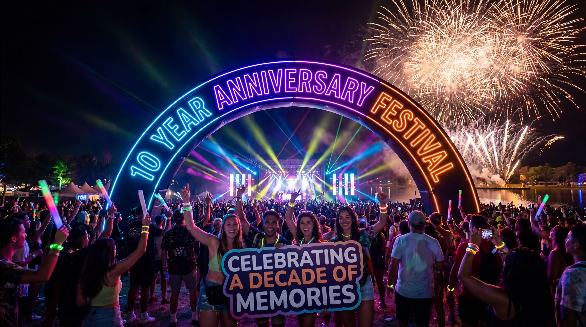
- Branding and Welcome: A grand entrance arch or sign bearing the festival’s name and artwork sets the tone as soon as people arrive. It assures attendees they are in the right place and builds excitement. For example, large music festivals often have iconic entrance structures (like a giant archway or gates themed to the festival’s art style) which become popular photo spots.
- Information at Entry: Near each main entrance or under the archway, include basic directional information. Right as attendees come in, provide signs or banners indicating where major areas are (“? Stages | Camping ? | Food & Drink ?”). This immediate guidance helps distribute the crowd efficiently from the get-go – people can orient themselves and head in the correct direction for what they seek (drop off bags, meet friends, find the first act, etc.).
- Multiple Entrances: If the festival has several entry points (e.g., North Gate, South Gate, VIP Entrance), clearly label each with its own signage. This not only helps ticket-holders find the correct gate but also becomes useful as a reference point (attendees might say “meet me at the East Gate sign”). Make sure each gate’s signage is distinct and visible from a distance, especially if queues form – a tall archway or banner that can be seen over the fence or crowd will help people arriving find the right line.
- Exits and Re-entry: Similarly, plan signage for exits and re-entry points. An exit sign should be obvious to those leaving (with “Thank you for coming!” messaging perhaps), but also clear for emergency use. If re-entry is allowed (with wristbands or stamps), have signs that indicate the process or direct people to re-entry lanes, so that staff aren’t overwhelmed answering the same questions.
- Premium and VIP Wayfinding: High-tier ticket holders expect frictionless entry. Dedicated VIP entrance maps should be distributed digitally before the event and reinforced with clear, exclusive physical music festival signage on-site. Whether you are routing guests through a sprawling greenfield site or managing a complex stadium perimeter (similar to navigating an MSG VIP entrance map), premium gateway signage must clearly delineate fast-track lanes, hospitality access, and exclusive parking zones without confusing general admission attendees.
Map Boards and Information Kiosks
Even with plentiful directional signs, attendees benefit from having the “big picture” of the festival grounds. Map boards are large maps of the festival site placed at strategic points, and they are invaluable for wayfinding and information:
- Designing the Map: A good festival site map is simplified for clarity. Highlight key areas like stages, entrances, exits, medical tents, restrooms, water stations, and any distinctive landmarks (art installations, big trees, etc.). Use clear symbols and a legend. Mark the “You Are Here” spot on each map board so users can orient themselves quickly. If the festival covers a large area, include a “distance scale” or walking time estimates between major points (for instance, a note like “Main Stage to Parking: ~10 min walk”).
- Placement of Map Boards: Place these near entrances (so newcomers can immediately get their bearings) and at major crossroads or gathering spots like food courts or lounge areas. If the festival has distinct zones (e.g., camping vs. arena, or different stages far apart), ensure each zone has at least one map board.
- Information Kiosks: Alongside maps, consider an information board or small kiosk for other crucial details – such as the day’s schedule, any last-minute changes or announcements, and the location of lost & found or other services. Some festivals put up chalkboards or whiteboards for schedule updates so they can be changed in real-time if needed (for example, if a performance is delayed or a venue change occurs).
- Interactive and Digital Maps: For tech-savvy events, digital touch-screen kiosks or QR codes on map boards can complement physical maps. Attendees could scan a QR code to load the map on their phone or see real-time data (like which water stations are busy). However, never rely solely on digital solutions – cell networks can get overloaded and batteries die. The physical map board is a reliable standby that works for everyone.
Emergency and Safety Signage
Effective wayfinding isn’t just about fun and convenience – it’s a critical component of festival safety and emergency preparedness. Emergency signage must be highly visible, universally understood, and strategically placed to facilitate quick responses in urgent situations:
Boost Revenue With Smart Upsells
Sell merchandise, VIP upgrades, parking passes, and add-ons during checkout and via post-purchase emails. Increase average order value by up to 220%.
- Exit Signs: Clearly marked exit routes can save lives in an evacuation. Every major area (stages, tents, fenced zones) should have visible exit signage. Use large “EXIT” signs with directional arrows, and if the festival runs into the evening or indoors, these signs should be illuminated or reflective for visibility in low light or smoke. It’s wise to elevate exit signs above head height and even use tall flag markers for emergency exits so they can be seen from across a crowd.
- First Aid and Emergency Services: Position signs for first aid tents, medical stations, and security posts so that someone seeking help can find them quickly (or run to get help). Use the universal red cross symbol (or the appropriate local medical symbol) along with text like “First Aid”. These should stand out – consider using a bright color (like red or neon) and possibly lighting at night. Additionally, ensure staff-only emergency access roads or gates are labeled discreetly, so crew and emergency personnel know their route.
- Safety Notices: Other signage might include warnings or instructions in case of emergencies. For example, in wildfire-prone areas, organizers might post signs labeled “Fire Assembly Point” indicating where people should gather if there’s a fire. In large venues, signs with “Emergency Exit Only” on fences or barricades could indicate gates that remain closed but will open if an evacuation is ordered.
- Code of Conduct and Warnings: Information signs about safety rules (like “No open flames”, “Keep off structures”, “Stay Hydrated – free water stations available”) contribute to preventing emergencies. While not directional, these informational safety signs can be placed in queues or common areas as gentle reminders. They should be noticeable but not so verbose that people won’t read them – concise with icons works best.
- Communication in Crisis: Plan for how signage might assist if organizers need to relay urgent messages. While staff and security will direct crowds, having electronic message boards or a PA system to complement static signs can be life-saving. For instance, some festivals use LED screens (originally for schedules or sponsor ads) to flash emergency directions if needed (“Severe weather approaching – proceed to exit gates calmly”). Static signage should cover the basics, but dynamic messaging can adapt to the situation.
Design Principles for Effective Festival Signage
Designing festival signage is a balancing act between creativity (to fit the festival’s vibe) and clarity (to ensure anyone can read and understand it quickly). Here are key design principles for making signs that work:
- Simplicity and Readability: In a festival environment, attendees might glance at a sign while walking or in a crowd, so keep text minimal. A general rule is that someone should grasp the sign’s message in a second or two. Use simple fonts (bold sans-serif typefaces are common for high visibility) and make sure the font size is large enough to read from the typical viewing distance. For instance, directional signs might use letters 4–6 inches (10–15 cm) high so they can be seen from 50+ feet away.
- High Contrast: Choose color combinations that stand out. Dark text on a light background or white text on a dark background works well. If your festival branding uses a specific palette, it can be incorporated, but always test that the text color vs. background offers enough contrast even in low light. Remember that outdoor conditions vary; a sign that looks fine on a computer screen might wash out in bright sunlight or be too dim at night.
- Iconography: Symbols are powerful in a diverse crowd. Use universally recognized icons (for example, fork/knife for food, tent for camping, “i” for information, wheelchair symbol for accessibility, etc.). Icons help break language barriers and are processed quickly by the brain. That said, don’t rely on an obscure icon without a label – combine icon + text for clarity (e.g., an icon of a water droplet with the text “Water Refill”).
- Durability: Festival signs must withstand weather and wear. Choose materials and printing methods that are water-resistant and wind-resistant. Thick laminated cardboard or coroplast boards can work for short-term use; vinyl banners or UV-resistant plastic signage are even better for multi-day use. If the event is in a windy open field, secure signs firmly (consider A-frame bases, weighted signposts, or even attaching signs to existing structures) to prevent them from toppling or spinning.
- Lighting and Visibility: For evening events, plan illumination for critical signs. This could mean using reflective materials (like the reflective film on road signs) for directional and exit signs or installing lights (e.g., small LED spotlights or string lights) to shine on important signage. Glow-in-the-dark or neon elements can also help, but test them in darkness to ensure they truly stand out. Remember that festival-goers might carry flashlights or phone lights; reflective signs will “pop” when light hits them.
- Thematic Design vs. Clarity: It’s fun to design signs that match the festival theme (a medieval-themed festival might have rustic wooden signs, for instance). Incorporate theme and art in moderation – a touch of design that makes the sign unique – but never at the cost of legibility. It’s possible to have both: for example, using a fantasy-themed frame or shape for a signboard, but keeping the text area plain and easy to read. Always prototype one or two signs early and get opinions: can people actually read it easily?
- Sustainability: Modern festival-goers and communities appreciate eco-friendly practices. Consider reusability and sustainable materials. Sturdy, generic signs (like those that just say “Entrance” or “Restrooms”) can be stored and reused for future events, which saves cost and reduces waste. If using dates or specific names, organizers can design banners with changeable panels (for example, a reusable “Stage Schedule” board where the daily performance list can be attached or updated easily). If signs are one-time use, look into recyclable or biodegradable materials.
- Scalability Across Venues: The principles of effective music festival signage must adapt whether you are operating in a dense urban grid or an expansive rural field. Urban event wayfinding might rely heavily on existing infrastructure and digital totems, whereas greenfield sites require custom-built towers and highly visible, weather-resistant physical markers to establish clear navigation paths.
- Accessible Materials for Grassroots Spaces: When determining the best materials for accessible signage in small DIY music venues or boutique festival spaces, operators must balance budget with compliance. High-contrast, non-glare acrylic or matte-finished aluminum are excellent choices that prevent light reflection, making text easier to read for visually impaired attendees. For tactile elements like Braille or raised lettering, photopolymer or routed PVC offer durability without the high costs associated with custom metal casting, ensuring your event wayfinding remains inclusive regardless of the venue’s size.
Placement, Installation, and On-Site Adjustments
Even the best-designed sign is only effective if placed correctly and maintained during the event. Festival producers must oversee the installation of signage and remain ready to adjust as necessary:
Need Festival Funding?
Get the capital you need to book headliners, secure venues, and scale your festival production.
- Strategic Placement: Walk the site in the shoes of an attendee. From each major area, check that the next destination is clearly indicated. Immediately upon entering, guests should encounter signs pointing to key destinations. At every junction or split path, double-check that a sign or map is there to guide people. Use height to your advantage – mounting signs on tall poles or rigging can help them rise above crowd level. In areas like marketplaces or dense food courts, hanging signs overhead (from tents or truss) can be more visible than signs at ground level.
- Redundancy: It’s better to have one sign too many than one too few in critical spots. Crowds can obscure signs, or a sign might get damaged – having multiple signs (or multi-sided signs viewable from different angles) for the same important direction (like “Exit” or “First Aid”) is a good safety measure. Redundancy is also helpful for huge festivals: for example, along a long pathway, reassurance signs (“keep going to Parking – 5 minutes walk”) can reduce attendee anxiety that they missed a turn.
- Installation Timing: Put up signage well before gates open and do a thorough site walk-through. Ideally, have a few staff or volunteers do a “beta test” – have them pretend to be attendees trying to find various locations with only the signs as a guide. Take their feedback to fix any confusing points. It’s easier to move or add signs during setup than when thousands of people are on site.
- Maintenance During Event: Assign staff to periodically check on signage throughout the festival. Signs can blow over, lighting for a sign might fail, or occasionally, mischievous attendees might rotate an arrow sign as a prank. A quick patrol every few hours (and especially after peak ingress times or overnight) can catch these issues. Keep a toolkit and a few spare signs or printouts on hand for replacements. For example, if an exit sign gets damaged, organizers should be ready to deploy a new one immediately.
- Flexibility for Changes: Live events are dynamic. If one area becomes overly crowded, organizers might want to direct attendees to an alternative route – having a couple of blank or generic arrow signs to deploy, or digital signage that can be updated, will allow the team to respond to unexpected situations. Similarly, if a scheduled activity moves location, update any relevant signs (and inform staff to direct people accordingly).
Learning from Experience: Successes and Cautionary Tales
Real festival scenarios illustrate how good signage makes a difference:
- Success Story – Smooth Navigation: At a large international festival in Europe, organizers divided the grounds into color-coded zones (Red, Green, Blue, etc.) and provided matching colored wayfinding signs and flags. Attendees found it intuitive to follow the colored pathways to stages and amenities. The result was noticeably fewer lost individuals and almost no bottlenecks where people stopped in confusion. Many festival-goers later commented that finding friends or particular stages was easier than at other events, a direct result of the clear signage strategy.
- Success Story – Emergency Evacuation: A mid-sized outdoor festival once faced a sudden severe thunderstorm, requiring an evacuation from the main stage area. Because the organizers had invested in tall, well-lit EXIT signs and trained staff at those points, the crowd was able to disperse quickly and calmly to the designated shelter areas. After the incident, emergency responders praised the signage system for guiding thousands of people out within minutes, with minimal panic.
- Lesson Learned – The Perils of Poor Signage: On the other hand, a boutique food and wine festival in a downtown park learned the hard way that inadequate signage can sour attendee mood. They provided maps in the program booklet but placed very few signs on the actual grounds. Visitors frequently got turned around looking for specific winery booths and restroom areas hidden behind buildings. Staff and volunteers were swamped with directional questions. Post-event surveys highlighted attendee frustration with finding things. The festival organizers took this feedback and the next year implemented prominent directional signs and banners at key intersections, which vastly improved the flow and satisfaction.
- Lesson Learned – Over-The-Top Design: In another case, an art-themed festival created beautiful hand-painted signs in elaborate, swirly fonts to match the artistic atmosphere. Unfortunately, the creative font was hard to read from a distance, especially at night. Attendees loved the artwork but still ended up lost. The following year, the organizers adjusted by keeping the artistic elements in the sign frame and background but using a clean, bold typeface for the actual directions – retaining the charm while restoring function.
- Landmarks as Wayfinding Aids: Many seasoned producers also leverage non-signage landmarks to complement the formal wayfinding system. For instance, installing a unique piece of art or a high-flying inflatable at the center of the grounds gives attendees a visual reference point (“meet at the giant statue” or “turn right at the big balloon”). At some large festivals, famous art installations or even distinct lighting on a tall structure serve as navigation anchors. These don’t replace directional signs, but they add another intuitive layer of orientation, especially for attendees who might get disoriented in a sea of similar-looking tents.
Impact on Attendee Experience and Safety
A well-executed signage and wayfinding system has tangible benefits for both attendee experience and overall festival safety:
- Reduced Confusion and Stress: When festival-goers can easily find stages, facilities, and exits, they feel more at ease. Instead of frustration or anxiety about getting lost, attendees can relax and enjoy the event. This positive mood translates into better engagement with the festival activities – people attend more shows, visit more vendors, and generally have a richer experience when navigation is seamless.
- Enhanced Discovery: Clear wayfinding can actually encourage exploration. If people see signs pointing to attractions they might have missed (like “Art Garden this way” or “Silent Disco ?”), they’re more likely to check them out. This can distribute crowds more evenly across the venue and give lesser-known areas or acts a better audience.
- Accessibility and Inclusivity: Thoughtful signage demonstrates respect for all attendees, including those who might have mobility challenges or those not fluent in the local language. For example, indicating wheelchair-accessible routes or having symbols in addition to text ensures everyone feels welcome and informed. This inclusivity can broaden the festival’s appeal and reputation.
- Operational Efficiency: From an operational standpoint, good signage lightens the load on staff and security. If attendees can self-navigate, staff spend less time fielding questions like “Where is Stage B?” or “How do I get to parking?”. Instead, they can focus on their primary roles (such as security checks or ticket scanning), which improves overall efficiency. It also means fewer bottlenecks; for instance, clear signs to all entrance lanes prevent everyone crowding into one line.
- Critical in Emergencies: In urgent situations, every second counts. If an evacuation is needed or if someone is trying to rush to a medical tent, clear signage can shave off crucial time. Attendees under stress may not think clearly, so having unmistakable visual cues (big arrows, bold words like “EXIT” or “AID”) can guide even a panicked crowd to safety. Moreover, when people have noticed exit signs throughout the day, they’re mentally prepared and aware of their options to leave quickly if something goes wrong.
Conclusion
Signage and wayfinding systems might not be the flashiest aspect of festival production, but they are undeniably one of the most important. By investing time and resources into a comprehensive signage plan, festival organizers set the stage for a smoother, safer, and more enjoyable event for everyone.
The next generation of festival producers should view signage not as an afterthought but as a core part of site design and guest services. It’s the invisible hand that guides the masses – when done right, attendees hardly notice it because everything simply works. From the moment a festival-goer spots the welcoming archway, to navigating between stages, to finding an exit during a sudden downpour, signage underpins each step of the journey.
In the end, effective festival signage is about care and respect for your audience. It’s a way of saying ‘we’ve got you’ – meaning the organizers have anticipated attendees’ needs and are guiding them. That level of care builds trust, turning first-time attendees into loyal fans who appreciate the well-organized experience. As the saying goes among veteran producers: a well-signed festival is a happy festival.
Frequently Asked Questions
How do organizers plan a festival signage strategy?
Festival organizers plan signage strategies by analyzing site layouts to identify high-traffic areas and decision points like crossroads before printing begins. Effective planning involves mapping all sign locations, considering audience demographics for multilingual or accessible needs, and integrating these elements early in the design process to ensure clear navigation and compliance with safety regulations.
What are the key design principles for effective festival signage?
Effective festival signage relies on simplicity, high contrast, and readability. Text should be minimal using bold sans-serif fonts, with letters 4–6 inches high for visibility from 50 feet away. Designers must use universally recognized icons to bridge language barriers and ensure materials like vinyl or laminated cardboard are durable enough to withstand weather conditions.
Where should directional signs be placed at a festival?
Directional signs should be positioned at decision points where attendees must choose a path, such as footpath forks or intersections. Organizers should mount signs on tall poles or towers to remain visible above crowds. Placing signs early enough to guide turns and using color-coded zones helps distribute foot traffic efficiently across the venue.
Why is emergency signage important at festivals?
Emergency signage is critical for facilitating quick evacuations and guiding attendees to safety during urgent situations. Clearly marked exit routes, first aid stations using universal red cross symbols, and safety notices help reduce panic. High-visibility designs, such as illuminated or reflective materials, ensure these signs remain visible in low light or smoke.
What information should be included on a festival map board?
A festival map board must feature a simplified site layout highlighting stages, restrooms, exits, and medical tents. Essential elements include a “You Are Here” marker for orientation, a legend for symbols, and a distance scale or walking time estimates. Placing these boards near entrances and major crossroads helps attendees quickly get their bearings.
How does good wayfinding improve the attendee experience?
Well-executed wayfinding reduces attendee confusion and stress, allowing guests to relax and enjoy the event. Clear navigation encourages exploration of lesser-known areas and improves operational efficiency by reducing the number of directional questions staff must answer. Furthermore, accessible signage demonstrates inclusivity, ensuring all guests feel welcome and safe throughout the festival.
How is digital signage used for event wayfinding?
Digital signage wayfinding is increasingly essential for modern events, conferences, and festivals. Unlike static boards, digital screens and LED totems allow organizers to update directional arrows, stage schedules, and emergency messaging in real-time. This dynamic approach helps manage crowd flow efficiently, redirecting attendees instantly if a specific zone becomes congested or a performance time shifts.
What is the difference between festival signage and event wayfinding?
While festival signage refers to the physical or digital assets—like banners, map boards, and LED screens—event wayfinding is the broader strategic system used to guide attendees through a venue. A comprehensive event wayfinding strategy incorporates those signs alongside spatial planning, lighting cues, crowd flow management, and natural landmarks to create an intuitive navigation experience for guests.
What are the most common festival wayfinding mistakes?
One of the most frequent festival wayfinding mistakes is overcomplicating directional boards with too much text. Organizers sometimes fail to account for crowd density, placing event wayfinding markers too low to the ground where they become obscured. Additionally, neglecting nighttime visibility and failing to update dynamic routes when schedules change can quickly lead to attendee frustration and unsafe bottlenecks.
What are the best materials for accessible signage in small DIY music venues?
For grassroots spaces and boutique events, the best materials for accessible signage in small DIY music venues include non-glare acrylic, matte-finished aluminum, and routed PVC. These options provide the necessary high contrast and tactile elements (like raised lettering or Braille) required for accessibility compliance, while remaining cost-effective and durable enough for high-traffic areas.